As we've seen, grid lets you layout widgets in columns and rows. If you're familiar with using
HTML tables for layout, you'll feel right at home here. This chapter illustrates the various ways
you can tweak grid to give you all the control you need for your user interface.
Grid is one of several geometry managers available in Tk, but its mix of power, flexibility, and ease of use make it the best choice
for general use. Its constraint model is a natural fit with today's layouts that rely on the alignment of widgets.
There are other geometry managers in Tk: pack is also quite powerful but harder to
use and understand, while place gives you complete control of positioning each element.
Even widgets like paned windows, notebooks, canvas, and text that we'll explore later can act as geometry managers.
Note that grid was first introduced to Tk in 1996, several years after Tk became popular and it took a while to catch on.
Before that, developers had always used pack to do constraint-based geometry management. When grid came
out, many developers kept using pack, and you'll still find it used in many Tk programs and documentation.
While there's nothing technically wrong with pack, the algorithm's behavior is often hard to understand.
More importantly, because the order that widgets are packed is significant in determining layout, modifying
existing layouts can be more difficult. Aligning widgets in different parts of the user interface is also much trickier.
Grid has all the power of pack, produces nicer layouts (that align widgets both horizontally and vertically), and is easier to learn and use. Because of that, grid is the right choice for most developers most of the time. Start your new programs using grid, and switch old ones to grid as you make changes to an existing user interface.
The reference documentation for grid provides an exhaustive description of grid, its behaviors, and all options.
Columns and rows
In grid, widgets are assigned a column number and a row number. These indicate each widget's position
relative to other widgets. Widgets in the same column are above or below each other. Those
in the same row are to the left or right of each other.
Column and row numbers must be positive integers (i.e., 0, 1, 2, ...). You don't have to start at 0 and can leave gaps in column and row numbers (e.g., column 1, 2, 10, 11, 12, 20, 21). This is useful if you plan to add more widgets in the middle of the user interface later.
The width of each column will vary depending on the width of the widgets contained within the column. Ditto for the height of each row. This means when sketching out your user interface and dividing it into rows and columns, you don't need to worry about each column or row being equal width.
Spanning multiple cells
Widgets can take up more than a single cell in the grid; to do this, we'll use the columnspan
and rowspan options when gridding the widget. These are analogous to the "colspan" and "rowspan"
attributes of HTML tables.
Here is an example of creating a user interface with multiple widgets, some that take up more than a single cell.
Gridding multiple widgets.
from tkinter import *
from tkinter import ttk

root = Tk()

content = ttk.Frame(root)
frame = ttk.Frame(content, borderwidth=5, relief="ridge", width=200, height=100)
namelbl = ttk.Label(content, text="Name")
name = ttk.Entry(content)

onevar = BooleanVar(value=True)
twovar = BooleanVar(value=False)
threevar = BooleanVar(value=True)

one = ttk.Checkbutton(content, text="One", variable=onevar, onvalue=True)
two = ttk.Checkbutton(content, text="Two", variable=twovar, onvalue=True)
three = ttk.Checkbutton(content, text="Three", variable=threevar, onvalue=True)
ok = ttk.Button(content, text="Okay")
cancel = ttk.Button(content, text="Cancel")

content.grid(column=0, row=0)
frame.grid(column=0, row=0, columnspan=3, rowspan=2)
namelbl.grid(column=3, row=0, columnspan=2)
name.grid(column=3, row=1, columnspan=2)
one.grid(column=0, row=5)
two.grid(column=1, row=5)
three.grid(column=2, row=5)
ok.grid(column=3, row=5)
cancel.grid(column=4, row=5)

root.mainloop()
ttk::frame .c
ttk::frame .c.f -borderwidth 5 -relief ridge -width 200 -height 100
ttk::label .c.namelbl -text Name
ttk::entry .c.name
ttk::checkbutton .c.one -text One -variable one -onvalue 1; set one 1
ttk::checkbutton .c.two -text Two -variable two -onvalue 1; set two 0
ttk::checkbutton .c.three -text Three -variable three -onvalue 1; set three 1
ttk::button .c.ok -text Okay
ttk::button .c.cancel -text Cancel
grid .c -column 0 -row 0
grid .c.f -column 0 -row 0 -columnspan 3 -rowspan 2
grid .c.namelbl -column 3 -row 0 -columnspan 2
grid .c.name -column 3 -row 1 -columnspan 2
grid .c.one -column 0 -row 5
grid .c.two -column 1 -row 5
grid .c.three -column 2 -row 5
grid .c.ok -column 3 -row 5
grid .c.cancel -column 4 -row 5require 'tk'
require 'tkextlib/tile'
root = TkRoot.new
content = Tk::Tile::Frame.new(root)
frame = Tk::Tile::Frame.new(content) {borderwidth 5; relief "ridge"; width 200; height 100}
namelbl = Tk::Tile::Label.new(content) {text "Name"}
name = Tk::Tile::Entry.new(content)
$option_one = TkVariable.new( 1 )
one = Tk::Tile::CheckButton.new(content) {text "One"; variable $option_one; onvalue 1}
$option_two = TkVariable.new( 0 )
two = Tk::Tile::CheckButton.new(content) {text "Two"; variable $option_two; onvalue 1}
$option_three = TkVariable.new( 1 )
three = Tk::Tile::CheckButton.new(content) {text "Three"; variable $option_three; onvalue 1}
ok = Tk::Tile::Button.new(content) {text "Okay"}
cancel = Tk::Tile::Button.new(content) {text "Cancel"}
content.grid :column => 0, :row => 0
frame.grid :column => 0, :row => 0, :columnspan => 3, :rowspan => 2
namelbl.grid :column => 3, :row => 0, :columnspan => 2
name.grid :column => 3, :row => 1, :columnspan => 2
one.grid :column => 0, :row => 5
two.grid :column => 1, :row => 5
three.grid :column => 2, :row => 5
ok.grid :column => 3, :row => 5
cancel.grid :column => 4, :row => 5
Tk.mainloopuse Tkx;
my $mw = Tkx::widget->new(".");
my $content = $mw->new_ttk__frame;
my $frame = $content->new_ttk__frame(-borderwidth => 5, -relief => "ridge", -width => 200, -height => 100);
my $namelbl = $content->new_ttk__label(-text => "Name");
my $name = $content->new_ttk__entry;
$option_one = 1; $option_two = 0; $option_three = 1;
my $one = $content->new_ttk__checkbutton(-text => "One", -variable => \$option_one, -onvalue => 1);
my $two = $content->new_ttk__checkbutton(-text => "Two", -variable => \$option_two, -onvalue => 1);
my $three = $content->new_ttk__checkbutton(-text => "Three", -variable => \$option_three, -onvalue => 1);
my $ok = $content->new_ttk__button(-text => "Okay");
my $cancel = $content->new_ttk__button(-text => "Cancel");
$content->g_grid(-column => 0, -row => 0);
$frame->g_grid(-column => 0, -row => 0, -columnspan => 3, -rowspan => 2);
$namelbl->g_grid(-column => 3, -row => 0, -columnspan => 2);
$name->g_grid(-column => 3, -row => 1, -columnspan => 2);
$one->g_grid(-column => 0, -row => 5);
$two->g_grid(-column => 1, -row => 5);
$three->g_grid(-column => 2, -row => 5);
$ok->g_grid(-column => 3, -row => 5);
$cancel->g_grid(-column => 4, -row => 5);
Tkx::MainLoop;Notice we chose row numbers 0, 1, and 5. Again, column and row numbers don't need to be contiguous.
Leaving gaps makes it easier to add extra elements to your interface later.
Layout within the cell
The width of a column (and height of a row) depends on all the widgets contained in it. That means some widgets could be smaller than the cells they are placed in. If so, where exactly should they be put within their cells?
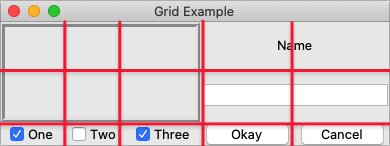
By default, if a cell is larger than the widget contained in it, the widget will be centered within it, both horizontally and vertically. The master's background color will display in the empty space around the widget. In the figure below, the widget in the top right is smaller than the cell allocated to it. The (white) background of the master fills the rest of the cell.
Layout within the cell and the 'sticky' option.
The sticky option can change this default behavior.
It consists of 0 or more of the compass directions n, s, e, and w,
specifying which edges of the cell the widget should be "stuck" to. For example, a
value of n (north) will jam the widget up against the top side, with any extra vertical
space on the bottom; the widget will still be centered horizontally. A value of nw (north-west)
means the widget will be stuck to the top left corner, with extra space on the bottom and right.
In Tkinter, you can also specify this as a list or tuple containing any of N, S, E, and W.
You can use the constants provided by Tkinter, or just string literals. It's a stylistic choice, and we'll tend to use the list format in this book.
Specifying two opposite edges, such as we (west, east), means the widget will be stretched.
In this case, it will be stuck to both the left and right edges of the cell. So the widget will be wider
than its "ideal" size.
If you want the widget to expand to fill up the entire cell, grid it with a sticky value of nsew
(north, south, east, west), meaning it will stick to every side. This is shown in the bottom left widget in the above figure.
Most widgets have options that can control how they are displayed if
they are larger than needed. For example, a label widget has an anchor option that
controls where the label's text will be positioned within the widget's boundaries. The bottom left label
in the figure above uses the default anchor (w, i.e., left side, vertically centered).
If you're having trouble getting things to line up the way you want them to,
first make sure you know how large the widget is. As discussed with the
label widget in the previous chapter, changing the widget's background or border can help.
Handling resize
If you've tried to resize the example, you'll notice that nothing moves at all, as shown below.
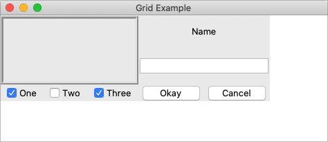
Resizing the window.
Even if you took a peek below and added the extra sticky options to our example, you'd still see the
same thing. It looks like sticky may tell Tk how to react if the cell's row or column does resize
but doesn't actually say that the row or columns should resize if any extra room becomes available.
Let's fix that.
Every column and row in the grid has a weight option associated with it. This tells grid how much
the column or row should grow if there is extra room in the master to fill. By default, the weight of each column or
row is 0, meaning it won't expand to fill any extra space.
For the user interface to resize, we'll need to specify a positive weight to the columns and rows that
we'd like to expand. You must provide weights for at least one column and one row. This is done using the columnconfigure and rowconfigure methods of grid.
This weight is relative. If two columns have the same weight, they'll expand at the same rate. In our example, we'll give the three leftmost columns (holding the checkbuttons) weights of 3 and the two rightmost columns weights of 1. For every one pixel the right columns grow, the left columns will grow by three pixels. So as the window grows larger, most of the extra space will go to the left side.
content.columnconfigure(0, weight=3)
content.columnconfigure(1, weight=3)
content.columnconfigure(2, weight=3)
content.columnconfigure(3, weight=1)
content.columnconfigure(4, weight=1)
content.rowconfigure(1, weight=1)
grid columnconfigure .c 0 -weight 3
grid columnconfigure .c 1 -weight 3
grid columnconfigure .c 2 -weight 3
grid columnconfigure .c 3 -weight 1
grid columnconfigure .c 4 -weight 1
grid rowconfigure .c 1 -weight 1TkGrid.columnconfigure( content, 0, :weight => 3 )
TkGrid.columnconfigure( content, 1, :weight => 3 )
TkGrid.columnconfigure( content, 2, :weight => 3 )
TkGrid.columnconfigure( content, 3, :weight => 1 )
TkGrid.columnconfigure( content, 4, :weight => 1 )
TkGrid.rowconfigure( content, 1, :weight => 1)$content->g_grid_columnconfigure(0, -weight => 3);
$content->g_grid_columnconfigure(1, -weight => 3);
$content->g_grid_columnconfigure(2, -weight => 3);
$content->g_grid_columnconfigure(3, -weight => 1);
$content->g_grid_columnconfigure(4, -weight => 1);
$content->g_grid_rowconfigure(1, -weight => 1);If you add those lines of code and then resize the window in the application… still nothing. Why?
We've told Tk how we want the widgets inside the content frame to expand. But remember that the content frame itself is gridded into the root application window. So we need to tell the root window to give any extra space to the row and column holding our content frame.
root.columnconfigure(0, weight=1)
root.rowconfigure(0, weight=1)grid columnconfigure . 0 -weight 1
grid rowconfigure . 0 -weight 1TkGrid.columnconfigure( root, 0, :weight => 1 )
TkGrid.rowconfigure( root, 0, :weight => 1 )$mw->g_grid_columnconfigure(0, -weight => 1);
$mw->g_grid_rowconfigure(0, -weight => 1);Add those lines and try again. Much better.

Resizing the window after adding weights.
For additional control, both columnconfigure and rowconfigure also take a minsize grid option,
which specifies a minimum size you really don't want the column or row to shrink beyond.
You can also disable resizing on the toplevel window using the following code; we'll discuss this in a later chapter.
window.resizable(False, False)wm resizable .window 0 0window['resizable'] = false, false$window->g_wm_resizable(0,0);Padding
Normally, each column or row is directly adjacent to the next so that widgets are right next to each other. This is sometimes what you want (think of a listbox and its scrollbar), but often you want some space between widgets. In Tk, this is called padding, and there are several ways you can choose to add it.
We've already actually seen one way, and that is using a widget's own options to add the extra
space around it. Not all widgets have this, but one that does is a frame; this is useful because
frames are most often used as the master to grid other widgets. The frame's padding
option lets you specify a bit of extra padding inside the frame, whether the same amount for
each of the four sides or even different amounts of padding for each.
A second way is using the padx and pady grid options when adding the widget. As you'd
expect, padx puts a bit of extra space to the left and right of the widget you're adding, while pady
adds extra space top and bottom. A single value for the option puts the same padding on
both left and right (or top and bottom), while a two-value list lets you put different amounts
on left and right (or top and bottom). Note that this extra padding is within the grid cell
containing the widget.
The columnconfigure and rowconfigure methods accept a pad option. This increases the requested size for each widget to
account for padding, but does not put extra padding around the widget, which must still be done via padx and/or pady.
Let's add the extra sticky, resizing, and padding behavior to our example (additions in bold).
from tkinter import *
from tkinter import ttk
root = Tk()
content = ttk.Frame(root, padding=(3,3,12,12))
frame = ttk.Frame(content, borderwidth=5, relief="ridge", width=200, height=100)
namelbl = ttk.Label(content, text="Name")
name = ttk.Entry(content)
onevar = BooleanVar()
twovar = BooleanVar()
threevar = BooleanVar()
onevar.set(True)
twovar.set(False)
threevar.set(True)
one = ttk.Checkbutton(content, text="One", variable=onevar, onvalue=True)
two = ttk.Checkbutton(content, text="Two", variable=twovar, onvalue=True)
three = ttk.Checkbutton(content, text="Three", variable=threevar, onvalue=True)
ok = ttk.Button(content, text="Okay")
cancel = ttk.Button(content, text="Cancel")
content.grid(column=0, row=0, sticky=(N, S, E, W))
frame.grid(column=0, row=0, columnspan=3, rowspan=2, sticky=(N, S, E, W))
namelbl.grid(column=3, row=0, columnspan=2, sticky=(N, W), padx=5)
name.grid(column=3, row=1, columnspan=2, sticky=(N,E,W), pady=5, padx=5)
one.grid(column=0, row=5)
two.grid(column=1, row=5)
three.grid(column=2, row=5)
ok.grid(column=3, row=5)
cancel.grid(column=4, row=5)
root.columnconfigure(0, weight=1)
root.rowconfigure(0, weight=1)
content.columnconfigure(0, weight=3)
content.columnconfigure(1, weight=3)
content.columnconfigure(2, weight=3)
content.columnconfigure(3, weight=1)
content.columnconfigure(4, weight=1)
content.rowconfigure(1, weight=1)
root.mainloop()ttk::frame .c -padding "3 3 12 12"
ttk::frame .c.f -borderwidth 5 -relief ridge -width 200 -height 100
ttk::label .c.namelbl -text Name
ttk::entry .c.name
ttk::checkbutton .c.one -text One -variable one -onvalue 1; set one 1
ttk::checkbutton .c.two -text Two -variable two -onvalue 1; set two 0
ttk::checkbutton .c.three -text Three -variable three -onvalue 1; set three 1
ttk::button .c.ok -text Okay
ttk::button .c.cancel -text Cancel
grid .c -column 0 -row 0 -sticky nsew
grid .c.f -column 0 -row 0 -columnspan 3 -rowspan 2 -sticky nsew
grid .c.namelbl -column 3 -row 0 -columnspan 2 -sticky nw -padx 5
grid .c.name -column 3 -row 1 -columnspan 2 -sticky new -pady 5 -padx 5
grid .c.one -column 0 -row 5
grid .c.two -column 1 -row 5
grid .c.three -column 2 -row 5
grid .c.ok -column 3 -row 5
grid .c.cancel -column 4 -row 5
grid columnconfigure . 0 -weight 1
grid rowconfigure . 0 -weight 1
grid columnconfigure .c 0 -weight 3
grid columnconfigure .c 1 -weight 3
grid columnconfigure .c 2 -weight 3
grid columnconfigure .c 3 -weight 1
grid columnconfigure .c 4 -weight 1
grid rowconfigure .c 1 -weight 1require 'tk'
require 'tkextlib/tile'
root = TkRoot.new
content = Tk::Tile::Frame.new(root) {padding "3 3 12 12"}
frame = Tk::Tile::Frame.new(content) {borderwidth 5; relief "ridge"; width 200; height 100}
namelbl = Tk::Tile::Label.new(content) {text "Name"}
name = Tk::Tile::Entry.new(content)
$option_one = TkVariable.new( 1 )
one = Tk::Tile::CheckButton.new(content) {text "One"; variable $option_one; onvalue 1}
$option_two = TkVariable.new( 0 )
two = Tk::Tile::CheckButton.new(content) {text "Two"; variable $option_two; onvalue 1}
$option_three = TkVariable.new( 1 )
three = Tk::Tile::CheckButton.new(content) {text "Three"; variable $option_three; onvalue 1}
ok = Tk::Tile::Button.new(content) {text "Okay"}
cancel = Tk::Tile::Button.new(content) {text "Cancel"}
content.grid :column => 0, :row => 0, :sticky => 'nsew'
frame.grid :column => 0, :row => 0, :columnspan => 3, :rowspan => 2, :sticky => 'nsew'
namelbl.grid :column => 3, :row => 0, :columnspan => 2, :sticky => 'nw', :padx => 5
name.grid :column => 3, :row => 1, :columnspan => 2, :sticky => 'new', :pady => 5, :padx => 5
one.grid :column => 0, :row => 5
two.grid :column => 1, :row => 5
three.grid :column => 2, :row => 5
ok.grid :column => 3, :row => 5
cancel.grid :column => 4, :row => 5
TkGrid.columnconfigure( root, 0, :weight => 1 )
TkGrid.rowconfigure( root, 0, :weight => 1 )
TkGrid.columnconfigure( content, 0, :weight => 3 )
TkGrid.columnconfigure( content, 1, :weight => 3 )
TkGrid.columnconfigure( content, 2, :weight => 3 )
TkGrid.columnconfigure( content, 3, :weight => 1 )
TkGrid.columnconfigure( content, 4, :weight => 1 )
TkGrid.rowconfigure( content, 1, :weight => 1)
Tk.mainloopuse Tkx;
my $mw = Tkx::widget->new(".");
my $content = $mw->new_ttk__frame(-padding => "3 3 12 12");
my $frame = $content->new_ttk__frame(-borderwidth => 5, -relief => "ridge", -width => 200, -height => 100);
my $namelbl = $content->new_ttk__label(-text => "Name");
my $name = $content->new_ttk__entry;
$option_one = 1; $option_two = 0; $option_three = 1;
my $one = $content->new_ttk__checkbutton(-text => "One", -variable => \$option_one, -onvalue => 1);
my $two = $content->new_ttk__checkbutton(-text => "Two", -variable => \$option_two, -onvalue => 1);
my $three = $content->new_ttk__checkbutton(-text => "Three", -variable => \$option_three, -onvalue => 1);
my $ok = $content->new_ttk__button(-text => "Okay");
my $cancel = $content->new_ttk__button(-text => "Cancel");
$content->g_grid(-column => 0, -row => 0, -sticky => "nsew");
$frame->g_grid(-column => 0, -row => 0, -columnspan => 3, -rowspan => 2, -sticky => "nsew");
$namelbl->g_grid(-column => 3, -row => 0, -columnspan => 2, -sticky => "nw", -padx => 5);
$name->g_grid(-column => 3, -row => 1, -columnspan => 2, -sticky => "new", -pady => 5, -padx => 5);
$one->g_grid(-column => 0, -row => 5);
$two->g_grid(-column => 1, -row => 5);
$three->g_grid(-column => 2, -row => 5);
$ok->g_grid(-column => 3, -row => 5);
$cancel->g_grid(-column => 4, -row => 5);
$mw->g_grid_columnconfigure(0, -weight => 1);
$mw->g_grid_rowconfigure(0, -weight => 1);
$content->g_grid_columnconfigure(0, -weight => 3);
$content->g_grid_columnconfigure(1, -weight => 3);
$content->g_grid_columnconfigure(2, -weight => 3);
$content->g_grid_columnconfigure(3, -weight => 1);
$content->g_grid_columnconfigure(4, -weight => 1);
$content->g_grid_rowconfigure(1, -weight => 1);
Tkx::MainLoop;This looks more promising. Play around with the example to get a feel for the resize behavior.
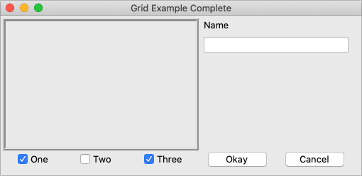
Grid example, handling in-cell layout and resize.
Additional grid features
If you look at the reference documentation for grid, you'll see
many other things you can do with grid. Here are a few of the more useful ones.
Querying and changing grid options
Like widgets themselves, it's easy to introspect the various grid options or change them. Setting options when you first grid the widget is certainly convenient, but you can change them anytime you'd like.
The slaves method will tell you all the widgets that have been gridded inside a master, or optionally
those within just a certain column or row. The info method will return a list of all the grid
options for a widget and their values. Finally, the configure method lets you change one or more
grid options on a widget.
These are illustrated in this interactive session:
>>> content.grid_slaves()
[<tkinter.ttk.Button object .!frame.!button2>, <tkinter.ttk.Button object .!frame.!button>,
<tkinter.ttk.Checkbutton object .!frame.!checkbutton3>, <tkinter.ttk.Checkbutton object .!frame.!checkbutton2>,
<tkinter.ttk.Checkbutton object .!frame.!checkbutton>, <tkinter.ttk.Entry object .!frame.!entry>,
<tkinter.ttk.Label object .!frame.!label>, <tkinter.ttk.Frame object .!frame.!frame>]
>>> for w in content.grid_slaves(): print(w)
...
.!frame.!button2
.!frame.!button
.!frame.!checkbutton3
.!frame.!checkbutton2
.!frame.!checkbutton
.!frame.!entry
.!frame.!label
.!frame.!frame
>>> for w in content.grid_slaves(row=3): print(w)
...
.!frame.!button2
.!frame.!button
.!frame.!checkbutton3
.!frame.!checkbutton2
.!frame.!checkbutton
>>> for w in content.grid_slaves(column=0): print(w)
...
.!frame.!checkbutton
.!frame.!frame
>>> namelbl.grid_info()
{'in': <tkinter.ttk.Frame object .!frame>, 'column': 3, 'row': 0, 'columnspan': 2, 'rowspan': 1,
'ipadx': 0, 'ipady': 0, 'padx': 5, 'pady': 0, 'sticky': 'nw'}
>>> namelbl.grid_configure(sticky=(E,W))
>>> namelbl.grid_info()
{'in': <tkinter.ttk.Frame object .!frame>, 'column': 3, 'row': 0, 'columnspan': 2, 'rowspan': 1,
'ipadx': 0, 'ipady': 0, 'padx': 5, 'pady': 0, 'sticky': 'ew'}
% grid slaves .c .c.cancel .c.ok .c.three .c.two .c.one .c.name .c.namelbl .c.f % grid slaves .c -row 3 .c.cancel .c.ok .c.three .c.two .c.one % grid slaves .c -column 0 .c.one .c.f % grid info .c.namelbl -in .c -column 3 -row 0 -columnspan 2 -rowspan 1 -ipadx 0 -ipady 0 -padx 5 -pady 0 -sticky nw % grid configure .c.namelbl -sticky ew % grid info .c.namelbl -in .c -column 3 -row 0 -columnspan 2 -rowspan 1 -ipadx 0 -ipady 0 -padx 5 -pady 0 -sticky ew
>> TkGrid.slaves(content, nil)
=> [#<Tk::Tile::TButton:0x380fa4 @path=".w00000.w00008">,
#<Tk::Tile::TButton:0x500d20 @path=".w00000.w00007">,
#<Tk::Tile::TCheckButton:0x50aac8 @path=".w00000.w00006">,
#<Tk::Tile::TCheckButton:0x524158 @path=".w00000.w00005">,
#<Tk::Tile::TCheckButton:0x54b4b0 @path=".w00000.w00004">,
#<Tk::Tile::TEntry:0x5d07a0 @path=".w00000.w00003">,
#<Tk::Tile::TLabel:0x5fa9b0 @path=".w00000.w00002">,
#<Tk::Tile::TFrame:0x5ff280 @visual=nil, @container=nil, @colormap=nil,
@path=".w00000.w00001", @db_class=Tk::Tile::TFrame, @classname="TFrame">]
>> TkGrid.slaves(content, :row => 3)
=> [#<Tk::Tile::TButton:0x380fa4 @path=".w00000.w00008">,
#<Tk::Tile::TButton:0x500d20 @path=".w00000.w00007">,
#<Tk::Tile::TCheckButton:0x50aac8 @path=".w00000.w00006">,
#<Tk::Tile::TCheckButton:0x524158 @path=".w00000.w00005">,
#<Tk::Tile::TCheckButton:0x54b4b0 @path=".w00000.w00004">]
>> TkGrid.slaves(content, :column => 0)
=> [#<Tk::Tile::TCheckButton:0x54b4b0 @path=".w00000.w00004">,
#<Tk::Tile::TFrame:0x5ff280 @visual=nil, @container=nil, @colormap=nil,
@path=".w00000.w00001", @db_class=Tk::Tile::TFrame, @classname="TFrame">]
>> TkGrid.info(namelbl)
=> {"ipadx"=>0, "ipady"=>0, "columnspan"=>2, "row"=>0, "column"=>3,
"in"=>#<Tk::Tile::TFrame:0x60ef78 @visual=nil, @container=nil, @colormap=nil,
 @path=".w00000", @db_class=Tk::Tile::TFrame, @classname="TFrame">, "rowspan"=>1,
"sticky"=>"nw", "padx"=>5, "pady"=>0}
>> TkGrid.configure(namelbl, :sticky => 'ew')
=> ""
>> TkGrid.info(namelbl)
=> {"ipadx"=>0, "ipady"=>0, "columnspan"=>2, "row"=>0, "column"=>3,
"in"=>#<Tk::Tile::TFrame:0x60ef78 @visual=nil, @container=nil, @colormap=nil,
@path=".w00000", @db_class=Tk::Tile::TFrame, @classname="TFrame">, "rowspan"=>1,
"sticky"=>"ew", "padx"=>5, "pady"=>0}
Perl> $content->g_grid_slaves
.f.b2 .f.b .f.c3 .f.c2 .f.c .f.e .f.l .f.f
Perl> $content->g_grid_slaves(-row => 3)
.f.b2 .f.b .f.c3 .f.c2 .f.c
Perl> $content->g_grid_slaves(-column => 0)
.f.c .f.f
Perl> $namelbl->g_grid_info
-in .f -column 3 -row 0 -columnspan 2 -rowspan 1 -ipadx 0 -ipady 0 -padx 5 -pady 0 -sticky nw
Perl> $namelbl->g_grid_configure(-sticky => "ew")

Perl> $namelbl->g_grid_info
-in .f -column 3 -row 0 -columnspan 2 -rowspan 1 -ipadx 0 -ipady 0 -padx 5 -pady 0 -sticky ew
Internal padding
You saw how the padx and pady grid options added extra space around the outside of a widget.
There's also a less used type of padding called "internal padding" controlled by the
grid options ipadx and ipady.
The difference can be subtle. Let's say you have a frame that's 20x20, and specify normal (external) padding of 5 pixels on each side. The frame will request a 20x20 rectangle (its natural size) from the geometry manager. Normally, that's what it will be granted, so it'll get a 20x20 rectangle for the frame, surrounded by a 5-pixel border.
With internal padding, the geometry manager will effectively add the extra padding to the widget when
figuring out its natural size, as if the widget has requested a 30x30 rectangle. If the frame is
centered or attached to a single side or corner (using sticky), we'll end up with a 20x20 frame
with extra space around it. If, however, the frame is set to stretch (i.e., a sticky value of we,
ns, or nwes), it will fill the extra space, resulting in a 30x30 frame with no border.
Forget and remove
The forget method of grid removes slaves from the grid they're currently part of.
It takes a list of one or more slave widgets as arguments. This does not destroy the widget altogether but takes it off the
screen as if it had not been gridded in the first place. You can grid it again later, though any grid options
you'd originally assigned will have been lost.
The remove method of grid works the same, except that the grid options will be remembered if you grid it again later.
Nested layouts
As your user interface gets more complicated, the grid that organizes all your widgets can get increasingly complicated. This can make changing and maintaining your program very difficult.
Luckily, you don't have to manage your entire user interface with a single grid. If you have one area of your user interface that is fairly independent of others, create a new frame and grid the widgets in the area within that frame. For example, if you were building a graphics editor with multiple palettes, toolbars, etc., each one of those areas might be a candidate for putting in its own frame.
In theory, these frames, each with its own grid, can be nested arbitrarily deep, though, in practice, this usually doesn't go beyond a few levels. This can be a big help in modularizing your program. If, for example, you have a palette of drawing tools, you can create the whole thing in a separate function or class. It would be responsible for creating all the component widgets, gridding them together, setting up event bindings, etc. The details of how things work inside that palette can be contained in that one piece of code. Your main program only needs to know about the single frame widget containing your palette.
Our examples have shown just a hint of this: a content frame was gridded into the main window, and then all the other widgets gridded into the content frame.
As your own programs grow, you'll likely run into situations where changing the layout of
one part of your interface requires code changes to the layout of another part. That may be a clue to reconsider
how you're using grid and if splitting out components into separate frames would help.