Introduction
This tutorial will help you quickly get up to speed and build mainstream desktop graphical user interfaces with Tk 8.5, 8.6, and beyond.
Tk has been around forever, but visually hadn't kept pace with the look and feel of modern desktop platforms. Tk applications had a well-deserved reputation for… well, being extremely ugly and just not fitting in with what users expected to see. In fact, the look and feel harks from a time before many people programming today were even born.
That all changed with the release of Tk 8.5 in 2007. This was a milestone release. It made it possible to build applications in Tk that looked like they fit in. They followed platform conventions around look and feel. And as user interface standards evolved, so did newer versions of Tk.
The downside is that unless you know one or two crucial things, your Tk applications will still look like they were created in 1995. It will appear like nothing has changed. Forget fitting in on modern platforms.
Why? Backward compatibility. Unless existing programs make a few simple changes, they won't look any different. (Imagine if you just moved into a rustic and quirky historical home. You'd want someone to point out where they've hidden the light switches and power outlets, wouldn't you?)
Tk had its heyday in the early 90's, well before Tk 8.5. Much of the sample code and documentation you'll find online comes from that time and still uses the "old way" of doing things. If you're building Tk applications today following those examples, you're going to find yourself with a decidedly "retro" user interface… and not in a good way.
Tk is actually remarkably easy to learn and use, which is why it became popular and why it's still used today. But having so much outdated information out there makes learning Tk more challenging than it should be.
The general state of Tk documentation (outside of the Tcl-oriented reference documentation, which is excellent) is unfortunately not at a high point these days. This is particularly true for developers using Tk from languages other than Tcl or working on multiple platforms.
This tutorial will show you how you should be using Tk.
If you're new to Tk or creating a new program, this tutorial will ensure you get started the right way. If you've used Tk before, it will help you bring your knowledge right up to date. And if you're updating code that may have been written years ago, you'll see step-by-step how to bring it into the modern age.
It's also not a reference guide. It's not going to cover everything, just the essentials you need in 95% of applications. The rest you can find in reference documentation.
Who this tutorial is for
This tutorial is designed for developers building tools and applications in Tk 8.5, 8.6, and beyond. It focuses on mainstream graphical user interfaces, with buttons, lists, checkboxes, rich text editing, 2D graphics, etc. So if you're either looking to hack on Tk's internal C code or build the next great 3D immersive game interface, this is probably not the material for you.
So this tutorial will, as much as possible, target developers on the three main platforms (Windows, macOS, Linux). It also strives to be language-neutral. It covers using Tk from Python, Tcl, Ruby, and Perl. Even if your own language isn't included, the chances are you'll still benefit; since all the languages use the same underlying Tk library, there's obviously a lot of overlap.
This tutorial also doesn't teach you the underlying programming language (Tcl, Ruby, Perl, Python, etc.), so you should have a basic grasp of that already. Similarly, it assumes a basic familiarity with desktop applications in general. While you don't have to be a user interface designer, some appreciation of GUI design is always helpful.
Modern best practices
This tutorial is all about building modern user interfaces using the current tools Tk has to offer. It covers the best practices you need to accomplish this. And also what you should avoid.
For most tools, you wouldn't think you'd have to say something like that. But for Tk, that's not the case. As mentioned, Tk has had a very long evolution (see Tk Backgrounder), and any evolution tends to leave behind a bit of cruft. Couple that with how much graphical user interface platforms and standards have evolved in that time. You can see where keeping something as large and complex as a GUI library up to date (and backward compatible) may be challenging.
Tk has, for most of its lifetime, gotten a bad rap, to put it mildly. Some of this has been well deserved, most of it not so much. Like any GUI tool, you can create absolutely terrible looking and outdated user interfaces with it. It can also be used to develop spectacularly good ones given the proper care and attention. When it comes to Tk, most people know about the crappy ones. Most of the good ones people don't even know are built in Tk. In this tutorial, we're going to focus on what you need to build good user interfaces. Thankfully, this isn't nearly as hard as it used to be before Tk 8.5.
So, to sum up: modern desktop graphical user interfaces, using modern conventions and design sense, using the modern tools provided by Tk 8.5 and 8.6.
The downside of backward compatibility
While maintaining backward compatibility makes upgrading to new versions of libraries much easier for software developers, it comes at a cost. When it comes to libraries for rapidly evolving domains like user interfaces, it slows migrating to newer and better ways of doing things. It leaves existing applications that technically "work" but no longer behave as they should from a user perspective.
As you'll see, the changes introduced since Tk 8.5 required some new ways of doing things for developers. That came with many benefits, but also meant that certain things that developers had accomplished using existing ways of doing things could no longer be supported. Rather than force developers to migrate their code, they chose to support both the old ways and new ways. Developers wanting to use the new and improved features migrated to the new ways of doing things. Code using the old ways of doing things still worked—and continues to still work today. Even though those old ways produce user interfaces that are archaic and out of place on today's platforms.
Unlike in language communities like Python that encourage migrating to newer and better ways of doing things, and are more aggressive at deprecating and eventually removing code that implements outdated practices, Tk took a much more "if it ain't (technically) broke, don't fix it" approach.
While there are some niche exceptions, there are two big things that Tk developers should mostly avoid in modern applications:
- non-themed "classic" widgets for buttons, frames, labels, entries, etc.
- the "pack" geometry manager
You'll learn about these shortly. And yes, if you see either of these in the examples or documentation you find online, that should be a big red flag. What you're seeing is not following modern best practices.
Tk extensions
When it comes to modern best practices, Tk extensions deserve a special word of note. Over the years, developers have created all kinds of add-ons to Tk, for example, adding new widgets not available in the core (or at least not at the time). Some well-known and quite popular Tk extensions include BLT, Tix, iWidgets, BWidgets; there are many, many others.
Many of these extensions were created decades ago. Because core Tk has always been highly backward compatible, these extensions generally keep working with newer versions. However, they rarely reflect current platform conventions or styles. They may "work" but can make your application appear extremely dated or out of place. In many cases, the facilities they provide have been made obsolete by newer and more modern facilities built into more recent versions of Tk itself.
If you decide to use Tk extensions, it's highly recommended to investigate and review your choices carefully.
The better way forward
As you've seen, Tk gives you many choices… too many. There are at least six different ways to layout widgets on the screen. Multiple widgets can be used to accomplish the same thing, and that's before considering any Tk extensions. Tk emphasized backward compatibility, which is a double-edged sword. Most of these old and outdated ways of doing things still keep working, year after year. That doesn't mean you should keep using some of them.
In this tutorial, we'll often use different ways of doing things than you'd find in other documentation or examples.
Often, it's because when those were written, the better ways didn't even exist yet.
Sometimes, newer documentation parrots the old because the writer didn't know any better.
(Here's a litmus test for Tk documentation: does it use the archaic pack instead of the modern grid?)
If you want to learn and use Tk, all that choice gets in the way. You don't need to know ten different ways to accomplish the same thing. You shouldn't need to do all the research, explore all the options, and make a choice yourself. You need to know the right way to do things today. That's what this tutorial will give you.
How to use this tutorial
While this tutorial is designed to be read linearly, feel free to jump around as you see fit. We'll often provide links to information, whether links to other documentation on this site, such as our "widget roundup" providing usage info on each Tk widget, or to external documentation, such as the full reference for a particular command.
The tutorial also lets you select what language (Tcl, Ruby, Perl or Python) to show. You can change this by the "Show:" popup menu which is located in the sidebar, near the top right of each page in the tutorial. But it also lets you see how Tk is used by all the different languages, which can itself be quite interesting and useful.
You can find a GitHub repository containing many of the larger examples at https://github.com/roseman/tkdocs.
Typographic conventions
As is typically done, code listings, interpreter or shell commands, and responses will be indicated
with a fixed-width font. When showing an interactive session with the interpreter,
what you type will be in bold fixed-width.
When describing procedure or method calls, the literal parts (e.g., the method name) will be in a
plain fixed-width font. Parameters, where you should fill in the actual value, will add italics,
and optional parameters will be surrounded by '?', e.g., set variable ?value?.
Installing Tk
In this chapter, you'll get Tk installed on your machine, verify it works, and then see a quick example of what a Tk program looks like.
Jump to Tk Install Instructions:
Though pretty much all macOS and Linux machines come with Tk installed already, it's often an ancient version (typically 8.4.x or an early 8.5). You'll want to ensure you have a more recent version (as of this writing, 8.6.17 is the latest in the 8.6 series).
You'll need both Tk and bindings for the language you're using it from. Sometimes these are bundled together, sometimes not. There's generally an easy way and a hard way to install what you need. The easy way involves downloading precompiled binaries or using a package manager. If you can, use the easy way! The hard way involves building Tcl/Tk and the language bindings from source code and is not always for the faint of heart. This tutorial will outline the steps needed to do build from source if that's what you require.
If you were building from source, earlier versions of this tutorial recommended using precompiled Tcl/Tk libraries from ActiveState. As they've moved away from supporting community editions, we no longer recommend this.
Installing Tk on macOS
Install Tk for Python (Tkinter) on macOS
The easy way
Python's binary installers, available at python.org, include a fully-functioning Tkinter.
The hard way: building from source
If you want to build Tkinter from Python source, there are four steps: install developer tools, install Tcl/Tk, build Python, and verify Tkinter.
Install developer tools
To install Apple's developer tools (compiler, etc.), open a Terminal and at the command line, run:
% xcode-select --installInstall Tcl/Tk
Here, you have two good options: using the Homebrew package manager, or compiling Tcl/Tk from source. Do not rely on the version included in macOS (8.5.9, released in 2010) which has several serious bugs easily triggered by Tkinter.
Homebrew. If you already use Homebrew, you can install Tcl/Tk using the following command:
% brew install tcl-tkCompiling Tcl/Tk from source. Visit www.tcl.tk and download the source code for both Tcl (e.g., tcl8.6.17-src.tar.gz) and Tk (e.g., tk8.6.17-src.tar.gz). Create a directory on your system and unpack them.
Open a terminal, change into the directory where you unpacked the Tcl and Tk source, and run the following commands. Adjust the version numbers (e.g., 8.6.17) as needed. This will build Tcl and Tk and install them in bin, lib, and include directories next to the source code; change the prefix option if you want to install them elsewhere.
% export TCLTKDIR=`pwd`
% cd tcl8.6.17/unix
% ./configure --with-system-libtommath --prefix=\$TCLTKDIR
% make && make install
% cd ../../tk8.6.17/unix
% ./configure --enable-aqua=yes --without-x --with-tcl=\$TCLTKDIR/lib
% make && make install
As of this writing, the build instructions (in macosx/README in the Tcl/Tk source) are woefully out of date and are best ignored. Of note, along with building a Unix-style command line binary and library, Tcl/Tk can also be built as a macOS framework.
Compile Python
Instructions on obtaining and compiling Python can be found at devguide.python.org. The only trick is telling it where to find the versions of Tcl/Tk you installed. Python's build system goes to great lengths to try to figure this out, and may even get it right. But it may also find a different (older) version on your system. To avoid any unexpected surprises, you can set two environment variables before building to tell it exactly which Tcl/Tk installation to use.
% export TCLTK_CFLAGS="-I\$TCLTKDIR/include"
% export TCLTK_LIBS="\$TCLTKDIR/lib/libtcl8.6.dylib \$TCLTKDIR/lib/libtk8.6.dylib"
% ./configure --with-pydebug && make -j8
Verify Tkinter
Test out what you've built. Start Python from your terminal, e.g.,
% ./python.exeFrom the Python command prompt, enter these two commands:
>>> import tkinter
>>> tkinter._test()
This should open a window saying, e.g., "This is Tcl/Tk version 8.6.17."
Install Tk for Tcl on macOS
The easy way
If you already use the Homebrew package manager, you can install Tcl/Tk using the following command:
% brew install tcl-tkThe hard way: building from source
To install Tcl/Tk from source, there are three steps: install developer tools, install Tcl/Tk, and verify.
Install developer tools
To install Apple's developer tools (compiler, etc.), open a Terminal and at the command line, run:
% xcode-select --installInstall Tcl/Tk
Visit www.tcl.tk and download the source code for both Tcl (e.g., tcl8.6.17-src.tar.gz) and Tk (e.g., tk8.6.17-src.tar.gz). Create a directory on your system and unpack them.
Open a terminal, change into the directory where you unpacked the Tcl and Tk source, and run the following commands. Adjust the version numbers (e.g., 8.6.17) as needed. This will build Tcl and Tk and install them in bin, lib, and include directories next to the source code; change the prefix option if you want to install them elsewhere.
% export TCLTKDIR=`pwd`
% cd tcl8.6.17/unix
% ./configure --with-system-libtommath --prefix=\$TCLTKDIR
% make && make install
% cd ../../tk8.6.17/unix
% ./configure --enable-aqua=yes --without-x --with-tcl=\$TCLTKDIR/lib
% make && make install
As of this writing, the build instructions (in macosx/README in the Tcl/Tk source) are woefully out of date and are best ignored. Of note, along with building a Unix-style command line binary and library, Tcl/Tk can also be built as a macOS framework.
Verify
Again from the Unix command line, run the wish8.6 binary (installed in the bin) directory. It should popup a small window. Back at the command line, enter the following Tcl command which should return the correct version, e.g., 8.6.17.
% info patchlevelInstall Tk for Ruby (Ruby/Tk) on macOS
Sep/2025: This section of the tutorial has not yet been updated.
While previous versions of macOS included both Ruby and Tk (albeit older 8.4 versions), since Snow Leopard this has no longer been the case.
Ruby/Tk is a binding that links against an existing but separate Tk library. So, to get the latest version of Tk for Ruby, we're going to have to do first download the latest 8.6.x Tcl/Tk version from ActiveState.
Install ActiveTcl
The "ActiveTcl" distribution from ActiveState contains the latest Tk, as well as the latest version of Tcl (which Ruby's Tk bindings use internally to talk to Tk). In your web browser, go to www.activestate.com, and follow along the links to download the Community Edition of ActiveTcl. Note that you will need to create an account with ActiveState (no cost) to download it. Again, make sure you're downloading an 8.6.x version.
Run the installer and everything will be loaded onto your machine.
Install Ruby
Next, you'll want to install Ruby. There are multiple ways to do this, as explained at
www.ruby-lang.org. One option is to use a package manager like
Homebrew. Once it's been installed (at /usr/local/bin/brew)
you can install Ruby from a command prompt (e.g. Terminal) via:
% brew install rubyThe initial "%" is the Unix shell prompt; you don't have to type it.
That should put the Ruby binaries in /usr/local/opt/ruby/bin).
You can check this via brew info ruby. Below, where we use gem or irb,
make sure you're running the version you just installed. One way to do that is specifying the full
path.
Install Ruby/Tk
Next, you'll need to download and install Ruby's Tk module, which is packaged as a Ruby gem. To do so, from the command prompt, run:
% /usr/local/opt/ruby/bin/gem install tkThe Tk gem will look for installed versions of Tcl and Tk in /Library/Frameworks, which is
where ActiveTcl puts them.
To verify that everything worked, start up /usr/local/opt/ruby/bin/irb and type:
% require 'tk'
% Tk::TK_PATCHLEVEL
The first line should load Ruby/Tk; typically if there was a problem with finding Tcl/Tk it would show up here. The second line will return the version of Tk that you're running, which should be something like "8.6.14".
Install Tk for Perl (Tkx) on macOS
Sep/2025: This section of the tutorial has not yet been updated.
For modern Tk programming using Perl, the "Tkx" module is highly recommended, and we'll be using that here. It links against an existing but separate Tk library. So, to get the latest version of Tk for Perl, we're going to have to do first download the latest 8.6.x Tcl/Tk version from ActiveState.
This tutorial used to rely on the ActivePerl distribution from ActiveState, which bundled a full Tcl/Tk installation, as well as the Tkx module. Unfortunately, as of this writing, there is not a macOS version of ActivePerl available.
Install ActiveTcl
The "ActiveTcl" distribution from ActiveState contains the latest Tk, as well as the latest version of Tcl (which Perl's Tk bindings use internally to talk to Tk). In your web browser, go to www.activestate.com, and follow along the links to download the Community Edition of ActiveTcl. Note that you will need to create an account with ActiveState (no cost) to download it. Again, make sure you're downloading an 8.6.x version.
Run the installer and everything will be loaded onto your machine.
Install Perl
Next, you'll want to install Perl. There are multiple ways to do this, as explained at
www.perl.org. One option is to use a package manager like
Homebrew. Once it's been installed (at /usr/local/bin/brew)
you can install Ruby from a command prompt (e.g. Terminal) via:
% brew install perlThe initial "%" is the Unix shell prompt; you don't have to type it.
That should put the Perl binaries in /usr/local/opt/perl/bin).
You can check this via brew info perl. Below, where we use perl,
make sure you're running the version you just installed. One way to do that is specifying the full
path.
Install Tkx
Next, you'll need to download and install Perl's Tkx module. We can grab it from CPAN. Unfortunately, at present it will not install correctly due to errors in its tests. We can bypass the tests and install it anyway. To do so, from the command prompt, run:
% /usr/local/opt/perl/bin/perl -MCPAN -e "CPAN::Shell->notest('install','Tkx')"The Tkx module will look for installed versions of Tcl and Tk in /Library/Frameworks, which is
where ActiveTcl puts them.
To check that this worked, run this from the Unix command line:
% /usr/local/opt/perl/bin/perl -MTkx -e 'print Tkx::info("patchlevel");'This will return the version of Tcl/Tk that it found. It should be something like "8.6.14".
Installing Tk on Windows
Install Tk for Python (Tkinter) on Windows
The easy way
Python's binary installers, available at python.org, include a fully-functioning Tkinter.
The (not so) hard way: building from source
Actually, if you're able to build Python already on Windows, you've very likely already built Tkinter. As part of the build process, the necessary Tcl/Tk source code is automatically downloaded and compiled for you. So not so hard, is it?
Once you've compiled Python, test it to ensure that Tkinter works. Start Python, and from its command prompt, enter these two commands:
>>> import tkinter
>>> tkinter._test()
This should open a window saying, e.g., "This is Tcl/Tk version 8.6.15."
Install Tk for Tcl on Windows
Sep/2025: This section of the tutorial has not yet been updated.
On Windows, the easiest way to get Tcl/Tk onto your machine is to install the "ActiveTcl" distribution from ActiveState, which includes Tcl, Tk, plus a number of other extension libraries.
In your web browser, go to www.activestate.com, and follow along the links to download the Community Edition of ActiveTcl for Windows. Make sure you're downloading an 8.6.x version. Note that you will need to create an account with ActiveState (no cost) to download it.
Run the installer, and follow along. You'll end up with a fresh install of ActiveTcl, usually located in C:\ActiveTcl. From a command prompt, you should then be able to run a Tcl/Tk 8.6 shell via:
% C:\ActiveTcl\bin\wishThis should pop up a small window titled "wish", which will contain your application. A second, larger window titled "Console" is where you can type in Tcl/Tk commands. To verify the exact version of Tcl/Tk that you are running, type the following:
% info patchlevelWe want this to be returning something like '8.6.14'.
Type "exit" in the console window to exit. You may also want to add C:\ActiveTcl\bin to your PATH environment variable.
Install Tk for Ruby (Ruby/Tk) on Windows
Sep/2025: This section of the tutorial has not yet been updated.
Ruby/Tk is the binding for Tk. In the distant past, installing it on your Windows machine used to be pure hell, involving installing a separate version of Tcl/Tk, downloading a development environment like Visual Studio, downloading the Ruby source code, carefully compiling Ruby, ...
Luckily, it is now only mildly painful, thanks to the good folks behind RubyInstaller for Windows.
The one-click installer used to include everything you needed to run Ruby/Tk, including the underlying Tcl/Tk libraries. Unfortunately, Tk was removed from the Ruby standard library (stdlib) in version 2.4, and made available as an external gem. RubyInstaller followed suit.
Install ActiveTcl
First, you'll need to install Tcl/Tk.
On Windows, the easiest way to get Tcl/Tk onto your machine is to install the "ActiveTcl" distribution from ActiveState, which includes Tcl, Tk, plus a number of other extension libraries.
In your web browser, go to www.activestate.com, and follow along the links to download the Community Edition of ActiveTcl for Windows. Make sure you're downloading an 8.6.x version. Note that you will need to create an account with ActiveState (no cost) to download it.
Run the installer, and follow along. You'll end up with a fresh install of ActiveTcl in C:\ActiveTcl.
Install Ruby
Next, go to rubyinstaller.org. Download and run the installer,
which will install everything into the directory you choose, e.g. C:\Ruby26.
Install Ruby/Tk
Next, you'll need to download and install Ruby's Tk module, which is packaged as a Ruby gem. To do so, open a command prompt and run:
% gem install tkThe initial "%" is the Unix shell prompt; you don't have to type it.
Tell Ruby where to find ActiveTcl
You're not done yet. If you try to use Tk from Ruby, it will complain that it can't find the underlying Tcl/Tk libraries. We'll need to do a couple of things to fix that.
First, Ruby needs to find the tcl86t.dll and tk86t.dll shared libraries.
These are located in C:\ActiveTcl\bin. Make a copy of them somewhere Ruby can find them, e.g. C:\Ruby26\bin.
Second, the Tcl and Tk shared libraries will look for a bunch of initialization and other scripts which were
installed as part of ActiveTcl. The best way to specify where to find them is to set the TCL_LIBRARY and
TK_LIBRARY system environment variables.
This can be done in the Windows control panel (or search for "system environment variables" from the taskbar). In Windows 10, you'll find a button labelled "Environment Variables..." in the "Advanced" tab of "System Properties". Add these system variables:
TCL_LIBRARY     C:\ActiveTcl\lib\tcl8.6
TK_LIBRARY      C:\ActiveTcl\lib\tk8.6
If you're running a shell via command prompt you'll need to restart it to see those new additions.
To verify the version of Tk, start up your newly installed copy of 'irb' (which would have been
installed in C:\Ruby26\bin), and type:
% require 'tk'
% Tk::TK_PATCHLEVEL
The first line should load Ruby/Tk. The second line will return the version of Tk that you're running, which should be something like "8.6.14".
Install Tk for Perl (Tkx) on Windows
Sep/2025: This section of the tutorial has not yet been updated.
For modern Tk programming using Perl, the "Tkx" module is highly recommended, and we'll be using that here. The easiest way to get set up is to use the "ActivePerl" distribution from www.activestate.com.
The "ActivePerl" distribution from ActiveState includes not only Perl, but also recent versions of Tk and Tcl (which Tkx uses internally to talk to Tk). In your web browser, go to www.activestate.com, and follow along the links to download the Community Edition of ActivePerl. Note that you will need to create an account with ActiveState (no cost) to download it.
Run the installer and everything will be loaded onto your machine. On our machine, perl.exe was installed at "C:\Perl64\bin"
To find out what version of Tk Perl and Tkx are using, run this from the Windows command prompt:
% perl -MTkx -e "print Tkx::info("patchlevel");"We want this to be returning something like "8.6.14".
Versions of ActivePerl prior to 5.10 (and some of the first 5.10 builds) included earlier versions of Tcl/Tk (8.4.x rather than 8.5.x). Use a more recent version, and and verify that you do have Tk 8.5 or newer.
Installing Tk on Linux
Install Tk for Python (Tkinter) on Linux/X11
The easy way
Most Linux distributions install a recent version of Python by default, or it can be installed using their package manager. Some Linux distributions separate out Tkinter support into a separate package that isn't automatically
installed. If so, they'll usually notify you how to proceed when you try to import tkinter. On many versions of Ubuntu for example, you need to install a package named python3-tk.
To verify Tkinter is installed correctly, start Python, and from its command prompt, enter these two commands:
>>> import tkinter
>>> tkinter._test()
This should open a window saying, e.g., "This is Tcl/Tk version 8.6.16."
The hard way: building from source
If you want to build Tkinter from Python source, there are four steps: install developer tools, install Tcl/Tk, build Python, and verify Tkinter.
Install developer tools and libraries
If needed, use your package manager to install standard development tools needed to build Tcl and Python: gcc, make, git, etc., including the X11 headers and libraries, which are often
in a package named something like libx11-dev.
Install Tcl/Tk
Again, you may wish to install Tcl/Tk using your package manager. But if not, visit www.tcl.tk and download the source code for both Tcl (e.g., tcl8.6.17-src.tar.gz) and Tk (e.g., tk8.6.17-src.tar.gz). Create a directory on your system and unpack them.
Open a terminal, change into the directory where you unpacked the Tcl and Tk source, and run the following commands. Adjust the version numbers (e.g., 8.6.17) as needed. This will build Tcl and Tk and install them in bin, lib, and include directories next to the source code; change the prefix option if you want to install them elsewhere.
% export TCLTKDIR=`pwd`
% cd tcl8.6.17/unix
% ./configure --prefix=\$TCLTKDIR
% make && make install
% cd ../../tk8.6.17/unix
% ./configure --with-tcl=\$TCLTKDIR/lib
% make && make install
Compile Python
Instructions on obtaining and compiling Python can be found at devguide.python.org. The only trick is telling it where to find the versions of Tcl/Tk you installed. Python's build system goes to some lengths to try to figure this out. But it may also find a different (older) version on your system. To avoid any unexpected surprises, you can set two environment variables before building to tell it exactly which Tcl/Tk installation to use.
% export TCLTK_CFLAGS="-I\$TCLTKDIR/include"
% export TCLTK_LIBS="\$TCLTKDIR/lib/libtcl8.6.dylib \$TCLTKDIR/lib/libtk8.6.dylib"
% ./configure --with-pydebug && make -j8
Verify Tkinter
When everything is built, be sure to test it out. Start your newly-built Python from your terminal, and from the Python command prompt, enter these two commands:
>>> import tkinter
>>> tkinter._test()
This should open a window saying, e.g., "This is Tcl/Tk version 8.6.17."
Install Tk for Tcl on Linux/X11
The easy way
Most Linux distributions include a recent version of Tcl/Tk, or it can be installed using their package manager. Look for a package named something like tk8.6.
To verify, from the Unix command line, run the wish8.6 binary (installed in /usr/bin or similar). It should popup a small window. Back at the command line, enter the following Tcl command which should return the correct version, e.g., 8.6.17.
% info patchlevelThe hard way: building from source
If you want to build Tcl/Tk from source, there are three steps: install developer tools, install Tcl/Tk, and verify.
Install developer tools and libraries
If needed, use your package manager to install standard development tools needed to build Tcl and Python: gcc, make, git, etc., including the X11 headers and libraries, which are often
in a package named something like libx11-dev.
Install Tcl/Tk
Visit www.tcl.tk and download the source code for both Tcl (e.g., tcl8.6.17-src.tar.gz) and Tk (e.g., tk8.6.17-src.tar.gz). Create a directory on your system and unpack them.
Open a terminal, change into the directory where you unpacked the Tcl and Tk source, and run the following commands. Adjust the version numbers (e.g., 8.6.17) as needed. This will build Tcl and Tk and install them in bin, lib, and include directories next to the source code; change the prefix option if you want to install them elsewhere.
% export TCLTKDIR=`pwd`
% cd tcl8.6.17/unix
% ./configure --prefix=\$TCLTKDIR
% make && make install
% cd ../../tk8.6.17/unix
% ./configure --with-tcl=\$TCLTKDIR/lib
% make && make install
Verify
Again from the Unix command line, run the wish8.6 binary (installed in bin directory). It should popup a small window. Back at the command line, enter the following Tcl command which should return the correct version, e.g., 8.6.17.
% info patchlevelInstall Tk for Ruby (Ruby/Tk) on Linux/X11
Sep/2025: This section of the tutorial has not yet been updated.
To get Ruby/Tk working on Linux, we'll rely on your distribution's package manager. The package names and commands shown here are for Ubuntu, and may be different on your system.
Because Ruby/Tk is an add-on gem, it needs to be compiled on your system. That means we're going to need to install the
development versions of the Tcl/Tk libraries (tk8.6-dev) as well as Ruby (ruby2.7-dev plus ruby2.7
for the command-line tools like irb and gem]). This will also ensure we have the necessary compilers,
dependent libraries like X11, and so on.
% sudo apt install tk8.6-dev ruby2.7 ruby2.7-devThe initial "%" is the Unix shell prompt; you don't have to type it.
Finally, you can install the Ruby/Tk binding with:
% sudo gem install tk To verify that everything worked, start up irb and type:
% require 'tk'
% Tk::TK_PATCHLEVEL
The first line should load Ruby/Tk; typically if there was a problem with compiling it would show up here. The second line will return the version of Tk that you're running, which should be something like "8.6.14".
Install Tk for Perl (Tkx) on Linux/X11
Sep/2025: This section of the tutorial has not yet been updated.
For modern Tk programming using Perl, the "Tkx" module is highly recommended, and we'll be using that here. The easiest way to get set up is to use the "ActivePerl" distribution from www.activestate.com.
The "ActivePerl" distribution from ActiveState includes not only Perl, but also recent versions of Tk and Tcl (which Tkx uses internally to talk to Tk). In your web browser, go to www.activestate.com, and follow along the links to download the Community Edition of ActivePerl. Note that you will need to create an account with ActiveState (no cost) to download it.
Run the installer and everything will be loaded onto your machine, in e.g. /opt/ActivePerl-5.28.
To find out what version of Tk Perl and Tkx are using, run this from the command line:
% perl -MTkx -e 'print Tkx::info("patchlevel");'We want this to be returning something like "8.6.14".
Versions of ActivePerl prior to 5.10 (and some of the first 5.10 builds) included earlier versions of Tcl/Tk (8.4.x rather than 8.5.x). Use a more recent version, and and verify that you do have Tk 8.5 or newer.
The obligatory first program
To make sure that everything actually did work, let's try to run a "Hello World" program in Tk. While for something this short, you could just type it in directly to the interpreter, instead use your favorite text editor to put it in a file.
from tkinter import *
from tkinter import ttk
root = Tk()
ttk.Button(root, text="Hello World").grid()
root.mainloop()
Save this to a file named "hello.py". From a command prompt, type:
% python hello.pyCouldn't find hello.py? You might be looking in the wrong directory. Try providing the full path to hello.py.
package require Tk
grid [ttk::button .b -text "Hello World"]
Save this to a file named "hello.tcl". From the wish shell, type:
% source hello.tcl
Couldn't find hello.tcl? You might be looking in the wrong directory. You can
either give the full path to hello.tcl, or use Tcl's pwd and cd commands to
see what directory you're in, and change to a different one.
require 'tk'
require 'tkextlib/tile'
root = TkRoot.new()
button = Tk::Tile::TButton.new(root) {text "Hello World"}.grid
Tk.mainloop()
Save this to a file named "hello.rb". Start up [tk::inl "irb"], and from the command prompt, type:
% source "hello.rb"
Couldn't find hello.rb? You might be looking in the wrong directory. You can
either give the full path to hello.rb, or use Ruby's Dir.pwd and Dir.chdir commands to
see what directory you're in, and change to a different one.
use Tkx;
Tkx::grid( Tkx::ttk__button(".b", -text => "Hello, world" ) );
Tkx::MainLoop();
Note that there are two underscores between "ttk" and "button".
Save this to a file named "hello.pl". From a command prompt, type:
% perl hello.pl
Couldn't find hello.pl? You might be looking in the wrong directory. Try providing the full path to hello.pl.
Not working? Are you sure you're using an 8.5 or newer version of Tcl/Tk? See the install chapter...
Our first program. Some work left to do before the IPO.
A First (Real) Example
With that out of the way, let's try a slightly more substantial example, which will give you a feel for what the code behind a real Tk program looks like.
Design
We'll create a simple GUI tool to convert a distance in feet to the equivalent distance in meters. If we were to sketch this out, it might look something like this:
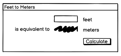
A sketch of our feet to meters conversion program.
So it looks like we have a short text entry widget that will let us type in the number of feet. A "Calculate" button will get the value out of that entry, perform the calculation, and put the result in a label below the entry. We've also got three static labels ("feet," "is equivalent to," and "meters"), which help our user figure out how to work the application.
The next thing we need to do is look at the layout. The widgets we've included seem to be naturally divided into a grid with three columns and three rows, as illustrated below:
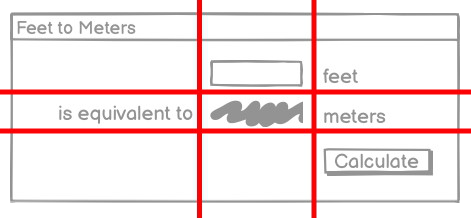
The layout of our user interface, which follows a 3 x 3 grid.
Code
Now here is the Python code needed to create this entire application using Tkinter.
from tkinter import *
from tkinter import ttk

def calculate(*args):
    try:
        value = float(feet.get())
        meters.set(round(0.3048 * value, 4))
    except ValueError:
        pass

root = Tk()
root.title("Feet to Meters")

mainframe = ttk.Frame(root, padding=(3, 3, 12, 12))
mainframe.grid(column=0, row=0, sticky=(N, W, E, S))

feet = StringVar()
feet_entry = ttk.Entry(mainframe, width=7, textvariable=feet)
feet_entry.grid(column=2, row=1, sticky=(W, E))

meters = StringVar()
ttk.Label(mainframe, textvariable=meters).grid(column=2, row=2, sticky=(W, E))

ttk.Button(mainframe, text="Calculate", command=calculate).grid(column=3, row=3, sticky=W)

ttk.Label(mainframe, text="feet").grid(column=3, row=1, sticky=W)
ttk.Label(mainframe, text="is equivalent to").grid(column=1, row=2, sticky=E)
ttk.Label(mainframe, text="meters").grid(column=3, row=2, sticky=W)

root.columnconfigure(0, weight=1)
root.rowconfigure(0, weight=1)
mainframe.columnconfigure(2, weight=1)
for child in mainframe.winfo_children():
    child.grid_configure(padx=5, pady=5)

feet_entry.focus()
root.bind("<Return>", calculate)

root.mainloop()
Now here is the Tcl/Tk code needed to create this entire application.
package require Tk

wm title . "Feet to Meters"
grid [ttk::frame .c -padding "3 3 12 12"] -column 0 -row 0 -sticky nwes
grid columnconfigure . 0 -weight 1; grid rowconfigure . 0 -weight 1

grid [ttk::entry .c.feet -width 7 -textvariable feet] -column 2 -row 1 -sticky we
grid [ttk::label .c.meters -textvariable meters] -column 2 -row 2 -sticky we
grid [ttk::button .c.calc -text "Calculate" -command calculate] -column 3 -row 3 -sticky w

grid [ttk::label .c.flbl -text "feet"] -column 3 -row 1 -sticky w
grid [ttk::label .c.islbl -text "is equivalent to"] -column 1 -row 2 -sticky e
grid [ttk::label .c.mlbl -text "meters"] -column 3 -row 2 -sticky w

grid columnconfigure . 0 -weight 1; grid rowconfigure . 0 -weight 1
grid columnconfigure .c 2 -weight 1
foreach w [winfo children .c] {grid configure $w -padx 5 -pady 5}
focus .c.feet
bind . <Return> {calculate}

proc calculate {} {
   if {[catch {
       set ::meters [expr {round($::feet*0.3048*10000.0)/10000.0}]
   }]!=0} {
       set ::meters ""
   }
}

vwait forever
Now here is the Ruby/Tk code needed to create this entire application.
require 'tk'
require 'tkextlib/tile'

root = TkRoot.new {title "Feet to Meters"}
content = Tk::Tile::Frame.new(root) {padding "3 3 12 12"}.grid( :sticky => 'nsew')

$feet = TkVariable.new; $meters = TkVariable.new
f = Tk::Tile::Entry.new(content) {width 7; textvariable $feet}.grid( :column => 2, :row => 1, :sticky => 'we' )
Tk::Tile::Label.new(content) {textvariable $meters}.grid( :column => 2, :row => 2, :sticky => 'we');
Tk::Tile::Button.new(content) {text 'Calculate'; command {calculate}}.grid( :column => 3, :row => 3, :sticky => 'w')

Tk::Tile::Label.new(content) {text 'feet'}.grid( :column => 3, :row => 1, :sticky => 'w')
Tk::Tile::Label.new(content) {text 'is equivalent to'}.grid( :column => 1, :row => 2, :sticky => 'e')
Tk::Tile::Label.new(content) {text 'meters'}.grid( :column => 3, :row => 2, :sticky => 'w')

TkGrid.columnconfigure root, 0, :weight => 1; TkGrid.rowconfigure root, 0, :weight => 1
TkGrid.columnconfigure content, 2, :weight => 1
TkWinfo.children(content).each {|w| TkGrid.configure w, :padx => 5, :pady => 5}
f.focus
root.bind("Return") {calculate}

def calculate
  begin
     $meters.value = (0.3048*$feet*10000.0).round()/10000.0
  rescue
     $meters.value = ''
  end
end

Tk.mainloop
Now here is the Perl/Tkx code needed to create this entire application.
use Tkx;

Tkx::wm_title(".", "Feet to Meters");
Tkx::ttk__frame(".c",  -padding => "3 3 12 12");
Tkx::grid( ".c", -column => 0, -row => 0, -sticky => "nwes");

Tkx::ttk__entry(".c.feet", -width => 7, -textvariable => \$feet);
Tkx::grid(".c.feet", -column => 2, -row => 1, -sticky => "we");
Tkx::ttk__label(".c.meters", -textvariable => \$meters);
Tkx::grid(".c.meters", -column => 2, -row => 2, -sticky => "we");
Tkx::ttk__button(".c.calc", -text => "Calculate", -command => sub {calculate();});
Tkx::grid(".c.calc", -column => 3, -row => 3, -sticky => "w");

Tkx::grid( Tkx::ttk__label(".c.flbl", -text => "feet"), -column => 3, -row => 1, -sticky => "w");
Tkx::grid( Tkx::ttk__label(".c.islbl", -text => "is equivalent to"), -column => 1, -row => 2, -sticky => "e");
Tkx::grid( Tkx::ttk__label(".c.mlbl", -text => "meters"), -column => 3, -row => 2, -sticky => "w");

Tkx::grid_columnconfigure( ".", 0, -weight => 1);
Tkx::grid_rowconfigure(".", 0, -weight => 1);
Tkx::grid_columnconfigure(".c", 2, -weight => 1);
foreach (Tkx::SplitList(Tkx::winfo_children(".c"))) {
    Tkx::grid_configure($_, -padx => 5, -pady => 5);
}
Tkx::focus(".c.feet");
Tkx::bind(".", "<Return>", sub {calculate();});

sub calculate {
   $meters = int(0.3048*$feet*10000.0+.5)/10000.0 || '';
}

Tkx::MainLoop();
As we'll see in the next chapter, there's another, more object-oriented way to do exactly the same thing. Are we surprised?
And the resulting user interface:
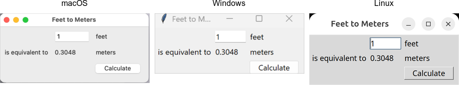
Screenshot of our completed feet to meters user interface.
A note on coding style
Each of the languages included in this tutorial has a variety of coding styles and conventions available to choose from, which help determine conventions for variable and function naming, procedural, functional or object-oriented styles, and so on.
Because the focus on this tutorial is Tk, this tutorial will keep things as simple as possible, generally using a very direct coding style, rather than wrapping up most of our code in procedures, modules, objects, classes and so on. As much as possible, you'll also see the same names for objects, variables, etc. used across the languages for each example.
Step-by-step walkthrough
Let's take a closer look at that code, piece by piece. For now, all we're trying to do is get a basic understanding of the types of things we need to do to create a user interface in Tk and roughly what those things look like. We'll go into details later.
Incorporating Tk
Our program starts by incorporating Tk.
from tkinter import *
from tkinter import ttk
These two lines tell Python that our program needs two modules. The first, tkinter, is the
standard binding to Tk. When imported, it loads the Tk library on your system.
The second, ttk, is a submodule of tkinter. It implements Python's binding to the
newer "themed widgets" that were added to Tk in 8.5.
Notice that we've imported everything (*) from the tkinter module. That way, we can call tkinter functions without
prefixing them with the module name. This is common Tkinter practice.
However, because we've imported just ttk
itself, we'll need to prefix anything inside that submodule. For example, calling Entry(...)
would refer to the Entry class inside the tkinter module (classic widgets). We'd need ttk.Entry(...) to use the Entry class inside ttk (themed widgets).
As you'll see, several classes with the same name are defined in both modules.
Sometimes you will need one or the other, depending on the context. Explicitly requiring the ttk prefix facilitates this and will be the style used
in this tutorial.
package require TkFirst thing we do is tell Tcl that our program needs Tk. Though not strictly necessary, it's considered good form to include this line. It can also be used to specify exactly what version of Tk is needed.
require 'tk'
require 'tkextlib/tile'
These two lines tell Ruby that our program needs two packages. The first, tk, is the
Ruby binding to Tk, which, when loaded, also causes the existing Tk library on your system to be loaded.
The second, tkextlib/tile, is Ruby Tk's binding to the newer "themed widgets" that were added to Tk
in 8.5.
The themed widget set evolved out of an earlier Tk add-on called Tile, hence the nomenclature. Despite that, the Tk::Tile::* calls you'll see in the programs are actually using the proper ttk versions in 8.5. Expect this to get better rationalized in the future.
use Tkx;The first thing that we need to do is tell Perl to load the "Tkx" module, which provides the Perl interface to Tk that we are using.
As mentioned here, there are other Perl bindings to Tk. However, we very strongly recommend using Tkx for development, and that will be the only binding we will be describing here. Tkx has the advantage of being a very thin layer above Tk's native Tcl API, which means that in almost all cases it automatically tracks the latest changes to Tk (something which became a considerable issue with Perl/Tk, which was extremely popular in earlier years, but has not been recently updated). As well, by avoiding introducing another layer of code, API errors are reduced, and we can also take advantage of available reference documentation for Tk (which is usually Tcl oriented).
If you set the global variable $Tkx::TRACE to any true value, Tkx will print to stderr
all calls into Tcl of the translated Tkx commands. This is very useful for debugging.
Setting up the main application window
Next, the following code sets up the main application window, giving it the title "Feet to Meters."
root = Tk()
root.title("Feet to Meters")
Yes, the calculate function appeared before this. We'll describe it below but need to include it
near the start because we reference it in other parts of the program.
wm title . "Feet to Meters"root = TkRoot.new {title "Feet to Meters"}Tkx::wm_title(".", "Feet to Meters");Creating a content frame
Next, we create a frame widget, which will hold the contents of our user interface.
When we create a widget, we need to specify its parent. That is the widget that the new widget will be placed inside.
In this case, our content frame's parent is the main application window.In Tcl and Perl, the widget name is used to specify the parent-child relationship, i.e. .c.feet is a child of .c. In Python and Ruby, the parent is passed as the first parameter when instantiating a widget object.
When creating widgets, we can optionally pass additional parameters to override the defaults of the widget's configuration options. Here, we're changing the padding inside the content frame widget (three pixels at the left and top, 12 pixels at the right and bottom).
mainframe = ttk.Frame(root, padding=(3, 3, 12, 12))ttk::frame .c -padding "3 3 12 12"content = Tk::Tile::Frame.new(root) {padding "3 3 12 12"}Tkx::ttk__frame(".c", -padding => "3 3 12 12");Inserting the frame into the user interface
After the frame is created, grid places it directly inside our main application window. We'll discuss its parameters shortly.
mainframe.grid(column=0, row=0, sticky=(N, W, E, S))grid .c -column 0 -row 0 -sticky nwescontent.grid(:sticky => 'nsew')Tkx::grid( ".c", -column => 0, -row => 0, -sticky => "nwes");Why do we put a frame inside the main window? Strictly speaking, we could just put the other widgets in our interface directly into the main application window without the intervening content frame. That's what you'll see in older Tk programs.
However, the main window isn't itself part of the newer "themed" widgets. Its background color may not match the themed widgets we will put inside it. Using a "themed" frame widget to hold the content ensures that the background is correct. This is illustrated below.

Placing a themed frame inside a window.
While the visual discrepancy is no longer as pronounced as indicated in the screenshot (taken with an older version of Tk on macOS), it's still good practice to use this inner frame rather than inserting widgets directly into the toplevel application window.
Creating the entry widget
The first functional widget we'll create is the entry. This is where the user can type in the number of feet to convert to meters.
feet = StringVar()
feet_entry = ttk.Entry(mainframe, width=7, textvariable=feet)
feet_entry.grid(column=2, row=1, sticky=(W, E))
grid [ttk::entry .c.feet -width 7 -textvariable feet] -column 2 -row 1 -sticky we$feet = TkVariable.new;
f = Tk::Tile::Entry.new(content) {width 7; textvariable $feet}.grid( :column => 2, :row => 1, :sticky => 'we' )Tkx::ttk__entry(".c.feet", -width => 7, -textvariable => \$feet);
Tkx::grid(".c.feet", -column => 2, -row => 1, -sticky => "we");We need to do two things: create the widget itself and then place it onscreen.
As before, when we create a widget, we need to specify its parent. In this case, we want our entry placed inside the content frame and not the main application window. Our entry, and other widgets we'll create shortly, are said to be children of the content frame.
When we create a widget, we may override the defaults for certain configuration options.
Here, we specify how wide we want the entry to appear, i.e., 7 characters.
We also assign it a mysterious textvariable; we'll see what that does shortly.
When widgets are created, they don't automatically appear on the screen; Tk doesn't know
where you want them placed relative to other widgets. That's what the grid part does.
Remember the 3x3 layout grid when we sketched out our application? Widgets are placed in the appropriate
column (1, 2, or 3) and row (also 1, 2, or 3).
Column numbers increase from left to right. Row numbers increase from top to bottom. You can choose arbitrary row or column numbers (0, 1, 2, ...) and they don't have to be contiguous. Here we chose to use row (and column) 1, 2, 3 but we could have equally used, e.g., 0, 10, 99.
The sticky option to grid describes how the widget should
line up within the grid cell, using compass directions. So w (west) means to anchor the widget
to the left side of the cell, we (west-east) means to attach it to both the left and right sides,
and so on.
N, S, W, E, as well as for common combinations: NW, SW, NE, SE, NS, EW, and NSEW, as well as center. You can also specify them as tuples, e.g., (W, E) or as lists, e.g., [W, E]. Your program can choose to use literal strings, constants, or lists and tuples of either, in any combination.
Creating the remaining widgets
We then do exactly the same thing for the remaining widgets. We have one label that will display the resulting number of meters that we calculate. We have a "Calculate" button that is pressed to perform the calculation. Finally, we have three static text labels to make it clear how to use the application. For each of these widgets, we first create it and then place it onscreen in the appropriate cell in the grid.
meters = StringVar()
ttk.Label(mainframe, textvariable=meters).grid(column=2, row=2, sticky=(W, E))
ttk.Button(mainframe, text="Calculate", command=calculate).grid(column=3, row=3, sticky=W)
ttk.Label(mainframe, text="feet").grid(column=3, row=1, sticky=W)
ttk.Label(mainframe, text="is equivalent to").grid(column=1, row=2, sticky=E)
ttk.Label(mainframe, text="meters").grid(column=3, row=2, sticky=W)grid [ttk::label .c.meters -textvariable meters] -column 2 -row 2 -sticky we
grid [ttk::button .c.calc -text "Calculate" -command calculate] -column 3 -row 3 -sticky w
grid [ttk::label .c.flbl -text "feet"] -column 3 -row 1 -sticky w
grid [ttk::label .c.islbl -text "is equivalent to"] -column 1 -row 2 -sticky e
grid [ttk::label .c.mlbl -text "meters"] -column 3 -row 2 -sticky w$meters = TkVariable.new
Tk::Tile::Label.new(content) {textvariable $meters}.grid( :column => 2, :row => 2, :sticky => 'we');
Tk::Tile::Button.new(content) {text 'Calculate'; command {calculate}}.grid( :column => 3, :row => 3, :sticky => 'w')
Tk::Tile::Label.new(content) {text 'feet'}.grid( :column => 3, :row => 1, :sticky => 'w')
Tk::Tile::Label.new(content) {text 'is equivalent to'}.grid( :column => 1, :row => 2, :sticky => 'e')
Tk::Tile::Label.new(content) {text 'meters'}.grid( :column => 3, :row => 2, :sticky => 'w')Tkx::ttk__label(".c.meters", -textvariable => \$meters);
Tkx::grid(".c.meters", -column => 2, -row => 2, -sticky => "we");
Tkx::ttk__button(".c.calc", -text => "Calculate", -command => sub {calculate();});
Tkx::grid(".c.calc", -column => 3, -row => 3, -sticky => "w");
Tkx::grid( Tkx::ttk__label(".c.flbl", -text => "feet"), -column => 3, -row => 1, -sticky => "w");
Tkx::grid( Tkx::ttk__label(".c.islbl", -text => "is equivalent to"), -column => 1, -row => 2, -sticky => "e");
Tkx::grid( Tkx::ttk__label(".c.mlbl", -text => "meters"), -column => 3, -row => 2, -sticky => "w");Adding some polish
We then put a few finishing touches on our user interface.
root.columnconfigure(0, weight=1)
root.rowconfigure(0, weight=1)
mainframe.columnconfigure(2, weight=1)
for child in mainframe.winfo_children():
child.grid_configure(padx=5, pady=5)
feet_entry.focus()
root.bind("<Return>", calculate)grid columnconfigure . 0 -weight 1; grid rowconfigure . 0 -weight 1
grid columnconfigure .c -weight 1
foreach w [winfo children .c] {grid configure $w -padx 5 -pady 5}
focus .c.feet
bind . <Return> {calculate}TkGrid.columnconfigure root, 0, :weight => 1; TkGrid.rowconfigure root, 0, :weight => 1
TkGrid.columnconfigure content, 2, :weight => 1
TkWinfo.children(content).each {|w| TkGrid.configure w, :padx => 5, :pady => 5}
f.focus
root.bind("Return") {calculate}Tkx::grid_columnconfigure( ".", 0, -weight => 1);
Tkx::grid_rowconfigure(".", 0, -weight => 1);
Tkx::grid_columnconfigure(".c", 2, -weight => 1);
foreach (Tkx::SplitList(Tkx::winfo_children(".c"))) { Tkx::grid_configure($_, -padx => 5, -pady => 5); }
Tkx::focus(".c.feet");
Tkx::bind(".", "<Return>", sub {calculate();});The columnconfigure/rowconfigure bits tell Tk that the content frame should expand to fill any extra space
if the window is resized and that the column in the content frame containing the entry should expand horizontally to fill any extra space.
The next part walks through all of the widgets contained within our content frame
and adds a little bit of padding around each so they aren't so scrunched together.
(We could have added these options to each grid call when we first put the widgets
onscreen, but this is a nice shortcut.)
The third part tells Tk to put the focus on our entry widget. That way, the cursor will start in that field, so users don't have to click on it before starting to type.
The final line tells Tk that if a user presses the Return key (Enter on Windows), it should call our calculate routine, the same as if they pressed the Calculate button.
Performing the calculation
Speaking of which, here we define our calculate procedure. It's called when a user presses the Calculate button or hits the Return key. It performs the feet to meters calculation.
def calculate(*args):
try:
value = float(feet.get())
meters.set(round(0.3048 * value, 4))
except ValueError:
passproc calculate {} {
if {[catch {
set ::meters [expr {round($::feet*0.3048*10000.0)/10000.0}]
}]!=0} {
set ::meters ""
}
}def calculate
begin
$meters.value = (0.3048*$feet*10000.0).round()/10000.0
rescue
$meters.value = ''
end
endsub calculate {
$meters = int(0.3048*$feet*10000.0+.5)/10000.0 || '';
}As you can clearly see, this routine takes the number of feet from our entry widget, does the calculation, and places the result in our label widget.
Say what? It doesn't look like we're doing anything with those widgets! Here's where
the magic textvariable options we specified when creating the widgets come into play.
We specified the global variable feet as the textvariable for the entry.
Whenever the entry changes, Tk will automatically update the global variable feet.
Similarly, if we explicitly change the value of a textvariable associated with a widget
(as we're doing for meters which is attached to our label), the widget will automatically
be updated with the current contents of the variable. Slick.
For Python, the
only caveat is that these variables must be an instance of the StringVar class.
They can't be a regular Python variable.
The multiplying and dividing by 10000.0 in the Tcl, Ruby, and Perl code is to avoid the rounding problems inherent in floating-point math.
A simple calculation, e.g., 0.3048*1.5, could result in a number like
0.45720000000000005, which would neither be correct or visually appealing when displayed.
There are other ways to do this, of course, such as the optional precision parameter of the round function we used in the Python code.
Start the event loop
Finally, we need to tell Tk to enter its event loop, which is necessary for everything to appear onscreen and allow users to interact with it.
The event loop will run for the duration of our application. It handles making sure all our widgets appear, respond to changes, and allows the user to interact with them. No matter how many widgets you create and grid, nothing will show u on the screen until the event loop starts. When you're typing commands interactively into an interpreter, there's some trickery going on behind the scenes so that an event loop starts running immediately.
root.mainloop()vwait foreverWe actually don't need to explicitly provide this (most of the time), as wish will automatically enter the event loop
after it's read your script.
Tk.mainloopTkx::MainLoop();What's missing?
We've now seen how to create widgets, put them onscreen, and respond to users interacting with them. It's certainly not fancy, could probably do with some error checking, but it's a fully functional GUI application.
It's also worth examining what we didn't have to include in our Tk program to make it work. For example:
- we didn't have to worry about redrawing the screen as things changed
- we didn't have to worry about parsing and dispatching events, hit detection, or handling events on each widget
- we didn't have to provide a lot of options when we created widgets; the defaults seemed to take care of most things, and so we only had to change things like the text the button displayed
- we didn't have to write complex code to get and set the values of simple widgets; we just attached them to variables
- we didn't have to worry about what happens when users close the window or resizes it
- we didn't need to write extra code to get this all to work cross-platform
One more thing...
As this tutorial emphasizes Tkinter, our examples use standalone script code, global variables, and simple functions. In practice, you'll likely organize anything beyond the simplest scripts in functions or classes. There are different ways to do this: using modules, creating classes for different parts of the user interface, inheriting from Tkinter classes, etc.
Often though, you just want to do something simple to encapsulate your data rather than putting everything into the global variable space. Here is the
feet to meters example, rewritten to encapsulate the main code into a class. Note the use of self on callbacks (which execute at the global scope)
and StringVar's.
from tkinter import *
from tkinter import ttk
class FeetToMeters:
def __init__(self, root):
root.title("Feet to Meters")
mainframe = ttk.Frame(root, padding=(3, 3, 12, 12))
mainframe.grid(column=0, row=0, sticky=(N, W, E, S))
self.feet = StringVar()
feet_entry = ttk.Entry(mainframe, width=7, textvariable=self.feet)
feet_entry.grid(column=2, row=1, sticky=(W, E))
self.meters = StringVar()
ttk.Label(mainframe, textvariable=self.meters).grid(column=2, row=2, sticky=(W, E))
ttk.Button(mainframe, text="Calculate", command=self.calculate).grid(column=3, row=3, sticky=W)
ttk.Label(mainframe, text="feet").grid(column=3, row=1, sticky=W)
ttk.Label(mainframe, text="is equivalent to").grid(column=1, row=2, sticky=E)
ttk.Label(mainframe, text="meters").grid(column=3, row=2, sticky=W)
root.columnconfigure(0, weight=1)
root.rowconfigure(0, weight=1)
mainframe.columnconfigure(2, weight=1)
for child in mainframe.winfo_children():
child.grid_configure(padx=5, pady=5)
feet_entry.focus()
root.bind("<Return>", self.calculate)
def calculate(self, *args):
try:
value = float(self.feet.get())
self.meters.set(round(0.3048 * value, 4))
except ValueError:
pass
root = Tk()
FeetToMeters(root)
root.mainloop()Tk Concepts
With your first example behind you, you now have a basic idea of what a Tk program looks like and the type of code you need to write to make it work. This chapter will step back and look at three broad concepts required to understand Tk: widgets, geometry management, and event handling.
Widgets
Widgets are all the things that you see onscreen. Our example had a button, an entry, a few labels, and a frame. Checkboxes, tree views, scrollbars, and text areas are examples of other widgets. Widgets are often referred to as "controls." You'll also sometimes see them referred to as "windows," particularly in Tk's documentation. This is a holdover from its X11 roots (under that terminology, both your toplevel application window and a button would be called windows).
Here are just a few of Tk's widgets, which we'll cover individually shortly.

Several Tk Widgets.
Widget classes
In Tk, individual widgets are objects, instances of classes that represent buttons, frames, and so on. To create a widget, you first need to identify the specific class of the widget you'd like to instantiate. We'll explore these in the coming chapters.
Widget hierarchy
Besides the widget class, you need one other piece of information before you can create a widget: its parent. Widgets don't float off in space. Instead, they're contained within something else, like a window. In Tk, all widgets are part of a widget (or window) hierarchy, with a single root at the top of the hierarchy.
In our metric conversion example, we created a single frame as a child of the root window, and that frame contained all the other widgets as children. The root window was a container for the frame and was, therefore, the frame's parent. The complete hierarchy for the example looked like this:
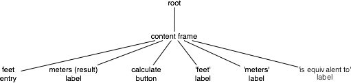
The widget hierarchy of the metric conversion example.
Widget hierarchies can be arbitrarily deep. For example, you might have a button in a frame in another frame within the root window. Even a new window in your application (a special widget called a toplevel) is part of that same hierarchy. That window and all its contents form a subtree of the overall widget hierarchy.

Hierarchy of a more substantial application. Leaf nodes (buttons, labels, etc.) omitted.
Creating widgets
Each separate widget is a Python object. When instantiating a widget, you pass its parent as the first
parameter to the widget class. The only exception is the "root" window.
That toplevel window is automatically created when you instantiate Tk.
It does not have a parent. For example:
root = Tk()
content = ttk.Frame(root)
button = ttk.Button(content)Whether or not you save the widget object in a variable is entirely up to you, depending on whether you'll need to refer to it later. Because the widget object is inserted into the widget hierarchy, it won't be garbage collected even if you don't keep your own reference to it.
Tkinter is a wrapper around the Tcl language interface to Tk. When you create a widget object in Tkinter, you're running a small bit of Tcl code. Sometimes when you're trying to figure out exactly how to make Tkinter do what you want, you may need to look at Tk's reference documentation, which is Tcl-based.
In Tcl, rather than widget objects, every widget is uniquely identified with a hierarchical path name.
For example, '.' (a single dot) is the path name of the root window, '.content' is a widget that is a child of the root window,
'.content.feet' might be an entry widget within that, and so on.
You'll see this pathname referred to in Tk reference documentation. Tkinter chooses and
manages all these pathnames for you behind the scenes, so you should never have to worry about
them. If you do, you can get the pathname from a widget by calling str(widget).
In Tcl, each widget is given an explicit pathname, which both differentiates it from other
widgets, and also indicates its place in the window hierarchy. The root of the hierarchy, the
toplevel widget that Tk automatically creates, is named simply . (dot).
The frame, which was a child of the root, was named .c. We could have put pretty much anything in
place of the "c", naming it for example .content. This name is purely for use by your program,
so it's best to choose something meaningful. The controls that were children of the frame were given
names like .c.feet, .c.meters, .c.flbl, and so on. If there were any widgets at a deeper
level of the hierarchy, we'd add another . and then a unique identifier.
So to create a widget, we need to provide the widget class, and the pathname. The pathname is used to indicate the widget's parent (which must of course exist also), and hence its position in the window hierarchy. For example:
ttk::button .b
ttk::frame .f
ttk::entry .f.entryThis also creates a new object command with the same name as the widget's pathname, which will
let us communicate with the widget. So the above code would produce new Tcl commands named .b,
.f, .f.entry, and so on. You can then use that object command to communicate
further with the widget, calling e.g. .b invoke, or .f.entry state disabled.
Because of the obvious parallels with many object-oriented systems, we'll often refer to the object
commands as objects, and calls on those objects (like the invoke) as method calls.
For example, we'll see below the use of the configure and cget methods.
Speaking of which, Tcl uses a more shell-like syntax than the other languages covered in this tutorial,
with spaces separating parameters rather than commas or other delimeters.
Some procedure or method names that are written as multiple words in Tcl (e.g., selection clear)
are implemented as a single identifier in most other Tk language bindings (e.g. selection_clear).
We'll generally use the latter notation when referring to these methods in the text, while language-specific
notation is used in accompanying code snippets.
Each separate widget is a Ruby object. When creating a widget, you must pass its parent as a
parameter to the widget class' new method. The only exception is the "root" window,
which is the toplevel window that will contain everything else. That is instantiated from
the TkRoot class, and it does not have a parent. For example:
root = TkRoot.new
content = Tk::Tile::Frame.new(root)
Tk::Tile::Button.new(content)Whether or not you save the widget object in a variable is entirely up to you, and depends of course whether you'll need to refer to it later. Because the object is inserted into the widget hierarchy, it won't be garbage collected even if you don't keep your own reference to it.
If you sneak a peek at how Tcl manages widgets, you'll see each widget has a specific pathname;
you'll also see this pathname referred to in Tk reference documentation. Ruby/Tk chooses and
manages all these pathnames for you behind the scenes, so you should never have to worry about
them. If you do though, you can get the pathname from a widget with its path method.
In Perl, each widget is given an explicit pathname, which both differentiates it from other
widgets, and also indicates its place in the window hierarchy. The root of the hierarchy, the
toplevel widget that Tk automatically creates, is named simply . (dot).
The frame, which was a child of the root, was named .c. We could have put pretty much anything in
place of the "c", naming it for example .content. This name is purely for use by your program,
so it's best to choose something meaningful. The controls that were children of the frame were given
names like .c.feet, .c.meters, .c.flbl, and so on. If there were any widgets at a deeper
level of the hierarchy, we'd add another . and then a unique identifier.
So to create a widget, we need to provide the widget class, and the pathname. The pathname is used to indicate the widget's parent (which must of course exist also), and hence its position in the window hierarchy. For example:
Tkx::ttk__button(".b", -text => "hello");
Tkx::ttk__frame(".f");
Tkx::ttk__entry(".f.entry");Widget Objects
Many widgets have operations that you can call on them, such as to disable a widget, invoke a button's
command, and so on. If we were doing this in Tcl, we'd write something like .b invoke or
.f.entry state disabled. Essentially you'd think of ".b" or ".f.entry" as objects, and
"invoke" and "state" as methods, the latter having a single parameter "disabled". In Perl, you can
call the exact Tcl command like this:
Tkx::i::call(".b", "invoke");
Tkx::i::call(".f.entry", "state", "disabled");Admittedly, that's pretty lame. Ideally, we'd want to have these widgets behave just like Perl objects. Luckily, Tkx lets us do exactly that.
The first thing we need to do is get a reference to an object for these widgets. We can do that
like this, passing the widget pathname to Tkx::widget->new:
my $b = Tkx::widget->new(".b");
my $e = Tkx::widget->new(".f.entry");Then we can invoke methods on these objects just how you'd expect:
$b->invoke;
$e->state("disabled");Creating each widget and then getting a reference to it as a separate step is a bit much. So there's another way to create widgets. If you have an object reference to the parent widget in the widget hierarchy, you can ask it to create a child.
my $mw = Tkx::widget->new(".");
my $b = $mw->new_ttk__button(-text => "hello");
my $f = $mw->new_ttk__frame;
my $e = $f->new_ttk__entry;In this case, Tkx will choose the widget pathname for you (it'll look something like ".b", ".f.e", ".f.e2", etc.).
You can get this path by calling the object's "_mpath" method (e.g. $b->_mpath). If you stringify the
object itself (e.g. trying to print it out), it will also be the widget pathname.
You also saw in our earlier example that some Tkx commands (like "grid") take the widget pathname as their first argument. There's a way to do that using the widget object instead. We invoke a method which is the name of the command, prefixed by "g_", e.g. "g_grid". So this:
Tkx::ttk__entry(".c.feet", -width => 7, -textvariable => \$feet);
Tkx::grid(".c.feet", -column => 2, -row => 1, -sticky => "we");becomes this:
my $mw = Tkx::widget->new(".");
my $ft = $mw->new_ttk__entry(-width => 7, -textvariable => \$feet);
$ft->g_grid(-column => 2, -row => 1, -sticky => "we");Translation Rules
What's somewhat scary about the Tkx module is that it implements all of this on a purely syntactic level. That is, it has no clue about buttons and entries and grid. It just knows that if it sees a method "new_something" it's creating a widget using the Tcl command "something", or if you call a method "g_otherthing", that it's going to invoke a Tcl command "otherthing", and pass the widget pathname associated with the object as a first parameter (followed by any other parameters passed to the method).
It's this pure syntactic mapping which gives Tkx its power and amazing brevity (check out the code in Tkx.pm!). It also explains why it can automatically track any changes in Tk. Any new commands and options don't need to be explicitly implemented in Tkx code; they are automatically available just by using the right syntax.
Now let's talk about those underscores in the Tkx commands and method names. If you've glanced at the Tcl version of the code in this tutorial, you know that they can take several forms, i.e.
- a single toplevel command, like
grid - a multi-word command (called an ensemble in Tcl), e.g.
wm title - a command in a namespace, e.g.
ttk::button - a single toplevel command with underscores, e.g.
tk_messageBox
No translations are needed for simple commands like "grid", but the others need to be tweaked. To translate these into Perl, Tkx uses underscores in the following way:
- a single underscore is replaced with a space, e.g.
wm_titlein Perl becomeswm titlein Tcl - two underscores is replaced with the namespace qualifier "::", e.g.
ttk__buttonbecomesttk::button - three underscores is replaced with a single underscore, e.g.
tk___messageBoxbecomestk_messageBox
Given that this purely syntactic translation is all that Tkx does, let's state the obvious: whether or not you use the pure command form, which we used in the "feet to meters" example, or the object oriented form, they both do exactly the same thing (i.e. invoke the same underlying Tcl command).
Because you can get an object's widget pathname, or get an object reference from a widget pathname, you can also freely intermix them. Most programs of any length will probably be a bit simpler if they predominately use the object oriented form, but this is almost entirely a stylistic issue.
Feet to Meters, Object Style
Here's the earlier "feet to meters" example, this time rewritten in the object oriented style. The programs do exactly the same thing.
use Tkx;
my $mw = Tkx::widget->new(".");
$mw->g_wm_title("Feet to Meters");
my $frm = $mw->new_ttk__frame(-padding => "3 3 12 12");
$frm->g_grid(-column => 0, -row => 0, -sticky => "nwes");
$mw->g_grid_columnconfigure(0, -weight => 1);
$mw->g_grid_rowconfigure(0, -weight => 1);
my $ef = $frm->new_ttk__entry(-width => 7, -textvariable => \$feet);
$ef->g_grid(-column => 2, -row => 1, -sticky => "we");
my $em = $frm->new_ttk__label(-textvariable => \$meters);
$em->g_grid(-column => 2, -row => 2, -sticky => "we");
my $cb = $frm->new_ttk__button(-text => "Calculate", -command => sub {calculate();});
$cb->g_grid(-column => 3, -row => 3, -sticky => "w");
$frm->new_ttk__label(-text => "feet")->g_grid(-column => 3, -row => 1, -sticky => "w");
$frm->new_ttk__label(-text => "is equivalent to")->g_grid(-column => 1, -row => 2, -sticky => "e");
$frm->new_ttk__label(-text => "meters")->g_grid(-column => 3, -row => 2, -sticky => "w");
foreach (Tkx::SplitList($frm->g_winfo_children)) {
Tkx::grid_configure($_, -padx => 5, -pady => 5);
}
$ef->g_focus;
$mw->g_bind("<Return>", sub {calculate();});
sub calculate {
   $meters = int(0.3048*$feet*10000.0+.5)/10000.0 || '';
}
Tkx::MainLoop();Configuration options
All widgets have multiple configuration options that control how the widget is displayed or how it behaves.
The available options for a widget depend upon the widget class, of course. There is a lot of consistency
between different widget classes, so options that do similar things tend to be named the same.
For example, both a button and a label have a text option to adjust the text displayed by the widget, while a
scrollbar would not have a text option since it's not needed.
A button has a command option telling it what to do when pushed, while a label, which holds just
static text, does not.
While widgets may have many configuration options, they have sensible defaults. In practice, each widget has only a few configuration options that are commonly used. As we describe different widgets, we'll focus on those. While reference documentation will describe all the options, it can be difficult to find the few you actually need.
Configuration options can be set when the widget is first created by specifying their names and values as optional parameters. Later, you can retrieve the current values of those options, and with a tiny number of exceptions, change them at any time.
If you're unsure what configuration options a widget supports, you can ask the widget to describe them. This gives you a long list of all its options.
This is all best illustrated with the following interactive dialog with the interpreter.
% python
>>> from tkinter import *
>>> from tkinter import ttk
>>> root = Tk()

# create a button, passing two options:
>>> button = ttk.Button(root, text="Hello", command="buttonpressed")
>>> button.grid()

#check the current value of the text option:
>>> button['text']
'Hello'

# change the value of the text option:
>>> button['text'] = 'goodbye'

# another way to do the same thing:
>>> button.configure(text='goodbye')

# check the current value of the text option:
>>> button['text']
'goodbye'

# get all information about the text option:
>>> button.configure('text')
('text', 'text', 'Text', '', 'goodbye')

# get information on all options for this widget:
>>> button.configure()
{'cursor': ('cursor', 'cursor', 'Cursor', '', ''), 'style': ('style', 'style', 'Style', '', ''),
'default': ('default', 'default', 'Default', <index object at 0x00DFFD10>, <index object at 0x00DFFD10>),
'text': ('text', 'text', 'Text', '', 'goodbye'), 'image': ('image', 'image', 'Image', '', ''),
'class': ('class', '', '', '', ''), 'padding': ('padding', 'padding', 'Pad', '', ''),
'width': ('width', 'width', 'Width', '', ''),
'state': ('state', 'state', 'State', <index object at 0x0167FA20>, <index object at 0x0167FA20>),
'command': ('command', 'command' , 'Command', '', 'buttonpressed'),
'textvariable': ('textvariable', 'textVariable', 'Variable', '', ''),
'compound': ('compound', 'compound', 'Compound', <index object at 0x0167FA08>, <index object at 0x0167FA08>),
'underline': ('underline', 'underline', 'Underline', -1, -1),
'takefocus': ('takefocus', 'takeFocus', 'TakeFocus', '', 'ttk::takefocus')}
% wish8.5
create a button, passing two options:
% grid [ttk::button .b -text "Hello" -command {button_pressed}]
check the current value of the text option:
% .b cget -text
Hello
check the current value of the command option:
% .b cget -command
button_pressed
change the value of the text option:
% .b configure -text Goodbye
check the current value of the text option:
% .b cget -text
Goodbye
get all information about the text option:
% .b configure -text
-text text Text {} Goodbye
get information on all options for this widget:
% .b configure
{-takefocus takeFocus TakeFocus ttk::takefocus ttk::takefocus}
{-command command Command {} button_pressed} {-default default Default normal normal}
{-text text Text {} Goodbye} {-textvariable textVariable Variable {} {}}
{-underline underline Underline -1 -1} {-width width Width {} {}} {-image image Image {} {}}
{-compound compound Compound none none} {-padding padding Pad {} {}}
{-state state State normal normal} {-takefocus takeFocus TakeFocus {} ttk::takefocus}
{-cursor cursor Cursor {} {}} {-style style Style {} {}} {-class {} {} {} {}}
% irb
irb(main):001:0> require 'tk'
=> true
irb(main):002:0> require 'tkextlib/tile'
=> true
create a button, passing two options:
irb(main):003:0> root = TkRoot.new
=> #<TkRoot:0xb7c8c9d8 @path=".">
irb(main):004:0> button = Tk::Tile::Button.new(root) {text "Hello"; command "button_pressed"}.grid
=> #<Tk::Tile::TButton:0xb7c86ab0 @cmdtbl=["c00001"], @path=".w00000">
check the current value of the text option:
irb(main):005:0> button['text']
=> "Hello"
check the current value of the command option:
irb(main):006:0> button['command']
=> #<cb_entry:fdbe42342>
change the value of the text option:
irb(main):007:0> button['text'] = 'goodbye'
=> "goodbye"
check the current value of the text option:
irb(main):008:0> button['text']
=> "goodbye"
get all information about the text option:
irb(main):009:0> button.configinfo 'text'
=> ["text", "text", "Text", "", "goodbye"]
get information on all options for this widget:
irb(main):010:0> button.configinfo
=> [["takefocus", "takeFocus", "TakeFocus", true, true], ["command", "command", "Command", "", #<cb_entry:fdbe42342>],
["default", "default", "Default", "normal", "normal"], ["text", "text", "Text", "", "goodbye"],
 ["textvariable", "textVariable", "Variable", nil, nil],
["underline", "underline", "Underline", -1, -1], ["width", "width", "Width", "", ""],
["image", "image", "Image", "", ""], ["compound", "compound", "Compound", "none", "none"],
["padding", "padding", "Pad", "", ""], ["state", "state", "State", "normal", "normal"],
["takefocus", "takeFocus", "TakeFocus", nil, true], ["cursor", "cursor", "Cursor", "", ""],
["style", "style", "Style", [], []], ["class", "", "", "", ""]]
run Perl interactively using the program "psh":
% psh
Perl> use Tkx
Perl> $mw = Tkx::widget->new(".")
.
create a button, passing two options:
Perl> ($b = $mw->new_ttk__button(-text => "Hello", -command => sub {button_pressed();}))->g_grid
.b
check the current value of the text option:
  (note that "m_<foo>" is another one of those magic Tkx translations
   like "g_<foo>"; in this case it means call the <foo> method on the object)
Perl> $b->m_cget(-text)
Hello
conveniently, the "m_" part is almost always optional:
Perl> $b->cget(-text)
Hello
check the current value of the command option:
Perl> $b->cget(-command)
::perl::CODE(0x839020)
change the value of the text option:
Perl> $b->configure(-text => "Goodbye")

check the current value of the text option:
Perl> $b->cget(-text)
Goodbye
get all information about the text option:
Perl> $b->configure(-text)
-text text Text {} Goodbye
convert the Tcl list this returns into a Perl list:
Perl> Tkx::SplitList($b->configure(-text))
-text, text, Text, , Goodbye
get information on all options for this widget:
Perl> $b->configure
{-takefocus takeFocus TakeFocus ttk::takefocus ttk::takefocus}
{-command command Command {} ::perl::CODE(0x839020)} {-default default Default normal normal}
{-text text Text {} Goodbye} {-textvariable textVariable Variable {} {}}
{-underline underline Underline -1 -1} {-width width Width {} {}} {-image image Image {} {}}
{-compound compound Compound none none} {-padding padding Pad {} {}}
{-state state State normal normal} {-takefocus takeFocus TakeFocus {} ttk::takefocus}
{-cursor cursor Cursor {} {}} {-style style Style {} {}} {-class {} {} {} {}}
As you can see, for each option, Tk will show you the name of the option and its current value (along with three other attributes which you can usually ignore).
Ok, if you really want to know, here are the details on the five pieces of data provided for each configuration option. The most useful are the first, the option's name, and the fifth, which is the option's current value. The fourth is the default value of the option, or in other words, the value it would have if you didn't change it. The other two relate to something called the option database. We'll briefly touch on it when we discuss menus, but it's not used in modern applications. The second item is the option's name in the database, and the third is its class.
Styles and themes
Tk's "classic" widgets each have a very large number of configuration options, providing for very precise control over numerous details of each individual widget's appearance. The need to customize each individual widget often resulted in a great deal of repetitive code and inconsistencies.
Tk's "themed" widgets move most of these details into theme and style objects, separate from the widget itself. This makes it far easier to create consistent user interfaces while using much less code to do it.
Styles and themes are covered in detail towards the end of the book. It explains the benefits.
So why use styles and themes in Tk? They take the fine-grained details of appearance decisions away from individual instances of widgets.
That makes for cleaner code and less repetition. If you have 20 entry widgets in your application, you don't need to repeat the exact appearance details every time you create one (or write a wrapper function). Instead, you assign them a style.
Themes collect a series of styles, putting all appearance decisions in one place. And because styles for a button and styles for other widgets can share common elements, collecting them in themes promotes consistency and improves reuse.
Changing themes allows for radical customization of your application's appearance. For most mainstream desktop applications, it's unlikely you will need to do so. However, you'll see in the next chapter how individual styles can be applied to widgets in lieu of making fine-grained changes to individual widgets.
These very different approaches to customization between classic and themed widgets are the main reason both sets of widgets exist today. It would not have been feasible to add support for themes while still maintaining backward compatibility.
Widget introspection
Tk exposes a treasure trove of information about each and every widget that your application can take advantage of.
Much of it is available via the winfo facility; see the winfo command reference
for full details.
This short example traverses the widget hierarchy, using each widget's winfo_children method to identify child widgets
that need to be examined. For each widget, we print some basic information, including its class (button, frame, etc.), width, height,
and position relative to its parent.
def print_hierarchy(w, depth=0):
    print('  '*depth + w.winfo_class() + ' w=' + str(w.winfo_width()) + ' h=' + str(w.winfo_height()) + ' x=' + str(w.winfo_x()) + ' y=' + str(w.winfo_y()))
    for i in w.winfo_children():
        print_hierarchy(i, depth+1)

print_hierarchy(root)
proc print_hierarchy {w {depth 0}} {
puts "[string repeat " " $depth][winfo class $w] w=[winfo width $w] h=[winfo height $w] x=[winfo x $w] y=[winfo y $w]"
foreach i [winfo children $w] {
print_hierarchy $i [expr {$depth+1}]
}
}
print_hierarchy .def print_hierarchy(w, depth=0)
print(" "*depth + w.winfo_class() + ' w=' + w.winfo_width().to_s + ' h=' + w.winfo_height().to_s + ' x=' + w.winfo_x().to_s + ' y=' + w.winfo_y().to_s + "\n")
w.winfo_children().each do |i|
print_hierarchy(i, depth+1)
end
end
print_hierarchy rootsub print_hierarchy {
my ($w, $depth) = @_;
$depth //= 0;
print(" "x$depth, $w->g_winfo_class(), " w=", $w->g_winfo_width(), " h=", $w->g_winfo_height(), " x=", $w->g_winfo_x(), " y=", $w->g_winfo_y(), "\n");
foreach (Tkx::SplitList($w->g_winfo_children())) {
print_hierarchy(Tkx::widget->new($_), $depth+1);
}
}
print_hierarchy($mw);The following are some of the most useful methods:
winfo_class:- a class identifying the type of widget, e.g.,
TButtonfor a themed button winfo_children:- a list of widgets that are the direct children of a widget in the hierarchy
winfo_parent:- parent of the widget in the hierarchy
winfo_toplevel:- the toplevel window containing this widget
winfo_width, winfo_height:- current width and height of the widget; not accurate until it appears onscreen
winfo_reqwidth, winfo_reqheight:- the width and height that the widget requests of the geometry manager (more on this shortly)
winfo_x, winfo_y:- the position of the top-left corner of the widget relative to its parent
winfo_rootx, winfo_rooty:- the position of the top-left corner of the widget relative to the entire screen
winfo_vieweable:- whether the widget is displayed or hidden (all its ancestors in the hierarchy must be viewable for it to be viewable)
Geometry management
As you've seen, widgets don't appear on the screen just by creating them. Placing widgets on the screen (and precisely where they are placed) is a separate step called geometry management.
In our feet to meters example, positioning each widget was accomplished by the grid command. We specified the column and row where we
wanted each widget placed], how things were aligned within the grid, etc. Grid is an example of a
geometry manager (of which there are several in Tk, grid being the most useful).
For now, we'll look at geometry management in general; we'll talk about grid in a later chapter.
A geometry manager's job is to figure out exactly where those widgets are going to be put. This turns out to be a complex
optimization problem, and a good geometry manager relies on quite sophisticated algorithms. A good geometry
manager provides the flexibility, power, and ease of use that makes programmers happy. It also makes it easy to create appealing user interface layouts without needing to jump through hoops. Tk's grid is, without
a doubt, one of the absolute best.
We'll go into more detail in a later chapter, but grid was introduced several years after Tk became popular.
Before that, an older geometry manager named pack was most commonly used. It's equally powerful but much harder to use,
making it onerous to create layouts that look appealing today. Unfortunately, much of the example Tk code and documentation out
there uses pack instead of grid (a good clue to how current it is). The widespread use of pack is a leading reason that so many Tk user interfaces look terrible. Start new code with grid, and upgrade old code when you can.
The problem
The problem for a geometry manager is to take all the different widgets the program creates, plus the program's instructions for where in the window each should go (explicitly, or more often, relative to other widgets), and then actually position them in the window.
In doing so, the geometry manager has to balance multiple constraints. Consider these situations:
- The widgets may have a natural size, e.g., the natural width of a label would depend on the text it displays and the font used to display it. What if the application window containing all these different widgets isn't big enough to accommodate them? The geometry manager must decide which widgets to shrink to fit, by how much, etc.
- If the application window is bigger than the natural size of all the widgets, how is the extra space used? Is extra space placed between each widget, and if so, how is that space distributed? Is it used to make certain widgets larger than they usually are, such as a text entry growing to fill a wider window? Which widgets should grow?
- If the application window is resized, how does the size and position of each widget inside it change? Will certain areas (e.g., a text entry area) expand or shrink while other parts stay the same size, or is the area distributed differently? Do certain widgets have a minimum size that you want to avoid going below? A maximum size? Does the window itself have a minimum or maximum size?
- How can widgets in different parts of the user interface be aligned with each other? How much space should be left between them? This is needed to present a clean layout and comply with platform-specific user interface guidelines.
- For a complex user interface, which may have many frames nested in other frames nested in the window (etc.), how can all the above be accomplished, trading off the conflicting demands of different parts of the entire user interface?
How it works
Geometry management in Tk relies on the concept of master and slave widgets. A master is a widget, typically a toplevel application window or a frame. It contains other widgets, called slaves. You can think of a geometry manager taking control of the master widget and deciding how all the slave widgets will be displayed within.
The computing community has embraced the more general societal trend towards more diversity, sensitivity, and awareness about the impacts of language. As a result, the Tk core will slowly adopt a more inclusive set of terminology. For example, where it makes sense, "parent" and "child" will be preferred over "master" and "slave." The current terminology will not disappear to preserve backward compatibility. This is something to be aware of for the future. For more details, see TIP #581.
Your program tells the geometry manager what slaves to manage within the master, i.e., via calling grid. Your program also
provides hints as to how it would like each slave to be displayed, e.g., via the column and row options.
You can also provide other information to the geometry manager. For example, we used columnconfigure and rowconfigure to indicate
the columns and rows we'd like to expand if extra space is available in the window. Note that all these
parameters and hints are specific to grid; other geometry managers would use different ones.
The geometry manager collects information about the slaves in the master and the total size of the master.
It asks each slave widget for its natural size, i.e., how large it would ideally be displayed. The geometry manager's internal algorithm calculates the rectangular area each slave will be allocated (if any!). The slave is then
responsible for rendering itself within that particular rectangle. And of course, we repeat the whole process whenever the size of the master changes
(e.g., because the toplevel window was resized), the natural size of a slave changes (e.g., because we've changed the
text in a label), or any geometry manager parameters change (e.g., like row, column, or sticky).
This all works recursively as well. In our example, we had a content frame inside the toplevel application window and then several other widgets inside the content frame. We, therefore, had to manage the geometry for two different masters. At the outer level, the toplevel window was the master, and the content frame was its slave. At the inner level, the content frame was the master, with each of the other widgets being slaves. Notice that the same widget, e.g., the content frame, can be both a master and a slave! As we saw previously, this widget hierarchy can be nested much more deeply.
While each master can be managed by only one geometry manager (e.g., grid), different masters can have
different geometry managers. While grid is the right choice most of the time, others may make sense for a particular layout used in one
part of your user interface. Other Tk geometry managers include pack, which we've mentioned, and place, which leaves all layout decisions entirely up to you. Some complex widgets like canvas and text let you embed other widgets, making them de facto geometry managers.
Finally, we've been assuming that slave widgets are the immediate children of their master in the widget hierarchy. While this is usually the case, and mostly there's no good reason to do it any other way, it's also possible (with some restrictions) to get around this.
Event handling
As with most user interface toolkits, Tk runs an event loop that receives events from the operating system. These are things like button presses, keystrokes, mouse movement, window resizing, and so on.
Generally, Tk takes care of managing this event loop for you. It will figure out what widget the event applies to (did a user click on this button? if a key was pressed, which textbox had the focus?), and dispatch the event accordingly. Individual widgets know how to respond to events; for example, a button might change color when the mouse moves over it and revert back when the mouse leaves.
It's critical in event-driven applications that the event loop not be blocked. The event loop runs continuously, normally executing dozens of steps per second. At every step, it processes an event. If your program is performing a long operation, it can potentially block the event loop. In that case, no events would be processed, no drawing would be done, and it would appear as if your application is frozen. There are many ways to prevent this from happening. We'll discuss this in more detail in a later chapter.
Command callbacks
You often want your program to handle some event in a particular way, e.g., do something when a button is
pushed. For those events that are most frequently customized (what good is a button without something
happening when you press it?), the widget lets you specify a callback via a widget configuration option.
We saw this in the example with the command option of the button.
def calculate(*args):
    ...

ttk.Button(mainframe, text="Calculate", command=calculate)
proc calculate {} {...}
ttk::button .c.calc -text "Calculate" -command calculatedef calculate
...
Tk::Tile::Button.new(content) {text 'Calculate'; command {calculate}}sub calculate {...}
Tkx::ttk__button(".c.calc", -text => "Calculate", -command => sub {calculate();});Callbacks in Tk tend to be simpler than in user interface toolkits used with compiled languages (where a callback must be a procedure with a certain set of parameters or an object method with a certain signature). Instead, the callback is just an ordinary bit of code that the interpreter evaluates. While it can be as complicated as you want to make it, most of the time, you'll just want your callback to call some other function or method.
Binding to events
For events that don't have a widget-specific callback configuration option associated with them, you can use Tk's bind to capture any
event and then (like with callbacks) execute an arbitrary piece of code.
Here's a (silly) example showing a label responding to different events. When an event occurs, a description of the event is displayed in the label.
from tkinter import *
from tkinter import ttk
root = Tk()
l =ttk.Label(root, text="Starting...")
l.grid()
l.bind('<Enter>', lambda e: l.configure(text='Moved mouse inside'))
l.bind('<Leave>', lambda e: l.configure(text='Moved mouse outside'))
l.bind('<ButtonPress-1>', lambda e: l.configure(text='Clicked left mouse button'))
l.bind('<3>', lambda e: l.configure(text='Clicked third mouse button'))
l.bind('<Double-1>', lambda e: l.configure(text='Double clicked'))
l.bind('<B3-Motion>', lambda e: l.configure(text=f'third button drag to {e.x},{e.y}'))
root.mainloop()
package require Tk
grid [ttk::label .l -text "Starting..."]
bind .l <Enter> {.l configure -text "Moved mouse inside"}
bind .l <Leave> {.l configure -text "Moved mouse outside"}
bind .l <ButtonPress-1> {.l configure -text "Clicked left mouse button"}
bind .l <3> {.l configure -text "Clicked third mouse button"}
bind .l <Double-1> {.l configure -text "Double clicked"}
bind .l <B3-Motion> {.l configure -text "third button drag to %x %y"}Note that the bind command lives in the global namespace; there is not a ttk::bind command.
require 'tk'
require 'tkextlib/tile'
root = TkRoot.new
l = Tk::Tile::Label.new(root) {text "Starting..."}.grid
l.bind("Enter") {l['text'] = "Moved mouse inside"}
l.bind("Leave") {l['text'] = "Moved mouse outside"}
l.bind("ButtonPress-1") {l['text'] = "Clicked left mouse button"}
l.bind("3") {l['text'] = "Clicked third mouse button"}
l.bind("Double-1") {l['text'] = "Double clicked"}
l.bind("B3-Motion", proc{|x,y| l['text'] = "third button drag to #{x} #{y}"}, "%x %y")
Tk.mainloop
use Tkx;
my $mw = Tkx::widget->new(".");
(my $l = $mw->new_ttk__label(-text => "Starting..."))->g_grid;
$l->g_bind("<Enter>", sub {$l->configure(-text => "Moved mouse inside")});
$l->g_bind("<Leave>", sub {$l->configure(-text => "Moved mouse outside")});
$l->g_bind("<ButtonPress-1>", sub {$l->configure(-text => "Clicked left mouse button")});
$l->g_bind("<3>", sub {$l->configure(-text => "Clicked third mouse button")});
$l->g_bind("<Double-1>", sub {$l->configure(-text => "Double clicked")});
$l->g_bind("<B3-Motion>", [sub { my($x,$y) = @_;
$l->configure(-text => "third button drag to $x $y")
}, Tkx::Ev("%x", "%y")]);
Tkx::MainLoop();The first two bindings are pretty straightforward, just watching for simple events.
An <Enter> event means the mouse has moved over top the widget, while the <Leave> event is
generated when the mouse moves outside the widget to a different one.
The next binding looks for a mouse click, specifically a <ButtonPress-1> event. Here,
the <ButtonPress> is the actual event, but the -1 is an event detail specifying the left (main)
mouse button on the mouse. The binding will only trigger when a <ButtonPress> event is generated involving
the main mouse button. If another mouse button was clicked, this binding would ignore it.
This next binding looks for a <3> event. This is actually a shorthand for <ButtonPress-3>.
It will respond to events generated when the third mouse button is clicked. The next binding, <Double-1>
(shorthand for <Double-ButtonPress-1>) adds another modifier,
Double, and so will respond to the left mouse button being double-clicked.
The last binding (<B3-Motion>) also uses a modifier: capture mouse movement (Motion), but only when the third
mouse button (B3) is held down.
You may have noticed we're being a bit cagey, referring to the "left" mouse button and the "third" mouse button… not the "right" mouse button. On Windows and Linux/X11, which have three button mouses, button #1 is the left button and button #3 is the right button. On macOS, things are different. Sometimes, only a single button mouse is available, in which case we'll never get an event for button #3. When a three button mouse is available on macOS, however, the right button is actually button #2, not button #3. On macOS, button #3 is the middle button (or scroll wheel button), which is button #2 on Windows and Linux/X11. We'll return to this in the chapter on menus.
This last binding also shows an example of how to use event parameters. Many events carry additional information, e.g., the position of the mouse when it's clicked. Tk provides access to these parameters in Tcl callback scripts through the use of percent substitutions. These percent substitutions let you capture them so they can be used in your script. We'll see percent substitutions used later in another context, entry widget validation.
Tkinter abstracts away these percent substitutions and instead encapsulates all the event parameters in an event object.
Above, we used the x and y fields to retrieve the mouse position.
What's with the lambda expressions?
Tkinter expects you to provide a function as the event callback, which is passed an event object
representing the event that triggered the callback. It's sometimes not worth the bother of defining regular
named functions for one-off trivial callbacks, such as in this example. But we still need to accept that
event object as a parameter. Here, we've used Python's anonymous functions via lambda to do just that,
ignoring it in all but the last binding.
In real applications, you'll almost always use a regular function, such as the
calculate function in our feet to meters example, or a method of an object.
As we've described here, and throughout Tk's documentation, events in Tk are surrounded by angle brackets, e.g. <Enter>.
The Ruby/Tk authors decided to strip the angle brackets from events in its API, e.g., Enter.
Tkx lets us provide command callbacks as just a Perl function (the first five), or as a two element
array (the last case). The first element is the Perl code to be called, while the second array element
specifies parameters to pass to that code. The function Tkx::Ev() will expand its parameter
(%x %y in this case) when the callback is invoked, which will perform the percent
substitutions. These then are passed as parameters to our function.
Multiple bindings for an event
We've just seen how event bindings can be assigned to an individual widget. When a matching event is received by that widget, the binding is triggered. But that's not all you can do.
Your binding can capture not only a single event but a short sequence of events. The <Double-1> binding
triggers when two mouse clicks occur in a short time. You can do the same thing to capture two keys pressed in a row,
e.g., <KeyPress-a><KeyPress-b> or simply <a><b>.
For keyboard events, case matters. If you want to bind to a capital A, use <KeyPress-A> or <A>.
You can also assign an event binding to a toplevel window. When a matching event occurs anywhere in that window, the binding is triggered. In our feet to meters example, we set up a binding for the "Return" key on the main application toplevel window. If the "Return" key is pressed when any widget contained in the toplevel window had the focus, that binding will fire.
Less commonly, you can create event bindings triggered when a matching event occurs anywhere in the application or even for events received by any widget of a given class, e.g., all buttons.
More than one binding can fire for an event. This keeps event handlers concise and limited in scope, making for more modular code.
For example, the behavior of each widget class in Tk is itself defined with script-level event bindings. These stay separate from event bindings in your application.
Event bindings assigned to a widget can also be changed (or deleted) at any time. They can be modified to alter event handling
for widgets of a certain class or parts of your application. You can reorder, extend, or change the sequence
of event bindings that are triggered for each widget;
see the bindtags command reference if you're curious.
Available events
The most common events are described below, along with the circumstances when they are generated.
Some are generated on some platforms and not others.
For a complete description of all the different event names,
modifiers, and the different event parameters that are available with each, the best place to look is the
bind command reference.
<Activate>:- Window has become active.
<Deactivate>:- Window has been deactivated.
<MouseWheel>:- Scroll wheel on mouse has been moved.
<KeyPress>:- Key on keyboard has been pressed down.
<KeyRelease>:- Key has been released.
<ButtonPress>:- A mouse button has been pressed.
<ButtonRelease>:- A mouse button has been released.
<Motion>:- Mouse has been moved.
<Configure>:- Widget has changed size or position.
<Destroy>:- Widget is being destroyed.
<FocusIn>:- Widget has been given keyboard focus.
<FocusOut>:- Widget has lost keyboard focus.
<Enter>:- Mouse pointer enters widget.
<Leave>:- Mouse pointer leaves widget.
Event detail for mouse events is the button that was pressed, e.g., 1, 2, or 3.
For keyboard events, it's the specific key, e.g., A, 9, space, plus,
comma, equal. A complete list can be found in the
keysyms command reference.
Event modifiers can include, e.g., B1 or Button1 to signify the main mouse button being held down,
Double or Triple for sequences of the same event. Key modifiers for when keys on the keyboard are
held down inline Control, Shift, Alt, Option, and Command.
Virtual events
The events we've seen so far are low-level operating system events like mouse clicks and window resizes.
Many widgets also generate higher-level, semantic events called virtual events. These are indicated
by double angle brackets around the event name, e.g., <<foo>>.
<foo>.
For example, a listbox widget
generates a <<ListboxSelect>> virtual event whenever its selection changes. The same virtual event is generated
whether a user clicked on an item, selected using the arrow keys, or another way. Virtual events
avoid the problem of setting up multiple, possibly platform-specific event bindings to capture
common changes. The available virtual events for a widget will be listed in the documentation
for the widget class.
Tk also defines virtual events for common operations that are triggered in different ways for different platforms.
These include <<Cut>>, <<Copy>> and <<Paste>>.
A <<ContextMenu>> virtual event is generated when the right mouse button is clicked, taking care of that
discrepancy between button #2 and button #3 on macOS we noted previously.
You can define your own virtual events, which can be specific to your application. This can be a useful way to keep platform-specific details isolated in a single module while using the virtual event throughout your application. Your own code can generate virtual events that work in exactly the same way that virtual events generated by Tk do.
root.event_generate("<<MyOwnEvent>>")event generate . "<<MyOwnEvent>>"Tk.event_generate(root, "<MyOwnEvent>")Tkx::event_generate($mw, "<<MyOwnEvent>>");Basic Widgets
This chapter introduces the basic Tk widgets that you'll find in just about any user interface: frames, labels, buttons, checkbuttons, radiobuttons, entries, and comboboxes. By the end, you'll know how to use all the widgets you'd ever need for a typical fill-in-the-form type of user interface.
You'll find it easiest to read this chapter (and those following that discuss more widgets) in order. Because there is so much commonality between many widgets, we'll introduce certain concepts when describing one widget that will also apply to a widget we describe later. Rather than going over the same ground multiple times, we'll refer back to when the concept was first introduced.
As each widget is introduced, we'll refer to the widget roundup page for the specific widget, as well as the Tk reference manual page. As a reminder, this tutorial highlights the most useful parts of Tk and how to use them to build effective modern user interfaces. The reference documentation, which details everything that can be done in Tk, serves a very different purpose.
Frame
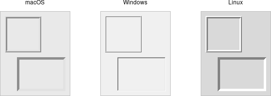
Frame widgets.
A frame is a widget that displays as a simple rectangle. Frames help to organize your user interface, often
both visually and at the coding level. Frames often act as master widgets for a geometry manager like grid,
which manages the slave widgets contained within the frame.
Frames are created using the ttk.Frame class:
frame = ttk.Frame(parent)Frames are created using the ttk::frame command:
ttk::frame .frameFrames are created using the Tk::Tile::Frame class:
frame = Tk::Tile::Frame.new(parent)Frames are created using the new_ttk__frame method, a.k.a. Tkx::ttk__frame():
$frame = $parent->new_ttk__frame;Frames can take several different configuration options, which can alter how they are displayed.
Requested size
Typically, the size of a frame is determined by the size and layout of any widgets within it. In turn, this is controlled by the geometry manager that manages the contents of the frame itself.
If, for some reason, you want an empty frame that does not contain other widgets, you can instead
explicitly set its size using the
width and/or height configuration options (otherwise, you'll end up with a
very small frame indeed).
frame['width'] = 500
frame['height'] = 400
.frame configure -width 500
.frame configure -height 400frame['padding'] = '500'
frame['padding'] = '400'$frame->configure(-padding => "500");
$frame->configure(-padding => "400");Remember, you can request a given size for a frame (or any widget), but the geometry manager has the final say. If you're wondering why a widget isn't displayed at the same size you requested, that's why.
Specifying screen distances
When we asked that the frame be "500" wide, how big is that? What are the units? If not otherwise specified, screen distances such as width and height (and others, like padding and borderwidth below) are measured in pixels. So when we ask that a frame be "500" wide, we're requesting 500 pixels.
You can also specify a number of different units for screen distances by appending one of several suffixes to the number. For example, 350 means
350 pixels, 350c means 350 centimeters, 350m means 350 millimeters, 350i means 350 inches, and 350p means 350 printer's points (1/72 inch).
While if we're specifying pixels we may have passed the screen distance as an integer, when we use one of these different units, we're passing the screen distance as a string.
frame['width'] = '500p' # 500 points (just under 7 inches).frame configure -width 500p ;# 500 points (just under 7 inches)frame['padding'] = '500p' ;# 500 points (just under 7 inches)$frame->configure(-padding => "500p"); # 500 points (just under 7 inches)Tk programs almost always specify screen distances as pixels… and you can see why. It's the default, and we don't even have to think about converting between integers and strings. Mostly, it works. But is it the best way to specify distances? Probably not. With today's high resolution monitors and different display scaling resolutions users can select, the same number of pixels may look very different on two different displays. Using points is probably a better bet, as it takes into account scaling. Another good option might be to base screen distances on the size of a standard font, like we do in HTML when we specify units as "em" or "rem." Unfortunately, Tk doesn't offer this as a built-in option like it does for points, millimeters, centimeters, and inches. But if you want to calculate such distances yourself, you'll see in the Fonts chapter how to determine how many pixels are required to render a given string (like "m") in a given font.
Padding
The padding configuration option is used to request extra space around the inside of
the widget. If you're putting other widgets inside the frame, that provides a margin between the frame's border and the widgets within.
You can specify the same padding for all sides, different horizontal and
vertical padding, or padding for each side separately.
frame['padding'] = 5              # 5 pixels on all sides
frame['padding'] = (5, 10)        # 5 on left and right, 10 on top and bottom
frame['padding'] = (5, 7, 10, 12) # left: 5, top: 7, right: 10, bottom: 12
.frame configure -padding 5 ;# 5 pixels on all sides
.frame configure -padding "5 10" ;# 5 on left and right, 10 on top and bottom
.frame configure -padding "5 7 10 12" ;# left: 5, top: 7, right: 10, bottom: 12frame['padding'] = '5' ;# 5 pixels on all sides
frame['padding'] = '5 10' ;# 5 on left and right, 10 on top and bottom
frame['padding'] = '5 7 10 12' ;# left: 5, top: 7, right: 10, bottom: 12$frame->configure(-padding => "5"); # 5 pixels on all sides
$frame->configure(-padding => "5 10"); # 5 on left and right, 10 on top and bottom
$frame->configure(-padding => "5 7 10 12"); # left: 5, top: 7, right: 10, bottom: 12Borders
You can display a border around a frame widget to visually separate it from its surroundings.
You'll see this often used to make a part of the user interface look sunken or raised. To do this,
you need to set the borderwidth configuration option (which defaults to 0, i.e., no border)
and the relief option, which specifies the visual appearance of the border. This can be one of:
flat (default), raised, sunken, solid, ridge, or groove.
frame['borderwidth'] = 2
frame['relief'] = 'sunken'
.frame configure -borderwidth 2 -relief sunkenframe['borderwidth'] = 2
frame['relief'] = 'sunken'$frame->configure(-borderwidth => 2, -relief => "sunken");Changing styles
Frames have a style configuration option, which is common to all of the themed widgets.
This lets you control many other aspects of their appearance or behavior. This is a bit more
advanced, so we won't go into it in too much detail right now. But here's a quick example of creating a "Danger"
frame with a red background and a raised border.
s = ttk.Style()
s.configure('Danger.TFrame', background='red', borderwidth=5, relief='raised')
ttk.Frame(root, width=200, height=200, style='Danger.TFrame').grid()
ttk::style configure Danger.TFrame -background red -borderwidth 5 -relief raised
grid [ttk::frame .f -width 200 -height 200 -style Danger.TFrame]Tk::Tile::Style.configure('Danger.TFrame', "background" => "red", "borderwidth" => 5, "relief" => "raised")
f = Tk::Tile::Frame.new(root) {width 200; height 200; style "Danger.TFrame"}.grid()Tkx::ttk__style_configure("Danger.TFrame", -background => "red", -borderwidth => 5, -relief => "raised");
my $f = $mw->new_ttk__frame(-width => 200, -height => 200, -style => "Danger.TFrame")->g_grid();What elements of widgets can be changed by styles vary by widget and platform. On Windows and Linux, it does what you'd expect. On current macOS, the frame will have a red raised border, but the background will remain the default grey. Much more on why this is in a later chapter.
We discussed the change from options to styles previously in the Concepts chapter, but it's worth a reminder. Styles mark a sharp departure from how most aspects of a widget's visual appearance were changed in the "classic" Tk widgets. In classic Tk, you could provide a wide range of options to finely control every aspect of an individual widget's behavior, e.g., foreground color, background color, font, highlight thickness, selected foreground color, and padding. When using the new themed widgets, these changes are made by modifying styles, not adding options to each widget.
As such, many options you may be familiar with in certain classic widgets are not present in their themed version. However, overuse of such options was a key factor undermining the appearance of Tk applications, especially when used across different platforms. Transitioning from classic to themed widgets provides an opportune time to review and refine how (and if!) such appearance changes are made.
Label
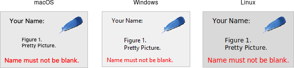
Label widgets.
A label is a widget that displays text or images, typically that users will just view but not otherwise interact with. Labels are used to identify controls or other parts of the user interface, provide textual feedback or results, etc.
Labels are created using the ttk.Label class. Often, the text or image the label will display are
specified via configuration options at the same time:
label = ttk.Label(parent, text='Full name:')Labels are created using the ttk::label command. Often, the text or image the label will display are
specified via configuration options at the same time:
ttk::label .label -text {Full name:}Labels are created using the Tk::Tile::Label class. Often, the text or image the label will display are
specified via configuration options at the same time:
label = Tk::Tile::Label.new(parent) {text 'Full name:'}Labels are created using the new_ttk__label method, a.k.a. Tkx::ttk__label().
Often, the text or image the label will display are specified via configuration options at the same time:
$label = $parent->new_ttk__label(-text => "Full name:");Like frames, labels can take several different configuration options, which can alter how they are displayed.
Displaying text
The text configuration option (shown above when creating the label) is the most commonly used, particularly when
the label is purely decorative or explanatory. You can change what text is displayed by modifying this configuration option.
This can be done at any time, not only when first creating the label.
You can also have the widget monitor a variable in your script. Whenever the variable changes, the label will automatically update to
display the new value of the variable. We saw this before in our feet to meters example. This is done with the textvariable configuration option:
resultsContents = StringVar()
label['textvariable'] = resultsContents
resultsContents.set('Initial value to display')
Tkinter only allows you to attach widgets to an instance of the StringVar class but not arbitrary Python variables.
This class contains all the
logic to watch for changes and communicate them back and forth between the variable and Tk. Use the get and set methods
to read or write the current value of the variable.
current = resultsContents.get()
resultsContents.set('New value to display)
.label configure -textvariable resultContents
set resultContents "Initial value to display"Variables must be global, or the fully qualified name given for those within a namespace.
$resultsVar = TkVariable.new
label['textvariable'] = $resultsVar
$resultsVar.value = 'Initial value to display'
Ruby's Tk binding only allows you to attach to an instance of the TkVariable class, which contains all the
logic to watch for changes, communicate them back and forth between the variable and Tk, and so on. You
need to read or write the current value using the value accessor, as shown.
$label->configure(-textvariable => \$resultContents);
$resultContents = "Initial value to display";
Displaying images
Labels can also display an image instead of text. If you just want a static image displayed in your
user interface, this is normally the way to do it. We'll go into images in more detail in a later chapter,
but for now, let's assume you want to display a PNG stored in a file on disk. This
is a two-step process. First, create an image "object." Then, tell the label to display that object
via its image configuration option:
image = PhotoImage(file='myimage.png')
label['image'] = image
image create photo imgobj -file "myimage.png"
.label configure -image imgobjimage = TkPhotoImage.new(:file => "myimage.png")
label['image'] = imageTkx::image_create_photo( "imgobj", -file => "myimage.png");
$label->configure(-image => "imgobj");We'll cover images in a later chapter. Tk supports PNG, GIF, and PPM/PGM by default, though others can be added.
Labels can also display both an image and text at the same time. You'll often see this in toolbar buttons. To do so, use the
compound configuration option, which accepts the following values:
none (default):- display only the image if present; if there is no image, display the text specified by the
textortextvariableoptions text:- text only (ignore any image provided)
image:- image only (ignore any text provided)
center:- text in the center of the image
top:- image above text
bottom:- image below text
left:- image to left of text
right:- image to right of text
Fonts, colors, and more
As with frames, you normally don't want to change things like fonts and colors directly.
If you need to change them (e.g., to create a special type of label), the preferred method would be to
create a new style, which is then assigned to the widget with its style option.
Unlike most themed widgets, the label widget also provides explicit widget-specific configuration options for fonts and colors as an alternative. Again, you should use these only in special one-off cases when using a style doesn't necessarily make sense.
You can specify the font used to display the label's text using the font configuration
option. While we'll go into fonts in more detail in a later chapter, here are the names of some
predefined fonts you can use:
TkDefaultFont:- Default for all GUI items not otherwise specified.
TkTextFont:- Used for entry widgets, listboxes, etc.
TkFixedFont:- A standard fixed-width font.
TkMenuFont:- The font used for menu items.
TkHeadingFont:- A font for column headings in lists and tables.
TkCaptionFont:- A font for window and dialog caption bars.
TkSmallCaptionFont:- Smaller captions for subwindows or tool dialogs.
TkIconFont:- A font for icon captions.
TkTooltipFont:- A font for tooltips.
Because font choices are platform-specific, be careful of hardcoding specifics (font families, sizes, etc.). This is something else you'll see in many older Tk programs that can make them look ugly.
label['font'] = "TkDefaultFont".label configure -font TkDefaultFontlabel['font'] = "TkDefaultFont"$label->configure(-font => "TkDefaultFont");The foreground (text) and background color of the label can also be changed via the foreground and
background configuration options. Colors are covered in detail later, but you can specify them as either
color names (e.g., red) or hex RGB codes (e.g., #ff340a).
label['foreground'] = "red"
label['background'] = "#ff340a"
.label configure -foreground red
.label configure -background #ff340alabel['foreground'] = "red"
label['background'] = "#ff340a"$label->configure(-foreground => "ref");
$label->configure(-background => "#ff340a");Font and color changes to labels may not be honoured on all platforms. At present, foreground color and font for labels can be changed on macOS, but not background color.
Labels also accept the relief configuration option discussed for frames to make them appear sunken or raised.
Layout
The geometry manager determines the overall layout of the label (i.e., where it is positioned within the user interface and how large it is). Yet, several options can help you control how the label is displayed within the rectangle the geometry manager gives it.
If the box given to the label is larger than the label requires for its contents, you can use
the anchor option to specify what edge or corner the label should be attached to,
which would leave any empty space in the opposite edge or corner. Possible values are
specified as compass directions: 'n' (north, or top edge), 'ne', (north-east, or top right corner),
'e', 'se', 's', 'sw', 'w', 'nw' or 'center'.
label['anchor'] = "nw"Anchor can be specified as a string, like was done here, using constants defined by Tkinter (e.g., NW), or even as a tuple, e.g., (N, W). Use whatever
approach makes sense for you keeping in mind any project or organizational style conventions.
.label configure -anchor nwlabel['anchor'] = "nw"$label->configure(-anchor => "nw");Things not appearing where you think they should? The position and size of the overall label widget may not be what you
think it is. They can be affected by various widget and geometry manager options.
For example, if you're using grid, you may need to adjust the sticky options.
Options on one widget can affect the placement of another, as the geometry manager juggles space to fit all the widgets together.
When debugging, it can help to change the background color of each widget so you know exactly where each is positioned.
Incidentally, this is a good example of those "one-off" cases we just mentioned where you might use configuration options rather than styles
to modify a widget's appearance.
Multi-line labels
Labels can display more than one line of text. To do so, embed carriage
returns (\n) in the text (or textvariable) string. Labels can also
automatically wrap your text into multiple lines via the wraplength option,
which specifies the maximum length of a line (in pixels, centimeters, etc.).
Multi-line labels are a replacement for the older message widgets in classic Tk.
You can also control how multi-line text is justified via the justify option. It
can have the values left, center, or right. If you have only a single line of text, you
probably want the anchor option instead.
Button

Button widgets.
A button, unlike a frame or label, is very much there to interact with. Users press a button to perform an action. Like labels, they can display text or images, but accept additional options to change their behavior.
Buttons are created using the ttk.Button class:
button = ttk.Button(parent, text='Okay', command=submitForm)Buttons are created using the ttk::button command:
ttk::button .button -text "Okay" -command "submitForm"Buttons are created using the Tk::Tile::Button class:
button = Tk::Tile::Button.new(parent) {text 'Okay'; command 'submitForm'}Buttons are created using the new_ttk__button method, a.k.a. Tkx::ttk__button():
$button = $parent->new_ttk__button(-text => "Okay", -command => sub {submitForm();});Typically, their contents and command callback are specified at the same time the button is created. As with other widgets, buttons accept several configuration options to alter their appearance and behavior, including the standard style option.
Text or image
Buttons take the same text, textvariable (less commonly used), image, and compound
configuration options as labels. These control whether the button displays text and/or an image.
Buttons have a default configuration option. If specified as active, this tells Tk that the
button is the default button in the user interface; otherwise, it is normal. Default buttons are invoked
if users hit the Return or Enter key. Some platforms and styles will draw this default button with
a different border or highlight. Note that setting this configuration option doesn't create an event binding that will make the "Return" or "Enter" key
activate the button; you have to do that yourself.
The command callback
The command option connects the button's action and your application.
When a user presses the button, the script provided by the option is evaluated by the interpreter.
You can also ask the button to invoke the command callback from your application, just as if the user pressed the button. That way, you don't need to repeat the command to be invoked several times in your program. If you change the command attached to the button, you don't need to change it elsewhere too. Sounds like a useful way to add that event binding on our default button, doesn't it?
action = ttk.Button(root, text="Action", default="active", command=myaction)
root.bind('<Return>', lambda e: action.invoke())
ttk::button .action -text "Action" -default active -command myaction
bind . <Return> ".action invoke"action = Tk::Tile::Button.new(root) {text "Action"; default "active"; command {myaction}}
root.bind("Return", proc{action.invoke()})$action = $mw->new_ttk__button(-text => "Action", -default => "active", -command => sub {myaction();});
Tkx::bind(".", "<Return>", sub{$action->invoke();});Standard behavior for dialog boxes and many other windows on most platforms is to set up a binding on
the window for the Return key (<Return> or <Key-Return>) to invoke the active button if it exists,
as we've done here. If there is a "Close" or "Cancel" button, create a binding to the Escape key (<Key-Escape>).
On macOS, you should additionally bind the Enter key on the keyboard (<KP_Enter>) to the active
button and Command-period (<Command-.>) to the close or cancel button.
Button state
Buttons and many other widgets start off in a normal state. A button in its normal state will respond to mouse movements, can be pressed, and will invoke its command callback. Buttons can also be put into a disabled state, where the button is greyed out, does not respond to mouse movements, and cannot be pressed. Your program would disable the button when its command is not applicable based on the state of the application at a given point in time.
All themed widgets maintain an internal state, represented as a series of binary flags. Each flag can either be set (on) or cleared (off).
You can set or clear these different flags, and check the current setting using the state and instate methods.
Buttons make use of the disabled flag to control whether or not users can press the button. For example:
b.state(['disabled'])          # set the disabled flag
b.state(['!disabled'])         # clear the disabled flag
b.instate(['disabled'])        # True if disabled, else False
b.instate(['!disabled'])       # True if not disabled, else False
b.instate(['!disabled'], cmd)  # execute 'cmd' if not disabled
Note that these commands accept a list of state flags as their argument.
.b state disabled            ;# set the disabled flag
.b state !disabled           ;# clear the disabled flag
.b instate disabled          ;# 1 if disabled, else 0
.b instate !disabled         ;# 1 if not disabled, else 0
.b instate !disabled {mycmd} ;# execute 'mycmd' if not disabled
b.state('disabled') ;# set the disabled flag
b.state('!disabled') ;# clear the disabled flag
b.instate('disabled') ;# true if disabled, else false
b.instate('!disabled') ;# true if not disabled, else false
b.instate('!disabled', 'cmd') ;# execute 'cmd' if not disabled$b->state("disabled"); # set the disabled flag
$b->state("!disabled"); # clear the disabled flag
$b->instate("disabled"); # 1 if disabled, else 0
$b->instate("!disabled"); # 1 if not disabled, else 0
$b->instate("!disabled", sub {mycmd}); # execute 'mycmd' if not disabledThe full list of state flags available to themed widgets is: active, disabled, focus, pressed, selected,
background, readonly, alternate, and invalid. These are described in the
themed widget reference. While all widgets have the same set of state flags, not all states
are meaningful for all widgets. It's also possible to get fancy in the state and instate methods
and specify multiple state flags at the same time.
The state and instate methods replace the older state configuration option (which took the values normal or
disabled).
That configuration option is actually still available for themed widgets, but "write-only," which means that
changing the option calls the appropriate state command. It's mainly intended as a convenience, so you can
specify a widget should be disabled when you first create it. However, any changes made using the new state
command do not update the configuration option. To avoid confusion, update your code to
use the state flags for all themed widgets.
Checkbutton

Checkbutton widgets.
A checkbutton widget is like a regular button that also holds a binary value of some kind (i.e., a toggle). When pressed, a checkbutton flips the toggle and then invokes its callback. Checkbutton widgets are frequently used to allow users to turn an option on or off.
Checkbuttons are created using the ttk.Checkbutton class. Typically, their contents and behavior are specified at the same time:
measureSystem = StringVar()
check = ttk.Checkbutton(parent, text='Use Metric',
	    command=metricChanged, variable=measureSystem,
	    onvalue='metric', offvalue='imperial')
Checkbuttons are created using the ttk::checkbutton command. Typically, their contents and behavior are specified at the same time:
ttk::checkbutton .check -text "Use Metric" -command "metricChanged"
	    -variable measuresystem -onvalue metric -offvalue imperial
Checkbuttons are created using the Tk::Tile::CheckButton class. Typically, their contents and behavior are specified at the same time:
$measureSystem = TkVariable.new
check = Tk::Tile::CheckButton.new(parent) {text 'Use Metric';
	    command 'metricChanged'; variable $measureSystem;
	    onvalue 'metric'; offvalue 'imperial'}
Checkbuttons are created using the new_ttk__checkbutton method, a.k.a. Tkx::ttk__checkbutton.
Typically, their contents and behavior are specified at the same time:
$check = $parent->new_ttk__checkbutton(-text => "Use Metric", -command => sub {metricChanged},
	    -variable => \$measuresystem, -onvalue => "metric", -offvalue => "imperial");
Checkbuttons use many of the same options as regular buttons but add a few more. The text, textvariable,
image, and compound configuration options control the display of the label (next to the checkbox itself).
Similarly, the command option lets you specify a command to be called every time a user toggles the checkbutton; and the
invoke method will also execute the same command.
The state and instate methods allow you to manipulate the disabled state flag to enable or disable the checkbutton.
Widget value
Unlike regular buttons, checkbuttons also hold a value. We've seen how the textvariable option links
the label of a widget to a variable. The variable option for checkbuttons behaves similarly, except
it links a variable to the widget's current value. The variable is updated whenever the widget is toggled. By default,
checkbuttons use a value of 1 when checked and 0 when not checked. These can be changed to
something else using the onvalue and offvalue options.
A checkbutton doesn't automatically set (or create) the linked variable. Therefore, your program needs to initialize it to the appropriate starting value.
What happens when the linked variable contains neither the onvalue or the offvalue (or even doesn't exist)? In that case,
the checkbutton is put into a special "tristate" or indeterminate mode. The checkbox might display a single dash in this mode instead of
being empty or holding a checkmark. Internally, the state flag alternate is set, which you can inspect
via the instate method:
check.instate(['alternate']).check instate alternatecheck.instate('alternate')$check->instate("alternate")So far, we've been using an instance of the StringVar class to attach variables to widgets. Tkinter provides other
variable classes that can hold booleans, integers, or floating-point numbers. You can always
use a StringVar (because the Tcl API that Tkinter uses is string-based) but can choose one of the others if
the data stored in it fits the type. All are subclasses of the base class Variable.
In the feet to meters example, we saw that you can call the get method of a Variable to retrieve its value or
the set method to provide a new value. You can also supply an initial value when you instantiate it.
s = StringVar(value="abc")   # default value is ''
b = BooleanVar(value=True)   # default is False
i = IntVar(value=10)         # default is 0
d = DoubleVar(value=10.5) # default is 0.0Radiobutton
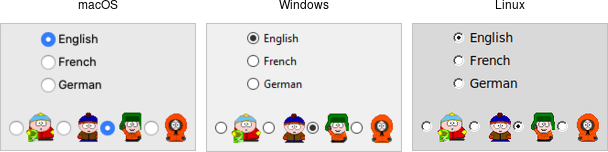
Radiobutton widgets.
A radiobutton widget lets you choose between one of several mutually exclusive choices. Unlike a checkbutton, they are not limited to just two options. Radiobuttons are always used together in a set, where multiple radiobutton widgets are tied to a single choice or preference. They are appropriate to use when the number of options is relatively small, e.g., 3-5.
Radiobuttons are created using the ttk.Radiobutton class. Typically, you'll create and initialize several of them at once:
phone = StringVar()
home = ttk.Radiobutton(parent, text='Home', variable=phone, value='home')
office = ttk.Radiobutton(parent, text='Office', variable=phone, value='office')
cell = ttk.Radiobutton(parent, text='Mobile', variable=phone, value='cell')
Radiobuttons are created using the ttk::radiobutton command. Typically, you'll create and initialize several of them at once:
ttk::radiobutton .home -text "Home" -variable phone -value home
ttk::radiobutton .office -text "Office" -variable phone -value office
ttk::radiobutton .cell -text "Mobile" -variable phone -value cell
Radiobuttons are created using the Tk::Tile::RadioButton class. Typically, you'll create and initialize several of them at once:
$phone = TkVariable.new
home = Tk::Tile::RadioButton.new(parent) {text 'Home'; variable $phone; value 'home'}
office = Tk::Tile::RadioButton.new(parent) {text 'Office'; variable $phone; value 'office'}
cell = Tk::Tile::RadioButton.new(parent) {text 'Mobile'; variable $phone; value 'cell'}
Radiobuttons are created using the new_ttk__radiobutton method, a.k.a. Tkx::ttk__radiobutton. Typically, you'll create and initialize several of them at once:
$home = $parent->new_ttk__radiobutton(-text => "Home", -variable => \$phone, -value => "home");
$office = $parent->new_ttk__radiobutton(-text => "Office", -variable => \$phone, -value => "office");
$cell = $parent->new_ttk__radiobutton(-text => "Mobile", -variable => \$phone, -value => "cell");
Radiobuttons share most of the same configuration options as checkbuttons. One exception is that the
onvalue and offvalue options are replaced with a single value option.
Each radiobutton in the set will have the same linked variable but a different value.
When the variable holds the matching value, that radiobutton will visually indicate it is selected.
If it doesn't match, the radiobutton will be unselected.
If the linked variable doesn't exist, or you don't specify one with the variable option,
radiobuttons also display as "tristate" or indeterminate. This can be checked via the alternate state flag.
Entry
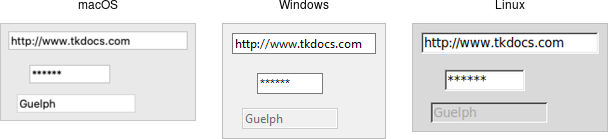
Entry widgets.
An entry widget provides users with a single-line text field where they can type in a string value. These can be just about anything: a name, a city, a password, social security number, etc.
Entries are created using the ttk.Entry class:
username = StringVar()
name = ttk.Entry(parent, textvariable=username)
Entries are created using the ttk::entry command:
ttk::entry .name -textvariable usernameEntries are created using the Tk::Tile::Entry class:
$username = TkVariable.new
name = Tk::Tile::Entry.new(parent) { textvariable $username }
Entries are created using the new_ttk__entry method, a.k.a. Tkx::ttk__entry:
$name = $parent->new_ttk__entry(-textvariable => \$username);A width configuration option may be specified to provide the number of
characters wide the entry should be. This allows you, for example, to display a shorter
entry for a zip or postal code.
name['width'] = 25.name configure -width 25name['width'] = 25$name->configure(-width => 25);Entry contents
We've seen how checkbutton and radiobutton widgets have a value associated with them.
Entries do as well. That value is usually accessed through a linked variable
specified by the textvariable configuration option.
Unlike the various buttons, entries don't have a text or image beside them to identify them. Use a separate label widget for that.
You can also retrieve or change the value of the entry widget without going
through the linked variable. The get method returns the current value.
The delete method allows you to remove part of all of the text in the widget, specified by a character position (0 for the first character, 1 for the second, etc.); the special end refers to the position just past the last character. The insert method allows you to add new text ata given position.
print(f'current value is {name.get()}')
name.delete(0, 'end')          # delete between two indices, 0-based
name.insert(0, 'your name')   # insert new text at a given index
puts "current value is [.name get]"
.name delete 0 end ; # delete between two indices, 0-based
.name insert 0 "your name" ; # insert new text at a given indexputs ("current value is #{name.get}")
name.delete(0, end) ; # delete between two indices, 0-based
name.insert(0, 'your name') ; # insert new text at a given indexprint "current value is " . $name->get;
$name->delete(0, "end"); # delete between two indices, 0-based
$name->insert(0, "your name"); # insert new text at a given indexWatching for changes
Entry widgets don't have a command option to invoke a
callback whenever the entry is changed. To watch for changes, monitor
the linked variable via the trace add method. See also "Validation" below.
def it_has_been_written(*args):
    ...
username.trace_add("write", it_has_been_written)
proc it_has_been_written {args} {...}
trace add variable username write it_has_been_writtendef it_has_been_written()
...
end
$username.trace("write", proc{it_has_been_written})sub it_has_been_written {...}
Tkx::trace("add", "variable", \$username, "write", sub{it_has_been_written});You'll be fine if you stick with simple uses of trace_add like that shown above. You might want to know that
this is a small part of a much more complex system for observing variables and invoking callbacks when they are read, written,
or deleted. You can trigger multiple callbacks, add or delete them (trace_remove), and introspect
them (trace_info).
These methods replace a now-deprecated set of older methods (trace, trace_variable, trace_vdelete,
and trace_vinfo) that should not be used.
StringVar (or any subclass of Variable).
Both the older and newer tracing tools are a very thin (and not terribly Pythonic) front end to Tcl's trace command.
Passwords
Entries can be used for passwords, where the actual contents are displayed as a bullet or other symbol.
To do this, set the show configuration option to the character you'd like to display.
passwd = ttk.Entry(parent, textvariable=password, show="*")ttk::entry .passwd -textvariable password -show "*"passwd = Tk::Tile::Entry.new(parent) { textvariable $password; show "*"}$passwd = $parent->new_ttk__entry(-textvariable => \$password, show => "*");Widget states
Like the various buttons, entries can also be put into a disabled state via the state command (and queried
with instate). Entries can also use the state flag readonly; if set, users cannot change the entry,
though they can still select the text in it (and copy it to the clipboard). There is also an invalid
state, set if the entry widget fails validation, which leads us to...
Validation
Users can type any text they like into an entry widget. However, if you'd like to restrict what they can type into the entry, you can do so with validation. For example, an entry might only accept an integer or a valid zip or postal code.
Your program can specify what makes an entry valid or invalid, as well as when to check its validity. As we'll see soon, the two are related. We'll start with a simple example, an entry that can only hold an integer up to five digits long.
The validation criteria are specified via an entry's validatecommand configuration option. You supply a piece of
code whose job is to validate the entry. It functions like a widget callback or event binding, except that it returns
True or False (whether or not the entry is valid). To start, we'll validate the entry on every keystroke; this
is specified by providing a value of key to the validate configuration option.
import re
def check_num(newval):
    return re.match('^[0-9]*$', newval) is not None and len(newval) <= 5
check_num_wrapper = (root.register(check_num), '%P')

num = StringVar()
e = ttk.Entry(root, textvariable=num, validate='key', validatecommand=check_num_wrapper)
e.grid(column=0, row=0, sticky='we')
proc check_num {newval} {
return [expr {[regexp {^[0-9]*$} $newval] && [string length $newval]<=5}]
}
ttk::entry .e -textvariable num -validate key -validatecommand "check_num %P"
grid .e -column 0 -row 0 -sticky wedef check_num(newval)
return /^[0-9]*$/.match(newval) && newval.length <= 5
end
num = TkVariable.new
e = Tk::Tile::Entry.new(root) {textvariable num; validate 'key'; validatecommand [proc{|v| check_num(v)}, '%P']}
e.grid :column => 0, :row => 0, :sticky => 'we'sub check_num {
my ($newval) = @_;
return $newval =~ /^[0-9]*$/ && length($newval) <= 5 ? 1 : 0;
}
$e = $mw->new_ttk__entry(-textvariable => \$num, -validate => 'key', -validatecommand => [\&check_num, Tkx::Ev('%P')]);
$e->g_grid(-column => 0, -row => 0, -sticky => 'we');Our check function accepts a single parameter, the new value of the entry if the validation succeeds We'll use a simple regular expression and a length
check to determine if the change is valid. To reject the change, our validation command can return a False value, leaving the entry unchanged.
As with event bindings, there are a number of parameters that provide more information about the conditions that triggered the validation.
To make them available, we need to access them via percent substitutions. We used one of these here:
%P is the new value of the entry (again, if the validation succeeds).
You'll notice some ugly code gymnastics are required to pass that new value to our validation function.
Taking advantage of these percent substitutions requires some gymnastics. We have to first choose which percent substitutions
we're interested in. The register method (callable on any widget) creates a Tcl procedure which will call our Python function.
The percent substitutions we've chosen will be passed to it as parameters.
Incidentally, Tk events use a very similar mechanism of percent substitutions to pass event parameters to bindings. However, Tkinter encapsulated all these parameters into an event object that is passed to the callback. Tkinter abstracts away all the details about percent substitutions so you don't have to worry about them. Unfortunately, there's no equivalent abstraction for validation callbacks.
Let's extend our example so that the entry will accept a US zip code, formatted as "#####" or "#####-####" ("#" can be any digit). We'll still do some validation on each keystroke (only allowing entry of numbers or a hyphen). However, we can no longer fully validate the entry on every keystroke. If they've just typed the first digit, it's not valid yet. If we reject the change after this first character, they'll never be able to enter a complete zip code.
So full validation will only happen when the entry loses focus (e.g., a user tabs away from it). Tk refers to this as revalidation, in contrast with prevalidation (accepting changes on each keystroke).
How should we respond to errors? Let's add a message reminding users of the format. It will appear if they type a wrong key or tab away from the entry when it's not holding a valid zip code. We'll remove the message when they return to the entry or type a valid key. We'll also add a (dummy) button to "process" the zip code, which will be disabled unless the zip entry is valid. Finally, we'll also add a "name" entry so you can tab away from the zip entry.
import re
errmsg = StringVar()
formatmsg = "Zip should be ##### or #####-####"

def check_zip(newval, op):
    errmsg.set('')
    valid = re.match('^[0-9]{5}(\-[0-9]{4})?$', newval) is not None
    btn.state(['!disabled'] if valid else ['disabled'])
    if op=='key':
        ok_so_far = re.match('^[0-9\-]*$', newval) is not None and len(newval) <= 10
        if not ok_so_far:
            errmsg.set(formatmsg)
        return ok_so_far
    elif op=='focusout':
        if not valid:
            errmsg.set(formatmsg)
    return valid
check_zip_wrapper = (root.register(check_zip), '%P', '%V')

zip = StringVar()
f = ttk.Frame(root)
f.grid(column=0, row=0)
ttk.Label(f, text='Name:').grid(column=0, row=0, padx=5, pady=5)
ttk.Entry(f).grid(column=1, row=0, padx=5, pady=5)
ttk.Label(f, text='Zip:').grid(column=0, row=1, padx=5, pady=5)
e = ttk.Entry(f, textvariable=zip, validate='all', validatecommand=check_zip_wrapper)
e.grid(column=1, row=1, padx=5, pady=5)
btn = ttk.Button(f, text="Process")
btn.grid(column=2, row=1, padx=5, pady=5)
btn.state(['disabled'])
msg = ttk.Label(f, font='TkSmallCaptionFont', foreground='red', textvariable=errmsg)
msg.grid(column=1, row=2, padx=5, pady=5, sticky='w')
set ::formatmsg "Zip should be ##### or #####-####"
proc check_zip {newval op} {
set ::errmsg ""
set valid [expr {[regexp {^[0-9]{5}(\-[0-9]{4})?$} $newval]}]
.f.btn state [expr {$valid ? "!disabled" : "disabled"}]
if {$op=="key"} {
set ok_so_far [expr {[regexp {^[0-9\-]*$} $newval] && [string length $newval]<=10}]
if {!$ok_so_far} {set ::errmsg $::formatmsg }
return $ok_so_far
} elseif {$op=="focusout"} {
if {!$valid} {set ::errmsg $::formatmsg}
}
return $valid
}
grid [ttk::frame .f] -column 0 -row 0
grid [ttk::label .f.l1 -text "Name:"] -column 0 -row 0 -padx 5 -pady 5
grid [ttk::entry .f.e1] -column 1 -row 0 -padx 5 -pady 5
grid [ttk::label .f.l -text "Zip:"] -column 0 -row 1 -padx 5 -pady 5
ttk::entry .f.e -textvariable zip -validate all -validatecommand "check_zip %P %V"
grid .f.e -column 1 -row 1 -padx 5 -pady 5
grid [ttk::button .f.btn -text Process] -column 2 -row 1 -padx 5 -pady 5
.f.btn state disabled
ttk::label .f.msg -font TkSmallCaptionFont -foreground red -textvariable errmsg
grid .f.msg -column 1 -row 2 -padx 5 -pady 5 -sticky w$errmsg = TkVariable.new
$formatmsg = "Zip should be ##### or #####-####"
def check_zip(newval, op)
$errmsg.value = ''
valid = /^[0-9]{5}(\-[0-9]{4})?$/.match(newval)
$btn.state(valid ? '!disabled' : 'disabled')
if op=='key'
ok_so_far = /^[0-9\-]*$/.match(newval) && newval.length <= 10
$errmsg.value = $formatmsg if not ok_so_far
return ok_so_far
elsif op=='focusout'
$errmsg.value = $formatmsg if not valid
end
return valid
end
zip = TkVariable.new
f = Tk::Tile::Frame.new(root)
f.grid :column => 0, :row =>0
Tk::Tile::Label.new(f) {text 'Name:'}.grid :column => 0, :row => 0, :padx => 5, :pady => 5
Tk::Tile::Entry.new(f).grid :column => 1, :row => 0, :padx => 5, :pady => 5
Tk::Tile::Label.new(f) {text 'Zip:'}.grid :column => 0, :row => 1, :padx => 5, :pady => 5
e = Tk::Tile::Entry.new(f) {textvariable zip; validate 'all'; validatecommand [proc{|v,o| check_zip(v,o)}, '%P', '%V']}
e.grid :column => 1, :row => 1, :padx => 5, :pady => 5
$btn = Tk::Tile::Button.new(f) {text 'Process'}
$btn.grid :column => 2, :row => 1, :padx => 5, :pady => 5
$btn.state 'disabled'
msg = Tk::Tile::Label.new(f) {font 'TkSmallCaptionFont'; foreground 'red'; textvariable $errmsg}
msg.grid :column => 1, :row => 2, :padx => 5, :pady => 5, :sticky => 'w'our $errmsg = "";
our $formatmsg = "Zip should be ##### or #####-####";
sub check_zip {
my ($newval,$op) = @_;
$errmsg = "";
$valid = $newval =~ /^[0-9]{5}(\-[0-9]{4})?$/;
$btn->state($valid ? "!disabled" : "disabled");
if ($op eq "key") {
$ok_so_far = $newval =~ /^[0-9\-]*$/ && length($newval) <= 10;
$errmsg = $formatmsg if not $ok_so_far;
return $ok_so_far ? 1 : 0;
} elsif ($op eq "focusout") {
$errmsg = $formatmsg if not $valid;
}
return $valid ? 1 : 0;
}
$f = $mw->new_ttk__frame();
$f->g_grid(-column => 0, -row => 0);
$f->new_ttk__label(-text => 'Name:')->g_grid(-column => 0, -row => 0, -padx => 5, -pady => 5);
$f->new_ttk__entry()->g_grid(-column => 1, -row => 0, -padx => 5, -pady => 5);
$f->new_ttk__label(-text => 'Zip:')->g_grid(-column => 0, -row => 1, -padx => 5, -pady => 5);
$e = $f->new_ttk__entry(-textvariable => \$zip, -validate => 'all', -validatecommand => [\&check_zip, Tkx::Ev('%P', '%V')]);
$e->g_grid(-column => 1, -row => 1);
our $btn = $f->new_ttk__button(-text => 'Process:');
$btn->g_grid(-column => 2, -row => 1, -padx => 5, -pady => 5);
$btn->state('disabled');
$msg = $f->new_ttk__label(-font => 'TkSmallCaptionFont', -foreground => 'red', -textvariable => \$errmsg);
$msg->g_grid(-column => 1, -row => 2, -padx => 5, -pady => 5, -sticky => 'w');Notice that the validate configuration option has been changed from key to all.
That arranges for the validatecommand callback to be invoked on not only keystrokes but other triggers.
The trigger is passed to the callback using the %V percent substitution.
The callback differentiated between key and focusout triggers (you can also check for focusin).
There are a few more things to know about validation. First, if your validatecommand ever generates an error
(or doesn't return a boolean), validation will be disabled for that widget. Your callback can modify the entry, e.g.,
change its textvariable. You can ask the widget to validate at any time by calling
its validate method, which returns true if validation passes (the %V substitution is set to forced).
There is an invalidcommand configuration option (which works like validatecommand) that is called whenever
validation fails. You can use it to accomplish nasty things like forcing the focus back on the widget that didn't validate.
In practice, it's rarely used. As mentioned earlier, the entry's invalid state flag (which can be checked via
the instate invalid method) is automatically updated as validation succeeds or fails.
Other percent substitutions allow you to get the entry's contents prior to editing (%s), differentiate between insert and delete (%d), where an insert or delete occurs (%i), what is being inserted or deleted (%S), the
current setting of the validate option (%v) and the name of the widget (%W).
Combobox

Combobox widgets.
A combobox widget combines an entry with a list of choices. This lets users either choose from a set of values you've provided (e.g., typical settings), but also put in their own value (e.g., for less common cases).
Comboboxes are created using the ttk.Combobox class:
countryvar = StringVar()
country = ttk.Combobox(parent, textvariable=countryvar)
Comboboxes are created using the ttk::combobox command:
ttk::combobox .country -textvariable countryComboboxes are created using the Tk::Tile::Combobox class:
$countryvar = TkVariable.new
country = Tk::Tile::Combobox.new(parent) { textvariable $countryvar }
Comboboxes are created using the new_ttk__combobox method, a.k.a. Tkx::ttk__combobox:
$country = $parent->new_ttk__combobox(-textvariable => \$countryvar);Like entries, the textvariable option links a variable in your program to the
current value of the combobox. As with other widgets, you should initialize
the linked variable in your own code.
A combobox will generate a <<ComboboxSelected>> virtual event that you can bind to whenever its value changes.
(You could also trace changes on the textvariable, as we've seen in the previous few widgets we covered.
Binding to the event is more straightforward, and so tends to be our preferred choice.)
country.bind('<<ComboboxSelected>>', function)bind .country <<ComboboxSelected>> { script }country.bind("<ComboboxSelected>") { script }$country->g_bind("<<ComboboxSelected>>", sub { script });Predefined values
You can provide a list of values that users can choose from using the values configuration
option:
country['values'] = ('USA', 'Canada', 'Australia').country configure -values [list USA Canada Australia]country['values'] = [ 'USA', 'Canada', 'Australia']$country->configure(-values => "USA Canada Australia");If set, the readonly state flag will restrict users to making choices only from the list
of predefined values but not be able to enter their own (though if the current value of the
combobox is not in the list, it won't be changed).
country.state(["readonly"]).country state readonlycountry.state('readonly')$country->state("readonly");If you're using the combobox in readonly mode, I'd recommend
that when the value changes (i.e., on a <<ComboboxSelected>> event), that
you call the selection_clear method. It looks a bit odd visually
without doing that.
You can also get the current value using the get method and change the current value using the set
method (which takes a single argument, the new value).
To complement the get and set methods, you can also use the current method to determine
which item in the predefined values list is selected. Call current with no arguments; it will
return a 0-based index into the list or -1 if the current value is not in the list. You can select
an item in the list by calling current with a single 0-based index argument.
Want to associate some other value with each item in the list so that your program can use one value internally, but it gets displayed in the combobox as something else? You'll want to have a look at the section entitled "Keeping Extra Item Data" when we get to the discussion of listboxes in a couple of chapters from now.
The Grid Geometry Manager
We'll take a bit of a break from talking about different widgets (what to put onscreen) and
focus instead on geometry management (where to put those widgets). We introduced the general idea of
geometry management in the "Tk Concepts" chapter. Here, we focus on one specific geometry manager: grid.
As we've seen, grid lets you layout widgets in columns and rows. If you're familiar with using
HTML tables for layout, you'll feel right at home here. This chapter illustrates the various ways
you can tweak grid to give you all the control you need for your user interface.
Grid is one of several geometry managers available in Tk, but its mix of power, flexibility, and ease of use make it the best choice
for general use. Its constraint model is a natural fit with today's layouts that rely on the alignment of widgets.
There are other geometry managers in Tk: pack is also quite powerful but harder to
use and understand, while place gives you complete control of positioning each element.
Even widgets like paned windows, notebooks, canvas, and text that we'll explore later can act as geometry managers.
Note that grid was first introduced to Tk in 1996, several years after Tk became popular and it took a while to catch on.
Before that, developers had always used pack to do constraint-based geometry management. When grid came
out, many developers kept using pack, and you'll still find it used in many Tk programs and documentation.
While there's nothing technically wrong with pack, the algorithm's behavior is often hard to understand.
More importantly, because the order that widgets are packed is significant in determining layout, modifying
existing layouts can be more difficult. Aligning widgets in different parts of the user interface is also much trickier.
Grid has all the power of pack, produces nicer layouts (that align widgets both horizontally and vertically), and is easier to learn and use. Because of that, grid is the right choice for most developers most of the time. Start your new programs using grid, and switch old ones to grid as you make changes to an existing user interface.
The reference documentation for grid provides an exhaustive description of grid, its behaviors, and all options.
Columns and rows
In grid, widgets are assigned a column number and a row number. These indicate each widget's position
relative to other widgets. Widgets in the same column are above or below each other. Those
in the same row are to the left or right of each other.
Column and row numbers must be positive integers (i.e., 0, 1, 2, ...). You don't have to start at 0 and can leave gaps in column and row numbers (e.g., column 1, 2, 10, 11, 12, 20, 21). This is useful if you plan to add more widgets in the middle of the user interface later.
The width of each column will vary depending on the width of the widgets contained within the column. Ditto for the height of each row. This means when sketching out your user interface and dividing it into rows and columns, you don't need to worry about each column or row being equal width.
Spanning multiple cells
Widgets can take up more than a single cell in the grid; to do this, we'll use the columnspan
and rowspan options when gridding the widget. These are analogous to the "colspan" and "rowspan"
attributes of HTML tables.
Here is an example of creating a user interface with multiple widgets, some that take up more than a single cell.
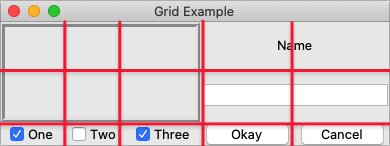
Gridding multiple widgets.
from tkinter import *
from tkinter import ttk

root = Tk()

content = ttk.Frame(root)
frame = ttk.Frame(content, borderwidth=5, relief="ridge", width=200, height=100)
namelbl = ttk.Label(content, text="Name")
name = ttk.Entry(content)

onevar = BooleanVar(value=True)
twovar = BooleanVar(value=False)
threevar = BooleanVar(value=True)

one = ttk.Checkbutton(content, text="One", variable=onevar, onvalue=True)
two = ttk.Checkbutton(content, text="Two", variable=twovar, onvalue=True)
three = ttk.Checkbutton(content, text="Three", variable=threevar, onvalue=True)
ok = ttk.Button(content, text="Okay")
cancel = ttk.Button(content, text="Cancel")

content.grid(column=0, row=0)
frame.grid(column=0, row=0, columnspan=3, rowspan=2)
namelbl.grid(column=3, row=0, columnspan=2)
name.grid(column=3, row=1, columnspan=2)
one.grid(column=0, row=5)
two.grid(column=1, row=5)
three.grid(column=2, row=5)
ok.grid(column=3, row=5)
cancel.grid(column=4, row=5)

root.mainloop()
ttk::frame .c
ttk::frame .c.f -borderwidth 5 -relief ridge -width 200 -height 100
ttk::label .c.namelbl -text Name
ttk::entry .c.name
ttk::checkbutton .c.one -text One -variable one -onvalue 1; set one 1
ttk::checkbutton .c.two -text Two -variable two -onvalue 1; set two 0
ttk::checkbutton .c.three -text Three -variable three -onvalue 1; set three 1
ttk::button .c.ok -text Okay
ttk::button .c.cancel -text Cancel
grid .c -column 0 -row 0
grid .c.f -column 0 -row 0 -columnspan 3 -rowspan 2
grid .c.namelbl -column 3 -row 0 -columnspan 2
grid .c.name -column 3 -row 1 -columnspan 2
grid .c.one -column 0 -row 5
grid .c.two -column 1 -row 5
grid .c.three -column 2 -row 5
grid .c.ok -column 3 -row 5
grid .c.cancel -column 4 -row 5require 'tk'
require 'tkextlib/tile'
root = TkRoot.new
content = Tk::Tile::Frame.new(root)
frame = Tk::Tile::Frame.new(content) {borderwidth 5; relief "ridge"; width 200; height 100}
namelbl = Tk::Tile::Label.new(content) {text "Name"}
name = Tk::Tile::Entry.new(content)
$option_one = TkVariable.new( 1 )
one = Tk::Tile::CheckButton.new(content) {text "One"; variable $option_one; onvalue 1}
$option_two = TkVariable.new( 0 )
two = Tk::Tile::CheckButton.new(content) {text "Two"; variable $option_two; onvalue 1}
$option_three = TkVariable.new( 1 )
three = Tk::Tile::CheckButton.new(content) {text "Three"; variable $option_three; onvalue 1}
ok = Tk::Tile::Button.new(content) {text "Okay"}
cancel = Tk::Tile::Button.new(content) {text "Cancel"}
content.grid :column => 0, :row => 0
frame.grid :column => 0, :row => 0, :columnspan => 3, :rowspan => 2
namelbl.grid :column => 3, :row => 0, :columnspan => 2
name.grid :column => 3, :row => 1, :columnspan => 2
one.grid :column => 0, :row => 5
two.grid :column => 1, :row => 5
three.grid :column => 2, :row => 5
ok.grid :column => 3, :row => 5
cancel.grid :column => 4, :row => 5
Tk.mainloopuse Tkx;
my $mw = Tkx::widget->new(".");
my $content = $mw->new_ttk__frame;
my $frame = $content->new_ttk__frame(-borderwidth => 5, -relief => "ridge", -width => 200, -height => 100);
my $namelbl = $content->new_ttk__label(-text => "Name");
my $name = $content->new_ttk__entry;
$option_one = 1; $option_two = 0; $option_three = 1;
my $one = $content->new_ttk__checkbutton(-text => "One", -variable => \$option_one, -onvalue => 1);
my $two = $content->new_ttk__checkbutton(-text => "Two", -variable => \$option_two, -onvalue => 1);
my $three = $content->new_ttk__checkbutton(-text => "Three", -variable => \$option_three, -onvalue => 1);
my $ok = $content->new_ttk__button(-text => "Okay");
my $cancel = $content->new_ttk__button(-text => "Cancel");
$content->g_grid(-column => 0, -row => 0);
$frame->g_grid(-column => 0, -row => 0, -columnspan => 3, -rowspan => 2);
$namelbl->g_grid(-column => 3, -row => 0, -columnspan => 2);
$name->g_grid(-column => 3, -row => 1, -columnspan => 2);
$one->g_grid(-column => 0, -row => 5);
$two->g_grid(-column => 1, -row => 5);
$three->g_grid(-column => 2, -row => 5);
$ok->g_grid(-column => 3, -row => 5);
$cancel->g_grid(-column => 4, -row => 5);
Tkx::MainLoop;Notice we chose row numbers 0, 1, and 5. Again, column and row numbers don't need to be contiguous.
Leaving gaps makes it easier to add extra elements to your interface later.
Layout within the cell
The width of a column (and height of a row) depends on all the widgets contained in it. That means some widgets could be smaller than the cells they are placed in. If so, where exactly should they be put within their cells?
By default, if a cell is larger than the widget contained in it, the widget will be centered within it, both horizontally and vertically. The master's background color will display in the empty space around the widget. In the figure below, the widget in the top right is smaller than the cell allocated to it. The (white) background of the master fills the rest of the cell.
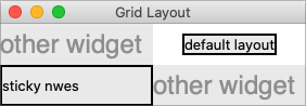
Layout within the cell and the 'sticky' option.
The sticky option can change this default behavior.
It consists of 0 or more of the compass directions n, s, e, and w,
specifying which edges of the cell the widget should be "stuck" to. For example, a
value of n (north) will jam the widget up against the top side, with any extra vertical
space on the bottom; the widget will still be centered horizontally. A value of nw (north-west)
means the widget will be stuck to the top left corner, with extra space on the bottom and right.
In Tkinter, you can also specify this as a list or tuple containing any of N, S, E, and W.
You can use the constants provided by Tkinter, or just string literals. It's a stylistic choice, and we'll tend to use the list format in this book.
Specifying two opposite edges, such as we (west, east), means the widget will be stretched.
In this case, it will be stuck to both the left and right edges of the cell. So the widget will be wider
than its "ideal" size.
If you want the widget to expand to fill up the entire cell, grid it with a sticky value of nsew
(north, south, east, west), meaning it will stick to every side. This is shown in the bottom left widget in the above figure.
Most widgets have options that can control how they are displayed if
they are larger than needed. For example, a label widget has an anchor option that
controls where the label's text will be positioned within the widget's boundaries. The bottom left label
in the figure above uses the default anchor (w, i.e., left side, vertically centered).
If you're having trouble getting things to line up the way you want them to,
first make sure you know how large the widget is. As discussed with the
label widget in the previous chapter, changing the widget's background or border can help.
Handling resize
If you've tried to resize the example, you'll notice that nothing moves at all, as shown below.
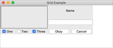
Resizing the window.
Even if you took a peek below and added the extra sticky options to our example, you'd still see the
same thing. It looks like sticky may tell Tk how to react if the cell's row or column does resize
but doesn't actually say that the row or columns should resize if any extra room becomes available.
Let's fix that.
Every column and row in the grid has a weight option associated with it. This tells grid how much
the column or row should grow if there is extra room in the master to fill. By default, the weight of each column or
row is 0, meaning it won't expand to fill any extra space.
For the user interface to resize, we'll need to specify a positive weight to the columns and rows that
we'd like to expand. You must provide weights for at least one column and one row. This is done using the columnconfigure and rowconfigure methods of grid.
This weight is relative. If two columns have the same weight, they'll expand at the same rate. In our example, we'll give the three leftmost columns (holding the checkbuttons) weights of 3 and the two rightmost columns weights of 1. For every one pixel the right columns grow, the left columns will grow by three pixels. So as the window grows larger, most of the extra space will go to the left side.
content.columnconfigure(0, weight=3)
content.columnconfigure(1, weight=3)
content.columnconfigure(2, weight=3)
content.columnconfigure(3, weight=1)
content.columnconfigure(4, weight=1)
content.rowconfigure(1, weight=1)
grid columnconfigure .c 0 -weight 3
grid columnconfigure .c 1 -weight 3
grid columnconfigure .c 2 -weight 3
grid columnconfigure .c 3 -weight 1
grid columnconfigure .c 4 -weight 1
grid rowconfigure .c 1 -weight 1TkGrid.columnconfigure( content, 0, :weight => 3 )
TkGrid.columnconfigure( content, 1, :weight => 3 )
TkGrid.columnconfigure( content, 2, :weight => 3 )
TkGrid.columnconfigure( content, 3, :weight => 1 )
TkGrid.columnconfigure( content, 4, :weight => 1 )
TkGrid.rowconfigure( content, 1, :weight => 1)$content->g_grid_columnconfigure(0, -weight => 3);
$content->g_grid_columnconfigure(1, -weight => 3);
$content->g_grid_columnconfigure(2, -weight => 3);
$content->g_grid_columnconfigure(3, -weight => 1);
$content->g_grid_columnconfigure(4, -weight => 1);
$content->g_grid_rowconfigure(1, -weight => 1);If you add those lines of code and then resize the window in the application… still nothing. Why?
We've told Tk how we want the widgets inside the content frame to expand. But remember that the content frame itself is gridded into the root application window. So we need to tell the root window to give any extra space to the row and column holding our content frame.
root.columnconfigure(0, weight=1)
root.rowconfigure(0, weight=1)grid columnconfigure . 0 -weight 1
grid rowconfigure . 0 -weight 1TkGrid.columnconfigure( root, 0, :weight => 1 )
TkGrid.rowconfigure( root, 0, :weight => 1 )$mw->g_grid_columnconfigure(0, -weight => 1);
$mw->g_grid_rowconfigure(0, -weight => 1);Add those lines and try again. Much better.

Resizing the window after adding weights.
For additional control, both columnconfigure and rowconfigure also take a minsize grid option,
which specifies a minimum size you really don't want the column or row to shrink beyond.
You can also disable resizing on the toplevel window using the following code; we'll discuss this in a later chapter.
window.resizable(False, False)wm resizable .window 0 0window['resizable'] = false, false$window->g_wm_resizable(0,0);Padding
Normally, each column or row is directly adjacent to the next so that widgets are right next to each other. This is sometimes what you want (think of a listbox and its scrollbar), but often you want some space between widgets. In Tk, this is called padding, and there are several ways you can choose to add it.
We've already actually seen one way, and that is using a widget's own options to add the extra
space around it. Not all widgets have this, but one that does is a frame; this is useful because
frames are most often used as the master to grid other widgets. The frame's padding
option lets you specify a bit of extra padding inside the frame, whether the same amount for
each of the four sides or even different amounts of padding for each.
A second way is using the padx and pady grid options when adding the widget. As you'd
expect, padx puts a bit of extra space to the left and right of the widget you're adding, while pady
adds extra space top and bottom. A single value for the option puts the same padding on
both left and right (or top and bottom), while a two-value list lets you put different amounts
on left and right (or top and bottom). Note that this extra padding is within the grid cell
containing the widget.
The columnconfigure and rowconfigure methods accept a pad option. This increases the requested size for each widget to
account for padding, but does not put extra padding around the widget, which must still be done via padx and/or pady.
Let's add the extra sticky, resizing, and padding behavior to our example (additions in bold).
from tkinter import *
from tkinter import ttk
root = Tk()
content = ttk.Frame(root, padding=(3,3,12,12))
frame = ttk.Frame(content, borderwidth=5, relief="ridge", width=200, height=100)
namelbl = ttk.Label(content, text="Name")
name = ttk.Entry(content)
onevar = BooleanVar()
twovar = BooleanVar()
threevar = BooleanVar()
onevar.set(True)
twovar.set(False)
threevar.set(True)
one = ttk.Checkbutton(content, text="One", variable=onevar, onvalue=True)
two = ttk.Checkbutton(content, text="Two", variable=twovar, onvalue=True)
three = ttk.Checkbutton(content, text="Three", variable=threevar, onvalue=True)
ok = ttk.Button(content, text="Okay")
cancel = ttk.Button(content, text="Cancel")
content.grid(column=0, row=0, sticky=(N, S, E, W))
frame.grid(column=0, row=0, columnspan=3, rowspan=2, sticky=(N, S, E, W))
namelbl.grid(column=3, row=0, columnspan=2, sticky=(N, W), padx=5)
name.grid(column=3, row=1, columnspan=2, sticky=(N,E,W), pady=5, padx=5)
one.grid(column=0, row=5)
two.grid(column=1, row=5)
three.grid(column=2, row=5)
ok.grid(column=3, row=5)
cancel.grid(column=4, row=5)
root.columnconfigure(0, weight=1)
root.rowconfigure(0, weight=1)
content.columnconfigure(0, weight=3)
content.columnconfigure(1, weight=3)
content.columnconfigure(2, weight=3)
content.columnconfigure(3, weight=1)
content.columnconfigure(4, weight=1)
content.rowconfigure(1, weight=1)
root.mainloop()ttk::frame .c -padding "3 3 12 12"
ttk::frame .c.f -borderwidth 5 -relief ridge -width 200 -height 100
ttk::label .c.namelbl -text Name
ttk::entry .c.name
ttk::checkbutton .c.one -text One -variable one -onvalue 1; set one 1
ttk::checkbutton .c.two -text Two -variable two -onvalue 1; set two 0
ttk::checkbutton .c.three -text Three -variable three -onvalue 1; set three 1
ttk::button .c.ok -text Okay
ttk::button .c.cancel -text Cancel
grid .c -column 0 -row 0 -sticky nsew
grid .c.f -column 0 -row 0 -columnspan 3 -rowspan 2 -sticky nsew
grid .c.namelbl -column 3 -row 0 -columnspan 2 -sticky nw -padx 5
grid .c.name -column 3 -row 1 -columnspan 2 -sticky new -pady 5 -padx 5
grid .c.one -column 0 -row 5
grid .c.two -column 1 -row 5
grid .c.three -column 2 -row 5
grid .c.ok -column 3 -row 5
grid .c.cancel -column 4 -row 5
grid columnconfigure . 0 -weight 1
grid rowconfigure . 0 -weight 1
grid columnconfigure .c 0 -weight 3
grid columnconfigure .c 1 -weight 3
grid columnconfigure .c 2 -weight 3
grid columnconfigure .c 3 -weight 1
grid columnconfigure .c 4 -weight 1
grid rowconfigure .c 1 -weight 1require 'tk'
require 'tkextlib/tile'
root = TkRoot.new
content = Tk::Tile::Frame.new(root) {padding "3 3 12 12"}
frame = Tk::Tile::Frame.new(content) {borderwidth 5; relief "ridge"; width 200; height 100}
namelbl = Tk::Tile::Label.new(content) {text "Name"}
name = Tk::Tile::Entry.new(content)
$option_one = TkVariable.new( 1 )
one = Tk::Tile::CheckButton.new(content) {text "One"; variable $option_one; onvalue 1}
$option_two = TkVariable.new( 0 )
two = Tk::Tile::CheckButton.new(content) {text "Two"; variable $option_two; onvalue 1}
$option_three = TkVariable.new( 1 )
three = Tk::Tile::CheckButton.new(content) {text "Three"; variable $option_three; onvalue 1}
ok = Tk::Tile::Button.new(content) {text "Okay"}
cancel = Tk::Tile::Button.new(content) {text "Cancel"}
content.grid :column => 0, :row => 0, :sticky => 'nsew'
frame.grid :column => 0, :row => 0, :columnspan => 3, :rowspan => 2, :sticky => 'nsew'
namelbl.grid :column => 3, :row => 0, :columnspan => 2, :sticky => 'nw', :padx => 5
name.grid :column => 3, :row => 1, :columnspan => 2, :sticky => 'new', :pady => 5, :padx => 5
one.grid :column => 0, :row => 5
two.grid :column => 1, :row => 5
three.grid :column => 2, :row => 5
ok.grid :column => 3, :row => 5
cancel.grid :column => 4, :row => 5
TkGrid.columnconfigure( root, 0, :weight => 1 )
TkGrid.rowconfigure( root, 0, :weight => 1 )
TkGrid.columnconfigure( content, 0, :weight => 3 )
TkGrid.columnconfigure( content, 1, :weight => 3 )
TkGrid.columnconfigure( content, 2, :weight => 3 )
TkGrid.columnconfigure( content, 3, :weight => 1 )
TkGrid.columnconfigure( content, 4, :weight => 1 )
TkGrid.rowconfigure( content, 1, :weight => 1)
Tk.mainloopuse Tkx;
my $mw = Tkx::widget->new(".");
my $content = $mw->new_ttk__frame(-padding => "3 3 12 12");
my $frame = $content->new_ttk__frame(-borderwidth => 5, -relief => "ridge", -width => 200, -height => 100);
my $namelbl = $content->new_ttk__label(-text => "Name");
my $name = $content->new_ttk__entry;
$option_one = 1; $option_two = 0; $option_three = 1;
my $one = $content->new_ttk__checkbutton(-text => "One", -variable => \$option_one, -onvalue => 1);
my $two = $content->new_ttk__checkbutton(-text => "Two", -variable => \$option_two, -onvalue => 1);
my $three = $content->new_ttk__checkbutton(-text => "Three", -variable => \$option_three, -onvalue => 1);
my $ok = $content->new_ttk__button(-text => "Okay");
my $cancel = $content->new_ttk__button(-text => "Cancel");
$content->g_grid(-column => 0, -row => 0, -sticky => "nsew");
$frame->g_grid(-column => 0, -row => 0, -columnspan => 3, -rowspan => 2, -sticky => "nsew");
$namelbl->g_grid(-column => 3, -row => 0, -columnspan => 2, -sticky => "nw", -padx => 5);
$name->g_grid(-column => 3, -row => 1, -columnspan => 2, -sticky => "new", -pady => 5, -padx => 5);
$one->g_grid(-column => 0, -row => 5);
$two->g_grid(-column => 1, -row => 5);
$three->g_grid(-column => 2, -row => 5);
$ok->g_grid(-column => 3, -row => 5);
$cancel->g_grid(-column => 4, -row => 5);
$mw->g_grid_columnconfigure(0, -weight => 1);
$mw->g_grid_rowconfigure(0, -weight => 1);
$content->g_grid_columnconfigure(0, -weight => 3);
$content->g_grid_columnconfigure(1, -weight => 3);
$content->g_grid_columnconfigure(2, -weight => 3);
$content->g_grid_columnconfigure(3, -weight => 1);
$content->g_grid_columnconfigure(4, -weight => 1);
$content->g_grid_rowconfigure(1, -weight => 1);
Tkx::MainLoop;This looks more promising. Play around with the example to get a feel for the resize behavior.
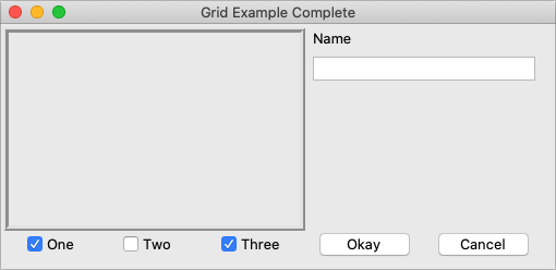
Grid example, handling in-cell layout and resize.
Additional grid features
If you look at the reference documentation for grid, you'll see
many other things you can do with grid. Here are a few of the more useful ones.
Querying and changing grid options
Like widgets themselves, it's easy to introspect the various grid options or change them. Setting options when you first grid the widget is certainly convenient, but you can change them anytime you'd like.
The slaves method will tell you all the widgets that have been gridded inside a master, or optionally
those within just a certain column or row. The info method will return a list of all the grid
options for a widget and their values. Finally, the configure method lets you change one or more
grid options on a widget.
These are illustrated in this interactive session:
>>> content.grid_slaves()
[<tkinter.ttk.Button object .!frame.!button2>, <tkinter.ttk.Button object .!frame.!button>,
<tkinter.ttk.Checkbutton object .!frame.!checkbutton3>, <tkinter.ttk.Checkbutton object .!frame.!checkbutton2>,
<tkinter.ttk.Checkbutton object .!frame.!checkbutton>, <tkinter.ttk.Entry object .!frame.!entry>,
<tkinter.ttk.Label object .!frame.!label>, <tkinter.ttk.Frame object .!frame.!frame>]
>>> for w in content.grid_slaves(): print(w)
...
.!frame.!button2
.!frame.!button
.!frame.!checkbutton3
.!frame.!checkbutton2
.!frame.!checkbutton
.!frame.!entry
.!frame.!label
.!frame.!frame
>>> for w in content.grid_slaves(row=3): print(w)
...
.!frame.!button2
.!frame.!button
.!frame.!checkbutton3
.!frame.!checkbutton2
.!frame.!checkbutton
>>> for w in content.grid_slaves(column=0): print(w)
...
.!frame.!checkbutton
.!frame.!frame
>>> namelbl.grid_info()
{'in': <tkinter.ttk.Frame object .!frame>, 'column': 3, 'row': 0, 'columnspan': 2, 'rowspan': 1,
'ipadx': 0, 'ipady': 0, 'padx': 5, 'pady': 0, 'sticky': 'nw'}
>>> namelbl.grid_configure(sticky=(E,W))
>>> namelbl.grid_info()
{'in': <tkinter.ttk.Frame object .!frame>, 'column': 3, 'row': 0, 'columnspan': 2, 'rowspan': 1,
'ipadx': 0, 'ipady': 0, 'padx': 5, 'pady': 0, 'sticky': 'ew'}% grid slaves .c .c.cancel .c.ok .c.three .c.two .c.one .c.name .c.namelbl .c.f % grid slaves .c -row 3 .c.cancel .c.ok .c.three .c.two .c.one % grid slaves .c -column 0 .c.one .c.f % grid info .c.namelbl -in .c -column 3 -row 0 -columnspan 2 -rowspan 1 -ipadx 0 -ipady 0 -padx 5 -pady 0 -sticky nw % grid configure .c.namelbl -sticky ew % grid info .c.namelbl -in .c -column 3 -row 0 -columnspan 2 -rowspan 1 -ipadx 0 -ipady 0 -padx 5 -pady 0 -sticky ew
>> TkGrid.slaves(content, nil)
=> [#<Tk::Tile::TButton:0x380fa4 @path=".w00000.w00008">,
#<Tk::Tile::TButton:0x500d20 @path=".w00000.w00007">,
#<Tk::Tile::TCheckButton:0x50aac8 @path=".w00000.w00006">,
#<Tk::Tile::TCheckButton:0x524158 @path=".w00000.w00005">,
#<Tk::Tile::TCheckButton:0x54b4b0 @path=".w00000.w00004">,
#<Tk::Tile::TEntry:0x5d07a0 @path=".w00000.w00003">,
#<Tk::Tile::TLabel:0x5fa9b0 @path=".w00000.w00002">,
#<Tk::Tile::TFrame:0x5ff280 @visual=nil, @container=nil, @colormap=nil,
@path=".w00000.w00001", @db_class=Tk::Tile::TFrame, @classname="TFrame">]
>> TkGrid.slaves(content, :row => 3)
=> [#<Tk::Tile::TButton:0x380fa4 @path=".w00000.w00008">,
#<Tk::Tile::TButton:0x500d20 @path=".w00000.w00007">,
#<Tk::Tile::TCheckButton:0x50aac8 @path=".w00000.w00006">,
#<Tk::Tile::TCheckButton:0x524158 @path=".w00000.w00005">,
#<Tk::Tile::TCheckButton:0x54b4b0 @path=".w00000.w00004">]
>> TkGrid.slaves(content, :column => 0)
=> [#<Tk::Tile::TCheckButton:0x54b4b0 @path=".w00000.w00004">,
#<Tk::Tile::TFrame:0x5ff280 @visual=nil, @container=nil, @colormap=nil,
@path=".w00000.w00001", @db_class=Tk::Tile::TFrame, @classname="TFrame">]
>> TkGrid.info(namelbl)
=> {"ipadx"=>0, "ipady"=>0, "columnspan"=>2, "row"=>0, "column"=>3,
"in"=>#<Tk::Tile::TFrame:0x60ef78 @visual=nil, @container=nil, @colormap=nil,
@path=".w00000", @db_class=Tk::Tile::TFrame, @classname="TFrame">, "rowspan"=>1,
"sticky"=>"nw", "padx"=>5, "pady"=>0}
>> TkGrid.configure(namelbl, :sticky => 'ew')
=> ""
>> TkGrid.info(namelbl)
=> {"ipadx"=>0, "ipady"=>0, "columnspan"=>2, "row"=>0, "column"=>3,
"in"=>#<Tk::Tile::TFrame:0x60ef78 @visual=nil, @container=nil, @colormap=nil,
@path=".w00000", @db_class=Tk::Tile::TFrame, @classname="TFrame">, "rowspan"=>1,
"sticky"=>"ew", "padx"=>5, "pady"=>0}
Perl> $content->g_grid_slaves .f.b2 .f.b .f.c3 .f.c2 .f.c .f.e .f.l .f.f Perl> $content->g_grid_slaves(-row => 3) .f.b2 .f.b .f.c3 .f.c2 .f.c Perl> $content->g_grid_slaves(-column => 0) .f.c .f.f Perl> $namelbl->g_grid_info -in .f -column 3 -row 0 -columnspan 2 -rowspan 1 -ipadx 0 -ipady 0 -padx 5 -pady 0 -sticky nw Perl> $namelbl->g_grid_configure(-sticky => "ew") Perl> $namelbl->g_grid_info -in .f -column 3 -row 0 -columnspan 2 -rowspan 1 -ipadx 0 -ipady 0 -padx 5 -pady 0 -sticky ew
Internal padding
You saw how the padx and pady grid options added extra space around the outside of a widget.
There's also a less used type of padding called "internal padding" controlled by the
grid options ipadx and ipady.
The difference can be subtle. Let's say you have a frame that's 20x20, and specify normal (external) padding of 5 pixels on each side. The frame will request a 20x20 rectangle (its natural size) from the geometry manager. Normally, that's what it will be granted, so it'll get a 20x20 rectangle for the frame, surrounded by a 5-pixel border.
With internal padding, the geometry manager will effectively add the extra padding to the widget when
figuring out its natural size, as if the widget has requested a 30x30 rectangle. If the frame is
centered or attached to a single side or corner (using sticky), we'll end up with a 20x20 frame
with extra space around it. If, however, the frame is set to stretch (i.e., a sticky value of we,
ns, or nwes), it will fill the extra space, resulting in a 30x30 frame with no border.
Forget and remove
The forget method of grid removes slaves from the grid they're currently part of.
It takes a list of one or more slave widgets as arguments. This does not destroy the widget altogether but takes it off the
screen as if it had not been gridded in the first place. You can grid it again later, though any grid options
you'd originally assigned will have been lost.
The remove method of grid works the same, except that the grid options will be remembered if you grid it again later.
Nested layouts
As your user interface gets more complicated, the grid that organizes all your widgets can get increasingly complicated. This can make changing and maintaining your program very difficult.
Luckily, you don't have to manage your entire user interface with a single grid. If you have one area of your user interface that is fairly independent of others, create a new frame and grid the widgets in the area within that frame. For example, if you were building a graphics editor with multiple palettes, toolbars, etc., each one of those areas might be a candidate for putting in its own frame.
In theory, these frames, each with its own grid, can be nested arbitrarily deep, though, in practice, this usually doesn't go beyond a few levels. This can be a big help in modularizing your program. If, for example, you have a palette of drawing tools, you can create the whole thing in a separate function or class. It would be responsible for creating all the component widgets, gridding them together, setting up event bindings, etc. The details of how things work inside that palette can be contained in that one piece of code. Your main program only needs to know about the single frame widget containing your palette.
Our examples have shown just a hint of this: a content frame was gridded into the main window, and then all the other widgets gridded into the content frame.
As your own programs grow, you'll likely run into situations where changing the layout of
one part of your interface requires code changes to the layout of another part. That may be a clue to reconsider
how you're using grid and if splitting out components into separate frames would help.
More Widgets
This chapter introduces several more widgets: listbox, scrollbar, text, scale, spinbox, and progressbar. Some of these are starting to be a bit more powerful than the basic ones we looked at before. Here we'll also see a few instances of using the classic Tk widgets in cases where there isn't (or there isn't a need for) a themed counterpart.
Listbox
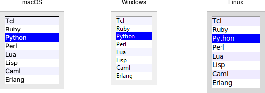
Listbox widgets.
A listbox widget displays a list of single-line text items, potentially lengthy, and allows users
to browse through the list, selecting one or more items.
Listboxes are part of the classic Tk widgets; there is not presently a listbox in the
themed Tk widget set.
Tk's treeview widget (which is themed) can also be used as a listbox (a one-level deep tree), allowing you to use icons and styles with the list. It's also likely that a multi-column (table) list widget will make it into Tk at some point, whether based on treeview or one of the available extensions.
Listboxes are created using the Listbox class. A height configuration option can specify the number of lines the listbox will display at a time without scrolling:
l = Listbox(parent, height=10)Listboxes are created using the tk::listbox command. A height configuration option can specify the number of lines the listbox will display at a time without scrolling:
tk::listbox .l -height 10Listboxes are created using the TkListbox class. A height configuration option can specify the number of lines the listbox will display at a time without scrolling:
l = TkListbox.new(parent) {height 10}Listboxes are created using the new_tk__listbox method, a.k.a. Tkx::tk__listbox. A height configuration option can specify the number of lines the listbox will display at a time without scrolling
$parent->new_tk__listbox(-height => 10);Populating the listbox items
There's an easy way and a hard way to populate and manage all the items in the listbox.
Here's the easy way. Each listbox has a listvariable configuration option, which allows you to
link a variable (which must hold a list) to the listbox. Each element of this list
is a string representing one item in the listbox. To add, remove, or rearrange
items in the listbox, you can simply modify this variable as you would any other
list. Similarly, to find out, e.g., which item is on the third line of the listbox, just
look at the third element of the list variable.
listbox.
As we saw with widgets like entry, we need to use a StringVar as an intermediary. It provides a
mapping between Python's lists and a string representation that the underlying Tk widgets can use. It also means that anytime we change the list, we need to update the StringVar.
choices = ["apple", "orange", "banana"]
choicesvar = StringVar(value=choices)
l = Listbox(parent, listvariable=choicesvar)
...
choices.append("peach")
choicesvar.set(choices)Unfortunately, you can't pass a reference to a Perl list for this listvariable parameter.
It actually requires a Tcl formatted list, which is a string with elements separated by spaces,
and braces around all but the simplest elements. So, you'll need to do the conversion
yourself. There's a simple one-liner in the upcoming example that handles converting fairly
simple lists, but for unknown data you'll need something more robust.
The older, harder way is to use a set of methods that are part of the listbox widget itself. They operate on the (internal) list of items maintained by the widget:
- The
insert idx item ?item...?method is used to add one or more items to the list;idxis a 0-based index indicating the position of the item before which the item(s) should be added; specifyendto put the new items at the end of the list. - Use the
delete first ?last?method to delete one or more items from the list;firstandlastare indices as per theinsertmethod. - Use the
get first ?last?method to deselect either a single item or any within the range of indices specified. To select an item or all items in a range, use theselection_set first ?last?method. Both of these will not touch the selection of any items outside the range specified.If you change the selection, you should also ensure that the newly selected item is visible (i.e., it is not scrolled out of view). To do this, use the
seemethod.lbox.selection_set(idx) lbox.see(idx)$lbox selection set $idx $lbox see $idx$lbox.selection_set(idx) $lbox.see(idx)$lbox->selection_set($idx); $lbox->see($idx);When a user changes the selection, a
<<ListboxSelect>>virtual event is generated. You can bind to this to take any action you need. Depending on your application, you may also want to bind to a double-click<Double-1>event and use it to invoke an action with the currently selected item.lbox.bind("<<ListboxSelect>>", lambda e: updateDetails(lbox.curselection())) lbox.bind("<Double-1>", lambda e: invokeAction(lbox.curselection()))bind $lbox <<ListboxSelect>> {updateDetails [$lbox curselection]} bind $lbox <Double-1> {invokeAction [$lbox curselection]}$lbox.bind('<ListboxSelect>', proc{updateDetails($lbox.curselection)}) $lbox.bind('Double-1', proc{invokeAction($lbox.curselection)})$lbox->g_bind(<<ListboxSelect>>", sub {updateDetails($lbox->curselection)})' $lbox->g_bind(<Double-1>", sub {invokeAction($lbox->curselection)});Styling the list
Like most of the "classic" Tk widgets, you have immense flexibility in modifying the appearance of a listbox. As described in the reference manual, you can modify the font the listbox items are displayed in, the foreground (text) and background colors for items in their normal state, when selected, when the widget is disabled, etc. There is also an
itemconfiguremethod that allows you to change the foreground and background colors of individual items.As is often the case, restraint is useful. Generally, the default values will be entirely suitable and a good match for platform conventions. In the example we'll get to momentarily, we'll show how restrained use of these options can be put to good effect, in this case displaying alternate lines of the listbox in slightly different colors.
Keeping extra item data
The
listvariable(or the internal list, if you're managing things the old way) holds the strings that will be displayed in the listbox. It's often the case, though, that each string you're displaying is associated with some other data item. This might be an internal object meaningful to your program but not meant to be displayed to users. In other words, what you're really interested in is not so much the string displayed in the listbox but the associated data item. For example, a listbox may display a list of names to users, but your program is really interested in the underlying user object (or id number) for each one, not the particular name.How can we associate this underlying value with the name that is displayed? Unfortunately, the listbox widget itself doesn't offer any facilities, so it's something we'll have to manage separately. There are a couple of obvious approaches. First, if the displayed strings are guaranteed unique, you could use a dictionary to map each name to its associated underlying object. This wouldn't work well for peoples' names, where duplicates are possible, but could work for countries, which are unique.
Another approach is to keep a second list parallel to the list of strings displayed in the listbox. This second list will hold the underlying object associated with each item that is displayed. So the first item in the displayed strings list corresponds to the first item in the underlying objects list, the second to the second, etc. Any changes that you make in one list (insert, delete, reorder), you must make in the other. You can then easily map from the displayed list item to the underlying object based on their position in the list.
Example
Here is a silly example showing several of these listbox techniques. We'll display a list of countries and allow selecting only a single country at a time. When we do, a status bar displays the population of the country. You can press a button to send one of several gifts to the selected country's head of state (well, not really, but use your imagination). Sending a gift can also be triggered by double-clicking the list or hitting the Return key.
Behind the scenes, we maintain two lists in parallel. The first is a list of two-letter country codes. The other is the corresponding name for each country that we will display in the listbox. We also have a dictionary that contains the population of each country, indexed by its two-letter country code.
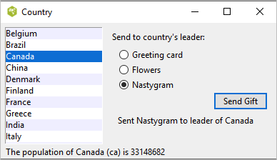
Country selector listbox example.from tkinter import * from tkinter import ttk root = Tk() # Initialize our country "databases": # - the list of country codes (a subset anyway) # - parallel list of country names, same order as the country codes # - a hash table mapping country code to population countrycodes = ('ar', 'au', 'be', 'br', 'ca', 'cn', 'dk', 'fi', 'fr', 'gr', 'in', 'it', 'jp', 'mx', 'nl', 'no', 'es', 'se', 'ch') countrynames = ('Argentina', 'Australia', 'Belgium', 'Brazil', 'Canada', 'China', 'Denmark', 'Finland', 'France', 'Greece', 'India', 'Italy', 'Japan', 'Mexico', 'Netherlands', 'Norway', 'Spain', 'Sweden', 'Switzerland') cnames = StringVar(value=countrynames) populations = {'ar':41000000, 'au':21179211, 'be':10584534, 'br':185971537, 'ca':33148682, 'cn':1323128240, 'dk':5457415, 'fi':5302000, 'fr':64102140, 'gr':11147000, 'in':1131043000, 'it':59206382, 'jp':127718000, 'mx':106535000, 'nl':16402414, 'no':4738085, 'es':45116894, 'se':9174082, 'ch':7508700} # Names of the gifts we can send gifts = { 'card':'Greeting card', 'flowers':'Flowers', 'nastygram':'Nastygram'} # State variables gift = StringVar() sentmsg = StringVar() statusmsg = StringVar() # Called when the selection in the listbox changes; figure out # which country is currently selected, and then lookup its country # code, and from that, its population. Update the status message # with the new population. As well, clear the message about the # gift being sent, so it doesn't stick around after we start doing # other things. def showPopulation(*args): idxs = lbox.curselection() if len(idxs)==1: idx = int(idxs[0]) code = countrycodes[idx] name = countrynames[idx] popn = populations[code] statusmsg.set(f"The population of {name} ({code}) is {popn}") sentmsg.set('') # Called when the user double clicks an item in the listbox, presses # the "Send Gift" button, or presses the Return key. In case the selected # item is scrolled out of view, make sure it is visible. # # Figure out which country is selected, which gift is selected with the # radiobuttons, "send the gift", and provide feedback that it was sent. def sendGift(*args): idxs = lbox.curselection() if len(idxs)==1: idx = int(idxs[0]) lbox.see(idx) name = countrynames[idx] # Gift sending left as an exercise to the reader sentmsg.set(f"Sent {gifts[gift.get()]} to leader of {name}") # Create and grid the outer content frame c = ttk.Frame(root, padding=(5, 5, 12, 0)) c.grid(column=0, row=0, sticky=(N,W,E,S)) root.grid_columnconfigure(0, weight=1) root.grid_rowconfigure(0,weight=1) # Create the different widgets; note the variables that many # of them are bound to, as well as the button callback. # We're using the StringVar() 'cnames', constructed from 'countrynames' lbox = Listbox(c, listvariable=cnames, height=5) lbl = ttk.Label(c, text="Send to country's leader:") g1 = ttk.Radiobutton(c, text=gifts['card'], variable=gift, value='card') g2 = ttk.Radiobutton(c, text=gifts['flowers'], variable=gift, value='flowers') g3 = ttk.Radiobutton(c, text=gifts['nastygram'], variable=gift, value='nastygram') send = ttk.Button(c, text='Send Gift', command=sendGift, default='active') sentlbl = ttk.Label(c, textvariable=sentmsg, anchor='center') status = ttk.Label(c, textvariable=statusmsg, anchor=W) # Grid all the widgets lbox.grid(column=0, row=0, rowspan=6, sticky=(N,S,E,W)) lbl.grid(column=1, row=0, padx=10, pady=5) g1.grid(column=1, row=1, sticky=W, padx=20) g2.grid(column=1, row=2, sticky=W, padx=20) g3.grid(column=1, row=3, sticky=W, padx=20) send.grid(column=2, row=4, sticky=E) sentlbl.grid(column=1, row=5, columnspan=2, sticky=N, pady=5, padx=5) status.grid(column=0, row=6, columnspan=2, sticky=(W,E)) c.grid_columnconfigure(0, weight=1) c.grid_rowconfigure(5, weight=1) # Set event bindings for when the selection in the listbox changes, # when the user double clicks the list, and when they hit the Return key lbox.bind('<<ListboxSelect>>', showPopulation) lbox.bind('<Double-1>', sendGift) root.bind('<Return>', sendGift) # Colorize alternating lines of the listbox for i in range(0,len(countrynames),2): lbox.itemconfigure(i, background='#f0f0ff') # Set the starting state of the interface, including selecting the # default gift to send, and clearing the messages. Select the first # country in the list; because the <<ListboxSelect>> event is only # fired when users makes a change, we explicitly call showPopulation. gift.set('card') sentmsg.set('') statusmsg.set('') lbox.selection_set(0) showPopulation() root.mainloop()# Initialize our country "databases": # - the list of country codes (a subset anyway) # - parallel list of country names, same order as the country codes # - a hash table mapping country code to population set countrycodes [list ar au be br ca cn dk fi fr gr in it jp mx nl no es se ch] set countrynames [list Argentina Australia Belgium Brazil Canada China Denmark \ Finland France Greece India Italy Japan Mexico Netherlands Norway Spain \ Sweden Switzerland] array set populations [list ar 41000000 au 21179211 be 10584534 br 185971537 \ ca 33148682 cn 1323128240 dk 5457415 fi 5302000 fr 64102140 gr 11147000 \ in 1131043000 it 59206382 jp 127718000 mx 106535000 nl 16402414 \ no 4738085 es 45116894 se 9174082 ch 7508700] # Names of the gifts we can send array set gifts [list card "Greeting card" flowers "Flowers" nastygram "Nastygram"] # Create and grid the outer content frame grid [ttk::frame .c -padding "5 5 12 0"] -column 0 -row 0 -sticky nwes grid columnconfigure . 0 -weight 1; grid rowconfigure . 0 -weight 1 # Create the different widgets; note the variables that many # of them are bound to, as well as the button callback. # The listbox is the only widget we'll need to refer to directly # later in our program, so for convenience we'll assign it to a variable. set ::lbox [tk::listbox .c.countries -listvariable countrynames -height 5] ttk::label .c.lbl -text "Send to country's leader:" ttk::radiobutton .c.g1 -text $gifts(card) -variable gift -value card ttk::radiobutton .c.g2 -text $gifts(flowers) -variable gift -value flowers ttk::radiobutton .c.g3 -text $gifts(nastygram) -variable gift -value nastygram ttk::button .c.send -text "Send Gift" -command {sendGift} -default active ttk::label .c.sentlbl -textvariable sentmsg -anchor center ttk::label .c.status -textvariable statusmsg -anchor w # Grid all the widgets grid .c.countries -column 0 -row 0 -rowspan 6 -sticky nsew grid .c.lbl -column 1 -row 0 -padx 10 -pady 5 grid .c.g1 -column 1 -row 1 -sticky w -padx 20 grid .c.g2 -column 1 -row 2 -sticky w -padx 20 grid .c.g3 -column 1 -row 3 -sticky w -padx 20 grid .c.send -column 2 -row 4 -sticky e grid .c.sentlbl -column 1 -row 5 -columnspan 2 -sticky n -pady 5 -padx 5 grid .c.status -column 0 -row 6 -columnspan 2 -sticky we grid columnconfigure .c 0 -weight 1; grid rowconfigure .c 5 -weight 1 # Set event bindings for when the selection in the listbox changes, # when the user double clicks the list, and when they hit the Return key bind $::lbox <<ListboxSelect>> "showPopulation" bind $::lbox <Double-1> "sendGift" bind . <Return> "sendGift" # Called when the selection in the listbox changes; figure out # which country is currently selected, and then lookup its country # code, and from that, its population. Update the status message # with the new population. As well, clear the message about the # gift being sent, so it doesn't stick around after we start doing # other things. proc showPopulation {} { set idx [$::lbox curselection] if {[llength $idx]==1} { set code [lindex $::countrycodes $idx] set name [lindex $::countrynames $idx] set popn $::populations($code) set ::statusmsg "The population of $name ($code) is $popn" } set ::sentmsg "" } # Called when the user double clicks an item in the listbox, presses # the "Send Gift" button, or presses the Return key. In case the selected # item is scrolled out of view, make sure it is visible. # # Figure out which country is selected, which gift is selected with the # radiobuttons, "send the gift", and provide feedback that it was sent. proc sendGift {} { set idx [$::lbox curselection] if {[llength $idx]==1} { $::lbox see $idx set name [lindex $::countrynames $idx] # Gift sending left as an exercise to the reader set ::sentmsg "Sent $::gifts($::gift) to leader of $name" } } # Colorize alternating lines of the listbox for {set i 0} {$i<[llength $countrynames]} {incr i 2} { $::lbox itemconfigure $i -background #f0f0ff } # Set the starting state of the interface, including selecting the # default gift to send, and clearing the messages. Select the first # country in the list; because the <<ListboxSelect>> event is only # fired when users makes a change, we explicitly call showPopulation. set gift card set sentmsg "" set statusmsg "" $::lbox selection set 0 showPopulationrequire 'tkextlib/tile' # Initialize our country "databases": # - the list of country codes (a subset anyway) # - parallel list of country names, same order as the country codes # - a hash table mapping country code to population $countrycodes = %w{ ar au be br ca cn dk fi fr gr in it jp mx nl no es se ch } $countrynames = %w{ Argentina Australia Belgium Brazil Canada China Denmark Finland France Greece India Italy Japan Mexico Netherlands Norway Spain Sweden Switzerland} $populations = { 'ar' => 41000000, 'au' => 21179211, 'be' => 10584534, 'br' => 185971537, 'ca' => 33148682, 'cn' => 1323128240, 'dk' => 5457415, 'fi' => 5302000, 'fr' => 64102140, 'gr' => 11147000, 'in' => 1131043000, 'it' => 59206382, 'jp' => 127718000, 'mx' => 106535000, 'nl' => 16402414, 'no' => 4738085, 'es' => 45116894, 'se' => 9174082, 'ch' => 7508700} # Names of the gifts we can send $gifts = { 'card' => "Greeting card", 'flowers' => "Flowers", 'nastygram' => "Nastygram" } # Create and initialize the linked variables we'll need in the interface $gift = TkVariable.new( "card" ) $names = TkVariable.new ( $countrynames ) $sent = TkVariable.new ( "" ) $status = TkVariable.new ( "" ) # Create and grid the outer content frame root = TkRoot.new content = Tk::Tile::Frame.new(root) {padding "5 5 12 0"}.grid :column => 0, :row => 0, :sticky => "nwes" TkGrid.columnconfigure root, 0, :weight => 1 TkGrid.rowconfigure root, 0, :weight => 1 # Create the different widgets; note the variables that many # of them are bound to, as well as the button callback. $countries = TkListbox.new(content) {listvariable $names; height 5} sendlbl = Tk::Tile::Label.new(content) {text "Send to country's leader:"} gift1 = Tk::Tile::Radiobutton.new(content) {text $gifts['card']; variable $gift; value 'card'} gift2 = Tk::Tile::Radiobutton.new(content) {text $gifts['flowers']; variable $gift; value 'floweres'} gift3 = Tk::Tile::Radiobutton.new(content) {text $gifts['nastygram']; variable $gift; value 'nastygram'} send = Tk::Tile::Button.new(content) {text "Send Gift"; command "sendGift"; default "active"} sentlbl = Tk::Tile::Label.new(content) {textvariable $sent; anchor "center"} statuslbl = Tk::Tile::Label.new(content) {textvariable $status; anchor "w"} # Grid all the widgets $countries.grid :column => 0, :row => 0, :rowspan => 6, :sticky => 'nsew' sendlbl.grid :column => 1, :row => 0, :padx => 10, :pady => 5 gift1.grid :column => 1, :row => 1, :sticky => 'w', :padx => 20 gift2.grid :column => 1, :row => 2, :sticky => 'w', :padx => 20 gift3.grid :column => 1, :row => 3, :sticky => 'w', :padx => 20 send.grid :column => 2, :row => 4, :sticky => 'e' sentlbl.grid :column => 1, :row => 5, :columnspan => 2, :sticky => 'n', :pady => 5, :padx => 5 statuslbl.grid :column => 0, :row => 6, :columnspan => 2, :sticky => 'we' TkGrid.columnconfigure content, 0, :weight => 1 TkGrid.rowconfigure content, 5, :weight => 1 # Set event bindings for when the selection in the listbox changes, # when the user double clicks the list, and when they hit the Return key $countries.bind '<ListboxSelect>', proc{showPopulation} $countries.bind 'Double-1', proc{sendGift} root.bind 'Return', proc{sendGift} # Called when the selection in the listbox changes; figure out # which country is currently selected, and then lookup its country # code, and from that, its population. Update the status message # with the new population. As well, clear the message about the # gift being sent, so it doesn't stick around after we start doing # other things. def showPopulation idx = $countries.curselection if idx.length==1 idx = idx[0] code = $countrycodes[idx] name = $countrynames[idx] popn = $populations[code] $status.value = "The population of #{name} (#{code}) is #{popn}" end $sent.value = "" end # Called when the user double clicks an item in the listbox, presses # the "Send Gift" button, or presses the Return key. In case the selected # item is scrolled out of view, make sure it is visible. # # Figure out which country is selected, which gift is selected with the # radiobuttons, "send the gift", and provide feedback that it was sent. def sendGift idx = $countries.curselection if idx.length==1 idx = idx[0] $countries.see idx name = $countrynames[idx] # Gift sending left as an exercise to the reader $sent.value = "Sent #{$gifts[$gift.value]} to leader of #{name}" end end # Colorize alternating lines of the listbox 0.step($countrycodes.length-1, 2) {|i| $countries.itemconfigure i, :background, "#f0f0ff"} # Select the first country in the list; because the <<ListboxSelect>> event is only # fired when users makes a change, we explicitly call showPopulation. $countries.selection_set 0 showPopulation Tk.mainloopuse Tkx; # Initialize our country "databases": # - the list of country codes (a subset anyway) # - parallel list of country names, same order as the country codes # - a hash table mapping country code to population @countrycodes = ("ar", "au", "be", "br", "ca", "cn", "dk", "fi", "fr", "gr", "in", "it", "jp", "mx", "nl", "no", "es", "se", "ch"); @countrynames = ("Argentina", "Australia", "Belgium", "Brazil", "Canada", "China", "Denmark", "Finland", "France", "Greece", "India", "Italy", "Japan", "Mexico", "Netherlands", "Norway", "Spain", "Sweden", "Switzerland"); %populations = ("ar" => 41000000, "au" => 21179211, "be" => 10584534, "br" => 185971537, "ca" => 33148682, "cn" => 1323128240, "dk" => 5457415, "fi" => 5302000, "fr" => 64102140, "gr" => 11147000, "in" => 1131043000, "it" => 59206382, "jp" => 127718000, "mx" => 106535000, "nl" => 16402414, "no" => 4738085, "es" => 45116894, "se" => 9174082, "ch" => 7508700); # Names of the gifts we can send %gifts =("card" => "Greeting card", "flowers" => "Flowers", "nastygram" => "Nastygram"); # Create and grid the outer content frame $mw = Tkx::widget->new("."); $content = $mw->new_ttk__frame(-padding => "5 5 12 0"); $content->g_grid(-column => 0, -row => 0, -sticky => "nwes"); $mw->g_grid_columnconfigure(0, -weight => 1); $mw->g_grid_rowconfigure(0, -weight => 1); # Create the different widgets; note the variables that many # of them are bound to, as well as the button callback. # The listbox is the only widget we'll need to refer to directly # later in our program, so for convenience we'll assign it to a variable. # Remember that we must use a Tcl formatted list for listvariable. $cnames = ''; foreach $i (@countrynames) {$cnames = $cnames . ' {' . $i . '}';}; $lbox = $content->new_tk__listbox(-listvariable => \$cnames, -height => 5); $lbl = $content->new_ttk__label(-text => "Send to country's leader:"); $g1 = $content->new_ttk__radiobutton(-text => $gifts{'card'}, -variable => \$gift, -value => 'card'); $g2 = $content->new_ttk__radiobutton(-text => $gifts{'flowers'}, -variable => \$gift, -value => 'flowers'); $g3 = $content->new_ttk__radiobutton(-text => $gifts{'nastygram'}, -variable => \$gift, -value => 'nastygram'); $send = $content->new_ttk__button(-text => "Send Gift", -command => sub {sendGift()}, -default => 'active'); $l1 = $content->new_ttk__label(-textvariable => \$sentmsg, -anchor => "center"); $l2 = $content->new_ttk__label(-textvariable => \$statusmsg, -anchor => "w"); # Grid all the widgets $lbox->g_grid(-column => 0, -row => 0, -rowspan => 6, -sticky => "nsew"); $lbl->g_grid(-column => 1, -row => 0, -padx => 10, -pady => 5); $g1->g_grid(-column => 1, -row => 1, -sticky => "w", -padx => 20); $g2->g_grid(-column => 1, -row => 2, -sticky => "w", -padx => 20); $g3->g_grid(-column => 1, -row => 3, -sticky => "w", -padx => 20); $send->g_grid(-column => 2, -row => 4, -sticky => "e"); $l1->g_grid(-column => 1, -row => 5, -columnspan => 2, -sticky => "n", -pady => 5, -padx => 5); $l2->g_grid(-column => 0, -row => 6, -columnspan => 2, -sticky => "we"); $content->g_grid_columnconfigure(0, -weight => 1); $content->g_grid_rowconfigure(0, -weight => 1); # Set event bindings for when the selection in the listbox changes, # when the user double clicks the list, and when they hit the Return key $lbox->g_bind("<<ListboxSelect>>", sub {showPopulation()}); $lbox->g_bind("<Double-1>", sub {sendGift()}); $mw->g_bind("<Return>", sub {sendGift()}); # Called when the selection in the listbox changes; figure out # which country is currently selected, and then lookup its country # code, and from that, its population. Update the status message # with the new population. As well, clear the message about the # gift being sent, so it doesn't stick around after we start doing # other things. sub showPopulation { my @idx = $lbox->curselection; if ($#idx==0) { my $code = $countrycodes[$idx[0]]; my $name = $countrynames[$idx[0]]; my $popn = $populations{$code}; $statusmsg = "The population of " . $name . "(" . $code . ") is $popn"; } $sentmsg = ""; } # Called when the user double clicks an item in the listbox, presses # the "Send Gift" button, or presses the Return key. In case the selected # item is scrolled out of view, make sure it is visible. # # Figure out which country is selected, which gift is selected with the # radiobuttons, "send the gift", and provide feedback that it was sent. sub sendGift { my @idx = $lbox->curselection; if ($#idx==0) { $lbox->see($idx[0]); my $name =$countrynames[$idx[0]]; # Gift sending left as an exercise to the reader $sentmsg = "Sent " . $gifts{$gift} . " to leader of " . $name } } # Colorize alternating lines of the listbox for ($i=0; $i<=$#countrynames; $i+=2) { $lbox->itemconfigure($i, -background => "#f0f0ff"); } # Set the starting state of the interface, including selecting the # default gift to send, and clearing the messages. Select the first # country in the list; because the <<ListboxSelect>> event is only # fired when users makes a change, we explicitly call showPopulation. $gift = 'card'; $sentmsg = ""; $statusmsg = ""; $lbox->selection_set(0); showPopulation; Tkx::MainLoop();One obvious thing missing from this example was that while the list of countries could be quite long, only part of it fits on the screen at once. To show countries further down in the list, you had to either drag with your mouse or use the down arrow key. A scrollbar would have been nice. Let's fix that.
Scrollbar

Scrollbar widgets.A scrollbar widget helps users see all parts of another widget, whose content is typically much larger than what can be shown in the available screen space.
Scrollbars are created using the
ttk.Scrollbarclass:s = ttk.Scrollbar( parent, orient=VERTICAL, command=listbox.yview) listbox.configure(yscrollcommand=s.set)Scrollbars are created using the
ttk::scrollbarcommand:ttk::scrollbar .s -orient vertical -command ".l yview" .l configure -yscrollcommand ".s set"Scrollbars are created using the
Tk::Tile::Scrollbarclass:s = Tk::Tile::Scrollbar.new(parent) {orient "vertical"; command proc{|*args| l.yview(*args);} } l['yscrollcommand'] = proc{|*args| s.set(*args);}Scrollbars are created using thenew_ttk__scrollbarmethod, a.k.a.Tkx::ttk__scrollbar:$s = $parent->new_ttk__scrollbar(-orient => 'vertical', -command => [$listbox, 'yview']); $listbox->configure(-scrollcommand => [$s, 'set']);Unlike in some user interface toolkits, Tk scrollbars are not a part of another widget (e.g., a listbox) but are a separate widget altogether. Instead, scrollbars communicate with the scrolled widget by calling methods on the scrolled widget; as it turns out, the scrolled widget also needs to call methods on the scrollbar.
If you're using a recent Linux distribution, you've probably noticed that the scrollbars you see in many applications have changed to look more like what you'd see on macOS. This newer look isn't supported on Linux by any of the default themes included with Tk. However, some third-party themes do support it.
The
orientconfiguration option determines whether the scrollbar will scroll the scrolled widget in thehorizontalorverticaldimension. You then need to use thecommandconfiguration option to specify how to communicate with the scrolled widget. This is the method to call on the scrolled widget when the scrollbar moves.Every widget that can be scrolled vertically includes a method named
yview, while those that can be scrolled horizontally have a method namedxview). As long as this method is present, the scrollbar doesn't need to know anything else about the scrolled widget. When the scrollbar is manipulated, it passes several parameters to the method call, indicating how it was scrolled, to what position, etc.The scrolled widget also needs to communicate back to the scrollbar, telling it what percentage of the entire content area is now visible. Besides the
yviewand/orxviewmethods, every scrollable widget also has ayscrollcommandand/orxscrollcommandconfiguration option. This is used to specify a method call, which must be the scrollbar'ssetmethod. Again, additional parameters will be automatically tacked onto the method call.Most scrollable widgets also have
xscrollbarandyscrollbarmethods that will save you the trouble of writing your owncommand,xscrollcommand, andyscrollcommandcallbacks needed to wire a scrollable widget to a scrollbar. Instead you just do something like:s = Tk::Tile::Scrollbar.new(parent) {orient "vertical"} l.yscrollbar = sIf you want to move the scrollbar to a particular position from within your program, you can call the
set first lastmethod yourself. Pass it two floating-point values (between 0 and 1) indicating the start and end percentage of the content area that is visible.Example
Listboxes are one of several types of widgets that are scrollable. Here, we'll build a very simple user interface consisting of a vertically scrollable listbox that takes up the entire window, with just a status line at the bottom.
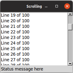
Scrolling a listbox.from tkinter import * from tkinter import ttk root = Tk() l = Listbox(root, height=5) l.grid(column=0, row=0, sticky=(N,W,E,S)) s = ttk.Scrollbar(root, orient=VERTICAL, command=l.yview) s.grid(column=1, row=0, sticky=(N,S)) l['yscrollcommand'] = s.set ttk.Label(root, text="Status message here", anchor=(W)).grid(column=0, columnspan=2, row=1, sticky=(W,E)) root.grid_columnconfigure(0, weight=1) root.grid_rowconfigure(0, weight=1) for i in range(1,101): l.insert('end', f"Line {i} of 100") root.mainloop()grid [tk::listbox .l -yscrollcommand ".s set" -height 5] -column 0 -row 0 -sticky nwes grid [ttk::scrollbar .s -command ".l yview" -orient vertical] -column 1 -row 0 -sticky ns grid [ttk::label .stat -text "Status message here" -anchor w] -column 0 -columnspan 2 -row 1 -sticky we grid columnconfigure . 0 -weight 1; grid rowconfigure . 0 -weight 1 for {set i 0} {$i<100} {incr i} { .l insert end "Line $i of 100" }require 'tk' require 'tkextlib/tile' root = TkRoot.new $l = TkListbox.new(root) {height 5; yscrollcommand proc{|*args| $s.set(*args)} }.grid :column => 0, :row => 0, :sticky => 'nwes' $s = Tk::Tile::Scrollbar.new(root) {orient 'vertical'; command proc{|*args| $l.yview(*args)}}.grid :column => 1, :row => 0, :sticky => 'ns' stat = Tk::Tile::Label.new(root) {text "Status message here"; anchor 'w'}.grid :column => 0, :columnspan => 2, :row => 1, :sticky => 'we' TkGrid.columnconfigure root, 0, :weight => 1 TkGrid.rowconfigure root, 0, :weight => 1 (0..99).each {|i| $l.insert 'end', "Line #{i} of 100"} Tk.mainloopuse Tkx; my $mw = Tkx::widget->new("."); ($lb = $mw->new_tk__listbox(-height => 5))->g_grid(-column => 0, -row => 0, -sticky => "nwes"); ($s = $mw->new_ttk__scrollbar(-command => [$lb, "yview"], -orient => "vertical"))->g_grid(-column =>1, -row => 0, -sticky => "ns"); $lb->configure(-yscrollcommand => [$s, "set"]); ($mw->new_ttk__label(-text => "Status message here", -anchor => "w"))->g_grid(-column => 0, -columnspan => 2, -row => 1, -sticky => "we"); $mw->g_grid_columnconfigure(0, -weight => 1); $mw->g_grid_rowconfigure(0, -weight => 1); for ($i=0; $i<100; $i++) { $lb->insert("end", "Line " . $i . " of 100"); } Tkx::MainLoop();If you've seen an earlier version of this tutorial, you might recall that at this point, we introduced a
sizegripwidget. It placed a small handle at the bottom right of the window, allowing users to resize the window by dragging the handle. This was commonly seen on some platforms, including older versions of macOS. Some older versions of Tk even automatically added this handle to the window for you.Platform conventions tend to evolve faster than long-lived open source GUI toolkits. Mac OS X 10.7 did away with the size grip in the corner in favor of allowing resizing from any window edge, finally catching up with the rest of the world. Unless there's a pressing need to be visually compatible with 15+ year old operating systems, if you have a
sizegripin your application, it's probably best to remove it.Text

Text widgets.A text widget allows users to enter multiple lines of text.
Text widgets are part of the classic Tk widgets, not the themed Tk widgets.
Tk's text widget is, along with the canvas widget, one of two uber-powerful widgets that provide amazingly deep but easily programmed features. Text widgets have formed the basis for full word processors, outliners, web browsers, and more. We'll get into some of the advanced stuff in a later chapter. Here, we'll show you how to use the text widget to capture fairly simple, multi-line text input.
Text widgets are created using the
Textclass:txt = Text(parent, width=40, height=10)Text widgets are created using the
tk::textcommand:tk::text .txt -width 40 -height 10Text widgets are created using the
TkTextclass:txt = TkText.new(parent) {width 40; height 10}Text widgets are created using the
new_tk__textmethod, a.k.a.Tkx::tk__text:$parent->new_tk__text(-width => 40, -height => 10);The
widthandheightoptions specify the requested screen size of the text widget, in characters and rows, respectively. The contents of the text can be arbitrarily large. You can use thewrapconfiguration option to control how line wrapping is handled: values arenone(no wrapping, text may horizontally scroll),char(wrap at any character), andword(wrapping will only occur at word boundaries).A text widget can be disabled so that no editing can occur. Because text is not a themed widget, the usual
stateandinstatemethods are not available. Instead, use the configuration optionstate, setting it to eitherdisabledornormal.txt['state'] = 'disabled'.txt configure -state disabledtxt['state'] = 'disabled'$txt->configure(-state => "disabled");Scrolling works the same way as in listboxes. The
xscrollcommandandyscrollcommandconfiguration options attach the text widget to horizontal and/or vertical scrollbars, and thexviewandyviewmethods are called from scrollbars. To ensure that a given bit of text is visible (i.e., not scrolled out of view), you can use theseemethod, passing it an index indicating the position of a character in the text.txt.see(5.0).txt see 5.0txt.see('5.0')$txt->see('5.0');Contents and indices
Text widgets do not have a linked variable associated with them like, for example, entry widgets do. To retrieve the contents of the entire text widget, call the
getmethod, passing it the index of the first character (1.0) as well as the end of the text (end).contents = txt.get('1.0', 'end')set contents [.txt get 1.0 end]contents = txt.get("1.0", 'end')$contents = $txt->get("1.0", "end");In its simplest form, indices are of the form
row.column, where row indicates the row number (1-based, so the first line is 1) and column indicates the character in the line (0-based, so 0 is the first character in the line). The shortcutendrefers to just past the last character of the last line.The
row.columnindices can be provided as strings or floating point numbers, which are converted to strings. You can't provide an integer, e.g.,5, but would need to convert it to a floating point number, e.g.,5.0.Text can be added to the widget using the
insertmethod, passing it the index where to insert the text as well as the text to insert. Thedeletemethod deletes text between two indices you provide.txt.insert('1.0', 'here is my\ntext to insert') txt.delete('1.5', '1.8').txt insert 1.0 "here is my\ntext to insert" .txt delete 1.5 1.8txt.insert(1.0, "here is my\ntext to insert") txt.delete(1.5, 1.8)$txt->insert("1.0", "here is my\ntext to insert"); $txt->delete("1.5", "1.8");We'll get into the text widget's many additional advanced features in a later chapter.
Scale
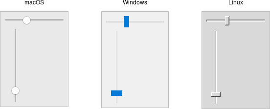
Scale widgets.A scale widget allows users to choose a numeric value through direct manipulation.
Scale widgets are created using the
ttk.Scaleclass:s = ttk.Scale(parent, orient=HORIZONTAL, length=200, from_=1.0, to=100.0)Because 'from' is a reserved keyword in Python, we need to add a trailing underscore when using it as a configuration option.
Scale widgets are created using the
ttk::scalecommand:ttk::scale .s -orient horizontal -length 200 -from 1.0 -to 100.0Scale widgets are created using the
Tk::Tile::Scaleclass:s = Tk::Tile::Scale.new(parent) {orient 'horizontal'; length 200; from 1.0; to 100.0}Scale widgets are created using the
new_ttk__scalemethod, a.k.a.Tkx::ttk__scale:$parent->new_ttk__scale(-orient => 'horizontal', -length => 200, -from => 1.0, -to => 100.0);As with scrollbars, the
orientoption may be eitherhorizontalorvertical. Thelengthoption, which represents the longer axis of either horizontal or vertical scales, is specified in screen units (e.g., pixels). You should also define the range of the number that the scale allows users to choose; to do this, set a floating-point number for each of thefromandtoconfiguration options.There are several different ways you can set the current value of the scale (which must be a floating-point value between the
fromandtovalues). You can set (or read, to get the current value) the scale'svalueconfiguration option. You can link the scale to a variable using thevariableoption. Or, you can call the scale'ssetmethod to change the value or thegetmethod to read the current value.A
commandconfiguration option lets you specify a callback which is invoked whenever the scale is changed. Tk passes the current value of the scale as a parameter each time it calls this script (we saw a similar thing with parameters being passed to scrollbar callbacks).# label tied to the same variable as the scale, so auto-updates num = StringVar() ttk.Label(root, textvariable=num).grid(column=0, row=0, sticky='we') # label that we'll manually update via the scale's command callback manual = ttk.Label(root) manual.grid(column=0, row=1, sticky='we') def update_lbl(val): manual['text'] = "Scale at " + val scale = ttk.Scale(root, orient='horizontal', length=200, from_=1.0, to=100.0, variable=num, command=update_lbl) scale.grid(column=0, row=2, sticky='we') scale.set(20)# label tied to the same variable as the scale, so auto-updates grid [ttk::label .auto -textvariable num] -column 0 -row 0 -sticky we # label that we'll manually update via the scale's command callback grid [ttk::label .manual] -column 0 -row 1 -sticky we proc update_lbl {val} { .manual configure -text "Scale at $val" } ttk::scale .scale -orient horizontal -length 200 -from 1.0 -to 100.0 -variable num -command update_lbl grid .scale -column 0 -row 2 -sticky we .scale set 20# label tied to the same variable as the scale, so auto-updates num = TkVariable.new Tk::Tile::Label.new(root) {textvariable num}.grid :column => 0, :row => 0, :sticky => 'we' # label that we'll manually update via the scale's command callback $manual = Tk::Tile::Label.new(root) $manual.grid :column => 0, :row => 1, :sticky => 'we' def update_lbl(val) $manual['text'] = "Scale at " + val.to_s end scale = Tk::Tile::Scale.new(root) {orient 'horizontal'; length 200; from 1.0; to 100.0; variable num; command proc{|v| update_lbl v}} scale.grid :column => 0, :row => 2, :sticky => 'we' scale.set 20# label tied to the same variable as the scale, so auto-updates $mw->new_ttk__label(-textvariable => \$num)->g_grid(-column => 0, -row => 0, -sticky => "we"); # label that we'll manually update via the scale's command callback $manual = $mw->new_ttk__label(); $manual->g_grid(-column => 0, -row => 1, -sticky => "we"); sub update_lbl { my ($val) = @_; $manual->configure(-text => "Scale x at ".$val); } $scale = $mw->new_ttk__scale(-orient => 'horizontal', -length => 200, -from => 1.0, -to => 100.0, -variable => \$num, -command => sub {($v) = @_; update_lbl($v);}); $scale->g_grid(-column => 0, -row => 2, -sticky => 'we'); $scale->set(20);As with other themed widgets, you can use the
statemethod to modify thedisabledstate flag; this prevent users from modifying the scale.As the scale widget does not display the actual values, you may want to add those separately, e.g., using label widgets.
Spinbox
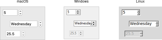
Spinbox widgets.A spinbox widget allows users to choose numbers (or, in fact, items from an arbitrary list). It does this by combining an entry-like widget showing the current value with a pair of small up/down arrows, which can be used to step through the range of possible choices.
The themed spinbox was added in Tk 8.5.9 (released in 2010). Earlier programs may have used the spinbox in the classic Tk widgets, which has a slightly different API.
Spinbox widgets are created using the
ttk.Spinboxclass:spinval = StringVar()
s = ttk.Spinbox(parent, from_=1.0, to=100.0, textvariable=spinval)Spinbox widgets are created using the
ttk::spinboxcommand:ttk::spinbox .s -from 1.0 -to 100.0 -textvariable spinvalSpinbox widgets are created using the
Tk::Tile::Spinboxclass:$spinval = TkVariable.new
s = Tk::Tile::Spinbox.new(parent) {from 1.0; to 100.0; textvariable $spinval}Spinbox widgets are created using the
new_ttk__spinboxmethod, a.k.a.Tkx::ttk__spinbox:$parent->new_ttk__spinbox(-from => 1.0, -to => 100.0, -textvariable => \$spinval);Like scale widgets, spinboxes let users choose a number between a certain range (specified using the
fromandtoconfiguration options), though through a very different user interface. You can also specify anincrement, which controls how much the value changes every time you click the up or down button.Like a listbox or combobox, spinboxes can also be used to let users choose an item from an arbitrary list of strings; these can be specified using the
valuesconfiguration option. This works in the same way it does for comboboxes; specifying a list of values will override tofromandtosettings.In their default state, spinboxes allow users to select values either via the up and down buttons or by typing them directly into the entry area that displays the current value. If you'd like to disable the latter feature so that only the up and down buttons are available, you can set the
readonlystate flag.s.state(['readonly']).s state readonlys.state('readonly')$s->state("readonly");Like other themed widgets, you can also disable spinboxes via the
disabledstate flag or check the state via theinstatemethod. Spinboxes also support validation in the same manner as entry widgets, using thevalidateandvalidatecommandconfiguration options.You might be puzzled about when to choose a scale, listbox, combobox, entry, or a spinbox. Often, several of these can be used for the same types of data. The answer really depends on what you want users to select, platform user interface conventions, and the role the value plays in your user interface.
For example, both a combobox and a spinbox take up fairly small amounts of space compared with a listbox. They might make sense for a more peripheral setting. A more primary and prominent choice in a user interface may warrant the extra space a listbox occupies. Spinboxes don't make much sense when items don't have a natural and obvious ordering to them. Be careful about putting too many items in both comboboxes and spinboxes. This can make it more time-consuming to select an item.
There is a boolean
wrapoption that determines whether the value should wrap around when it goes beyond the starting or ending values. You can also specify awidthfor the entry holding the current value of the spinbox.Again there are choices as to how to set or get the current value in the spinbox. Normally, you would specify a linked variable with the
textvariableconfiguration option. As usual, any changes to the variable are reflected in the spinbox, while any changes in the spinbox are reflected in the linked variable. As well, thesetandgetmethods allow you to set or get the value directly.Spinboxes generate virtual events when users press up (
<<Increment>>) or down (<<Decrement>>). Acommandconfiguration option allows you to provide a callback that is invoked on any changes.Progressbar
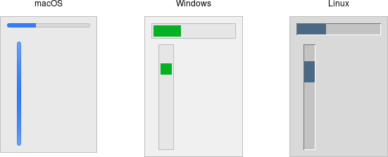
Progressbar widgets.A progressbar widget provides feedback to users about the progress of a lengthy operation.
In situations where you can estimate how long the operation will take to complete, you can display what fraction has already been completed. Otherwise, you can indicate the operation is continuing, but without suggesting how much longer it will take.
Progressbar widgets are created using the
ttk.Progressbarclass:p = ttk.Progressbar(parent, orient=HORIZONTAL, length=200, mode='determinate')Progressbar widgets are created using the
ttk::progressbarcommand:ttk::progressbar .p -orient horizontal -length 200 -mode determinateProgressbar widgets are created using the
Tk::Tile::Progressbarclass:p = Tk::Tile::Progressbar.new(parent) {orient 'horizontal'; length 200; mode 'determinate'}Progressbar widgets are created using the
new_ttk__progressbarmethod, a.k.a.Tkx::ttk__progressbar:$parent->new_ttk__progressbar(-orient => 'horizontal', -length => 200, -mode => 'determinate');As with scale widgets, they should be given an orientation (
horizontalorvertical) with theorientconfiguration option and can be given an optionallength. Themodeconfiguration option can be set to eitherdeterminate, where the progressbar will indicate relative progress towards completion, orindeterminate, where it shows that the operation is still continuing but without showing relative progress.Determinate progress
To use determinate mode, estimate the total number of "steps" the operation will take to complete. This could be an amount of time but doesn't need to be. Provide this to the progressbar using the
maximumconfiguration option. It should be a floating-point number and defaults to100.0(i.e., each step is 1%).As you proceed through the operation, tell the progressbar how far along you are with the
valueconfiguration option. So this would start at 0 and then count upwards to the maximum value you have set.There are two other ways to specify the current progress to display. First, you can just store the current value for the progressbar in a variable linked to it by the progressbar's
variableconfiguration option; that way, when you change the variable, the progressbar will update. The other alternative is to call the progressbar'sstepmethod, which increments the value by a given amount (defaults to 1.0).Indeterminate progress
Use indeterminate mode when you can't easily estimate how far along in a long-running task you actually are. However, you still want to provide feedback that the operation is continuing (and that your program hasn't crashed). At the start of the operation, call the progressbar's
startmethod. At the end of the operation, call itsstopmethod. The progressbar will take care of the rest.Unfortunately, "the progressbar will take care of the rest" isn't quite so simple. In fact, if you
startthe progressbar, call a function that takes several minutes to complete, and thenstopthe progressbar, your program will appear frozen the whole time, with the progressbar not updating. In fact, it will not likely appear onscreen at all. Yikes!To learn why that is and how to address it, we'll need to take a deeper dive into Tk's event loop.
Event Loop
At the end of the More Widgets chapter, we explained how to use a progressbar to provide feedback to users about long-running operations. The progressbar itself was simple: call its
startmethod, perform your operation, and then call itsstopmethod. Unfortunately, you learned that if you tried this, your application would most likely appear completely frozen.To understand why, we need to revisit our discussion of event handling way back in the Tk Concepts chapter. As we've seen, after we construct our application's initial user interface, we enter the Tk main event loop. The event loop continually processes events, pulled from the system event queue, usually dozens of times a second. It watches for mouse or keyboard events, invoking command callbacks and event bindings as needed.
Less obviously, all screen updates are processed only in the event loop. For example, you may change the text of a label widget. However, that change doesn't appear onscreen immediately. Instead, the widget notifies Tk that it needs to be redrawn. Later on, in between processing other events, Tk's event loop will ask the widget to redraw itself. All drawing occurs only in the event loop. The change appears to happen immediately because the time between changing the widget and the actual redraw in the event loop is so short.
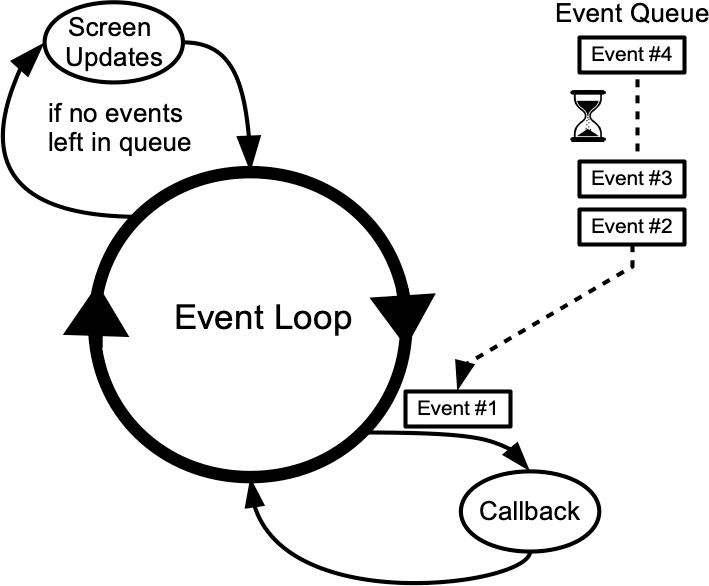
Event loop showing application callbacks and screen updates.Blocking the event loop
You run into problems when the event loop is prevented from processing events for a lengthy period. Your application won't redraw or respond to events and will appear to be frozen. The event loop is said to be blocked. How can this happen?
Let's start by visualizing the event loop as an execution timeline. In a normal situation, each deviation from the event loop (callback, screen update) takes only a fraction of a second before returning control to the event loop.
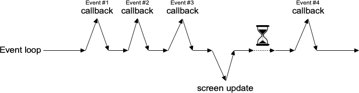
Execution timeline for a well-behaved event loop.In our progressbar scenario, the whole thing probably started from an event like a user pressing a button. So the event loop calls our application code to handle the button event. Our code creates the progressbar, starts it, performs the (lengthy) operations, and stops the progressbar. Only then does our code return control back to the event loop. No events have been processed in the meantime, and no screen redrawing has occurred. Our application has appeared frozen. The progressbar never appeared on the screen. Meanwhile, events have been piling up in the event queue.
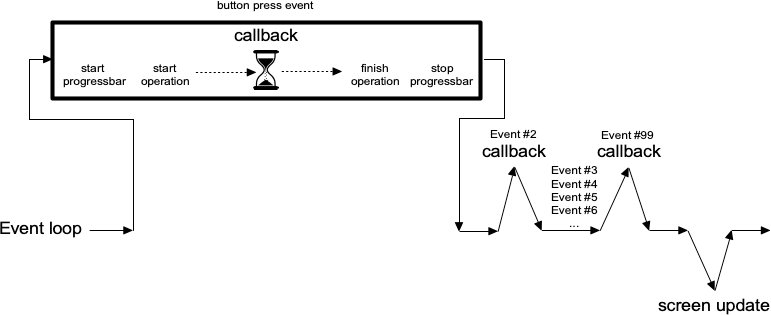
Lengthy callback blocking the event loop.To prevent blocking the event loop, event handlers must execute quickly and return control to the event loop.
If you have a long-running operation to perform or anything like network I/O that could potentially take a long time, you can't perform them directly within your event handler. Instead, there are a few different approaches you can take.
For the more technically inclined, Tk uses a single-threaded, event-driven programming model. All the GUI code, the event loop, and your application run within the same thread. Because of this, any calls or computations that block event handlers are highly discouraged. Some GUI toolkits use different models that allow for blocking code, running the GUI and event handlers in separate threads from application code, etc. Attempting to shoehorn these models into Tk can be a recipe for frustration and lead to fragile and hacky code. If you respect Tk's model rather than fight it, you won't run into problems.
One step at a time
If possible, the very best thing you can do is break your operation into tiny steps, each of which can execute very quickly. You let the event loop be responsible for when the next step occurs. That way, the event loop continues to run, processing regular events, updating the screen, and, in between all that, calling your code to perform the next step of the operation.
To do this, we make use of timer events. Our program can ask the event loop to generate one of these events at a later time. As part of its regular work, when the event loop reaches that time, it will call back into our code to handle the event. Our code would perform the next step of the operation. It then schedules another timer event for the next step of the operation and immediately returns control back to the event loop.

Breaking up a large operation into small steps tied together with timer events.Tk's
aftercommand can be used to generate timer events. You provide the number of milliseconds to wait until the event should be fired. It may happen later than that if Tk is busy processing other events, but it won't happen before that. Alternatively, rather than passing a number of milliseconds, use theafter_idlemethod to request your code be called when Tk is idle. Idle callbacks fire when no other events in the queue need to be processed. (Tk's screen updates and redraws occur in the context of these idle events.) You can find more details onafterin the reference manual.In the following example, we'll perform a lengthy operation that is broken up into 20 small steps. While this operation is being performed, we'll update a progressbar and allow users to interrupt the operation.
def start(): b.configure(text='Stop', command=stop) l['text'] = 'Working...' global interrupt; interrupt = False root.after(1, step) def stop(): global interrupt; interrupt = True def step(count=0): p['value'] = count if interrupt: result(None) return root.after(100) # next step in our operation; don't take too long! if count == 20: # done! result(42) return root.after(1, lambda: step(count+1)) def result(answer): p['value'] = 0 b.configure(text='Start!', command=start) l['text'] = "Answer: " + str(answer) if answer else "No Answer" f = ttk.Frame(root); f.grid() b = ttk.Button(f, text="Start!", command=start); b.grid(column=1, row=0, padx=5, pady=5) l = ttk.Label(f, text="No Answer"); l.grid(column=0, row=0, padx=5, pady=5) p = ttk.Progressbar(f, orient="horizontal", mode="determinate", maximum=20); p.grid(column=0, row=1, padx=5, pady=5)proc start {} { .f.b configure -text Stop -command stop .f.l configure -text "Working..." set ::interrupt 0 after 1 step } proc stop {} {set ::interrupt 1} proc step {{count 0}} { .f.p configure -value $count if {$::interrupt} {result ""; return} after 100 ; # next step in our operation; don't take too long! if {$count==20} {result 42; return} ; # done! after 1 step [incr count] } proc result {{answer ""}} { .f.p configure -value 0 .f.b configure -text "Start!" -command start .f.l configure -text [expr {$answer!="" ? "Answer: $answer" : "No Answer"}] } grid [ttk::frame .f] grid [ttk::button .f.b -text "Start!" -command start] -column 1 -row 0 -padx 5 -pady 5 grid [ttk::label .f.l -text "No Answer"] -column 0 -row 0 -padx 5 -pady 5 grid [ttk::progressbar .f.p -orient horizontal -mode determinate -maximum 20] -column 0 -row 1 -padx 5 -pady 5$f = Tk::Tile::Frame.new($root); $f.grid $b = Tk::Tile::Button.new($f) {text "Start!"; command proc{start()}}; $b.grid :column => 1, :row => 0, :padx => 5, :pady => 5 $l = Tk::Tile::Label.new($f) {text "No Answer"}; $l.grid :column => 0, :row => 0, :padx => 5, :pady => 5 $p = Tk::Tile::Progressbar.new($f) {orient "horizontal"; mode "determinate"; maximum 20} $p.grid :column => 0, :row => 1, :padx => 5, :pady => 5 def start $b.configure(:text => 'Stop', :command => proc{stop()}) $l[:text] = "Working..." $interrupt = false TkTimer.start(1, 1) {step(0)} end def stop $interrupt = true end def step(count) $p[:value] = count if $interrupt then result(''); return; end sleep 0.1 # next step in our operation; don't take too long! if count == 20 then result(42); return; end # done! TkTimer.start(1,1) {step(count+1)} end def result(answer) $p[:value] = 0 $b.configure :text => "Start!", :command => proc{start()} $l[:text] = answer ? "Answer: " + answer.to_s : "No Answer" endRuby/Tk provides the
TkTimerclass as a front end to Tk'saftercommand. The first argument to the constructor is the number of milliseconds for the timer event, and the second is the number of times the timer should repeat. There's not a nice interface to the blocking variant of Tk'saftercommand, so we usesleepinstead.our $interrupt; sub start { $b->configure(-text => "Stop", -command => sub{stop()}); $l->configure(-text => "Working..."); $interrupt = 0; Tkx::after(1, sub{step()}); } sub stop { $interrupt = 1; } sub step { my ($count) = @_; $count //= 0; $p->configure(-value => $count); if ($interrupt) {result(""); return;} Tkx::after(100); # next step in our operation; don't take too long! if ($count==20) {result(42); return;} # done! Tkx::after(1, sub{step($count+1)}); } sub result { my ($answer) = @_; $p->configure(-value => 0); $b->configure(-text => "Start!", -command => sub{start()}); $l->configure(-text => $answer ? "Answer: " . $answer : "No Answer"); } our $f = $mw->new_ttk__frame; $f->g_grid(); our $b = $f->new_ttk__button(-text => "Start!", -command => sub{start()}); $b->g_grid(-column => 1, -row => 0, -padx => 5, -pady => 5); our $l = $f->new_ttk__label(-text => "No Answer"); $l->g_grid(-column => 0, -row => 0, -padx => 5, -pady => 5); our $p = $f->new_ttk__progressbar(-orient => "horizontal", -mode => "determinate", -maximum => 20); $p->g_grid(-column => 0, -row => 1, -padx => 5, -pady => 5);To interrupt the process, we set a global variable, checking it each time the timer event fires. Another option would be to cancel the pending timer event. When we create the timer event, it returns an id number to uniquely identify the pending timer. To cancel it, we can call the
after_cancelmethod, passing it that unique id.You'll also note that we used a blocking form of
afterto simulate performing our operation. Rather than scheduling an event, in this form, the call blocks, waiting a given time before returning. It works the same as asleepsystem call.Asynchronous I/O
Timer events take care of breaking up a long-running computation, where you know that each step can be guaranteed to complete quickly so that your handler will return to the event loop. What if you have an operation that may not complete quickly? This can happen when you make a variety of calls to the operating system. The most common is when we're doing some kind of I/O, whether writing a file, communicating with a database, or retrieving data from a remote web server.
Most I/O calls are blocking, so they don't return until the operation completes (or fails). What we want to use instead are non-blocking or asynchronous I/O calls. When you make an asynchronous I/O call, it returns immediately, before the operation is completed. Your code can continue running, or in this case, return back to the event loop. Later on, when the I/O operation completes, your program is notified and can process the result of the I/O operation.
If this sounds like treating I/O as another type of event, you're exactly right. In fact, it's also called event-driven I/O.
In Tcl, asynchronous I/O is managed through the
fileeeventcommand, which uses the same event loop used by Tk, timers, etc. It's fully detailed in the reference manual. It's used extensively in other parts of Tcl, such as the http package, and by third-party packages.In Python, asynchronous I/O is provided by the
asynciomodule and other modules layered on top of it.All asyncio applications rely heavily on an event loop. How convenient; Tkinter has a great event loop! Unfortunately, the asyncio event loop and the Tkinter event loop are not the same. You can't run both at the same time, at least not within the same thread (well, you can have one repeatedly call the other, but it's pretty hacky and fragile).
My recommendation: keep Tkinter in the main thread and spin-off your asyncio event loops in another thread.
Your application code, running in the main thread, may need to coordinate with the asyncio event loop running in the other thread. You can call a function running in the asyncio event loop thread (even from the Tkinter event loop, e.g., in a widget callback) using the asyncio
call_soon_threadsafemethod. To call Tkinter from the asyncio event loop, keep reading.Threads or processes
Sometimes it's either impossible or impractical to break up a long-running computation into discrete pieces that each run quickly. Or you may be using a library that doesn't support asynchronous operations. Or, like Python's
asyncio, it doesn't play nice with Tk's event loop. In cases like these, to keep your Tk GUI responsive, you'll need to move those time-consuming operations or library calls out of your event handlers and run them somewhere else. Threads, or even other processes, can help with that.Running tasks in threads, communicating with them, etc., is beyond the scope of this tutorial. However, there are some restrictions on using Tk with threads that you should be aware of. The main rule is that you must only make Tk calls from the thread where you loaded Tk.
Tkinter goes to great lengths internally so that you can make Tkinter calls from multiple threads by routing them to the main thread (the one that created the Tk instance). It mostly works, but not always. Despite all it tries to do, I highly recommend you make all Tkinter calls from a single thread.
If you need to communicate from another thread to the thread running Tkinter, keep it as simple as possible. Use
event_generateto post a virtual event to the Tkinter event queue, and thenbindto that event in your code.root.event_generate("<<MyOwnEvent>>")Nested event processing
The previous three approaches are the correct ways to handle long-running operations while keeping your Tk GUI responsive. What they have in common is a single event loop that continuously processes events of all kinds. That event loop will call event handlers in your application code, which do their thing and quickly return.
There is one other way. Within your long-running operation, you can invoke the event loop to process a bunch of events. You can do this with a single command,
update. There's no messing around with timer events or asynchronous I/O. Instead, you just sprinkle someupdatecalls throughout your operation. If you want to only keep the screen redrawing but not process other events, there's even an option for that (update_idletasks).This approach is seductively easy. And if you're lucky, it might work. At least for a little while. But sooner or later, you're going to run into serious difficulties trying to do things that way. Something won't be updating, event handlers aren't getting called that should be, events are going missing or being fired out of order, or worse. You'll turn your program's logic inside out and tear your hair out trying to make it work again.
When you use
update, you're not returning control back to the running event loop. You're effectively starting a new event loop nested within the existing one. Remember, the event loop follows a single thread of execution: no threads, no coroutines. If you're not careful, you're going to end up with event loops called from within event loops called from... well, you get the idea. If you even realize you're doing this, unwinding the event loops (each of which may have different conditions to terminate it) will be an interesting exercise. The reality won't match your mental model of a simple event loop dispatching events one at a time, independent of every other event. It's a classic example of fighting against Tk's model. In very specific circumstances, it's possible to make it work. In practice, you're asking for trouble. Don't say you haven't been warned...
Nested event loops... this way madness lies.Menus
This chapter describes how to handle menubars and popup menus in Tk. For a polished application, these are areas you particularly want to pay attention to.
Menu
Menu widgets.Menus are implemented as widgets in Tk, just like buttons and entries. Each menu widget consists of a number of different items in the menu. Items have various attributes, such as the text to display for the item, a keyboard accelerator, and a command to invoke.
Menus are arranged in a hierarchy. The menubar is itself a menu widget. It has several items ("File," "Edit," etc.), each of which is a submenu containing more items. These items can include things like the "Open..." command in a "File" menu but also separators between other items. It can even have items that open up their own submenu (so-called cascading menus). As you'd expect from other things you've seen already in Tk, anytime you have a submenu, it must be created as a child of its parent menu.
Menus are part of the classic Tk widgets; there is no menu widget in the themed Tk widget set.
Before you start
It's essential to put the following line in your application somewhere before you start creating menus.
root.option_add('*tearOff', FALSE)option add *tearOff 0TkOption.add '*tearOff', 0Tkx::option_add("*tearOff", 0);Without it, each of your menus (on Windows and X11) will start with what looks like a dashed line and allows you to "tear-off" the menu, so it appears in its own window. You should eliminate tear-off menus from your application as they're not a part of any modern user interface style.
This is a throw-back to the Motif-style X11 that Tk's original look and feel were based on. Get rid of them unless your application is designed to run only on that old box collecting dust in the basement. We'll all look forward to a future version of Tk where this misguided paean to backward compatibility is removed.
While on the topic of ancient history, the
option_addbit uses the option database. This provided a standardized way to customize some aspects of X11 user interfaces through text-based configuration files, but it's no longer used today. Older Tk programs may use theoptioncommand internally to separate style configuration options from widget creation code. That approach pre-dated themed Tk styles, which should be used for that purpose today. However, it's somehow fitting to use the obsolete option database to automatically remove the obsolete tear-off menus.Platform considerations
Menus need special care if you want your application to fit in with other applications on your users' platform. Speaking of which, the recommended way to figure out which platform you're running on is:
root.tk.call('tk', 'windowingsystem') # returns x11, win32 or aquatk windowingsystem; # returns x11, win32 or aquaTk.windowingsystem; # returns x11, win32 or aquaTkx::tk_windowingsystem(); # returns x11, win32 or aquaTkinter does not provide a public direct equivalent to this call. However, it is possible to directly execute an arbitrary Tcl-based Tk command using the
call()method (available on any Tkinter widget). Here, we're invoking the Tcl/Tk commandtk windowingsystem.This is more useful than examining global variables like
tcl_platformorsys.platform; older checks that used these methods should be reviewed. While there used to be a strong correlation between platform and windowing system, that's less true today. For example, if your platform is identified as Unix, that might mean Linux under X11, macOS under Aqua, or even macOS under X11.Menubars and the menu hierarchy
In this section, we'll look at menubars: how to create them, what goes in them, how they're used, etc.
Properly designing a menubar and its set of menus is beyond the scope of this tutorial. However, if you're creating an application for someone other than yourself, here is a bit of advice. First, if you find yourself with many menus, very long menus, or deeply nested menus, you may need to rethink how your user interface is organized. Second, many people use the menus to explore what the program can do, particularly when they're first learning it, so try to ensure major features are accessible by the menus. Finally, for each platform you're targeting, become familiar with how applications use menus. Consult the platform's human interface guidelines for full details about the design, terminology, shortcuts, and much more. This is an area you will likely have to customize for each platform.
Menubars.You'll notice applications on some recent Linux distributions that show their menus at the top of the screen when active rather than in the window itself. Tk does not yet support this style of menus.
Creating a menubar
In Tk, menubars are associated with individual windows; each toplevel window can have at most one menubar. This is visually obvious on Windows and many X11 systems, where menus are part of each window, sitting just below the title bar.
On macOS, though, there is a single menubar along the top of the screen, shared by each window. As far as your Tk program is concerned, each window still has its own menubar. As you switch between windows, Tk ensures that the correct menubar is displayed. If you don't specify a menubar for a particular window, Tk uses the menubar associated with the root window; you'll have noticed by now that this is automatically created for you when your Tk application starts.
Because all windows have a menubar on macOS, it's important to define one, either for each window or a fallback menubar for the root window. Otherwise, you'll end up with the "built-in" menubar, which contains menus that are only intended for typing commands directly into the interpreter.
To create a menubar for a window, first, create a menu widget. Then, use the window's
menuconfiguration option to attach the menu widget to the window.win = Toplevel(root) menubar = Menu(win) win['menu'] = menubartoplevel .win menu .win.menubar .win configure -menu .win.menubarwin = TkToplevel.new(root) menubar = TkMenu.new(win) win['menu'] = menubar$w = $mw->new_toplevel; $m = $w->new_menu; $w->configure(-menu => $m);You can use the same menubar for more than one window. In other words, you can specify the same menubar as the
menuconfiguration option for several toplevel windows. This is particularly useful on Windows and X11, where you may want a window to include a menu but don't necessarily need to juggle different menus in your application. However, if the contents or state of menu items depends on what's going on in the active window, you'll have to manage this yourself.This is truly ancient history, but menubars used to be implemented by creating a frame widget containing the menu items and packing it into the top of the window like any other widget. Hopefully, you don't have any code or documentation that still does this.
Adding menus
We now have a menubar, but that's pretty useless without some menus to go in it. So again, we'll create a menu widget for each menu, each one a child of the menubar. We'll then add them all to the menubar.
menubar = Menu(parent) menu_file = Menu(menubar) menu_edit = Menu(menubar) menubar.add_cascade(menu=menu_file, label='File') menubar.add_cascade(menu=menu_edit, label='Edit')set m .win.menubar menu $m.file menu $m.edit $m add cascade -menu $m.file -label File $m add cascade -menu $m.edit -label Editfile = TkMenu.new(menubar) edit = TkMenu.new(menubar) menubar.add :cascade, :menu => file, :label => 'File' menubar.add :cascade, :menu => edit, :label => 'Edit'$m = $w->new_menu; $file = $m->new_menu; $edit = $m->new_menu; $m->add_cascade(-menu => $file, -label => "File"); $m->add_cascade(-menu => $edit, -label => "Edit");The
add_cascademethod adds a menu item, which itself is a menu (a submenu).Adding menu items
Now that we have a couple of menus in our menubar, we can add a few items to each menu.
Command items
Regular menu items are called
commanditems in Tk. We'll see some other types of menu items shortly. Notice that menu items are part of the menu itself; we don't have to create a separate menu widget for each one (submenus being the exception).menu_file.add_command(label='New', command=newFile) menu_file.add_command(label='Open...', command=openFile) menu_file.add_command(label='Close', command=closeFile)$m.file add command -label "New" -command "newFile" $m.file add command -label "Open..." -command "openFile" $m.file add command -label "Close" -command "closeFile"file.add :command, :label => 'New', :command => proc{newFile} file.add :command, :label => 'Open...', :command => proc{openFile} file.add :command, :label => 'Close', :command => proc{closeFile}$file->add_command(-label => "New", -command => sub {newFile()}); $file->add_command(-label => "Open...", -command => sub {openFile()}); $file->add_command(-label => "Close", -command => sub {closeFile()});The ellipsis ("...") is a special character on macOS, more tightly spaced than three periods in a row. Tk takes care of substituting this character for you automatically.
Each menu item has associated with it several configuration options, analogous to widget configuration options. Each type of menu item has a different set of available options. Cascade menu items have a
menuoption used to specify the submenu, command menu items have acommandoption to specify the command to invoke when the item is chosen. Both have alabeloption to specify the text to display for the item.Submenus
We've already seen
cascademenu items used to add a menu to a menubar. Not surprisingly, if you want to add a submenu to an existing menu, you also use acascademenu item exactly the same way. You might use this to build build a "recent files" submenu, for example.menu_recent = Menu(menu_file) menu_file.add_cascade(menu=menu_recent, label='Open Recent') for f in recent_files: menu_recent.add_command(label=os.path.basename(f), command=lambda f=f: openFile(f))menu $m.file.recent $m.file add cascade -menu $m.file.recent -label "Open Recent" foreach f $recent_files { $m.file.recent add command -label [file tail $f] -command "openFile $f" }recent = TkMenu.new(file) file.add :cascade, :menu => recent, :label => 'Open Recent' recent_files.each do |f| recent.add :command, :label => File.basename(f), :command => proc{openFile(f)} end$recent = $file->new_menu; $file->add_cascade(-menu => $recent, -label => "Open Recent"); foreach $f (@recent_files) { $recent->add_command(-label => basename($f), -command => [\&openFile, $f]); }Separators
A third type of menu item is the
separator, which produces the dividing line you often see between different menu items.menu_file.add_separator()$m.file add separatorfile.add :separator$file->add_separator();Checkbutton and radiobutton Items
Finally, there are also
checkbuttonandradiobuttonmenu items that behave analogously to checkbutton and radiobutton widgets. These menu items have a variable associated with them. Depending on its value, an indicator (i.e., checkmark or selected radiobutton) may be shown next to its label.check = StringVar() menu_file.add_checkbutton(label='Check', variable=check, onvalue=1, offvalue=0) radio = StringVar() menu_file.add_radiobutton(label='One', variable=radio, value=1) menu_file.add_radiobutton(label='Two', variable=radio, value=2)$m.file add checkbutton -label Check -variable check -onvalue 1 -offvalue 0 $m.file add radiobutton -label One -variable radio -value 1 $m.file add radiobutton -label Two -variable radio -value 2check = TkVariable.new file.add :checkbutton, :label => 'Check', :variable => check, :onvalue => 1, :offvalue => 0 radio = TkVariable.new file.add :radiobutton, :label => 'One', :variable => radio, :value => 1 file.add :radiobutton, :label => 'Two', :variable => radio, :value => 2$file->add_checkbutton(-label => "Check", -variable => \$check, -onvalue => 1, -offvalue => 0); $file->add_radiobutton(-label => "One", -variable => \$radio, -value => 1); $file->add_radiobutton(-label => "Two", -variable => \$radio, -value => 2);When a user selects a checkbutton item that is not already checked, it sets the associated variable to the value in
onvalue. Selecting an item that is already checked sets it to the value inoffvalue. Selecting a radiobutton item sets the associated variable to the value invalue. Both types of items also react to any changes you make to the associated variable.Like command items, checkbutton and radiobutton menu items support a
commandconfiguration option that is invoked when the menu item is chosen. The associated variable and the menu item's state are updated before the callback is invoked.Radiobutton menu items are not part of the Windows or macOS human interface guidelines. On those platforms, the item's indicator is a checkmark, as it would be for a checkbutton item. The semantics still work. It's a good way to select between multiple items since it will show one of them selected (checked).
Manipulating menu items
Like most everything in Tk, you can look at or change the value of an item's options at any time. Items are referred to via an index. Usually, this is a number (
0..n-1) indicating the item's position in the menu. You can also specify the label of the menu item (or, in fact, a "glob-style" pattern to match against the item's label).print( menu_file.entrycget(0, 'label')) # get label of top entry in menu print( menu_file.entryconfigure(0)) # show all options for an itemputs [$m.file entrycget 0 -label]; # get label of top entry in menu puts [$m.file entryconfigure 0]; # show all options for an itemputs( file.entrycget 0, :state ); # get label of top entry in menu puts( file.entryconfiginfo 0 ); # show all options for an itemprint $file->entrycget(0, -label); # get label of top entry in menu print $file->entryconfigure(0); # show all options for an itemAs well as adding items to the end of menus, you can also insert them in the middle of menus via the
insert_typemethod, providing the index of an existing item; the new item will be inserted before the one you specify.menu_file.insert_command(3, label='Export', command=exportFile)$m.file insert 3 command -label Export -command exportFilefile.insert 3, :command, :label => 'Export', :command => proc{exportFile}You can also delete one or more menu items using the$file->insert(3, "command", -label => "Export", -command => sub {exportFile()});deletemethod.menu_recent.delete(0, 'end')$m.file.recent delete 0 endrecent.delete 0, 'end'$recent->delete(0, 'end');State
You can disable a menu item so that users cannot select it. This can be done via the
stateoption, setting it to the valuedisabled. Use a value ofnormalto re-enable the item.Menus should always reflect the current state of your application. If a menu item is not presently relevant (e.g., the "Copy" item is only applicable if something in your application is selected), you should disable it. When your application state changes so that the item is applicable, make sure to enable it.
menu_file.entryconfigure('Close', state=DISABLED)$m.file entryconfigure Close -state disabledfile.entryconfigure 'Close', :state => 'disabled'$file->entryconfigure("Close", -state => "disabled");Sometimes you may have menu items whose name changes in response to application state changes, rather than the menu item being disabled. For example, A web browser might have a menu item that changes between "Show Bookmarks" and "Hide Bookmarks" as a bookmarks pane is hidden or displayed.
menu_bookmarks.entryconfigure(3, label="Hide Bookmarks")$m.bookmarks entryconfigure 3 -label "Hide Bookmarks"bookmarks.entryconfigure 3, :label => 'Hide Bookmarks'$bookmarks->entryconfigure(3, -label => "Hide Bookmarks");As your program grows complex, it's easy to miss enabling or disabling some items. One strategy is to centralize all the menu state changes in one routine. Whenever there is a state change in your application, it should call this routine. It should examine the current state and update menus accordingly. The same code can also handle toolbars, status bars, or other user interface components.
Accelerator keys
The
acceleratoroption is used to indicate a keyboard equivalent that corresponds to a menu item. This does not actually create the accelerator but only displays it next to the menu item. You still need to create an event binding for the accelerator yourself.Remember that event bindings can be set on individual widgets, all widgets of a certain type, the toplevel window containing the widget you're interested in, or the application as a whole. As menu bars are associated with individual windows, event bindings for menu items will usually be on the toplevel window the menu is associated with.
Accelerators are very platform-specific, not only in terms of which keys are used for what operation, but what modifier keys are used for menu accelerators (e.g., on macOS, it is the "Command" key, on Windows and X11, it is usually the "Control" key). Examples of valid accelerator options are
Command-N,Shift+Ctrl+X, andCommand-Option-B. Commonly used modifiers includeControl,Ctrl,Option,Opt,Alt,Shift,Command,Cmd, andMeta.On macOS, modifier names are automatically mapped to the different modifier icons that appear in menus, i.e.,
Shift⇒ ⇧,Command⇒ ⌘,Control⇒ ⌃, andOption⇒ ⌥.m_edit.entryconfigure('Paste', accelerator='Command+V')$m.edit entryconfigure "Paste" -accelerator "Command+V"edit.entryconfigure "Paste", :accelerator => "Command+V"$edit->entryconfigure("Paste", -accelerator => "Command+V");Underline
All platforms support keyboard traversal of the menubar via the arrow keys. On Windows and X11, you can also use other keys to jump to particular menus or menu items. The keys that trigger these jumps are indicated by an underlined letter in the menu item's label. To add one of these to a menu item, use the
underlineconfiguration option for the item. Its value should be the index of the character you'd like underlined (from 0 to the length of the string - 1). Unlike accelerator keys, the menu will watch for the keystroke, so no separate event binding is needed.m.add_command(label='Path Browser', underline=5) # underline "B"$m add command -label "Path Browser" -underline 5" # underline "B"m.add :command, :label => 'Path Browser', :underine => 5 # underline "B"$m->add_command(-label => "Path Browser", -underline => 5); # underline "B"Images
It is also possible to use images in menu items, either beside the menu item's label or replacing it altogether. To do this, use the
imageandcompoundoptions, which work just like in label widgets. The value forimagemust be a Tk image object, whilecompoundcan have the valuesbottom,center,left,right,top, ornone.Menu virtual events
Platform conventions for menus suggest standard menus and items that should be available in most applications. For example, most applications have an "Edit" menu, with menu items for "Copy," "Paste," etc. Tk widgets like entry or text will react appropriately when those menu items are chosen. But if you're building your own menus, how do you make that work? What
commandwould you assign to a "Copy" menu item?Tk handles this with virtual events, e.g.,
<<Copy>>and<<Paste>>. As you'll recall from the Tk Concepts chapter, these are high-level application events, not low-level operating system events. Tk's default menus generate these events and your own custom menus can as well. In turn, Tk's widgets will watch for specific virtual events. Your application can create event bindings to watch for those events too. That way, you don't need to worry about figuring out what callback function to invoke from the menu item—you just generate the virtual event.Some developers create virtual events for every item in their menus, generating those events instead of directly calling routines in their code. It's one way of splitting off your user interface code from the rest of your application. Remember that even if you do this, you'll still need code that enables and disables menu items, adjusts their labels, etc., in response to application state changes.
Here's a minimal example showing how we'd add two items to an "Edit" menu, the standard "Paste" item, and an application-specific "Find..." item that will open a dialog to find or search for something. We'll include an entry widget so that we can check that "Paste" works.
from tkinter import * from tkinter import ttk, messagebox root = Tk() ttk.Entry(root).grid() m = Menu(root) m_edit = Menu(m) m.add_cascade(menu=m_edit, label="Edit") m_edit.add_command(label="Paste", command=lambda: root.focus_get().event_generate("<<Paste>>")) m_edit.add_command(label="Find...", command=lambda: root.event_generate("<<OpenFindDialog>>")) root['menu'] = m def launchFindDialog(*args): messagebox.showinfo(message="I hope you find what you're looking for!") root.bind("<<OpenFindDialog>>", launchFindDialog) root.mainloop()grid [ttk::entry .e] menu .m menu .m.edit .m add cascade -menu .m.edit -label Edit .m.edit add command -label "Paste" -command {event generate [focus] "<<Paste>>"} .m.edit add command -label "Find..." -command {event generate . "<<OpenFindDialog>>"} . configure -menu .m proc launchFindDialog {} {tk_messageBox -message "I hope you find what you're looking for!"} bind . <<OpenFindDialog>> launchFindDialogrequire 'tk' require 'tkextlib/tile' root = TkRoot.new() Tk::Tile::Entry.new(root).grid m = TkMenu.new(root) m_edit = TkMenu.new(m) m.add :cascade, :menu => m_edit, :label => "Edit" m_edit.add :command, :label => "Paste", :command => proc{Tk.event_generate(Tk.focus, "<Paste>")} m_edit.add :command, :label => "Find...", :command => proc{Tk.event_generate(root, "<OpenFindDialog>")} root['menu'] = m def launchFindDialog() Tk::messageBox :message => "I hope you find what you're looking for!" end root.bind("<OpenFindDialog>") {launchFindDialog} Tk.mainloop()use Tkx; my $mw = Tkx::widget->new("."); $mw->new_ttk__entry()->g_grid(); $m = $mw->new_menu; $m_edit = $m->new_menu; $m->add_cascade(-menu => $m_edit, -label => "Edit"); $m_edit->add_command(-label => "Paste", -command => sub{Tkx::event_generate(Tkx::focus(), "<<Paste>>");}); $m_edit->add_command(-label => "Find...", -command => sub{$mw->g_event_generate("<<OpenFindDialog>>");}); $mw->configure(-menu => $m); sub launchFindDialog {Tkx::tk___messageBox(-message => "I hope you find what you're looking for!");} $mw->g_bind("<<OpenFindDialog>>", sub{launchFindDialog();}); Tkx::MainLoop();When you generate a virtual event, you need to specify the widget that the event should be sent to. We want the "Paste" event to be sent to the widget with the keyboard focus (usually indicated by a focus ring). You can determine which widget has the keyboard focus using the
focuscommand. Try it out, choosing the Paste item when the window is first opened (when there's no focus) and after clicking on the entry (making it the focus). Notice the entry handles the<<Paste>>event itself. There's no need for us to create an event binding.The
<<OpenFindDialog>>event is sent to the root window, which is where we create an event binding. If we had multiple toplevel windows, we'd send it to a specific window.Tk predefines the following virtual events:
<<Clear>>,<<Copy>>,<<Cut>>,<<Paste>>,<<PasteSelection>>,<<PrevWindow>>,<<SelectAll>>,<<Redo>>, and<<Undo>>. There are a number of others as well. For the complete list and additional information, see theeventcommand reference.Special menus on macOS
You've probably noticed that Tk on macOS supplies its own default menubar. It includes the Apple icon menu (About this Mac…, System Settings…, etc.), a menu named after the program being run (in this case, your programming language's shell, e.g., "Wish", "Python", etc.), a File menu, and standard Edit, Window, and Help menus, all stocked with various menu items.
You can override this menubar in your own program, but to get the results you want, you'll need to follow some particular steps (in some cases, in a particular order).
The first thing to know is that if you don't specify a menubar for a window (or its parent window, e.g., the root window), you'll end up with the default menubar Tk supplies, which unless you're just mucking around on your own, is almost certainly not what you want.
Application menu
Every menubar starts with the system-wide Apple icon menu. To the right of that is a menu for the frontmost application. It is always named after the binary being run, and includes "About" and "Settings" items for the application, as well as the Services menu, hide/show application items, and a "Quit" item for the application.
Tk automatically includes the Apple icon menu and Application menu in any menubar you create. Unless you have a compelling reason to do so, I recommend you use what Tk provides, and then add additional menus (File, Edit, …) after the application menu.
Responding to Application menu items
You can customize how your application responds to three standard items in the application menu: "About," "Settings," and "Quit."
By default, Tk displays a small standard "About" dialog box for your application. You can ask Tk to call a function in your application instead, which can display it's own dialog box. Internally, Tk detects this by the presence of a Tcl command named
tkAboutDialog. Use this code to set that up:def showMyAboutDialog(): .... root.createcommand('tkAboutDialog', showMyAboutDialog)proc tkAboutDialog {} {showMyAboutDialog}Tk.ip_eval("proc tkAboutDialog {} {#{Tk.install_cmd(proc{showMyAboutDialog})}}")Tkx::proc('tkAboutDialog', '{args}', sub {showMyAboutDialog()});The application "Settings" item works similarly. If you don't provide your own via the
tk::mac::ShowPreferenceshook, Tk will ensure the item is disabled.root.createcommand('tk::mac::ShowPreferences', showMyPreferencesDialog)proc tk::mac::ShowPreferences {} {showMyPreferencesDialog}Tk.ip_eval("proc ::tk::mac::ShowPreferences {} {#{Tk.install_cmd(proc{showMyPreferencesDialog})}}")Tkx::proc('::tk::mac::ShowPreferences', '{args}', sub {showMyPreferencesDialog()});Finally, you can intercept the "Quit" item via the
tk::mac::Quithook.root.createcommand('tk::mac::Quit', myExitHandler)proc tk::mac::Quit {} {myExitHandler}Tk.ip_eval("proc ::tk::mac::Quit {} {#{Tk.install_cmd(proc{myExitHandler})}}")Tkx::proc('::tk::mac::Quit', '{args}', sub {myExitHandler()});Adding items to the Application menu
If you absolutely must add additional items to the Application menu, you can do so by providing your own Application menu. Pay close attention to the following:
- Create your menubar as usual.
- Create a menu named
appleas a child of the menubar and add it to the menubar. - Add an "About" item and any new items you'd like to add. The standard Settings, Services, Hide/Show, and Quit items will be automatically added beneath any items you add.
- Only after doing all this should you attach your menubar to the window (via the window's
menu) configuration option. If you attach it to the window before you add yourapplemenu, it will be ignored and the default Application menu used.
win = Toplevel(root) menubar = Menu(win) appmenu = Menu(menubar, name='apple') menubar.add_cascade(menu=appmenu) appmenu.add_command(label='About My Application') appmenu.add_separator() win['menu'] = menubarWhile usually, Tkinter chooses a widget pathname for us, we've had to explicitly provide one (
apple) using thenameoption when creating the application menu.toplevel .win menu .win.menubar .win.menubar add cascade -menu [menu .win.menubar.apple] .win.menubar.apple add command -label "About My Application" .win.menubar.apple add separator .win configure -menu .win.menubarThe pathname of the application menu must be
.apple.win = TkToplevel.new(root) menubar = TkMenu.new(win) appmenu = TkSysMenu_Apple.new(menubar) menubar.add :cascade, :menu => appmenu appmenu.add :command, :label => 'About My Application' appmenu.add :separator win['menu'] = menubarThe
TkSysMenu_Applecall ensures the menu is named.appleinternally.$w = $mw->new_toplevel; $m = $w->new_menu; $appmenu = Tkx::widget->new(Tkx::menu($m->_mpath . ".apple")); $m->add_cascade(-menu => $appmenu); $appmenu->add_command(-label => "About My Application") $appmenu->add_separator; $w->configure(-menu => $m);While usually, Tkx chooses a widget pathname for us, we've had to explicitly provide one (
.apple) using the_mpathoption when creating the application menu.The Application menu, which we're dealing with here, is distinct from the Apple menu (the one with the Apple icon, just to the left of the Application menu). Despite that, we really mean the Application menu, even though Tk still refers to it as the
applemenu. This is a holdover from pre-OS X days when these sorts of items did go in the actual Apple menu, and there was no separate application menu.Providing a Window menu
On macOS, a "Window" menu contains items like minimize, zoom, bring all to front, etc. It also includes a list of currently open windows. Before that list, other application-specific items are sometimes provided.
By providing a menu named
.windowin your menubar, this standard window menu will be added. Tk automatically keeps it in sync with all your toplevel windows, without any extra code on your part. You can also add any application-specific commands to this menu. These appear before the list of your windows.windowmenu = Menu(menubar, name='window') menubar.add_cascade(menu=windowmenu, label='Window').win.menubar add cascade -menu [menu .win.menubar.window] -label Windowclass Tk::TkSysMenu_Window<Tk::Menu include Tk::SystemMenu SYSMENU_NAME = 'window' end windowmenu = Tk::TkSysMenu_Window.new(menubar) menubar.add :cascade, :menu => windowmenu, :label => 'Window'As of this writing, Ruby/Tk hadn't yet added the TkSysMenu_Window helper.
$windowmenu = Tkx::widget->new(Tkx::menu($m->_mpath . ".window")); $m->add_cascade(-menu => $windowmenu);Providing a Help menu
You can add the standard "Help" menu to your menubar, which will include a help search box and a "yourapp Help item." As with the Settings item, you can provide your own help handler via the
tk::mac::ShowHelphook. You can add additional items to the menu if needed. If you aren't providing a help handler, don't add a help menu to the menubar!helpmenu = Menu(menubar, name='help') menubar.add_cascade(menu=helpmenu, label='Help') root.createcommand('tk::mac::ShowHelp', ...).win.menubar add cascade -menu [menu .win.menubar.help] -label Help ::tk::mac::ShowHelp {} {...}helpmenu = TkSysMenu_Help.new(menubar) menubar.add :cascade, :menu => helpmenu, :label => 'Help' Tk.ip_eval("proc ::tk::mac::ShowHelp {} {#{Tk.install_cmd(proc{...})}}")$helpmenu = Tkx::widget->new(Tkx::menu($m->_mpath . ".help")); $m->add_cascade(-menu => $helpmenu); Tkx::proc('::tk::mac::ShowHelp', '{args}', sub {...});Other menu handlers
You've seen how handling certain standard menu items required you to define Tcl callback procedures. There are several other callbacks that you can define. Here is the complete list:
tkAboutDialog:- Called when the "About..." menu item is selected.
tk::mac::ShowPreferences:- Called when the "Settings..." menu item is selected.
tk::mac::ShowHelp:- Called to display main online help for the application.
tk::mac::Quit:- Called when the Quit menu item is selected, when a user is trying to shut down the system etc.
tk::mac::OnHide:- Called when your application has been hidden.
tk::mac::OnShow:- Called when your application is shown after being hidden.
tk::mac::OpenApplication:- Called when your application is first opened.
tk::mac::ReopenApplication:- Called when a user "reopens" your already-running application (e.g., clicks on it in the Dock)
tk::mac::OpenDocument:- Called when the Finder wants the application to open one or more documents (e.g., that were dropped on it). The procedure is passed a list of pathnames of files to be opened.
tk::mac::PrintDocument:- As with OpenDocument, but the documents should be printed rather than opened.
For additional information, see the
tk_maccommand reference.Special menus on Windows
On Windows, each window has a "System" menu at the top left of the window frame, with a small icon for your application. It contains items like "Close", "Minimize", etc. In Tk, if you create a system menu, you can add new items below the standard items.
sysmenu = Menu(menubar, name='system') menubar.add_cascade(menu=sysmenu)While Tkinter usually chooses a widget pathname for us, we've had to explicitly provide one with the name
system; this is the cue needed to recognize it as the system menu.$m add cascade -menu [menu $m.system]The pathname of the menu widget must be
.system.sysmenu = TkSysMenu_System.new(menubar) menubar.add :cascade, :menu => sysmenu$system = Tkx::widget->new(Tkx::menu($m->_mpath . ".system")); $m->add_cascade(-menu => $system);The pathname of the menu must be explicitly provided, in this case with the name ".system".
Contextual menus
Contextual menus ("popup" menus) are typically invoked by a right mouse button click on an object in the application. A menu pops up at the location of the mouse cursor. Users can then select an item from the menu (or click outside it to dismiss it without choosing any item).
To create a contextual menu, we'll use exactly the same commands we used to create menus in the menubar. Typically, we'd create one menu with several command items and potentially some cascade menu items and their associated menus.
To activate the menu, users will perform a contextual menu click. We'll have to create an event binding to capture that click. That, however, can mean different things on different platforms. On Windows and X11, this can be clicking the right mouse button (the third mouse button). On macOS, it can be either clicking the left (or only) button with the control key held down or right-clicking on a multi-button mouse. Unlike Windows and X11, macOS refers to this as the second mouse button, not the third, so that's the event we'll see in our program.
Tk defines a virtual event
<<ContextMenu>>that is generated when the appropriate mouse button is pressed, so we don't need to worry about those differences… mostly. It handles the "button 2" vs. "button 3" issue but doesn't handle the "control-click" option on macOS. We can add the necessary code at the beginning of our application to ensure that the same<<ContextMenu>>virtual event is generated on "control-click." That way, we don't need to worry about checking it for it every time we set up a context menu binding.Most earlier programs that have used popup menus assumed it was only "button 3" they needed to worry about. Switch to the
<<ContextMenu>>virtual event.Besides capturing the correct contextual menu event, we also need to capture the mouse's location. It turns out we need to do this relative to the entire screen (global coordinates) and not local to the window or widget you clicked on (local coordinates). The
%Xand%Ysubstitutions in Tk's event binding system (orx_rootandy_rootproperties on Tkinter's event object wrapper) will capture those for us.The last step is telling the menu to pop up at the particular location via the
postmethod. Here's an example of the whole process, using a popup menu on the application's main window.from tkinter import * root = Tk() if (root.tk.call('tk', 'windowingsystem')=='aqua'): root.event_add('<<ContextMenu>>', '<Control-Button-1>') menu = Menu(root) for i in ('One', 'Two', 'Three'): menu.add_command(label=i) root.bind('<<ContextMenu>>', lambda e: menu.post(e.x_root, e.y_root)) root.mainloop()menu .menu if {[tk windowingsystem]=="aqua"} { event add <> <Control-Button-1> } foreach i [list One Two Three] {.menu add command -label $i} bind . <<ContextMenu>> "tk_popup .menu %X %Y" require 'tk' root = TkRoot.new if Tk.windowingsystem == 'aqua' root.event_add '<ContextMenu>', 'Control-Button-1' end menu = TkMenu.new(root) %w(One Two Three).each {|i| menu.add :command, :label => i} root.bind '<ContextMenu>', proc{|x,y| menu.popup(x,y)}, "%X %Y" Tk.mainloopuse Tkx; my $mw = Tkx::widget->new("."); if (Tkx::tk_windowingsystem() eq "aqua") { $mw->g_event_add("<<ContextMenu>>", "<Control-Button-1>") } my $menu = $mw->new_menu(); foreach ("One", "Two", "Three") {$menu->add_command(-label => $_);} $mw->g_bind("<<ContextMenu>>", [sub {my($x,$y) = @_; $menu->g_tk___popup($x,$y)}, Tkx::Ev("%X", "%Y")] ); Tkx::MainLoop();Windows and Dialogs
Everything we've done up until now has been in a single window. In this chapter, we'll cover how to use multiple windows, change various attributes of windows, and use some of the standard dialog boxes available in Tk.
Creating and destroying windows
We've seen that all Tk programs start out with a root toplevel window, and then widgets are created as children of that root window. Creating new toplevel windows works almost exactly the same as creating new widgets.
Toplevel windows are created using the
Toplevelclass:t = Toplevel(parent)Toplevel windows are created using the
tk::toplevelcommand:tk::toplevel .tToplevel windows are created using the
TkToplevelclass:t = TkToplevel.new(parent)Toplevel windows are created using the
new_toplevelmethod, a.k.a.Tkx::toplevel:my $win = $parent->new_toplevel;Note: Toplevels are part of the classic Tk widgets, not the themed widgets.
Unlike regular widgets, we don't have to
grida toplevel for it to appear onscreen. Once we've created a new toplevel, we can create other widgets as children of that toplevel andgridthem inside the toplevel. The new toplevel behaves exactly like the automatically created root window.To destroy a window, use its
destroymethod:window.destroy()To destroy a window, use the
destroycommand:destroy .win1 ?.win2 ...?Note that the
destroycommand lives in the global namespace; there is not atk::destroycommand.To destroy a window, use the
destroymethod on a widget:window.destroyTo destroy a window, use the
g_destroymethod on a widget:$window->g_destroy();Note that you can use
destroyon any widget, not just a toplevel window. When you destroy a window, all windows (widgets) that are children of that window are also destroyed. Be careful! If you destroy the root window (that all other widgets are descended from), that will terminate your application.In a typical document-oriented application, we want to allow closing a window while leaving others open. In that case, we may want to create a new toplevel for every window and not put anything directly inside the root window at all. While we can't just destroy the root window, we can remove it entirely from the screen using its
withdrawmethod, which we'll see shortly.Window behavior and styles
We can change many aspects of how windows look and behave.
Window title
To examine or change the title of the window:
oldtitle = window.title()
window.title('New title')set oldtitle [wm title .window]
wm title .window "New title"The "wm" here stands for "window manager" which is an X11 term used for a program that manages all the windows onscreen, including their title bars, frames, and so on. What we're effectively doing is asking the window manager to change the title of this particular window for us. The same terminology has been carried over to Tk running on macOS and Windows.
Note that the
wmcommand lives in the global namespace; there is not atk::wmcommand.oldtitle = window['title']
window['title'] = "New title"my $oldtitle = $window->g_wm_title;
$window->g_wm_title("New title");Size and location
In Tk, a window's position and size on the screen are known as its geometry. A full geometry specification looks like this:
widthxheight±x±y.Width and height (usually in pixels) are pretty self-explanatory. The
x(horizontal position) is specified with a leading plus or minus, so+25means the left edge of the window should be 25 pixels from the left edge of the screen, while-50means the right edge of the window should be 50 pixels from the right edge of the screen. Similarly, ay(vertical) position of+10means the top edge of the window should be ten pixels below the top of the screen, while-100means the bottom edge of the window should be 100 pixels above the bottom of the screen.Geometry specifies the actual coordinates on the screen. It doesn't make allowances for systems like macOS with a menubar along the top or a dock along the bottom. So specifying a position of
+0+0would actually place the top part of the window under the system menu bar. It's a good idea to leave a healthy margin (at least 30 pixels) from the screen's edge.Screen positions can be different than you might expect when you have multiple monitors on your system. We'll cover that shortly.
Here is an example of changing the size and position. It places the window towards the top righthand corner of the screen:
window.geometry('300x200-5+40')wm geometry .window 300x200-5+40window['geometry'] = '300x200-5+40'$window->g_wm_geometry("300x200-5+40");You can retrieve the current geometry the same way; just don't provide a new geometry value as a parameter. However, if you try it immediately after changing the geometry, you'll find it doesn't match. Remember that all drawing effectively occurs in the background when the event loop is idle. Until that background drawing occurs, the internal geometry of the window won't be updated. If you do want to force things to update immediately, you can.
window.update_idletasks() print(window.geometry())update idletasks puts [wm geometry .window]window.update :idletasks print(window['geometry'])Tkx::update_idletasks(); print($window->g_wm_geometry());We've seen that the window defaults to the size requested by the widgets that are gridded into it. If we create and add new widgets interactively in the interpreter or add new widgets in response to other events, the window size adjusts. This behavior continues until either we explicitly provide the window's geometry as above or a user resizes the window. At that point, even if we add more widgets, the window won't change size. You'll want to be sure you're using all of
grid's features (e.g.,sticky,weight) to make everything fit nicely.Resizing behavior
By default, toplevel windows, including the root window, can be resized by users. However, sometimes you may want to prevent users from resizing the window. You can do this via the
resizablemethod. Its first parameter controls whether users can change the width, and the second if they can change the height. So to disable all resizing:window.resizable(False, False)wm resizable .window 0 0window['resizable'] = false, false$window->g_wm_resizable(0,0);If a window is resizable, you can specify a minimum and/or maximum size that you'd like the window's size constrained to (again, parameters are width and height):
window.minsize(200, 100) window.maxsize(500, 500)wm minsize .window 200 100 wm maxsize .window 500 500window['minsize'] = 200, 100 window['maxsize'] = 500, 500$window->g_wm_minsize(200,100); $window->g_wm_maxsize(500,500);You saw earlier how to obtain the current size of the window via its geometry. Wondering how large it would be if you didn't specify its geometry, or a user didn't resize it? You can retrieve the window's requested size, i.e., how much space it requests from the geometry manager. Like with drawing, geometry calculations are only done at idle time in the event loop, so you won't get a useful response until the widget has appeared onscreen.
window.winfo_reqwidth() # or winfo_reqheightwinfo reqwidth .window # or reqheightwindow.winfo_reqwidth() # or winfo_reqheight$window->g_winfo_reqwidth() # or g_winfo_reqheightYou can use the
reqwidthandreqheightmethods on any widget, not just toplevel windows. There are otherwinfomethods you can call on any widget, such aswidthandheight, to get the actual (not requested) width and height. For more, see thewinfocommand reference.Intercepting the close button
Most windows have a close button in their title bar. By default, Tk will destroy the window if users click on that button. You can, however, provide a callback that will be run instead. A common use is to prompt the user to save an open file if modifications have been made.
window.protocol("WM_DELETE_WINDOW", myCloseCallback)wm protocol .window WM_DELETE_WINDOW myCloseCallbackwindow.protocol("WM_DELETE_WINDOW", myCloseCallback)$window->g_wm_protocol("WM_DELETE_WINDOW" => myCloseCallback);The somewhat obscurely-named
WM_DELETE_WINDOWoriginated with X11 window manager protocols.Transparency
Windows can be made partially transparent by specifying an alpha channel, ranging from
0.0(fully transparent) to1.0(fully opaque).window.attributes(alpha=0.5)wm attributes .window -alpha 0.5window.attributes(:alpha => 0.5)$window->g_wm_attributes(-alpha => 0.5);On macOS, you can additionally specify a
transparentattribute (using the same mechanism as withalpha), which makes the window background transparent and removes its shadow. You should also set thebackgroundconfiguration option for the window and any frames to the colorsystemTransparent.Full screen
You can make a window expand to take up the full screen:
window.attributes(fullscreen=True)wm attributes .window -fullscreen 1window.attributes(:fullscreen => 1)$window->g_wm_attributes(-fullscreen => 1);Other macOS-specific attributes
In addition to the
transparentattribute described above, macOS windows boast some additional attributes.The (red) close widget in the title bar can indicate that the content inside the window has been modified (e.g., the file needs to be saved). Set the
modifiedattribute to1to indicate this or0to remove the modified indicator.You can draw users' attention to the window by bouncing its icon in the macOS dock. To do so, set the window's
notifyattribute.If a window contains the contents of a document, you can place an icon in the title bar specifying the file the document refers to. Users can drag this icon as a proxy for dragging the file in the Finder. Set the window's
titlepathattribute to the full path of the file. Note that this does not change the title of the window (you'll need to change that separately) but just provides the icon.On macOS, windows can also take a variety of appearances for different purposes, e.g., utility windows, modal dialogs, floating windows, and so on. An unsupported command in Tk called
MacWindowStylelets you assign one of these appearances to a window. Unlike many options in Tk that can be changed later, these appearances must be assigned after creating the window but before it appears onscreen.t = Toplevel(root) t.tk.call("::tk::unsupported::MacWindowStyle", "style", t._w, "utility")toplevel .t tk::unsupported::MacWindowStyle style .t utilityt = TkToplevel.new(root) Tk.tk_call("::tk::unsupported::MacWindowStyle", "style", t, "utility")$t = $mw->new_toplevel; Tkx::eval("::tk::unsupported::MacWindowStyle", "style", $t, "utility");Besides
utility, other useful appearance styles includefloating,plain, andmodal.While officially unsupported, this feature has been available for a long time in Tk. In the future, it will likely migrate to the
wm attributescommand. For further information, including more details on the different appearances and optional attributes, see the MacWindowStyle wiki page.Iconifying and withdrawing
On most systems, you can temporarily remove the window from the screen by iconifying it. In Tk, whether or not a window is iconified is referred to as the window's state. The possible states for a window include
normalandiconic(for an iconified window), and several others:withdrawn,icon, orzoomed.You can query or set the current window state directly. There are also methods
iconify,deiconify, andwithdraw; these are shortcuts for setting theiconic,normal, andwithdrawnstates, respectively.thestate = window.state() window.state('normal') window.iconify() window.deiconify() window.withdraw()set thestate [wm state .window] wm state .window normal wm iconify .window wm deiconify .window wm withdraw .windowthestate = window['state'] window['state'] = 'normal' window.iconify window.deiconify window.withdrawmy $thestate = $window->g_wm_state; $window->g_wm_state("normal"); $window->g_wm_iconify; $window->g_wm_deiconify; $window->g_wm_withdraw;For document-centric applications, where you want to allow closing any window without the application exiting (as would happen if you destroy the root window), use
withdrawon the root window to remove it from the screen, use new toplevel windows for your user interface.Stacking order
Stacking order refers to the order that windows are "placed" on the screen, from bottom to top. When the positions of two windows overlap each other, the one closer to the top of the stacking order will obscure or overlap the one lower in the stacking order.
You can ensure that a window is always at the top of the stacking order (or at least above all others where this attribute isn't set):
window.attributes(topmost=True)wm attributes .window -topmost 1window.attributes(:topmost => 1)$window->g_wm_attributes(-topmost => 1);You can find the current stacking order, listed from lowest to highest:
root.tk.call('wm', 'stackorder', str(window))This method isn't exposed cleanly in Tkinter. It returns the internal names of each window, not the window object.
wm stackorder .windowwindow.stackorder$window->wm_stackorderYou can also just check if one window is above or below another:
if (root.tk.call('wm', 'stackorder', str(window), 'isabove', str(otherwindow))=='1') ... if (root.tk.call('wm', 'stackorder', str(window), 'isbelow', str(otherwindow))=='1') ...if {[wm stackorder .window isabove .other]} {...} if {[wm stackorder .window isbelow .other]} {...}if (window.stackorder_isabove otherwin) ... if (window.stackorder_isbelow otherwin) ...if ($window->g_wm_stackorder("isabove", $otherwin)) ... if ($window->g_wm_stackorder("isbelow", $otherwin)) ...You can also raise or lower windows, either to the very top (bottom) of the stacking order, or just above (below) a designated window:
window.lift() window.lift(otherwin) window.lower() window.lower(otherwin)Tkinter uses the name
liftsinceraiseis a reserved keyword in Python.raise .window raise .window .other lower .window lower .window .otherwindow.raise window.raise_window otherwin window.lower window.lower_window otherwin$window->g_raise; $window->g_raise($otherwin); $window->g_lower; $window->g_lower($otherwin);Why do you need to pass a window to get the stacking order? Stacking order applies not only for toplevel windows, but for any sibling widgets (those with the same parent). If you have several widgets gridded together but overlapping, you can raise and lower them relative to each other:
from tkinter import * from tkinter import ttk root = Tk() little = ttk.Label(root, text="Little") bigger = ttk.Label(root, text='Much bigger label') little.grid(column=0,row=0) bigger.grid(column=0,row=0) root.after(2000, lambda: little.lift()) root.mainloop()grid [ttk::label .little -text "Little"] -column 0 -row 0 grid [ttk::label .bigger -text "Much Bigger Label"] -column 0 -row 0 after 2000 raise .littlerequire 'tk' require 'tkextlib/tile' root = TkRoot.new little = Tk::Tile::Label.new(root) {text 'Little'}.grid( :column => 0, :row => 0) bigger = Tk::Tile::Label.new(root) {text 'Much Bigger Label'}.grid( :column => 0, :row => 0) Tk.after 2000, proc{little.raise} Tk.mainloopuse Tkx; $mw = Tkx::widget->new("."); $little = $mw->new_ttk__label(-text => "Little"); $little->g_grid(-column => 0, -row => 0); $bigger = $mw->new_ttk__label(-text => "Much Bigger Label"); $bigger->g_grid(-column => 0, -row => 0); Tkx::after(2000, sub {$little->g_raise();}); Tkx::MainLoop();This uses timer events, which we covered in the event loop chapter. The
aftercommand schedules a script to run in a certain number of milliseconds in the future but leaves the event loop to continue.Screen information
We've previously used the
winfocommand to find out information about specific widgets. It can also provide information about the entire display or screen. As usual, see thewinfocommand reference for full details.For example, you can determine the screen's color depth (how many bits per pixel) and color model (usually
truecoloron modern displays), its pixel density, and resolution.print(f"color depth={root.winfo_screendepth()} ({root.winfo_screenvisual()})") print(f"pixels per inch={root.winfo_pixels('1i')}") print(f"width={root.winfo_screenwidth()} height={root.winfo_screenheight()}")"puts "color depth=[winfo screendepth .] ([winfo screenvisual .])" puts "pixels per inch=[winfo pixels . 1i]" puts "width=[winfo screenwidth .] height=[winfo screenheight .]"print "color depth=" + root.winfo_screendepth().to_s + " (" + root.winfo_screenvisual() + ")\n" print "pixels per inch=" + root.winfo_pixels('1i').to_s + "\n" print "width=" + root.winfo_screenwidth().to_s + " height=" + root.winfo_screenheight().to_s + "\n"print("color depth=", $mw->g_winfo_screendepth(), " (", $mw->g_winfo_screenvisual(), ")\n"); print("pixels per inch=", $mw->g_winfo_pixels("1i"), "\n"); print("width=", $mw->g_winfo_screenwidth(), " height=", $mw->g_winfo_screenheight(), "\n");Multiple monitors
While normally you shouldn't have to pay attention to it, if you have multiple monitors on your system and want to customize things a bit, there are some tools in Tk to help.
First, there are two ways that multiple monitors can be represented. The first is with logically separate displays. This is often the case on X11 systems, though it can be changed, e.g., using the
xrandrsystem utility. A downside of this model is that once a window is created on a screen, it can't be moved to a different one. You can determine the screen that a Tk window is running on, which looks something like:0.0(an X11-formatted display name).root.winfo_screen()winfo screen .root.winfo_screen$mw->g_winfo_screen()When first creating a
toplevel, you can specify the screen it should be created on using thescreenconfiguration option.Different monitors may have different resolutions, color depths, etc. You'll notice that all the screen information calls we just covered are methods invoked on a specific widget. They will return information about whatever screen that window is located on.
Alternatively, multiple monitors can also be represented as one big virtual display, which is the case on macOS and Windows. When you ask for information about the screen, Tk will return information on the primary monitor. For example, if you have two Full HD monitors side-by-side, the screen resolution will be reported as 1920 x 1080, not 3840 x 1080. This is probably a good thing; it means that if we're positioning or sizing windows, we don't need to worry about multiple monitors, and everything will just show up correctly on the primary monitor.
What if a user moves a window from the primary monitor to a different one? If you ask for its position, it will be relative to the primary monitor. So in our side-by-side FHD monitor setup, if you call the
winfo_xmethod on a window positioned near the left edge of a monitor, it might return100(if it's on the primary monitor),-1820(if it's on a monitor to the left of the primary monitor), or2020(if it's on a monitor to the right of the primary monitor). You can still use thegeometrymethod we saw a bit earlier to position the window on a different monitor, even though the geometry specification may look a bit odd, e.g.,+-1820+100.You can find out approximately how large the entire display is, spanning multiple monitors. To do so, check a toplevel widget's maximum size, i.e., how large the user can resize it (you can't do this after you've already changed it, of course). This may be a bit smaller than the full size of the display. For example, on macOS, it will be reduced by the size of the menubar at the top of the screen.
root.maxsize()wm maxsize .root.wm_maxsize$mw->g_wm_maxsize()Dialog windows
Dialog boxes are a type of window used in applications to get information from users, inform them that some event has occurred, confirm an action, and more. The appearance and usage of dialog boxes are usually quite specifically detailed in a platform's style guide. Tk comes with several dialog boxes built-in for common tasks. These help you conform to platform-specific style guidelines.
Selecting files and directories
Tk provides several dialogs to let users select files or directories. On Windows and macOS, these invoke the underlying operating system dialogs directly. The "open" variant on the dialog is used when you want users to select an existing file (like in a
"File | Open..."menu command), while the "save" variant is used to choose a file to save into (usually used by the"File | Save As..."menu command).from tkinter import filedialog filename = filedialog.askopenfilename() filename = filedialog.asksaveasfilename() dirname = filedialog.askdirectory()set filename [tk_getOpenFile] set filename [tk_getSaveFile] set dirname [tk_chooseDirectory]filename = Tk::getOpenFile filename = Tk::getSaveFile dirname = Tk::chooseDirectory$filename = Tkx::tk___getOpenFile(); $filename = Tkx::tk___getSaveFile(); $dirname = Tkx::tk___chooseDirectory();All of these commands produce modal dialogs. This means that the commands will not return until a user submits or cancels the dialog. These commands return the full pathname of the file or directory a user has chosen or an empty string if a user cancels out of the dialog.

Open file dialogs.
Save file dialogs.
Choose directory dialogs.Various options can be passed to these dialogs, allowing you to set the allowable file types, initial directory, default filename, and many more. These are detailed in the getOpenFile (includes
getSaveFile) and chooseDirectory reference manual pages.Selecting colors
Another modal dialog lets users select a color. It will return a color value, e.g.
#ff62b8. The dialog takes an optionalinitialcoloroption to specify an existing color, i.e., that users might want to replace. More information is available in the chooseColor reference manual pages.from tkinter import colorchooser colorchooser.askcolor(initialcolor='#ff0000')tk_chooseColor -initialcolor #ff0000Tk::chooseColor :initialcolor => '#ff0000'Tkx::tk___chooseColor(-initialcolor => "#ff0000");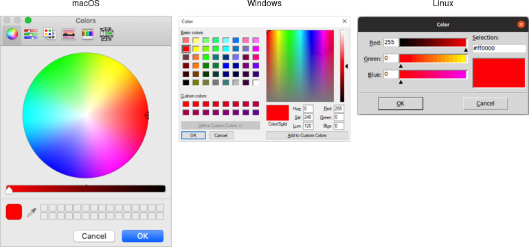
Choose color dialogs.Selecting fonts
Tk 8.6 added support for another system dialog: a font chooser. While the file dialogs and color chooser were modal dialogs that block until the dialog is dismissed and then return a result, the font chooser doesn't work like that.
The font chooser was added in Tk 8.6.

Font chooser dialogs.While the system font dialog is modal on some platforms, e.g., Windows, that's not the case everywhere. On macOS, the system font chooser works more like a floating tool palette in a drawing program, remaining available to change the font for whatever text is selected in your main application window. The Tk font dialog API has to accommodate both models. To do so, it uses callbacks (and virtual events) to notify your application of font changes. Additional details can be found in the fontchooser reference manual pages.
To use the font dialog, first, provide it with an initial font and a callback which will be invoked when a font is chosen. For illustration, we'll have the callback change the font on a label.
l = ttk.Label(root, text="Hello World", font="helvetica 24") l.grid(padx=10, pady=10) def font_changed(font): l['font'] = font root.tk.call('tk', 'fontchooser', 'configure', '-font', 'helvetica 24', '-command', root.register(font_changed))Tkinter has not yet added a convenient way to use this new dialog, so this example code uses the Tcl API directly.
grid [ttk::label .l -text "Hello World" -font "helvetica 24"] -padx 10 -pady 10 proc font_changed {font} {.l configure -font $font} tk fontchooser configure -font "helvetica 24" -command font_changed$l = Tk::Tile::Label.new(root) {text "Hello World"; font "helvetica 24";} $l.grid :padx => 10, :pady => 10 def font_changed(font) $l['font'] = font end TkFont::Fontchooser.configure :font => "helvetica 24", :command => proc{|f| font_changed(f);}our $l = $mw->new_ttk__label(-text => "Hello World", -font => "helvetica 24"); $l->g_grid(-padx => 10, -pady => 10); sub font_changed { ($font) = @_; $l->configure(-font => $font); } Tkx::tk_fontchooser_configure( -font => "helvetica 24", -command => \&font_changed);You can query or change the font that is (or will be) displayed in the dialog at any time.
Next, put the dialog onscreen via the
showmethod. On platforms where the font dialog is modal, your program will block at this point until the dialog is dismissed. On other platforms,showreturns immediately; the dialog remains onscreen while your program continues. At this point, a font has not been chosen. There's also ahidemethod to remove it from the screen (not terribly useful when the font dialog is modal).root.tk.call('tk', 'fontchooser', 'show') root.tk.call('tk', 'fontchooser', 'hide')tk fontchooser show tk fontchooser hideTkFont::Fontchooser.show TkFont::Fontchooser.hideTkx::tk_fontchooser_show(); Tkx::tk_fontchooser_hide();If the font dialog was modal, and the user chose a font, the dialog would have invoked your callback, passing it a font specification. If they canceled out of the dialog, there'd be no callback. When the dialog isn't modal and the user chooses a font, it will invoke your callback. A <<TkFontchooserFontChanged>> virtual event is also generated; you can retrieve the current font via the dialog's
fontconfiguration option. If the font dialog is closed, a <<TkFontchooserVisibility>> virtual event is generated. You can also find out if the font dialog is currently visible onscreen via thevisibleconfiguration option (though changing it is an error; use theshowandhidemethods instead).Because of the significant differences, providing a good user experience on all platforms takes a bit of work. On platforms where the font dialog is modal, it's likely to be invoked from a button or menu item that says, e.g.,
Font.... On other platforms, the button or menu item should toggle betweenShow FontsandHide Fonts.If you have several text widgets in your application that can be given different fonts, when one of them gains focus, it should update the font chooser with its current font. This also means that a callback from the font dialog may apply to a different text widget than the one you initially called
showfrom! Finally, be aware that the font chooser itself may gain the keyboard focus on some platforms.As of Tk 8.6.17, there are still a few bugs in the font chooser on various platforms. Here's a quick rundown, including workarounds:
- on macOS, if you don't provide a font via the
fontconfiguration option, your callbacks won't be invoked ⇒ always provide an initial font - on X11, if you don't provide values for all configuration options, those you don't include will be reset to their default values ⇒ whenever you change any option, change all of them, even if it's just to their current value
- on X11, the font dialog includes an
Applybutton when you provide a callback but omits it when you don't (and just watch for virtual events); however, other bugs mean those virtual events are never generated ⇒ always provide a command callback - on Windows, you can also leave off the
Applybutton by not providing a callback; while virtual events are generated on font changes, thefontconfiguration option is never updated ⇒ always provide a command callback, and hold onto the font yourself, rather than trying to ask the font dialog for it later - on Windows, a font change virtual event is not generated if you change the
fontconfiguration option in your code, though it is on macOS and X11 ⇒ take any necessary actions when you change the font in your code rather than in a virtual event handler
Because of the differences between platforms and the various bugs, testing is far more important when using the font chooser than the other system dialogs.
Alert and confirmation dialogs
Many applications use various simple modal alerts or dialogs to notify users of an event, ask them to confirm an action, or make another similar choice via clicking on a button. Tk provides a versatile "message box" that encapsulates all these different types of dialogs.
from tkinter import messagebox messagebox.showinfo(message='Have a good day')tk_messageBox -message "Have a good day"Tk::messageBox :message => 'Have a good day'Tkx::tk___messageBox(-message => "Have a good day");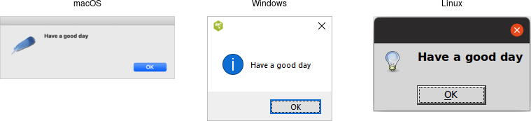
Simple message boxes.messagebox.askyesno( message='Are you sure you want to install SuperVirus?', icon='question', title='Install')tk_messageBox -type "yesno" -message "Are you sure you want to install SuperVirus?" -icon question -title "Install"Tk::messageBox :type => 'yesno', :message => 'Are you sure you want to install SuperVirus?', :icon => 'question', :title => 'Install'Tkx::tk___messageBox(-type => "yesno", -message => "Are you sure you want to install SuperVirus?", -icon => "question", -title => "Install");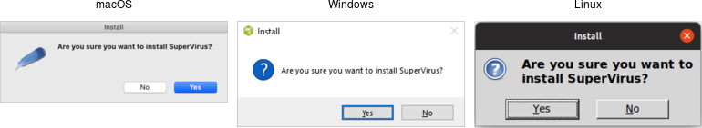
Example message boxes.Like the previous dialogs we've seen, these are modal and return the result of a user's action to the caller. The exact return value will depend on the
typeoption passed to the command, as shown here:ok (default):- ⇒
ok okcancel:- ⇒
okorcancel yesno:- ⇒
yesorno yesnocancel:- ⇒
yes,noorcancel retrycancel:- ⇒
retryorcancel abortretryignore:- ⇒
abort,retryorignore
Rather than using a
typeoption, Tkinter uses a different method name for each type of dialog. The return values vary with the method:showinfo:- ⇒
"ok" showwarning:- ⇒
"ok" showerror:- ⇒
"ok" askokcancel:- ⇒
True(on ok) orFalse(on cancel) askyesno:- ⇒
True(on yes) orFalse(on no) askretrycancel:- ⇒
True(on retry) orFalse(on cancel) askquestion:- ⇒
"yes"or"no" askyesnocancel:- ⇒
True(on yes),False(on no), orNone(on cancel)
Admittedly, the Tkinter
messageboxAPI isn't the most consistent. It mixes return types (strings or booleans), there is some duplication (askyesnoandaskquestion), and one underlying dialog type (abortretryignore) is omitted.The full list of possible options is shown here:
type:- As described above.
message:- The main message displayed inside the alert.
detail:- A secondary message (if needed).
title:- Title for the dialog window. Not used on macOS.
icon:- Icon, one of
info(default),error,question, orwarning. default:- Default button, e.g.,
okorcancelfor anokcanceldialog. parent:- Window of your application this dialog is being posted for.
Additional details can be found in the reference manual.
These new messagebox dialogs replace the older
tk_dialogcommand, which does not comply with current platform user interface conventions.Rolling your own
If you need to create your own modal dialogs, there are a few things you'll need to take care of. We've covered most of them earlier in the chapter, e.g., setting up window styles, positioning the window, etc.
First, you need to ensure that users can only interact with your dialog. You can use
grab_setto do this.If you want your dialog function to block your application (i.e., the call to create the dialog shouldn't return until the dialog is dismissed), this is also possible. There's no reason you'd need to do this, as you can respond to callbacks, event bindings, etc., while running the normal event loop, destroy the dialog and move on.
This somewhat cryptic example includes the main steps needed to create a modal dialog.
ttk.Entry(root).grid() # something to interact with def dismiss (): dlg.grab_release() dlg.destroy() dlg = Toplevel(root) ttk.Button(dlg, text="Done", command=dismiss).grid() dlg.protocol("WM_DELETE_WINDOW", dismiss) # intercept close button dlg.transient(root) # dialog window is related to main dlg.wait_visibility() # can't grab until window appears, so we wait dlg.grab_set() # ensure all input goes to our window dlg.wait_window() # block until window is destroyedgrid [ttk::entry .e] ; # something to interact with proc dismiss {} { grab release .dlg destroy .dlg } toplevel .dlg grid [ttk::button .dlg.b -text Done -command dismiss] wm protocol .dlg WM_DELETE_WINDOW dismiss ; # intercept close button wm transient .dlg . ; # dialog window is related to main tkwait visibility .dlg ; # can't grab until window appears, so we wait grab set .dlg ; # ensure all input goes to our window tkwait window .dlg ; # block until window is destroyedTk::Tile::Entry.new(root).grid() # something to interact with def dismiss $dlg.grab_release() $dlg.destroy() end $dlg = TkToplevel.new(root) Tk::Tile::Button.new($dlg) {text "Done"; command proc{dismiss}}.grid() $dlg.protocol("WM_DELETE_WINDOW", proc{dismiss}) # intercept close button $dlg.transient(root) # dialog window is related to main $dlg.wait_visibility() # can't grab until window appears, so we wait $dlg.grab_set() # ensure all input goes to our window $dlg.wait_window() # block until window is destroyed$mw->new_ttk__entry()->g_grid(); # something to interact with sub dismiss { $dlg->g_grab_release(); $dlg->g_destroy(); } $dlg = $mw->new_toplevel; $dlg->new_ttk__button(-text => "Done", -command => sub{dismiss})->g_grid(); $dlg->g_wm_protocol("WM_DELETE_WINDOW", sub{dismiss}); # intercept close button $dlg->g_wm_transient($mw); # dialog window is related to main $dlg->g_tkwait_visibility(); # can't grab until window appears, so we wait $dlg->g_grab_set(); # ensure all input goes to our window $dlg->g_tkwait_window(); # block until window is destroyedApplication code blocking like this is an example of running a nested event loop that we generally recommend against, though it may be more convenient in certain circumstances.
Tkinter's standard library includes a
simpledialogmodule that helps with building your own dialogs. We don't recommend using it directly because it uses the classic Tk widgets rather than the newer themed widgets. However, it does illustrate how to use some of the techniques for making dialogs behave that we just covered.Organizing Complex Interfaces
If you have a complex user interface, you'll need to find ways to organize it that don't overwhelm your users. There are several different approaches to doing this. Both general-purpose and platform-specific human interface guidelines are good resources when designing your user interface.
When we talk about complexity in this chapter, we don't mean the underlying technical complexity of how the program is implemented. Instead, we mean how it's presented to users. A user interface can be pulled together from many different modules, built from hundreds of widgets combined in a deeply nested hierarchy, but that doesn't mean users need to perceive it as complex.
Multiple windows
One benefit of using multiple windows in an application can be to simplify the user interface. Done well, it can require users to focus only on the contents of one window at a time to complete a task. Forcing them to focus on or switch between several windows can also have the opposite effect. Similarly, showing only the widgets relevant to the current task (i.e., via
grid) can help simplify the user interface.White space
If you do need to display a large number of widgets onscreen at the same time, think about how to organize them visually. We've seen how
gridmakes it easy to align widgets with each other. White space is another useful aid. Place related widgets close to each other (possibly with an explanatory label immediately above) and separate them from other widgets by white space. This helps users organize the user interface in their own minds.The recommended amount of white space around different widgets, between groups of widgets, around borders, etc., is highly platform-specific. While you can do an adequate job without worrying about exact pixel numbers, you'll need to tune this for each platform if you want a highly polished user interface.
Separator
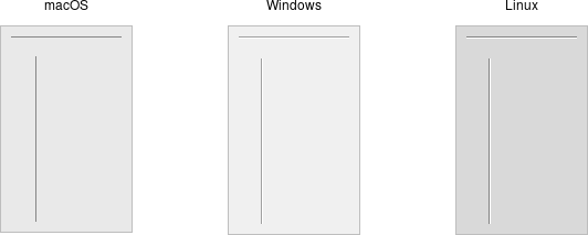
Separator widgets.A second approach to grouping widgets in one display is to place a thin horizontal or vertical rule between groups of widgets; often, this can be more space-efficient than using white space, which may be relevant for a tight display. Tk provides a simple separator widget for this purpose.
Separators are created using the
ttk.Separatorclass:s = ttk.Separator(parent, orient=HORIZONTAL)Separators are created using the
ttk::separatorcommand:ttk::separator .s -orient horizontalSeparators are created using the
Tk::Tile::Separatorclass:s = Tk::Tile::Separator.new(parent) { orient 'horizontal' }Separators are created using thenew_ttk__separatormethod, a.k.a.Tkx::ttk__separator:$sep = $parent->new_ttk__separator(-orient => 'horizontal');The
orientoption may be specified as eitherhorizontalorvertical.Labelframe

Labelframe widgets.A labelframe widget, also commonly known as a group box, provides another way to group related components. It acts like a normal
ttk::frame, in that it contains other widgets that yougridinside it. However, it is visually set off from the rest of the user interface. You can optionally provide a text label to be displayed outside the labelframe.
Labelframes are created using the
ttk.Labelframeclass:lf = ttk.Labelframe(parent, text='Label')Labelframes are created using the
ttk::labelframecommand:ttk::labelframe .lf -text "Label"Labelframes are created using the
Tk::Tile::Labelframeclass:lf = Tk::Tile::Labelframe.new(parent) { text 'Label' }Labelframes are created using thenew_ttk__labelframemethod, a.k.a.Tkx::ttk__labelframe:$lf = $parent->new_ttk__labelframe(-text => "Label");Panedwindow

Panedwindow widgets (shown here managing several labelframes).A panedwindow widget lets you stack two or more resizable widgets above and below each other (or to the left and right). Users can adjust their relative heights (or widths) by dragging a sash located between the panes. Typically the widgets you're adding to a panedwindow will be frames containing many other widgets
Panedwindows are created using thettk.Panedwindowclass:p = ttk.Panedwindow(parent, orient=VERTICAL) # two panes, each of which would get widgets gridded into it: f1 = ttk.Labelframe(p, text='Pane1', width=100, height=100) f2 = ttk.Labelframe(p, text='Pane2', width=100, height=100) p.add(f1) p.add(f2)Panedwindows are created using the
ttk::panedwindowcommand:ttk::panedwindow .p -orient vertical # two panes, each of which would get widgets gridded into it: ttk::labelframe .p.f1 -text Pane1 -width 100 -height 100 ttk::labelframe .p.f2 -text Pane2 -width 100 -height 100 .p add .p.f1 .p add .p.f2Panedwindows are created using the
Tk::Tile::Panedclass:p = Tk::Tile::Paned.new(parent) { orient 'vertical' } # two panes, each of which would get widgets gridded into it: f1 = Tk::Tile::Labelframe.new(p) {text 'Pane1'; width 100; height 100;} f2 = Tk::Tile::Labelframe.new(p) {text 'Pane2'; width 100; height 100;} p.add f1, nil p.add f2, nilThe extra
nilparameter toaddcan be replaced with a hash of pane-specific options, which usually aren't needed.Panedwindows are created using thenew_ttk__panedwindowmethod, a.k.a.Tkx::ttk__panedwindow:$p = $mw->new_ttk__panedwindow(-orient => 'vertical'); # two panes, each of which would get widgets gridded into it: $f1 = $p->new_ttk__labelframe(-text => "Panel", -width => 100, -height => 100); $f2 = $p->new_ttk__labelframe(-text => "Pane2", -width => 100, -height => 100); $p->add($f1); $p->add($f2);A panedwindow is either
vertical(its panes are stacked vertically on top of each other) orhorizontal. Importantly, each pane you add to the panedwindow must be a direct child of the panedwindow itself.Calling the
addmethod adds a new pane at the end of the list of panes. Theinsertmethod allows you to add a new pane before the last pane; pass the position (0..n-1) as the first parameter. If the pane is already managed by the panedwindow, it will be moved to the new position. You can use theforgetmethod to remove a pane from the panedwindow, passing it either the window to remove or its position as a parameter.There are a number of other options available to fine-tune the display. You can assign relative weights to each pane so that if the overall panedwindow resizes, certain panes will be allocated more space than others. As well, you can adjust the position of each sash between items in the panedwindow. See the command reference for details.
Notebook

Notebook widgets.A notebook widget uses the metaphor of a tabbed notebook to let users switch between one of several pages using an index tab. Unlike with paned windows, users only see a single page (akin to a pane) at a time.
Notebooks are created using the
ttk.Notebookclass:n = ttk.Notebook(parent) f1 = ttk.Frame(n) # first page, which would get widgets gridded into it f2 = ttk.Frame(n) # second page n.add(f1, text='One') n.add(f2, text='Two')Notebooks are created using the
ttk::notebookcommand:ttk::notebook .n ttk::frame .n.f1; # first page, which would get widgets gridded into it ttk::frame .n.f2; # second page .n add .n.f1 -text "One" .n add .n.f2 -text "Two"Notebooks are created using the
Tk::Tile::Notebookclass:n = Tk::Tile::Notebook.new(parent) f1 = Tk::Tile::Frame.new(n); # first page, which would get widgets gridded into it f2 = Tk::Tile::Frame.new(n); # second page n.add f1, :text => 'One' n.add f2, :text => 'Two'Notebooks are created using thenew_ttk__notebookmethod, a.k.a.Tkx::ttk__notebook:$n = $mw->new_ttk__notebook; $f1 = $n->new_ttk__frame; # first page, which would get widgets gridded into it $f2 = $n->new_ttk__frame; # second page $n->add($f1, -text => "One"); $n->add($f2, -text => "Two");The operations on tabbed notebooks are similar to those on panedwindows. Each page is typically a frame and again must be a direct child (subwindow) of the notebook itself. Add a new page and its associated tab after the last tab with the
addmethod. Thetexttab option sets the label on the tab; also useful is thestatetab option, which can have the valuenormal,disabled(not selectable), orhidden.To insert a tab at somewhere other than the end of the list, use the
insertmethod, passing a position (0..n-1) as the first parameter. To remove a given tab, use theforgetmethod, passing it either the position (0..n-1) or the tab's subwindow. You can retrieve the list of all subwindows contained in the notebook via thetabsmethod.To retrieve the currently selected subwindow, call the
selectmethod. Change the selected tab by passing either the tab's position or the subwindow itself as a parameter toselect.print(n.select()) n.select(f2)puts [.n select] .n select .n.f2print n.selected() n.select f2Ruby uses
selectedrather thanselectto return the selected tab.print($n->select()); $n->select($f2);The notebook's
tabmethod allows you to examine or change options for individual tabs. Again, pass it either the tab's subwindow or its position as the first parameter.print(n.tab(f1)) # a dictionary of all the tab's options print(n.tab(f1)['text']) # value of the tab's 'text' option print(n.tab(f1, 'text')) # another way to get tab's 'text' option n.tab(f1, text="New Title") # change the tab's 'text' optionputs [.n tab .n.f1] # all the tab's options puts [.n tab .n.f1 -text] # get the value of the tab's 'text' option .n tab .n.f1 -text "New Title" # change the tab's 'text' optionprint n.itemcget(f1, :text) # get the value of the tab's text option n.itemconfigure(f1, :text => 'New Title') # change the tab's 'text' optionRuby uses
itemcgetanditemconfigureinstead oftab.print($n->tab($f1, -text)); # get the value of the tab's text option $n->tab($f2, -text => "New Title"); # change the tab's 'text' optionNotebook widgets generate a
<<NotebookTabChanged>>virtual event whenever a new tab is selected.Again, there are a variety of less frequently used options and commands detailed in the command reference.
Fonts, Colors, Images
This chapter describes how Tk handles fonts, colors, and images. We've touched on all of these before, but here we'll provide a more in-depth treatment.
Fonts
Tk's label widget allows you to change the font used to display text via the
fontconfiguration option. The canvas and text widgets, covered in the following chapters, also allow you to specify fonts. Other themed widgets that display text may not have afontconfiguration option, but their fonts can be changed using styles.We'll cover styles in detail later. In essence, they replace the old way of tweaking multiple configuration options on individual widgets. Instead, fonts, colors, and other settings that control appearance can be bundled together in a style. That style can then be applied to multiple widgets. It's akin to the difference between hardcoding display-oriented markup inside HTML pages vs. using CSS to keep display-specific information separate.
As with many things in Tk, the default fonts are usually a good choice. If you need to make changes, this section shows you the best way to do so, using named fonts. Tk includes named fonts suitable for use in all different components of your user interface. They take into account the conventions of the specific platform you're running on. You can also specify your own fonts when you need additional flexibility.
The font command reference provides full details on specifying fonts, as well as other font-related operations.
Many older Tk programs hardcoded fonts, using either the "family size style" format we'll see below, X11 font names, or the older and more arcane X11 font specification strings. These applications looked increasingly dated as platforms evolved. Worse, fonts were often specified on a per-widget basis, leaving font decisions spread throughout the code. Named fonts, particularly the standard fonts that Tk provides, are a far better solution. Reviewing and updating font decisions is an easy and important change to make in any existing application.
Standard fonts
Each platform defines specific fonts that should be used for standard user interface elements. Tk encapsulates many of these decisions into a standard set of named fonts. They are available on all platforms, though the exact font used will vary. This helps abstract away platform differences. Of course, the standard widgets use these named fonts. The predefined fonts are:
TkDefaultFont:- Default for items not otherwise specified.
TkTextFont:- Used for entry widgets, listboxes, etc.
TkFixedFont:- A standard fixed-width font.
TkMenuFont:- The font used for menu items.
TkHeadingFont:- Font for column headings in lists and tables.
TkCaptionFont:- A font for window and dialog caption bars.
TkSmallCaptionFont:- A smaller caption font for tool dialogs.
TkIconFont:- A font for icon captions.
TkTooltipFont:- A font for tooltips.
Platform-specific fonts
Tk provides additional named fonts to help you comply with less common situations on specific platforms. Individual platform guidelines detail how and where these fonts should be used. These fonts are only defined on specific platforms. You'll need to take that into account if your application is portable across platforms.
Tk on X11 recognizes any valid X11 font name (see, e.g., the
xlsfontscommand). However, these can vary with the operating system, installed software, and the configuration of the individual machine. There is no guarantee that a font available on your X11 system has been installed on any other X11 system.On Windows, Tk provides named fonts for all the fonts that can be set in the "Display" Control Panel. It recognizes the following font names:
On macOS, the Apple Human Interface Guidelines (HIG) specifies a number of additional fonts. Tk recognizes the following names:system,ansi,device,systemfixed,ansifixed, andoemfixed.systemSystemFont,systemSmallSystemFont,systemApplicationFont,systemViewsFont,systemMenuItemFont,systemMenuItemCmdKeyFont,systemPushButtonFont,systemAlertHeaderFont,systemMiniSystemFont,systemDetailEmphasizedSystemFont,systemEmphasizedSystemFont,systemSmallEmphasizedSystemFont,systemLabelFont,systemMenuTitleFont,systemMenuItemMarkFont,systemWindowTitleFont,systemUtilityWindowTitleFont,systemToolbarFont, andsystemDetailSystemFont.Working with named fonts
Tk provides several operations that help you work with named fonts. You can start by getting a list of all the currently defined named fonts.
from tkinter import font font.names()font namesTkFont.namesTkx::font_names()You can find out the actual system font represented by an abstract named font. This consists of the
family(e.g.,TimesorHelvetica), thesize(in points if positive, in pixels if negative), theweight(normalorbold), theslant(romanoritalic), and boolean attributes forunderlineandoverstrike. You can find out the font'smetrics(how tall characters in the font can be and whether it is monospaced), and evenmeasurehow many pixels wide a piece of text rendered in the font would be.>>> from tkinter import font >>> f = font.nametofont('TkTextFont') >>> f.actual() {'family': '.AppleSystemUIFont', 'size': 13, 'weight': 'normal', 'slant': 'roman', 'underline': 0, 'overstrike': 0} >>> f.metrics() {'ascent': 13, 'descent': 3, 'linespace': 16, 'fixed': 0} >>> f.measure('The quick brown fox') 124Tkinter provides a
Fontclass to hold information about a named font. You can create an instance of this class from the name of a font using thenametofontfunction. When you use named fonts in your application (e.g., via a label'sfontconfiguration option), you can supply either the font name (as a string) or aFontinstance.% font actual TkTextFont -family .AppleSystemUIFont -size 13 -weight normal -slant roman -underline 0 -overstrike 0 % font metrics TkTextFont -ascent 13 -descent 3 -linespace 16 -fixed 0 % font measure TkTextFont "The quick brown fox" 124irb(main):003:0> TkFont.actual "TkTextFont" => [["family", ".AppleSystemUIFont"], ["size", 13], ["weight", "normal"], ["slant", "roman"], ["underline", false], ["overstrike", false]] irb(main):004:0> TkFont.metrics "TkTextFont" => [["ascent", 13], ["descent", 3], ["linespace", 16], ["fixed", 0]] irb(main):005:0> TkFont.measure "TkTextFont", "The quick brown fox" => 124perl> Tkx::font_actual('TkTextFont') -family .AppleSystemUIFont -size 13 -weight normal -slant roman -underline 0 -overstrike 0 perl> Tkx::font_metrics('TkTextFont') -ascent 13 -descent 3 -linespace 16 -fixed 0 perl> Tkx::font_measure('TkTextFont', 'The quick brown fox') 124Trying these in an interactive shell and got an error? Even though we're not displaying anything onscreen, you need to initialize Tk before using the various font functions.
You can also create your own fonts, which can then be used exactly like the predefined ones. To do so, choose a name for the font and specify its font attributes as above.
from tkinter import font highlightFont = font.Font(family='Helvetica', name='appHighlightFont', size=12, weight='bold') ttk.Label(root, text='Attention!', font=highlightFont).grid()If you don't supply a name, Tkinter will generate one, which you can retrieve via
font.nameorstr(font). It's usually best to supply one.font create AppHighlightFont -family Helvetica -size 12 -weight bold grid [ttk::label .l -text "Attention!" -font AppHighlightFont]AppHighlightFont = TkFont.new :family => 'Helvetica', :size => 12, :weight => 'bold' Tk::Tile::Label.new(root) {text 'Attention!'; font AppHighlightFont}.gridTkx::font_create("AppHighlightFont", -family => "Helvetica", -size => 12, -weight => "bold"); $l = $parent->new_ttk__label(-text => "Attention!", -font => "AppHighlightFont"); $l->g_grid;The
familyattribute specifies the font family. Tk ensures the namesCourier,Times, andHelveticaare available, though they may be mapped to an appropriate monospaced, serif, or sans-serif font). Other fonts installed on your system can be used, but the usual caveats about portability apply. You can get the names of all available families with:font.families()font familiesTkFont.familiesTkx::font_families()You can change the attributes of a named font. For example, you might change the size in response to menu options allowing users to zoom in or out.
f['size'] = 12font configure TkTextFont -size 12TkFont.configure 'TkTextFont' size => 12Tkx::font_configure('TkTextFont', -size => 12);Font descriptions
Another way to specify fonts is via a list of attributes, starting with the font family, and optionally including a size and one or more style options. Some examples of this are
Helvetica,Helvetica 12,Helvetica 12 bold, andHelvetica 12 bold italic. These font descriptions can be used anywhere you'd use a named font, e.g., afontconfiguration option.In general, switching from font descriptions to named fonts is advisable to isolate font differences in one location in the program.
Colors
As with fonts, there are various ways to specify colors. Full details can be found in the colors command reference.
In general, Tk widgets default to the right colors for most situations. If you'd like to change colors, you'll do so via widget-specific commands or options, e.g., the label's
foregroundandbackgroundconfiguration options. For most themed widgets, color changes are specified through styles, not by changing the widget directly.You can specify colors via RGB, as you would in HTML or CSS, e.g.
#3FFor#FF016A. Tk also recognizes names such asred,black,grey50,light blue, etc.Tk recognizes the standard names for colors defined by X11. You can find a complete list in the command reference (noted above).
As with fonts, both macOS and Windows specify many system-specific abstract color names (again, see the reference). The actual color these correspond to may depend on system settings and can change over time, e.g., dark mode, text highlight colors, default backgrounds.
If needed, you can find the RGB values (each between 0 and 65535) for a color using the
winfo_rgbmethod on any widget.root.winfo_rgb('red')winfo rgb . redroot.winfo_rgb('red')$mw->g_winfo_rgb('red')It should probably go without saying, but restraint in the use of colors is highly advisable!
Images
We've seen the basics of using images already, displaying them in labels or buttons, for example. We create an image object, usually from a file on disk.
imgobj = PhotoImage(file='myimage.png') label['image'] = imgobjimage create photo imgobj -file "myimage.png" .label configure -image imgobjimage = TkPhotoImage.new(:file => "myimage.png") label['image'] = imageTkx::image_create_photo("imgobj", -file => "myimage.png"); $l->configure(-image => "imgobj");Out of the box, Tk includes support for PNG, GIF, and PPM/PNM images.
The Python Imaging Library (PIL) adds support for many other formats. More specifically, we'll use an up-to-date fork of PIL called
pillow. As it doesn't come bundled with Python, you'll normally need to install it, e.g., viapip install Pillow.from PIL import ImageTk, Image myimg = ImageTk.PhotoImage(Image.open('myimage.jpeg'))A Tk extension library called
Imgadds support for many other formats.package require Img image create photo myimg -file "myimage.jpeg"A Tk extension library called
Imgadds support for many other formats.require 'tkextlib/tkimg' myimg = TkPhotoImage.new(:file => 'myimage.jpeg')A Tk extension library called
Imgadds support for many other formats.Tkx::package_require("Img"); Tkx::image_create_photo("myimg", -file => "myimage.jpeg");Tk's images are actually quite powerful and sophisticated and provide various ways to inspect and modify images. You can find out more from the image command reference and the photo command reference.
The types of multi-color images we've seen here are referred to in Tk as photo images. Tk also provides a second type, two-bit bitmap images, which were widely used in the '90s when most Unix workstations used quite large (compared with PCs) monitors, but they were only black and white. Needless to say, color is mostly de rigueur these days, so updating to full-color images for icons and so on is highly advisable. Though in what some may consider retro-styling, some flat and material design schemes have returned to black and white. Plus ça change...
Canvas
Tk's canvas is an incredibly powerful and flexible widget and truly one of Tk's highlights. It is suitable for a wide range of uses, including drawing or diagramming, CAD tools, displaying or monitoring simulations or actual equipment, and building more complex widgets out of simpler ones.
Canvas
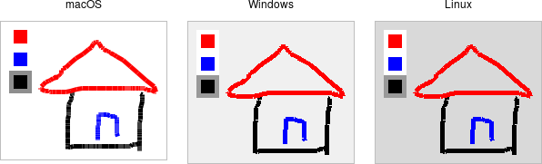
Canvas widgets.A canvas widget manages a 2D collection of graphical objects — lines, circles, text, images, other widgets, and more.
Canvas widgets are part of the classic Tk widgets, not the themed Tk widgets.
Canvas widgets are created using the
Canvasclass:canvas = Canvas(parent, width=500, height=400, background='gray75')Canvas widgets are created using the
tk::canvascommand:tk::canvas .canvas -width 500 -height 400 -background gray75Canvas widgets are created using the
TkCanvasclass:canvas = TkCanvas.new(parent) {width 500; height 400; background 'gray75'}Canvas widgets are created using the
new_tk__canvasmethod, a.k.a.Tkx::tk__canvas:$canvas = $parent->new_tk__canvas(-width => 500, -height => 400, -background => 'gray75');You'll often provide a width and height, either in pixels or any of the other standard distance units. As always, you can ask the geometry manager to expand it to fill the available space in the window. You might provide a default background color for the canvas, specifying colors as you learned about in the last chapter. Canvas widgets also support other appearance options like
reliefandborderwidththat we've used before.Canvas widgets have a tremendous number of features, and we won't cover everything here. Instead, we'll start with a simple example, a freehand sketching tool, and incrementally add new pieces, each showing another feature of canvas widgets.
Creating items
When you create a new canvas widget, it is essentially a large rectangle with nothing on it; truly a blank canvas, in other words. To do anything useful with it, you'll need to add items to it. There are a wide variety of different types of items you can add. Here, we'll add a simple line item to the canvas.
To create a line, you need to specify its starting and ending coordinates. Coordinates are expressed as the number of pixels away from the top-left corner, horizontally and vertically, i.e. (x,y). The pixel at the top-left corner, known as the origin, has coordinates (0,0). The "x" value increases as you move to the right, and the "y" value increases as you move down. A line is described by two points, which we'd refer to as (x0,y0) and (x1,y1). This code creates a line from (10,5) to (200,50):
canvas.create_line(10, 5, 200, 50)The
create_linemethod returns an item id (an integer) that uniquely refers to this item. We'll see how it can be used shortly. Often, we don't need to refer to the item later and can ignore the returned id.When specifying a set of coordinates for an item, you can provide them as individual arguments as we did here, or combine them into a single tuple or list argument, e.g.,
canvas.create_line((10, 5, 200, 50))orcanvas.create_line([10, 5, 200, 50])..canvas create line 10 5 200 50The
create linecommand returns an item id (an integer) that uniquely refers to this item. We'll see how it can be used shortly. Often, we don't need to refer to the item later and can ignore the returned id.TkcLine.new( canvas, 10, 5, 200, 50)This command returns an item object representing the line. We'll see how it can be used shortly. Often, we don't need to refer to the item later, and can ignore the returned item object.
Internally, Tk refers to individual canvas items by a unique id, an integer starting at 1 and counting up for each object created. Ruby encapsulates this well inside item objects. In some cases, as well as to understand much of the reference documentation, you'll need this numeric id. You can retrieve it via the
idmethod of a canvas item object.$canvas->create_line(10,5,200,50);The
create_linemethod returns an item id (an integer) that uniquely refers to this item. We'll see how it can be used shortly. Often, we don't need to refer to the item later and can ignore the returned id.A simple sketchpad
Let's start our simple sketchpad example. For now, we'll implement freehand drawing on the canvas with the mouse. We create a canvas widget and attach event bindings to it to capture mouse clicks and drags. When the mouse is first pressed, we'll remember that location as the "start" of our next line. As the mouse is moved with the mouse button held down, we create a line item from this "start" position to the current mouse location. This current location becomes the "start" position for the next line item. Every mouse drag creates a new line item.
from tkinter import * from tkinter import ttk def savePosn(event): global lastx, lasty lastx, lasty = event.x, event.y def addLine(event): canvas.create_line(lastx, lasty, event.x, event.y) savePosn(event) root = Tk() root.columnconfigure(0, weight=1) root.rowconfigure(0, weight=1) canvas = Canvas(root) canvas.grid(column=0, row=0, sticky=(N, W, E, S)) canvas.bind("<Button-1>", savePosn) canvas.bind("<B1-Motion>", addLine) root.mainloop()In this simple example, we're using global variables to store the start position. In practice, we'd encapsulate all of this in a Python class. Here's one way we could do that. Note that this example creates a subclass of
Canvas, which is treated like any other widget in the code. We could have equally well used a standalone class, as we did with the "feet to meters" example.from tkinter import * from tkinter import ttk class Sketchpad(Canvas): def __init__(self, parent, **kwargs): super().__init__(parent, **kwargs) self.bind("<Button-1>", self.save_posn) self.bind("<B1-Motion>", self.add_line) def save_posn(self, event): self.lastx, self.lasty = event.x, event.y def add_line(self, event): self.create_line(self.lastx, self.lasty, event.x, event.y) self.save_posn(event) root = Tk() root.columnconfigure(0, weight=1) root.rowconfigure(0, weight=1) sketch = Sketchpad(root) sketch.grid(column=0, row=0, sticky=(N, W, E, S)) root.mainloop()package require Tk grid [tk::canvas .canvas] -sticky nwes -column 0 -row 0 grid columnconfigure . 0 -weight 1 grid rowconfigure . 0 -weight 1 bind .canvas <1> "set lastx %x; set lasty %y" bind .canvas <B1-Motion> "addLine %x %y" proc addLine {x y} { .canvas create line $::lastx $::lasty $x $y set ::lastx $x; set ::lasty $y }require 'tk' root = TkRoot.new() $canvas = TkCanvas.new(root) $canvas.grid :sticky => 'nwes', :column => 0, :row => 0 TkGrid.columnconfigure( root, 0, :weight => 1 ) TkGrid.rowconfigure( root, 0, :weight => 1 ) $canvas.bind( "1", proc{|x,y| @lastx = x; @lasty = y}, "%x %y") $canvas.bind( "B1-Motion", proc{|x, y| addLine(x,y)}, "%x %y") def addLine (x,y) TkcLine.new( $canvas, @lastx, @lasty, x, y ) @lastx = x; @lasty = y; end Tk.mainloopuse Tkx; $mw = Tkx::widget->new("."); $canvas = $mw->new_tk__canvas; $canvas->g_grid(-column=>0, -row=>0, -sticky=>"nwes"); $mw->g_grid_columnconfigure(0, -weight=>1); $mw->g_grid_rowconfigure(0, -weight=>1); $canvas->g_bind("<1>", [sub {my ($x,$y) = @_; $lastx=$x; $lasty=$y}, Tkx::Ev("%x","%y")]); $canvas->g_bind("<B1-Motion>", [sub {my ($x,$y) = @_; addLine($x,$y)}, Tkx::Ev("%x","%y")]); sub addLine { my ($x,$y) = @_; $canvas->create_line($lastx,$lasty,$x,$y); $lastx = $x; $lasty = $y; } Tkx::MainLoop();Try it out - drag the mouse around the canvas to create your masterpiece.
Item attributes
When creating items, you can also specify one or more item attributes, affecting how it appears. For example, we can specify that the line should be red and three pixels wide.
canvas.create_line(10, 10, 200, 50, fill='red', width=3).canvas create line 10 10 200 50 -fill red -width 3TkcLine.new( canvas, 10, 10, 200, 50, :fill => 'red', :width => 3)$canvas->create_line(10, 10, 200, 50, -fill => "red", -width => 3);The exact set of attributes will vary according to the type of item. Some commonly used ones are:
fill:- color to draw the object
width:- line width of the item (or its outline)
outline:- for filled shapes like rectangles, the color to draw the item's outline
dash:- draw a dashed line instead of a solid one, e.g.,
2 4 6 4alternates short (2 pixels) and long (6 pixels) dashes with 4 pixels between stipple:- instead of a solid fill color, use a pattern, typically
gray75,gray50,gray25, orgray12; stippling is currently not supported on macOS state:- assign a state of
normal(default),disabled(item event bindings are ignored), orhidden(removed from display) disabledfill, disabledwidth, ...:- if the item's
stateis set todisabled, the item will display using these variants of the usual attributes activefill, activewidth, ...:- when the mouse pointer is over the item, it will display using these variants of the usual attributes
If you have canvas items that change state, creating the item with both the regular and
disabled*attribute variants can simplify your code. You simply need to change the item'sstaterather than writing code to change multiple display attributes. The same applies to theactive*attribute variants. Both encourage a more declarative style that can remove a lot of boilerplate code.Just like with Tk widgets, you can change the attributes of canvas items after they're created, or retrieve the current value of an attribute.
id = canvas.create_line(0, 0, 10, 10, fill='red') ... canvas.itemconfigure(id, fill='blue', width=2) print(canvas.itemcget(id, 'fill'))set id [.canvas create line 0 0 10 10 -fill red] ... .canvas itemconfigure $id -fill blue -width 2 puts [.c itemcget $id -fill]line = TkcLine.new( canvas, 0, 0, 10, 10, :fill => 'red' ) line[:fill] = 'blue' line[:width] = 2 print line[:fill]$id = $canvas->create_line(0, 0, 10, 10, -fill => "red"); ... $canvas->itemconfigure($id, -fill => "blue", -width => 2); print($canvas->itemcget($id, -fill));Item types
Canvas widgets support a wide variety of item types.
Line
Our sketchpad created simple line items, each a single segment with a start point and an end point. Lines items can also consist of multiple segments.
canvas.create_line(10, 10, 200, 50, 90, 150, 50, 80).canvas create line 10 10 200 50 90 150 50 80TkcLine.new( canvas, 10, 10, 200, 50, 90, 150, 50, 80)$canvas->create_line(10, 10, 200, 50, 90, 150, 50, 80);Lines have several interesting additional attributes, allowing for drawing curves, arrows, and more.
arrow:- place an arrowhead at the start (
first), end (last), or both ends (both); default isnone arrowshape:- allows changing the appearance of any arrowheads
capstyle:- for wide lines without arrowheads, this controls how the end of lines are drawn; one of
butt(default),projecting, orround joinstyle:- for wide lines with multiple segments, this controls drawings of each vertex; one of
round(default),bevel, ormiter smooth:- if specified as
true(orbezier), draws a smooth curve (via quadratic splines) between multiple segments rather than using straight lines;rawspecifies a different type of curve (cubic splines) splinesteps:- controls the smoothness of curved lines, i.e., those with the
smoothoption set
Rectangle
Rectangles are specified by the coordinates of opposing corners, e.g., top-left and bottom-right. They can be filled in (via
fill) with one color, and theoutlinegiven a different color.canvas.create_rectangle(10, 10, 200, 50, fill='red', outline='blue').canvas create rectangle 10 10 200 50 -fill red -outline blueTkcRectangle.new( canvas, 10, 10, 200, 50, :fill => 'red', :outline => 'blue')$canvas->create_rectangle(10, 10, 200, 50, -fill => "red", -outline => "blue");Oval
Ovals items work exactly the same as rectangles.
canvas.create_oval(10, 10, 200, 150, fill='red', outline='blue').canvas create oval 10 10 200 50 -fill red -outline blueTkcOval.new( canvas, 10, 10, 200, 150, :fill => 'red', :outline => 'blue')$canvas->create_oval(10, 10, 200, 150, -fill => "red", -outline => "blue");Polygon
Polygon items allow you to create arbitrary shapes as defined by a series of points. The coordinates are given in the same way as multipoint lines. Tk ensures the polygon is "closed," attaching the last point to the first if needed. Like ovals and rectangles, they can have separate
fillandoutlinecolors. They also support thejoinstyle,smooth, andsplinestepsattributes of line items.canvas.create_polygon(10, 10, 200, 50, 90, 150, 50, 80, 120, 55, fill='red', outline='blue').canvas create polygon 10 10 200 50 90 150 50 80 120 55 -fill red -outline blueTkcPolygon.new( canvas, 10, 10, 200, 50, 90, 150, 50, 80, 120, 55, :fill => 'red', :outline => 'blue')$canvas->create_polygon(10, 10, 200, 50, 90, 150, 50, 80, 120, 55, -fill => "red", -outline => "blue"Arc
Arc items draw a portion of an oval; think of one piece of a pie chart. Its display is controlled by three attributes:
start: how far along the oval the arc should start, in degrees (0 is the 3-o'clock position)- The
extent: how many degrees "wide" the arc should be, positive for counter-clockwise from the start, negative for clockwise style: one ofpieslice(the default),arc(draws just the outer perimeter), orchord(draws the area between a line connecting the start and end points of the arc and the outer perimeter).
canvas.create_arc(10, 10, 200, 150, fill='yellow', outline='black', start=45, extent=135, width=5).canvas create arc 10 10 200 50 -fill yellow -outline black -start 45 -extent 135 -width 5TkcArc.new( canvas, 10, 10, 200, 150, :fill => 'yellow', :outline => 'black', :start => 45, :extent => 135, :width => 5)$canvas->create_arc(10, 10, 200, 150, -fill => "yellow", -outline => "black", -start => 45, -extent => 135, -width => 5);Image
Image items can display arbitrary images. By default, the item is centered at the coordinates you specify, but this can be changed with the anchor
option, e.g., nw means the coordinates are where to put the top-left of the image.
myimg = PhotoImage(file='pretty.png')
canvas.create_image(10, 10, image=myimg, anchor='nw')image create photo myimg -file pretty.png
.canvas create image 10 10 -image myimg -anchor nwmyimg = TkPhotoImage.new(:file => "pretty.png")
TkcImage.new( canvas, 10, 10, :image => myimg, :anchor => "nw")$im = Tkx::image_create_photo("myimg", -file => "pretty.png");
$canvas->create_image( 10, 10, -image => $im, -anchor => "nw");There's also a bitmap item type for images having only two colors, which can be changed via foreground and background.
They're not commonly used these days.
Text
Text items can display a block of text. Positioning the text works the same as with image items.
Specify the text to display using the text attribute.
All of the text in the item will have the same color (specified by the fill attribute) and the same font (specified by a font attribute).
The text item can display multiple lines of text if you embed \n in the text.
Alternatively, you can have the item automatically wrapped into multiple lines by providing a width attribute to represent the maximum width of a line.
The alignment of multiple lines of text can be set using the justify attribute, which can be one of left (the default), right,
or center.
canvas.create_text(100, 100, text='A wonderful story', anchor='nw', font='TkMenuFont', fill='red').canvas create text 100 100 -text "A wonderful story" -anchor nw -font TkMenuFont -fill redTkcText.new( canvas, 100, 100, :text => 'A wonderful story', :anchor => 'nw', font => 'TkMenuFont', :fill => 'red')$canvas->create_text(100, 100, -text => "A wonderful story", -anchor => "nw", -font => "TkMenuFont", -fill => "red");Widget
One of the coolest things you can do with the canvas widget is embed other widgets inside it. This can be a lowly button, an entry (think in-place
editing of text items), a listbox, a frame itself containing a complex set of widgets... anything! Remember when we said way back when that a canvas widget
could act as a geometry manager? This is what we meant. You're adding these other widgets to your user interface using the canvas instead of using grid.
Canvas items that display other widgets are known as window items (Tk's longstanding terminology for widgets). They are positioned like text and image items.
You can give them explicit width and height attributes; they default to the widget's preferred size. Finally, it's important that
the widget you're placing on the canvas (via the window) attribute be a child widget of the canvas.
b = ttk.Button(canvas, text='Implode!')
canvas.create_window(10, 10, anchor='nw', window=b)ttk::button .canvas.b -text "Implode!"
.canvas create window 10 10 -anchor nw -window .canvas.bb = Tk::Tile::Button.new(canvas) {text 'Implode!'}
TkcWindow.new( canvas, 10, 10, :anchor => "nw", :window => b)$b = $canvas->new_ttk__button(-text => "Implode!");
$canvas->create_window( 10, 10, -anchor => "nw", -window => $b);Modifying items
We've seen how you can modify the configuration options on an item — its color, width, etc. There are several other things you can do with items.
To delete items, use the delete method.
To change an item's size and position, you can use the coords method. You supply
new coordinates for the item, specified the same way as when you first created it. Calling this method
without a new set of coordinates will return the current coordinates of the item. You can use the move
method to offset one or more items
horizontally or vertically from their current position.
All items are ordered from top to bottom in what's called the stacking order. If an item later in the
stacking order overlaps an item below it, the first item will be drawn on top of the second.
The raise (lift in Tkinter)
and lower methods allow you to adjust an item's position in the stacking order.
There are several more operations detailed in the reference manual to modify items and retrieve information about them.
Event bindings
We've already seen that the canvas widget as a whole, like any other Tk widget, can capture events
using the bind command.
You can also attach bindings to individual items in the canvas (or groups of them, as we'll see in the next section using tags). So if you want to know whether or not a particular item has been clicked on, you don't need to watch for mouse click events for the canvas as a whole and then figure out if that click happened on your item. Tk will take care of all this for you.
To capture these events, you use a bind command built into the canvas. It works exactly like the regular bind command, taking an event pattern and a callback. The only difference is you specify the canvas item this binding applies to.
canvas.tag_bind(id, '<1>', ...)Note the difference between the item-specific tag_bind method
and the widget-level bind method.
.canvas bind $id <1> {...}line.bind("1", ...)$canvas->bind($id, "<1>", sub{...});Note the difference between the item-specific bind method and the
widget-level g_bind method.
Let's add some code to our sketchpad example to allow changing the drawing color. We'll first create a few different rectangle items, each filled with a different color. We'll then attach a binding to each of these. When they're clicked on, they'll set a global variable to the new drawing color. Our mouse motion binding will look at that variable when creating the line segments.
color = "black"
def setColor(newcolor):
global color
color = newcolor
def addLine(event):
global lastx, lasty
canvas.create_line(lastx, lasty, event.x, event.y, fill=color)
lastx, lasty = event.x, event.y
id = canvas.create_rectangle(10, 10, 30, 30, fill="red")
canvas.tag_bind(id, "<Button-1>", lambda x: setColor("red"))
id = canvas.create_rectangle(10, 35, 30, 55, fill="blue")
canvas.tag_bind(id, "<Button-1>", lambda x: setColor("blue"))
id = canvas.create_rectangle(10, 60, 30, 80, fill="black")
canvas.tag_bind(id, "<Button-1>", lambda x: setColor("black"))set id [.canvas create rectangle 10 10 30 30 -fill red]
.canvas bind $id <1> "setColor red"
set id [.canvas create rectangle 10 35 30 55 -fill blue]
.canvas bind $id <1> "setColor blue"
set id [.canvas create rectangle 10 60 30 80 -fill black]
.canvas bind $id <1> "setColor black"
set ::color black
proc setColor {color} {
set ::color $color
}
proc addLine {x y} {
.canvas create line $::lastx $::lasty $x $y -fill $::color
set ::lastx $x; set ::lasty $y
}r = TkcRectangle.new( $canvas, 10, 10, 30, 30, :fill => 'red')
r.bind( "1", proc {setColor('red')})
r = TkcRectangle.new( $canvas, 10, 35, 30, 55, :fill => 'blue')
r.bind( "1", proc {setColor('blue')})
r = TkcRectangle.new( $canvas, 10, 60, 30, 80, :fill => 'black')
r.bind( "1", proc {setColor('black')})
@color = 'black'
def setColor color
@color = color
end
def addLine (x,y)
TkcLine.new( $canvas, @lastx, @lasty, x, y, :fill => @color )
@lastx = x; @lasty = y;
end$canvas->g_bind("<1>", [sub {my ($x,$y) = @_; $lastx=$x; $lasty=$y}, Tkx::Ev("%x","%y")]);
$canvas->g_bind("<B1-Motion>", [sub {my ($x,$y) = @_; addLine($x,$y)}, Tkx::Ev("%x","%y")]);
$id = $canvas->create_rectangle(10, 10, 30, 30, -fill => "red");
$canvas->bind($id, "<1>", sub {setColor("red")});
$id = $canvas->create_rectangle(10, 35, 30, 55, -fill => "blue");
$canvas->bind($id, "<1>", sub {setColor("blue")});
$id = $canvas->create_rectangle(10, 60, 30, 80, -fill => "black");
$canvas->bind($id, "<1>", sub {setColor("black")});
$color = "black";
sub setColor {
my ($newcolor) = @_;
$color = $newcolor;
}
sub addLine {
my ($x,$y) = @_;
$canvas->create_line($lastx,$lasty,$x,$y, -fill => $color);
$lastx = $x; $lasty = $y;
}Tags
We've seen that every canvas item can be referred to by a unique id number. There is another handy and powerful way to refer to items on a canvas, using tags.
A tag is just an identifier of your creation, something meaningful to your program. You can attach tags to canvas items; each item can have any number of tags. Unlike item id numbers, which are unique for each item, many items can share the same tag.
What can you do with tags? We saw that you can use the item id to modify a canvas item (and we'll see soon there are other things you can do to items, like move them around, delete them, etc.). Any time you can use an item id, you can use a tag. For example, you can change the color of all items having a specific tag.
Tags are a good way to identify collections of items in your canvas (items in a drawn line, items in a palette, etc.). You can use tags to correlate canvas items to particular objects in your application (for example, tag all canvas items that are part of the robot with id #X37 with the tag "robotX37"). With tags, you don't have to keep track of the ids of canvas items to refer to groups of items later; tags let Tk do that for you.
You can assign tags when creating an item using the tags item configuration option. You
can add tags later with the addtag method or remove them with the dtags method.
You can get the list of tags for an item with the gettags method or return a list of item
id numbers having the given tag with the find command.
For example:
>>> c = Canvas(root)
>>> c.create_line(10, 10, 20, 20, tags=('firstline', 'drawing'))
1
>>> c.create_rectangle(30, 30, 40, 40, tags=('drawing'))
2
>>> c.addtag('rectangle', 'withtag', 2)
>>> c.addtag('polygon', 'withtag', 'rectangle')
>>> c.gettags(2)
('drawing', 'rectangle', 'polygon')
>>> c.dtag(2, 'polygon')
>>> c.gettags(2)
('drawing', 'rectangle')
>>> c.find_withtag('drawing')
(1, 2)
% canvas .c .c % .c create line 10 10 20 20 -tags "firstline drawing" 1 % .c create rectangle 30 30 40 40 -tags "drawing" 2 % .c addtag rectangle withtag 2 % .c addtag polygon withtag rectangle % .c gettags 2 drawing rectangle polygon % .c dtag 2 polygon % .c gettags 2 drawing rectangle % .c find withtag drawing 1 2
>> canvas = TkCanvas.new root
=> #<TkCanvas:0x73c92c @path=".w00000">l
>> l = TkcLine.new canvas, 10, 10, 20, 20, :tags => 'firstline drawing'
=> #<TkcLine:0x737990 @id=1, @parent=#<TkCanvas:0x73c92c @path=".w00000">,
@path=".w00000", @c=#<TkCanvas:0x73c92c @path=".w00000">>
>> r = TkcRectangle.new canvas, 30, 30, 40, 40, :tags => 'drawing'
=> #<TkcRectangle:0x732b34 @id=2, @parent=#<TkCanvas:0x73c92c @path=".w00000">,
@path=".w00000", @c=#<TkCanvas:0x73c92c @path=".w00000">>
>> r.addtag 'rectangle'
=> #<TkcRectangle:0x732b34 @id=2, ... >
>> canvas.addtag 'polygon', :withtag, 'rectangle'
=> <TkCanvas:0x73c92c @path=".w00000">
>> canvas.gettags r
=> ["drawing", "rectangle", "polygon"]
>> r.dtag 'polygon'
=> #<TkcRectangle:0x732b34 @id=2 ... >
>> r.gettags
=> ["drawing", "rectangle"]
>> canvas.find :withtag, 'drawing'
=> [#<TkcLine:0x737990 @id=1 ... >, #<TkcRectangle:0x732b34 @id=2 ... >]
Perl> $c = $mw->new_canvas()
.c
Perl> $c->create_line(10, 10, 20, 20, -tags => "firstline drawing")
1
Perl> $c->create_rectangle(30,30,40,40, -tags => "drawing")
2
Perl> $c->addtag("rectangle", "withtag", 2)
Perl> $c->addtag("polygon", "withtag", "rectangle")
Perl> $c->gettags(2)
drawing rectangle polygon
Perl> $c->dtag(2,"polygon")
Perl> $c->gettags(2)
drawing rectangle
Perl> $c->find_withtag("drawing")
1 2
As you can see, methods like withtag accept either an individual item or a tag; in the latter
case, they will apply to all items having that tag (which could be none). The addtag
and find methods have many other options, allowing you to specify items near a point, overlapping
a particular area, etc.
Let's use tags first to put a border around whichever item in our color palette is currently selected.
def setColor(newcolor):
global color
color = newcolor
canvas.dtag('all', 'paletteSelected')
canvas.itemconfigure('palette', outline='white')
canvas.addtag('paletteSelected', 'withtag', 'palette%s' % color)
canvas.itemconfigure('paletteSelected', outline='#999999')
id = canvas.create_rectangle(10, 10, 30, 30, fill="red", tags=('palette', 'palettered'))
id = canvas.create_rectangle(10, 35, 30, 55, fill="blue", tags=('palette', 'paletteblue'))
id = canvas.create_rectangle(10, 60, 30, 80, fill="black", tags=('palette', 'paletteblack', 'paletteSelected'))
setColor('black')
canvas.itemconfigure('palette', width=5)set id [.canvas create rectangle 10 10 30 30 -fill red -tags "palette palettered"]
set id [.canvas create rectangle 10 35 30 55 -fill blue -tags "palette paletteblue"]
set id [.canvas create rectangle 10 60 30 80 -fill black -tags "palette paletteblack paletteSelected"]
proc setColor {color} {
set ::color $color
.canvas dtag all paletteSelected
.canvas itemconfigure palette -outline white
.canvas addtag paletteSelected withtag palette$color
.canvas itemconfigure paletteSelected -outline #999999
}
setColor black
.canvas itemconfigure palette -width 5r = TkcRectangle.new( $canvas, 10, 10, 30, 30, :fill => 'red', :tags => 'palette palettered')
r = TkcRectangle.new( $canvas, 10, 35, 30, 55, :fill => 'blue', :tags => 'palette paletteblue')
r = TkcRectangle.new( $canvas, 10, 60, 30, 80, :fill => 'black', :tags => 'palette paletteblack paletteSelected')
def setColor color
@color = color
$canvas.dtag 'all', 'paletteSelected'
$canvas.itemconfigure 'palette', :outline => 'white'
$canvas.addtag 'paletteSelected', :withtag, "palette#{color}"
$canvas.itemconfigure 'paletteSelected', :outline => '#999999'
end
setColor 'black'
$canvas.itemconfigure 'palette', :width => 5The canvas itemconfigure method provides another way to change the properties of a canvas item.
The advantage over dealing with the canvas item object directly is that we can specify a tag, so that the
change we're making applies to all items having that tag. Without this, we could use gettags
to get all the items, iterate through them, and set the option, but itemconfigure is more convenient.
$id = $canvas->create_rectangle(10, 10, 30, 30, -fill => "red", -tags => "palette palettered");
$id = $canvas->create_rectangle(10, 35, 30, 55, -fill => "blue", -tags => "palette paletteblue");
$id = $canvas->create_rectangle(10, 60, 30, 80, -fill => "black", -tags => "palette paletteblack paletteSelected");
sub setColor {
my ($newcolor) = @_;
$color = $newcolor;
$canvas->dtag_all("paletteSelected");
$canvas->itemconfigure("palette", -outline => "white");
$canvas->addtag("paletteSelected", withtag => "palette".$color);
$canvas->itemconfigure("paletteSelected", -outline => "#999999");
}
setColor "black";
$canvas->itemconfigure("palette", -width => 5);Let's also use tags to make the current stroke being drawn appear more prominent. When the mouse button is released, we'll return the line to normal.
def addLine(event):
global lastx, lasty
canvas.create_line(lastx, lasty, event.x, event.y, fill=color, width=5, tags='currentline')
lastx, lasty = event.x, event.y
def doneStroke(event):
canvas.itemconfigure('currentline', width=1)
canvas.bind("<B1-ButtonRelease>", doneStroke)bind .canvas <B1-ButtonRelease> "doneStroke"
proc addLine {x y} {
.canvas create line $::lastx $::lasty $x $y -fill $::color -width 5 -tags currentline
set ::lastx $x; set ::lasty $y
}
proc doneStroke {} {
.canvas itemconfigure currentline -width 1
}$canvas.bind( "B1-ButtonRelease", proc{doneStroke})
def addLine (x,y)
TkcLine.new( $canvas, @lastx, @lasty, x, y, :fill => @color, :width => 5, :tags => 'currentline' )
@lastx = x; @lasty = y;
end
def doneStroke
$canvas.itemconfigure 'currentline', :width => 1
end$canvas->g_bind("<B1-ButtonRelease>", sub {doneStroke();});
sub addLine {
my ($x,$y) = @_;
$canvas->create_line($lastx,$lasty,$x,$y, -fill => $color, -width => 5, -tags => "currentline");
$lastx = $x; $lasty = $y;
}
sub doneStroke {
$canvas->itemconfigure("currentline", -width => 1);
}Scrolling
In many applications, you'll want the canvas to be larger than what appears on the screen. You can attach
horizontal and vertical scrollbars to the canvas in the usual way via the xview and yview
methods.
You can specify both how large you'd like it to be on screen and its full size (which would require scrolling to see).
The width and height configuration options control how much space the canvas widget requests
from the geometry manager. The scrollregion configuration option tells Tk how large the canvas surface is by
specifying its left, top, right, and bottom coordinates, e.g., 0 0 1000 1000.
You should be able to modify the sketchpad program to add scrolling, given what you already know. Give it a try.
Once you've done that, scroll the canvas down just a little bit, and then try drawing. You'll see that the line you're drawing appears above where the mouse is pointing! Surprised?
What's going on is that the global bind command doesn't know that the canvas is scrolled (it doesn't
know the details of any particular widget). So if you've scrolled the canvas down by 50 pixels, and you click
on the top left corner, bind will report that you've clicked at (0,0). But we know that because of the scrolling,
that position should really be (0,50).
The canvasx and canvasy methods translate the position onscreen (which bind reports)
into the actual point on the canvas (taking into account scrolling).
Be careful if you're adding canvasx and canvasy methods directly to the event binding scripts.
You need to watch the quoting and substitutions to ensure the conversions are done when the event fires.
As always, it's better to place that code in a procedure separate from the event binding itself.
Here then, is our complete example. We probably don't want the palette to be scrolled away when the canvas is scrolled, but we'll leave that for another day.
from tkinter import *
from tkinter import ttk
root = Tk()
h = ttk.Scrollbar(root, orient=HORIZONTAL)
v = ttk.Scrollbar(root, orient=VERTICAL)
canvas = Canvas(root, scrollregion=(0, 0, 1000, 1000), yscrollcommand=v.set, xscrollcommand=h.set)
h['command'] = canvas.xview
v['command'] = canvas.yview
canvas.grid(column=0, row=0, sticky=(N,W,E,S))
h.grid(column=0, row=1, sticky=(W,E))
v.grid(column=1, row=0, sticky=(N,S))
root.grid_columnconfigure(0, weight=1)
root.grid_rowconfigure(0, weight=1)
lastx, lasty = 0, 0
def xy(event):
global lastx, lasty
lastx, lasty = canvas.canvasx(event.x), canvas.canvasy(event.y)
def setColor(newcolor):
global color
color = newcolor
canvas.dtag('all', 'paletteSelected')
canvas.itemconfigure('palette', outline='white')
canvas.addtag('paletteSelected', 'withtag', 'palette%s' % color)
canvas.itemconfigure('paletteSelected', outline='#999999')
def addLine(event):
global lastx, lasty
x, y = canvas.canvasx(event.x), canvas.canvasy(event.y)
canvas.create_line(lastx, lasty, x, y, fill=color, width=5, tags='currentline')
lastx, lasty = x, y
def doneStroke(event):
canvas.itemconfigure('currentline', width=1)
canvas.bind("<Button-1>", xy)
canvas.bind("<B1-Motion>", addLine)
canvas.bind("<B1-ButtonRelease>", doneStroke)
id = canvas.create_rectangle(10, 10, 30, 30, fill="red", tags=('palette', 'palettered'))
canvas.tag_bind(id, "<Button-1>", lambda x: setColor("red"))
id = canvas.create_rectangle(10, 35, 30, 55, fill="blue", tags=('palette', 'paletteblue'))
canvas.tag_bind(id, "<Button-1>", lambda x: setColor("blue"))
id = canvas.create_rectangle(10, 60, 30, 80, fill="black", tags=('palette', 'paletteblack', 'paletteSelected'))
canvas.tag_bind(id, "<Button-1>", lambda x: setColor("black"))
setColor('black')
canvas.itemconfigure('palette', width=5)
root.mainloop()package require Tk
grid [tk::canvas .canvas -scrollregion "0 0 1000 1000" -yscrollcommand ".v set" -xscrollcommand ".h set"] -sticky nwes -column 0 -row 0
grid columnconfigure . 0 -weight 1
grid rowconfigure . 0 -weight 1
grid [ttk::scrollbar .h -orient horizontal -command ".canvas xview"] -column 0 -row 1 -sticky we
grid [ttk::scrollbar .v -orient vertical -command ".canvas yview"] -column 1 -row 0 -sticky ns
bind .canvas <1> {set lastx [.canvas canvasx %x]; set lasty [.canvas canvasy %y]}
bind .canvas <B1-Motion> {addLine [.canvas canvasx %x] [.canvas canvasy %y]}
bind .canvas <B1-ButtonRelease> "doneStroke"
set id [.canvas create rectangle 10 10 30 30 -fill red -tags "palette palettered"]
.canvas bind $id <1> "setColor red"
set id [.canvas create rectangle 10 35 30 55 -fill blue -tags "palette paletteblue"]
.canvas bind $id <1> "setColor blue"
set id [.canvas create rectangle 10 60 30 80 -fill black -tags "palette paletteblack paletteSelected"]
.canvas bind $id <1> "setColor black"
proc setColor {color} {
set ::color $color
.canvas dtag all paletteSelected
.canvas itemconfigure palette -outline white
.canvas addtag paletteSelected withtag palette$color
.canvas itemconfigure paletteSelected -outline #999999
}
proc addLine {x y} {
.canvas create line $::lastx $::lasty $x $y -fill $::color -width 5 -tags currentline
set ::lastx $x; set ::lasty $y
}
proc doneStroke {} {
.canvas itemconfigure currentline -width 1
}
setColor black
.canvas itemconfigure palette -width 5require 'tk'
require 'tkextlib/tile'
root = TkRoot.new()
$canvas = TkCanvas.new(root) {scrollregion '0 0 1000 1000'}
$h = Tk::Tile::Scrollbar.new(root) {orient 'horizontal'; command proc{|*args| $canvas.xview(*args);}}
$v = Tk::Tile::Scrollbar.new(root) {orient 'vertical'; command proc{|*args| $canvas.yview(*args);}}
$canvas['xscrollcommand'] = proc{|*args| $h.set(*args);}
$canvas['yscrollcommand'] = proc{|*args| $v.set(*args);}
$canvas.grid :sticky => 'nwes', :column => 0, :row => 0
$h.grid :sticky => 'we', :column => 0, :row => 1
$v.grid :sticky => 'ns', :column => 1, :row => 0
TkGrid.columnconfigure( root, 0, :weight => 1 )
TkGrid.rowconfigure( root, 0, :weight => 1 )
$canvas.bind( "1", proc{|x,y| @lastx = $canvas.canvasx(x); @lasty = $canvas.canvasy(y)}, "%x %y")
$canvas.bind( "B1-Motion", proc{|x, y| addLine($canvas.canvasx(x), $canvas.canvasy(y))}, "%x %y")
$canvas.bind( "B1-ButtonRelease", proc{doneStroke})
r = TkcRectangle.new( $canvas, 10, 10, 30, 30, :fill => 'red', :tags => 'palette palettered')
r.bind( "1", proc {setColor('red')})
r = TkcRectangle.new( $canvas, 10, 35, 30, 55, :fill => 'blue', :tags => 'palette paletteblue')
r.bind( "1", proc {setColor('blue')})
r = TkcRectangle.new( $canvas, 10, 60, 30, 80, :fill => 'black', :tags => 'palette paletteblack paletteSelected')
r.bind( "1", proc {setColor('black')})
$canvas.itemconfigure 'palette', :width => 5
def setColor color
@color = color
$canvas.dtag 'all', 'paletteSelected'
$canvas.itemconfigure 'palette', :outline => 'white'
$canvas.addtag 'paletteSelected', :withtag, "palette#{color}"
$canvas.itemconfigure 'paletteSelected', :outline => '#999999'
end
setColor 'black'
def addLine (x,y)
TkcLine.new( $canvas, @lastx, @lasty, x, y, :fill => @color, :width => 5, :tags => 'currentline' )
@lastx = x; @lasty = y;
end
def doneStroke
$canvas.itemconfigure 'currentline', :width => 1
end
Tk.mainloopuse Tkx;
$mw = Tkx::widget->new(".");
$canvas = $mw->new_tk__canvas(-scrollregion => "0 0 1000 1000");
$canvas->g_grid(-column=>0, -row=>0, -sticky=>"nwes");
$mw->g_grid_columnconfigure(0, -weight=>1);
$mw->g_grid_rowconfigure(0, -weight=>1);
$hscroll = $mw->new_ttk__scrollbar(-orient => "horizontal", -command => [$canvas, "xview"]);
$vscroll = $mw->new_ttk__scrollbar(-orient => "vertical", -command => [$canvas, "yview"]);
$hscroll->g_grid(-column => 0, -row => 1, -sticky => "we");
$vscroll->g_grid(-column => 1, -row => 0, -sticky => "ns");
$canvas->configure(-yscrollcommand => [$vscroll, "set"], -xscrollcommand => [$hscroll, "set"]);
$canvas->g_bind("<1>", [sub {my ($x,$y) = @_; $lastx=$canvas->canvasx($x); $lasty=$canvas->canvasy($y)}, Tkx::Ev("%x","%y")]);
$canvas->g_bind("<B1-Motion>", [sub {my ($x,$y) = @_; addLine($canvas->canvasx($x),$canvas->canvasy($y))}, Tkx::Ev("%x","%y")]);
$canvas->g_bind("<B1-ButtonRelease>", sub {doneStroke();});
$id = $canvas->create_rectangle(10, 10, 30, 30, -fill => "red", -tags => "palette palettered");
$canvas->bind($id, "<1>", sub {setColor("red")});
$id = $canvas->create_rectangle(10, 35, 30, 55, -fill => "blue", -tags => "palette paletteblue");
$canvas->bind($id, "<1>", sub {setColor("blue")});
$id = $canvas->create_rectangle(10, 60, 30, 80, -fill => "black", -tags => "palette paletteblack paletteSelected");
$canvas->bind($id, "<1>", sub {setColor("black")});
sub setColor {
my ($newcolor) = @_;
$color = $newcolor;
$canvas->dtag_all("paletteSelected");
$canvas->itemconfigure("palette", -outline => "white");
$canvas->addtag("paletteSelected", withtag => "palette".$color);
$canvas->itemconfigure("paletteSelected", -outline => "#999999");
}
setColor "black";
$canvas->itemconfigure("palette", -width => 5);
sub addLine {
my ($x,$y) = @_;
$canvas->create_line($lastx,$lasty,$x,$y, -fill => $color, -width => 5, -tags => "currentline");
$lastx = $x; $lasty = $y;
}
sub doneStroke {
$canvas->itemconfigure("currentline", -width => 1);
}
Tkx::MainLoop();Text
Like the canvas widget, Tk's text widget is an immensely flexible and powerful tool that can be used for a wide variety of tasks. It can provide a simple multi-line text area as part of a form. But text widgets can also form the basis for a stylized code editor, an outliner, a web browser, and much more.
Text
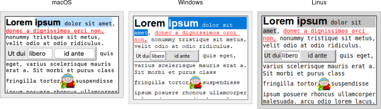
Text widgets.
A text widget manages a multi-line text area.
Text widgets are part of the classic Tk widgets, not the themed Tk widgets.
While we briefly introduced text widgets in an earlier chapter, we'll go into more detail here. You'll get a better sense of the level of sophistication they allow. Still, if you plan to do any significant work with the text widget, the reference manual is a well-organized, helpful, and highly-recommended read.
Text widgets are created using the Text class:
text = Text(parent, width=40, height=10)Text widgets are created using the tk::text command:
tk::text .text -width 40 -height 10Text widgets are created using the TkText class:
text = TkText.new(parent) {width 40; height 10}new_tk__text method, a.k.a. Tkx::tk__text:
$text = $parent->new_tk__text(-width => 40, -height => 10);You'll often provide a width (in characters) and height (in lines). As always, you can ask the geometry manager to expand it to fill the available space in the window.
The basics
If you simply need a multi-line text field for a form, there are only a few things to worry about: create and size the widget (check), provide an initial value, and retrieve the text after a user has submitted the form.
Providing initial content
Text widgets start with nothing in them, so we'll need to add any initial content ourselves.
Because text widgets can hold a lot more than plain text, a simple mechanism (like the entry widget's
textvariable configuration option) isn't sufficient.
Instead, we'll use the widget's insert method:
text.insert('1.0', 'here is my\ntext to insert').text insert 1.0 "here is my\ntext to insert"text.insert(1.0, "here is my\ntext to insert")$text->insert("1.0", "here is my\ntext to insert");The "1.0" here is the position where to insert the text, and can be read as "line 1, character 0". This refers to the first character of the first line. Historically, especially on Unix, programmers tend to think about line numbers as 1-based and character positions as 0-based.
The text to insert is just a string. Because the widget can hold multi-line text, the string we
supply can be multi-line as well. To do this, simply embed \n (newline) characters in the
string at the appropriate locations.
Retrieving the text
After users have made any changes and submitted the form (for example), your program can
retrieve the contents of the widget via the get method:
thetext = text.get('1.0', 'end')set thetext [.text get 1.0 end]thetext = t.get("1.0", 'end')$thetext = $text->get("1.0", "end");The two parameters are the start and end position; end has the obvious meaning.
You can provide different start and end positions if you want to obtain only part of the text.
You'll see more on positions shortly.
Customizing appearance
We previously saw the width and height configuration options for text widgets.
Several other options control its appearance. The most useful are:
foreground:- color to draw the text in
background:- background color of the widget
padx, pady:- extra padding along the inside border of the widget
borderwidth:- width of the border around widget
relief:- border style:
flat,raised,sunken,solid,ridge,groove
Wrapping and scrolling
What if some lines of text in the widget are very long, longer than the width of the widget? By default,
the text wraps around to the next line. This behavior can be changed with the
wrap configuration option. It defaults to char, meaning wrap lines at any character.
Other options are word to wrap lines only at
word breaks (e.g., spaces), and none meaning to not wrap lines at all. In the latter case,
some text of longer lines won't be visible unless we attach a horizontal scrollbar to the widget.
(Users can also scroll through the text using arrow keys, even if scrollbars aren't present).
Both horizontal and vertical scrollbars can be attached to the text widget in the same way as with other widgets, e.g., canvas, listbox.
t = Text(root, width = 40, height = 5, wrap = "none")
ys = ttk.Scrollbar(root, orient = 'vertical', command = t.yview)
xs = ttk.Scrollbar(root, orient = 'horizontal', command = t.xview)
t['yscrollcommand'] = ys.set
t['xscrollcommand'] = xs.set
t.insert('end', "Lorem ipsum...\n...\n...")
t.grid(column = 0, row = 0, sticky = 'nwes')
xs.grid(column = 0, row = 1, sticky = 'we')
ys.grid(column = 1, row = 0, sticky = 'ns')
root.grid_columnconfigure(0, weight = 1)
root.grid_rowconfigure(0, weight = 1)tk::text .t -width 40 -height 5 -wrap none -yscrollcommand ".ys set" -xscrollcommand ".xs set"
ttk::scrollbar .ys -orient vertical -command ".t yview"
ttk::scrollbar .xs -orient horizontal -command ".t xview"
.t insert end "Lorem ipsum...\n...\n... "
grid .t -column 0 -row 0 -sticky nwes
grid .xs -column 0 -row 1 -sticky we
grid .ys -column 1 -row 0 -sticky ns
grid columnconfigure . 0 -weight 1
grid rowconfigure . 0 -weight 1t = TkText.new(root) {width 40; height 5; wrap "none"}
ys = Tk::Tile::Scrollbar.new(root) {orient 'vertical'; command proc{|*args| t.yview(*args);}}
xs = Tk::Tile::Scrollbar.new(root) {orient 'horizontal'; command proc{|*args| t.xview(*args);}}
t['yscrollcommand'] = proc{|*args| ys.set(*args);}
t['xscrollcommand'] = proc{|*args| xs.set(*args);}
t.insert('end', "Lorem ipsum...\n...\n... ")
t.grid( :column => 0, :row => 0, :sticky => 'nwes')
xs.grid( :column => 0, :row => 1, :sticky => 'we')
ys.grid( :column => 1, :row => 0, :sticky => 'ns')
TkGrid.columnconfigure(root, 0, :weight => 1)
TkGrid.rowconfigure(root, 0, :weight => 1)$t = $mw->new_tk__text(-width => 40, -height => 5, -wrap => 'none');
$ys = $mw->new_ttk__scrollbar(-orient => 'vertical', -command => [$t, "yview"]);
$xs = $mw->new_ttk__scrollbar(-orient => 'horizontal', -command => [$t, "xview"]);
$t->configure(-yscrollcommand => [$ys, 'set']);
$t->configure(-xscrollcommand => [$xs, 'set']);
$t->insert('end', "Lorem ipsum...\n...\n... ");
$t->g_grid(-column => 0, -row => 0, -sticky => 'nwes');
$xs->g_grid(-column => 0, -row => 1, -sticky => 'we');
$ys->g_grid(-column => 1, -row => 0, -sticky => 'ns');
$mw->g_grid_columnconfigure(0, -weight => 1);
$mw->g_grid_rowconfigure(0, -weight => 1);We can also ask the widget to ensure that a certain part of the text is visible. For example, let's say
we've added more text to the widget than will fit onscreen (so it will scroll). However, we want to ensure
that the top of the text rather than the bottom is visible. We can use the see method.
text.see('1.0').text see 1.0text.see('1.0')$text->see("1.0");Disabling the widget
Some forms will temporarily disable editing in particular widgets unless certain conditions are met
(e.g., some other options are set to a certain value). To prevent users from changing
a text widget, set the state configuration option to disabled. Re-enable editing
by setting this option back to normal.
text['state'] = 'disabled'.text configure -state disabledtext['state'] = 'disabled'$text->configure(-state => "disabled");As text widgets are part of the classic widgets, the usual state and instate
methods are not available.
Modifying the text in code
While users can modify the text in the text widget interactively, your program can also make
changes. Adding text is done with the insert method, which we used above to provide an
initial value for the text widget.
Text positions and indices
When we specified a position of 1.0 (first line, first character), this was an example of an index.
It tells the insert method where to put the new text (just before the first line, first character, i.e., at the
very start of the widget). Indices can be specified in a variety of ways. We used another one with the get method:
end means just past the end of the text. (Why "just past?" Text is inserted right
before the given index, so inserting at end will add text to the end of the widget).
Note that Tk will always add a newline at the very end of the text widget.
Here are a few additional examples of indices and how to interpret them:
3.end:- The newline at the end of line 3.
1.0 + 3 chars:- Three characters past the start of line 1.
2.end -1 chars:- The last character before the new line in line 2.
end -1 chars:- The newline that Tk always adds at the end of the text.
end -2 chars:- The actual last character of the text.
end -1 lines:- The start of the last actual line of text.
2.2 + 2 lines:- The third character (index 2) of the fourth line of text.
2.5 linestart:- The first character of line 2.
2.5 lineend:- The position of the newline at the end of line 2.
2.5 wordstart:- First char. of the word with the char. at index 2.5.
2.5 wordend:- First char. after the word with the char. at index 2.5.
Some additional things to keep in mind:
- The term
charscan be abbreviated asc, andlinesasl. - Spaces between terms can be omitted, e.g.,
1.0+3c. - An index past the end of the text (e.g.,
end + 100c) is interpreted asend. - Indices wrap to subsequent lines as needed; e.g.,
1.0 + 10 charson a line with only five characters will refer to a position on the second line. - Line numbers in indices are interpreted as logical lines, i.e., each line ends only at the "\n." With long lines and wrapping enabled, one logical line may represent multiple display lines. If you'd like to move up or down a single line on the display, you can specify this as, e.g., "1.0 + 2 display lines".
- When indices contain multiple words, make sure they are quoted appropriately so that Tk sees the entire index as one argument.
To determine the canonical position of an index, use the index method. Pass it any
index expression, and it returns the corresponding index in the form line.char. For example,
to find the position of the last character (ignoring the automatic newline at the end), use:
text.index('end').text index endtext.index('end')$text->index("end") You can compare two indices using the compare method, which lets you check for equality,
whether one index is later in the text than the other, etc.
if text.compare(idx1, "==", idx2"): # same positionif {[.text compare idx1 "==" idx2]} { # same position }if text.compare(idx1, "==", idx2) then # same positionif ($text->compare(idx1, "==", idx2)) { # same position }Valid operators are ==, !=, <, <=, >, and >=.
Deleting text
While the insert method adds new text anywhere in the widget, the delete method removes it.
We can delete either a single character (specified by index) or a range of characters (specified by
start and end indices). In the latter case, characters from (and including) the start index until just before
the end index are deleted (the character at the end index is not deleted). So if we assume for each of these
we start off with "abcd\nefgh" in the text widget:
text.delete('1.2') ⇒ "abd\nefgh"
text.delete('1.1', '1.2') ⇒ "acd\nefgh"
text.delete('1.0', '2.0') ⇒ "efgh"
text.delete('1.2', '2.1') ⇒ "abfgh".text delete 1.2 ⇒ "abd\nefgh"
.text delete 1.1 1.2 ⇒ "acd\nefgh"
.text delete 1.0 2.0 ⇒ "efgh"
.text delete 1.2 2.1 ⇒ "abfgh"text.delete(1.2) ⇒ "abd\nefgh"
text.delete(1.1, 1.2) ⇒ "acd\nefgh"
text.delete(1.0, 2.0) ⇒ "efgh"
text.delete(1.2, 2.1) ⇒ "abfgh"$text->delete("1.2"); ⇒ "abd\nefgh"
$text->delete("1.1", "1.2"); ⇒ "acd\nefgh"
$text->delete("1.0", "2.0"); ⇒ "efgh"
$text->delete("1.2", "2.1"); ⇒ "abfgh"There is also a replace method that performs a delete followed by an insert
at the same location.
Example: logging window
Here's a short example using a text widget as an 80x24 logging window for an application. Users don't edit the text widget at all. Instead, the program writes log messages to it. We'd like to display more than 24 lines (so no scrolling). If the log is full, old messages are removed from the top before new ones are added at the end.
from tkinter import *
from tkinter import ttk
root = Tk()
log = Text(root, state='disabled', width=80, height=24, wrap='none')
log.grid()
def writeToLog(msg):
numlines = int(log.index('end - 1 line').split('.')[0])
log['state'] = 'normal'
if numlines==24:
log.delete(1.0, 2.0)
if log.index('end-1c')!='1.0':
log.insert('end', '\n')
log.insert('end', msg)
log['state'] = 'disabled'package require Tk
grid [text .log -state disabled -width 80 -height 24 -wrap none]
proc writeToLog {msg} {
set numlines [lindex [split [.log index "end - 1 line"] "."] 0]
.log configure -state normal
if {$numlines==24} {.log delete 1.0 2.0}
if {[.log index "end-1c"]!="1.0"} {.log insert end "\n"}
.log insert end "$msg"
.log configure -state disabled
}require 'tk'
root = TkRoot.new
@log = TkText.new(root) {state 'disabled';width 80;height 24;wrap 'none'}.grid
def writeToLog(msg)
numlines = @log.index("end - 1 line").split('.')[0].to_i
@log['state'] = :normal
@log.delete(1.0, 2.0) if numlines==24
@log.insert('end', "\n") unless @log.index('end-1c')=='1.0'
@log.insert('end', msg)
@log['state'] = :disabled
enduse Tkx;
$mw = Tkx::widget->new(".");
$log = $mw->new_tk__text(-state => "disabled", -width => 80, -height => 24, -wrap => "none");
$log->g_grid;
sub writeToLog {
my ($msg) = @_;
$numlines = $log->index("end - 1 line");
print $numlines . "\n";
$log->configure(-state => "normal");
if ($numlines==24) {$log->delete("1.0", "2.0");}
if ($log->index("end-1c")!="1.0") {$log->insert_end("\n");}
$log->insert_end($msg);
$log->configure(-state => "disabled");
}Note that because the program placed the widget in a disabled state, we had to re-enable it to make any changes, even from our program.
Formatting with tags
So far, we've used text widgets when all the text is in a single font. Now it's time to add formatting like bold, italic, strikethrough, background colors, font sizes, and much more. Tk's text widget implements these using a feature called tags.
Tags are objects associated with the text widget. Each tag is referred to via a name chosen by the programmer. Each tag has several configuration options. These are things like fonts and colors that control formatting. Though tags are objects having state, they don't need to be explicitly created but are automatically created the first time the tag name is used.
Adding tags to text
Tags can be associated with one or more ranges of text in the widget. As before, ranges are specified via indices.
A single index represents a single character, and a pair of indices represent a range from the start
character to just before the end character. Tags are added to a range of text using the
tag_add method.
text.tag_add('highlightline', '5.0', '6.0').text tag add highlightline 5.0 6.0text.tag_add('highlightline', 5.0, 6.0)$text->tag_add("highlightline", "5.0", "6.0");Tags can also be provided when first inserting text. The insert method supports an optional parameter
containing a list of one or more tags to add to the text being inserted.
text.insert('end', 'new material to insert', ('highlightline', 'recent', 'warning')).text insert end "new material to insert" "highlightline recent warning"text.insert('end', 'new material to insert', 'highlightline recent warning')$text->insert_end("new material to insert", "highlightline recent warning");As the widget's contents are modified (whether by a user or your program), the tags will adjust automatically. For example, if we tagged the text "the quick brown fox" with the tag "nounphrase", and then replaced the word "quick" with "speedy," the tag still applies to the entire phrase.
Applying formatting to tags
Formatting is applied to tags via configuration options; these work similarly to configuration options for the entire widget. As an example:
text.tag_configure('highlightline', background='yellow', font='TkFixedFont', relief='raised').text tag configure highlightline -background yellow -font "TkFixedFont" -relief raisedtext.tag_configure('highlightline', :background=>'yellow', :font=>'TkFixedFont', :relief=>'raised')$text->tag_configure("highlightline", -background => "yellow", -font => "TkFixedFont", -relief => "raised");Tags support the following configuration options: background, bgstipple, borderwidth,
elide, fgstipple, font, foreground, justify, lmargin1, lmargin2,
offset, overstrike, relief, rmargin, spacing1, spacing2,
spacing3, tabs, tabstyle, underline, and wrap.
Check the reference manual for detailed descriptions of these. The tag_cget method allows us to query the configuration options of a tag.
Because multiple tags can apply to the same range of text, there is the possibility of conflict (e.g., two tags
specifying different fonts). A priority order is used to resolve these; the most recently created tags have
the highest priority, but priorities can be rearranged using the tag_raise and tag_lower
methods.
More tag manipulations
To delete one or more tags altogether, we can use the tag_delete method. This also, of course,
removes any references to the tag in the text. We can also remove a tag from a range of text using the
tag_remove method, specifying the tag to remove, and the start and (optional) end index of the range.
Even if that leaves no ranges of text with that tag, the tag object itself still exists.
The tag_ranges method will return a list of ranges in the text that a given tag has been applied to. There
are also tag_nextrange and tag_prevrange methods that allow you to
search forward or backward for a tag starting from a given position.
The tag_names method, called with no additional parameters, will return a list of all tags currently
defined in the text widget (including those that may not be presently used). If we pass the method an index,
it will return the list of tags applied to just the character at the index.
Finally, we can use the first and last characters in the text having a given tag as indices, the same way we
can use "end" or "2.5". To do so, just specify tagname.first or tagname.last.
Differences between tags in canvas and text widgets
Both canvas and text widgets support "tags" that can be applied to several objects, style them, etc. However, canvas and text tags are not the same and there are substantial differences to take note of.
In canvas widgets, only individual canvas items have configuration options that control their appearance. When we refer to a tag in a canvas, the meaning of that is identical to "all canvas items presently having that tag." The tag itself does not exist as a separate object. So in the following snippet, the last rectangle added will not be colored red.
canvas.itemconfigure('important', fill='red')
canvas.create_rectangle(10, 10, 40, 40, tags=('important')).canvas itemconfigure important -fill red
.canvas create rectangle 10 10 40 40 -tags importantcanvas.itemconfigure('important', :fill => 'red')
TkcRectangle.new(canvas, 10, 10, 40, 40, :tags => 'important')$canvas->itemconfigure("important", -fill => "red");
$canvas->create_rectangle(10, 10, 40, 40, -tags => "important");In contrast, with text widgets, it's not the individual characters that retain the state information about appearance, but tags, which are objects in their own right. So in this snippet, the newly added text will be colored red.
text.insert('end', 'first text', ('important'))
text.tag_configure('important', foreground='red')
text.insert('end', 'second text', ('important')).text insert end "first text" important
.text tag configure important -foreground red
.text insert end "second text" importanttext.insert('end', 'first text', 'important')
text.tag_configure('important', :foreground => 'red')
text.insert('end', 'second text', 'important')$text->insert_end("first text", "important");
$text->tag_configure("important", -foreground => "red");
$text->insert_end("second text", "important");Events and bindings
One very cool thing we can do is define event bindings on tags. That allows us to easily do things like
recognize mouse clicks on particular ranges of text and popup a menu or dialog in response. Different
tags can have different bindings. This saves the hassle of sorting out questions like "what does a click
at this location mean?". Bindings on tags are implemented using the tag_bind method:
text.tag_bind('important', '<1>', popupImportantMenu).text tag bind important <1> "popupImportantMenu"text.tag_bind('important', '1', proc{popupImportantMenu})$text->tag_bind("important", "<1>", sub{popupImportantMenu});Widget-wide event bindings continue to work as they do for every other widget, e.g., to capture a mouse click
anywhere in the text. Besides the normal low-level events, the text widget generates a
<<Modified>> virtual event whenever a change is made to the
content of the widget, and a <<Selection>> virtual event
whenever there is a change made to which text is selected.
Selecting text
We can identify the range of text selected by a user, if any.
For example, an editor may have a toolbar button to bold the selected text. While you can tell when
the selection has changed (e.g., to update whether or not the bold button is active) via the <<Selection>>
virtual event, that doesn't tell you what has been selected.
The text widget automatically maintains a tag named sel, which refers to the selected text. Whenever the
selection changes, the sel tag will be updated. So we can find the range of text selected using the
tag_ranges method, passing it sel as the tag to report on.
Similarly, we can change the selection by using tag_add to set a new selection, or tag_remove
to remove the selection. The sel tag cannot be deleted, however.
Though the default widget bindings prevent this from happening, sel is like any other tag in that it can support
multiple ranges, i.e., disjoint selections. To prevent this from happening, when changing the selection from your
code, make sure to remove any old selection before adding a new one.
The text widget manages the concept of the insertion cursor (where newly typed text will appear) separate from the selection. It does so using a new concept called a mark.
Marks
Marks indicate a particular place in the text. In that respect, they are like indices. However, as the text is modified, the mark will adjust to be in the same relative location. In that way, they resemble tags but refer to a single position rather than a range of text. Marks actually don't refer to a position occupied by a character in the text but specify a position between two characters.
Tk automatically maintains two different marks. The first, named insert, is the present location of the
insertion cursor. As the cursor is moved (via mouse or keyboard), the mark moves with it. The second mark,
named current, tracks the position of the character underneath the current mouse position.
To create your own marks, use the widget's mark_set method, passing it the name of the mark and an index
(the mark is positioned just before the character at the given index). This is also used to move an existing mark to
a different position. Marks can be removed using the mark_unset method, passing it the name of the mark.
If you delete a range of text containing a mark, that also removes the mark.
The name of a mark can also be used as an index (in the same way 1.0 or end-1c are indices).
You can find the next mark (or previous one) from a given index in the text using the mark_next or
mark_previous methods. The mark_names method will return a list of the names of all marks.
Marks also have a gravity, which can be modified with the mark_gravity method, passing it the
name of the mark and the new gravity (left or right, the default). Gravity affects what happens when text is inserted at the mark.
Suppose we have the text "ac" with a mark in between that
we'll symbolize with a pipe, i.e., "a|c." If the gravity of that mark is right, the mark
attaches itself to the "c." If the new text "b" is inserted at the mark, the mark will remain stuck to the "c,"
and so the new text will be inserted before the mark, i.e., "ab|c." If the gravity is instead left, the mark
attaches itself to the "a," and so new text will be inserted after the mark, i.e., "a|bc."
Images and widgets
Like canvas widgets, text widgets can contain images and any other Tk widgets (including frames containing many other widgets). In a sense, this allows the text widget to work as a geometry manager in its own right. The ability to add images and widgets within the text opens up a world of possibilities for your program.
Images are added to a text widget at a particular index, with the image specified as an existing Tk image. Other options that allow you to fine-tune padding, etc.
flowers = PhotoImage(file='flowers.png')
text.image_create('sel.first', image=flowers)image create photo flowers -file flowers.png
.text image create sel.first -image flowersflowers = TkPhotoImage.new(:file => 'flowers.png')
TkTextImage.new(text, 'sel.first', :image => flowers)Tkx::image_create_photo( "flowers", -file => "flowers.png");
$text->image_create("sel.first", -image => "flowers");Other widgets are added to a text widget in much the same way as images. The widget being added must be a descendant of the text widget in the widget hierarchy.
b = ttk.Button(text, text='Push Me')
text.window_create('1.0', window=b)ttk::button .text.b -text "Push Me"
.text window create 1.0 -window .text.bb = Tk::Tile::Button.new(text) {text 'Push Me'}
TkTextWindow.new(text, 1.0, :window => b)$b = $text->new_ttk__button(-text => "Push Me");
$text->window_create("1.0", -window => $b);Even more
Text widgets can do many more things. Here, we'll briefly mention just a few more of them. For details on any of these, see the reference manual.
Search
The text widget includes a powerful search method to locate a piece of text within the
widget. This is useful for a "Find" dialog, as one obvious example. You can search backward or forward from a
particular position or within a given range, specify the search term using exact text, case insensitive, or via
regular expressions, find one or all occurrences of the search term, etc.
Modifications, undo and redo
The text widget keeps track of whether changes have been made (useful to know whether it needs to be
saved to a file, for example). We can query (or change) using the edit_modified method. There is also
a complete multi-level undo/redo mechanism, managed automatically by the widget when we set its undo
configuration option to true. Calling edit_undo or edit_redo modifies the current
text using information stored on the undo/redo stack.
Eliding text
Text widgets can include text that is not displayed. This is known as "elided" text, and is made
available using the elide configuration option for tags. It can be used to implement
an outliner, a "folding" code editor, or even to bury extra meta-data intermixed with displayed text.
When specifying positions within elided text, you have to be a bit more careful. Methods that work with
positions have extra options to either include or ignore the elided text.
Introspection
Like most Tk widgets, the text widget goes out of its way to expose information about its internal state. We've
seen this in terms of the get method, widget configuration options, names and
cget for both tags and marks, etc. There is even more information available that can be useful
for a wide variety of tasks. Check out the debug, dlineinfo, bbox,
count, and dump methods in the reference manual.
Peering
The Tk text widget allows the same underlying text data structure (containing all the text, marks, tags, images, etc.) to be
shared between two or more different text widgets. This is known as peering and is controlled via the
peer method.
Treeview
Tk's treeview can be used to build hierarchical user interfaces similar to the tree display you'd find in file managers like the macOS Finder or Windows Explorer. As with most Tk widgets, it offers incredible flexibility so it can be customized to suit a wide range of situations.
Treeview
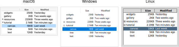
Treeview widgets.
A treeview widget displays a hierarchy of items and allows users to browse through it. One or more attributes of each item can be displayed as columns to the right of the tree.
Treeview widgets are created using the ttk.Treeview class:
tree = ttk.Treeview(parent)Treeview widgets are created using the ttk::treeview command:
ttk::treeview .treeTreeview widgets are created using the Tk::Tile::Treeview class:
tree = Tk::Tile::Treeview.new(parent)Treeview widgets are created using the new_ttk__treeview method, a.k.a. Tkx::ttk__treeview():
$tree = $parent->new_ttk__treeview;Horizontal and vertical scrollbars can be added in the usual manner if desired.
Adding items to the tree
To do anything useful with the treeview, we'll need to add one or more items to it. Each item represents a single node in the tree, whether a leaf node or an internal node containing other nodes. Items are referred to by a unique id. You can assign this id when the item is first created, or the widget can automatically generate one.
Items are created by inserting them into the tree, using the treeview's insert method. To
insert an item, we need to know where to insert it. That means specifying the parent item
and where within the list of the parent's existing children the new item should be inserted.
The treeview widget automatically creates a root node (which is not displayed). Its id is the empty string.
It serves as the parent of the first level of items that are added. Positions
within the list of a node's children are specified by index (0 being the first, and end
meaning insert after all existing children).
Normally, you'll also specify the name of each item. This is an internal name used by your program to
refer to that particular item, and is separate from the text configuration option, which controls what is displayed in the tree.
Other options allow you to add an image beside the name, specify whether the node is open or closed, etc.
# Inserted at the root, program chooses id:
tree.insert('', 'end', 'widgets', text='Widget Tour')
# Same thing, but inserted as first child:
tree.insert('', 0, 'gallery', text='Applications')
# Treeview chooses the id:
id = tree.insert('', 'end', text='Tutorial')
# Inserted underneath an existing node:
tree.insert('widgets', 'end', text='Canvas')
tree.insert(id, 'end', text='Tree')Inserting the item returns the id of the newly created item.
# Inserted at the root, program chooses id:
.tree insert {} end -id widgets -text "Widget Tour"
# Same thing, but inserted as first child:
.tree insert {} 0 -id gallery -text "Applications"
# Treeview chooses the id:
set id [.tree insert {} end -text "Tutorial"]
# Inserted underneath an existing node:
.tree insert widgets end -text "Canvas"
.tree insert $id end -text "Tree"Inserting the item returns the id of the newly created item.
# Inserted at the root, program chooses id:
tree.insert('', 'end', :id => 'widgets', :text => 'Widget Tour')
# Same thing, but inserted as first child:
tree.insert('', 0, :id => 'gallery', :text => 'Applications')
# Treeview chooses the id:
item = tree.insert('', 'end', :text => 'Tutorial')
# Inserted underneath an existing node:
tree.insert( 'widgets', 'end', :text => 'Canvas')
tree.insert( item, 'end', :text => 'Tree')Inserting the item returns an object for the item. This allows us to refer to the item later, e.g.,
as a parent in an insert call. To retrieve the id for the item, use the item's id method.
# Inserted at the root, program chooses id:
$tree->insert("", "end", -id => "widgets", -text => "Widget Tour");
# Same thing, but inserted as first child:
$tree->insert("", "0", -id => "gallery", -text => "Applications");
# Treeview chooses the id:
$id = $tree->insert("", "end", -text => "Tutorial");
# Inserted underneath an existing node:
$tree->insert("widgets", "end", -text => "Canvas");
$tree->insert($id, "end", -text => "Tree");Inserting the item returns the id of the newly created item.
Rearranging items
A node (and its descendants, if any) can be moved to a different location in the tree. The only restriction is that a node cannot be moved underneath one of its descendants for obvious reasons. As before, the target location is specified via a parent node and a position within its list of children.
tree.move('widgets', 'gallery', 'end') # move widgets under gallery.tree move widgets gallery end; # move widgets under gallerytree.move('widgets', 'gallery', 'end'); # move widgets under gallery$tree->move("widgets", "gallery", "end"); # move widgets under galleryItems can be detached from the tree. This removes the item and its descendants from the hierarchy
but does not destroy the items. This allows us to later reinsert them with move.
tree.detach('widgets').tree detach widgetstree.detach('widgets')
item.detach$tree->detach("widgets");Items can also be deleted, which does completely destroy the item and its descendants.
tree.delete('widgets').tree delete widgetstree.delete('widgets')
item.delete$tree->delete("widgets");To traverse the hierarchy, there are methods to find the parent of an item (parent),
its next or previous sibling (next and prev), and return the list of children
of an item (children or get_children). Each takes the item id as a parameter.
We can control whether or not the item is open and shows its children by modifying the open item
configuration option.
tree.item('widgets', open=TRUE)
isopen = tree.item('widgets', 'open').tree item widgets -open true
set isopen [.tree item widgets -open]tree.itemconfigure('widgets', 'open', true); # or item['open'] = true
isopen = tree.itemcget('widgets', 'open'); # or isopen = item['open']$tree->item("widgets", -open => "true");
$isopen = $tree->item("widgets", "-open");Displaying Information for each Item
The treeview can display one or more additional pieces of information about each item. These are shown as columns to the right of the main tree display.
Each column is referenced by a symbolic name that we assign. We can specify the list of columns
using the columns configuration option of the treeview widget, either when first creating the
widget or later on.
tree = ttk.Treeview(root, columns=('size', 'modified'))
tree['columns'] = ('size', 'modified', 'owner')ttk::treeview .tree -columns "size modified"
.tree configure -columns "size modified owner"tree = Tk::Tile::Treeview.new(parent) {columns 'size modified'}
tree['columns'] = 'size modified owner'$tree = $parent>->new_ttk__treeview(-columns => "size modified");
$tree->configure(-columns => "size modified owner");We can specify the width of the column, how the display of item information in the column is aligned, and more. We can also provide information about the column's heading, such as the text to display, an optional image, alignment, and a script to invoke when the item is clicked (e.g., to sort the tree).
tree.column('size', width=100, anchor='center')
tree.heading('size', text='Size').tree column size -width 100 -anchor center
.tree heading size -text "Size"tree.column_configure( 'size', :width => 100, :anchor => 'center')
tree.heading_configure( 'size', :text => 'Size')$tree->column("size", -width => 100, -anchor => "center");
$tree->heading("size", -text => "Size");What to display in each column for each item can be specified individually by using the set
method. You can also provide a list describing what to display in all the columns for the item.
This is done using the values item configuration option. It takes a list of values and can be provided when first inserting
the item or changed later. The order of the list must be the same as the order
in the columns widget configuration option.
tree.set('widgets', 'size', '12KB')
size = tree.set('widgets', 'size')
tree.insert('', 'end', text='Listbox', values=('15KB', 'Yesterday', 'mark')).tree set widgets size "12KB"
set size [.tree set widgets size]
.tree insert "" end -text Listbox -values [list "15KB" "Yesterday" "mark"]tree.set('widgets', 'size', '12KB'); # or item.set('size', '12KB')
size = tree.get('widgets', 'size'); # or item.get('size')
tree.insert('', 'end', :text => 'Listbox', :values => ['15KB','Yesterday','mark'])$tree->set("widgets", "size", "12KB");
$size = $tree->set("widgets", "size");
$tree->insert("", "end", -text => "Listbox", -values => "15KB Yesterday mark");Item appearance and events
Like the text and canvas widgets, the treeview widget uses tags to modify the
appearance of items in the tree. We can assign a list of tags to each item using the tags
item configuration option (again, when creating the item or later on).
Configuration options can then be specified on the tag, applied to all items having that
tag. Valid tag options include foreground (text color), background,
font, and image (not used if the item specifies its own image).
We can also create event bindings on tags to capture mouse clicks, keyboard events, etc.
tree.insert('', 'end', text='button', tags=('ttk', 'simple'))
tree.tag_configure('ttk', background='yellow')
tree.tag_bind('ttk', '<1>', itemClicked)
# the item clicked can be found via tree.focus().tree insert "" end -text button -tags "ttk simple"
.tree tag configure ttk -background yellow
.tree tag bind ttk <1> "itemclicked"
# the item clicked can be found via [.tree focus]tree.insert('', 'end', :text => 'button', :tags => ['ttk','simple'])
tree.tag_configure('ttk', :background => 'yellow')
tree.tag_bind('ttk', '1', proc{itemclicked})
# the item clicked can be found via 'tree.focus_item'$tree->insert("", "end", -text => "button", -tags => "ttk simple");
$tree->tag_configure("ttk", -background => "yellow");
$tree->tag_bind("ttk", "<1>", sub{itemClicked});
# the item clicked can be found via $tree->focusThe treeview will generate virtual events <<TreeviewSelect>>, <<TreeviewOpen>>, and
<<TreeviewClose>>, which allow us to monitor changes to the widget made by users.
We can use the selection method to determine the current selection (the selection can also be changed
from your program).
Customizing the display
There are many aspects of how the treeview widget is displayed that we can customize. We've already seen some of them, such as the text of items, fonts and colors, names of column headings, and more. Here are a few additional ones.
- Specify the desired number of rows to show using the
heightwidget configuration option. - Control the width of each column using the column's
widthorminwidthoptions. The column holding the tree can be accessed with the symbolic name#0. The overall requested width for the widget is based on the sum of the column widths. - Choose which columns to display and the order to display them in using the
displaycolumnswidget configuration option. - You can optionally hide one or both of the column headings or the tree itself (leaving just the columns)
using the
showwidget configuration option (default is "tree headings" to show both). - You can specify whether a single item or multiple items can be selected by users via the
selectmodewidget configuration option, passingbrowse(single item),extended(multiple items, the default), ornone.
Styles and Themes
The themed aspect of the modern Tk widgets is one of the most powerful and exciting aspects of the newer widget set. Yet, it's also one of the most confusing.
This chapter explains how to use existing styles (which control how widgets like buttons look) and themes (which are a collection of styles that define how all the widgets in your application look). Changing themes can give your application an entirely different look.
If you're looking to create custom styles and themes, the following chapter will guide you through the details.
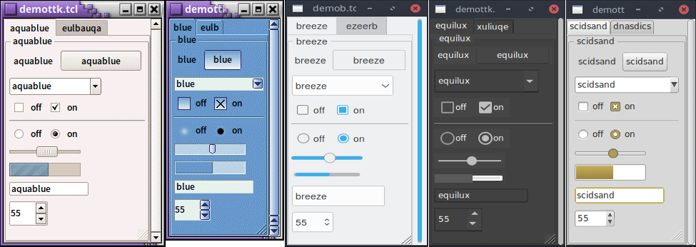
Applying different themes.
Note that it's not just colors that have changed, but the actual shape of individual widgets. Styles and themes are extremely flexible.
Why?
However, before you get carried away, very few applications will benefit from switching themes like this. Some games or educational programs might be exceptions. Using the standard Tk theme for a given platform will display widgets the way people expect to see them, particularly if they're running macOS and Windows.
On Linux systems, there's far less standardization of look and feel. Users expect (and are more comfortable with) some
variability and "coolness." Because different widget sets (typically GTK and QT) are used by window managers, control panels, and other system
utilities, Tk can't seamlessly blend in with the current settings on any particular system. Most of the Linux screenshots in this
tutorial use Tk's alt theme. Despite users being accustomed to variability, there are limits to what most users will accept.
A prime example is the styling of core widgets in Tk's classic widget set, matching circa-1992 OSF/Motif.
Styles and themes, used in a more targeted manner and with significant restraint, can have a role to play in modern applications. This chapter explains why and when you might want to use them and how to go about doing so. We'll begin by drawing a parallel between Tk's styles and themes and another realm of software development.
Understanding styles and themes
If you're familiar with web development, you know about cascading stylesheets (CSS). There are two ways it can be used to customize
the appearance of an element in your HTML page. One way is to add a bunch of style attributes (fonts, colors, borders, etc.) directly
to an element in your HTML code via the style attribute. For example:
<label style="color:red; font-size:14pt; font-weight:bold; background-color:yellow;">Meltdown imminent!</label>The other way to use CSS is to attach a class to each widget via the class attribute.
The details of how elements of that class appear are provided elsewhere, often in a separate CSS file.
You can attach the same class to many elements, and they will all have the same appearance. You don't need to repeat
the full details for every element. More importantly, you separate the logical content of your site (HTML) from its
appearance (CSS).
<label class="danger">Meltdown imminent!</label>
...
<style type="text/css">
label.danger {color:red; font-size:14pt; font-weight:bold; background-color:yellow;}
</style>Back to Tk.
- In the classic Tk widgets, all appearance customizations require specifying each detail on individual widgets,
akin to always using the
styleHTML attribute. - In the themed Tk widgets, all appearance customizations are made via attaching a style to a widget, akin to using
the
classHTML attribute. Separately, you define how widgets with that style will appear, akin to writing CSS. - Unlike with HTML, you can't freely mix and match. You can't customize some themed entries or buttons with styles and others by directly changing appearance options.
Yes, there are a few exceptions, like labels where you can customize the font and colors through both styles and configuration options.
Applying a style
To use a style means to apply that style to an individual widget. All you need is the style's name and the widget to apply it to. Setting the style can be done at creation time:
b = ttk.Button(parent, text='Hello', style='Fun.TButton')ttk::button .b -text "Hello" -style "Fun.TButton"b = Tk::Tile::Button.new(parent) {text "Hello"; style "Fun.TButton"}$b = $parent->new_ttk__button(-text => "Hello", -style => "Fun.TButton");A widget's style can also be changed later with the style configuration option:
b['style'] = 'Emergency.TButton'.b configure -style "Emergency.TButton"b['style'] = "Emergency.TButton"$b->configure(-style => "Emergency.TButton");Benefits
So why use styles and themes in Tk? They take the fine-grained details of appearance decisions away from individual instances of widgets.
That makes for cleaner code and less repetition. If you have 20 entry widgets in your application, you don't need to repeat the exact appearance details every time you create one (or write a wrapper function). Instead, you assign them a style.
Themes collect a series of styles, putting all appearance decisions in one place. And because styles for a button and styles for other widgets can share common elements, collecting them in themes promotes consistency and improves reuse.
Styles also have many benefits for widget authors. Widgets can delegate most appearance decisions to styles. A widget author no longer has to hardcode logic to the effect of "when the state is disabled, consult the 'disabledforeground' configuration option and use that for the foreground color." Not only did that make coding widgets longer (and more repetitive), but it also restricted how a widget could be changed based on its state. If the widget author omitted logic to change the font when the state changed, you were out of luck as an application developer using the widget.
Using styles, widget authors don't need to provide code for every possible appearance option. That not only simplifies the widget but paradoxically ensures that a wider range of appearances can be set, including those the widget author may not have anticipated.
Using existing themes
Before delving into the weightier matters of tastefully and selectively modifying and applying styles to improve the usability of your application and cleanliness of your code, let's deal with the fun bits: using existing themes to completely reskin your application.
Themes are identified by a name. You can obtain the names of all available themes:
>>> s = ttk.Style()
>>> s.theme_names()
('aqua', 'step', 'clam', 'alt', 'default', 'classic')Tkinter encapsulates all style manipulations in the ttk.Style class. We'll therefore need an instance of that
class for this and other operations.
% ttk::style theme names
aqua clam alt default classic>> Tk::Tile::Style.theme_names
=> ["aqua", "step", "clam", "alt", "default", "classic"]Perl> Tkx::ttk__style_theme_names()
aqua clam alt default classic
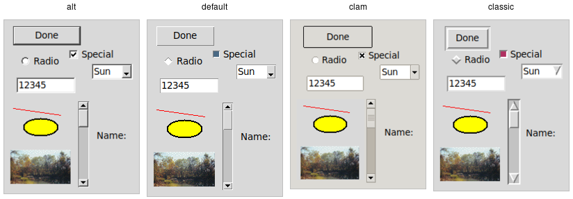
Built-in themes.
Besides the built-in themes (alt, default, clam, and classic), macOS includes a theme named
aqua to match the system-wide style, while Windows includes themes named vista, winxpnative, and
winnative.
Only one theme can be active at a time. To obtain the name of the theme currently in use, use the following:
>>> s.theme_use()
'aqua'% ttk::style theme use
aqua>> Tk.tk_call('ttk::style', 'theme', 'use')
=> "aqua"As of Ruby/Tk 0.2.0 (current version as of 2020), the Tk::Tile::Style.theme_use API doesn't allow querying the current style.
Perl> Tkx::ttk__style_theme_use()
aquaThis API, which was originally targeted for Tk 8.6, was back-ported to Tk 8.5.9. If you're using an earlier version of Tk getting this info is a bit trickier.
Switching to a new theme can be done with:
s.theme_use('themename')ttk::style theme use themenameTk::Tile::Style.theme_use "themename"Tkx::ttk__style_theme_use("themename");What does this actually do? Obviously, it sets the current theme to the indicated theme. Doing this, therefore, replaces all the currently available styles with the set of styles defined by the theme. Finally, it refreshes all widgets, so they take on the appearance described by the new theme.
Third-party themes
With a bit of looking around, you can find some existing add-on themes available for download. A good starting point is https://wiki.tcl-lang.org/page/List+of+ttk+Themes.
Though themes can be defined in any language that Tk supports, most that you will find are written in Tcl. How can you install them so that they are available to use in your application?
For Tkinter users, you'll find an increasing number of themes on PyPi and elsewhere designed to be directly incorporated into your applications. Some of these are small wrappers around the Tcl-based themes below, making them easier to use. Some are full-fledged themes in their own right, created using Python and Tkinter, without making use of Tcl code. The book version of this tutorial, Modern Tkinter, includes bonus material describing some of these, including a powerful and highly configurable theme called ttkbootstrap, which adds not only new visuals but also several entirely new widgets you can use in your Tkinter applications.
As an example, let's use the "awdark" theme, available from https://sourceforge.net/projects/tcl-awthemes/.
Download and unzip the awthemes-*.zip file somewhere. You'll notice it contains a bunch of .tcl files, a
subdirectory i containing more directory with images used by the theme, etc.
One of the files is named pkgIndex.tcl.
This identifies it as a Tcl package, which is similar to a module in other languages.
If we look inside, you'll see a bunch of lines like package ifneeded awdark 7.7. Here, awdark is the name
of the package, and 7.7 is its version number. It's not unusual, as in this case, for a single pkgIndex.tcl file
to provide several packages.
To use it, we need to tell Tcl where to find the package (via adding its directory to Tcl's auto_path) and the name of the
package to use.
root.tk.call('lappend', 'auto_path', '/full/path/to/awthemes-9.3.1')
root.tk.call('package', 'require', 'awdark')lappend auto_path "/full/path/to/awthemes-9.3.1"
package require awdarkTk.tk_call('lappend', 'auto_path', '/full/path/to/awthemes-9.3.1')
Tk.tk_call('package', 'require', 'awdark')Tkx::eval("lappend auto_path \"/full/path/to/awthemes-9.3.1\"");
Tkx::eval("package require awdark");If the theme is instead implemented as a single Tcl source file, without a pkgIndex.tcl, you can make it available like this:
root.tk.call('source', '/full/path/to/themefile.tcl')source "/full/path/to/themefile.tcl"Tk.tk_call('source', '/full/path/to/themefile.tcl')Tkx::eval("source \"/full/path/to/themefile.tcl\"");You should now be able to use the theme in your own application, just as you would a built-in theme.
Custom Styles and Themes
The previous chapter showed you how to use and apply existing styles and themes. This chapter tackles the more complex issue of creating or customizing styles and themes within your application.
The infrastructure that supports styles and themes is extremely powerful. However, there are many subtleties and inconsistencies, particularly between platforms. If you are deploying your application beyond your own desktop, or providing reusable code for others to build on, extensive testing is required.
As is often the case, copying techniques used by existing styles and themes (e.g., found via the directory of add-on themes) is a good approach to solving what may be difficult problems.
Definitions
We first need to introduce a few essential concepts.
Widget class
A widget class identifies the type of a particular widget, whether
it is a button, a label, a canvas, etc. All themed widgets have a default class. Buttons have the class TButton,
labels TLabel, etc.
Widget state
A widget state allows a single widget to have more than one appearance or behavior, depending on things like mouse position, different state options set by the application, and so on.
As you'll recall, all themed widgets maintain a set of binary state flags, accessed by the state and instate methods.
The flags are: active, disabled, focus, pressed,
selected, background, readonly, alternate, and invalid.
All widgets have the same set of state flags, though they may ignore some of them (e.g., a label widget would
likely ignore an invalid state flag). See the themed widget page
in the reference manual for the exact meaning of each state flag.
Style
A style describes the appearance (or appearances) of a widget class. All themed widgets with the same widget class have the same appearance(s).
Styles are referred to by the name of the widget class they describe. For example,
the style TButton defines the appearance of all widgets with the class TButton.
Styles know about different states, and one style can define different appearances based on a widget's state.
For example, a style can specify how a widget's appearance should change if the pressed state flag is set.
Theme
A theme is a collection of styles. While each style is widget-specific (one for buttons, one for entries, etc.), a theme collects many styles together. All styles in the same theme are designed to visually "fit" together with each other. (Tk doesn't technically restrict bad design or judgment, unfortunately!)
Using a particular theme in an application really means that, by default, the appearance of each widget will be controlled by the style within that theme responsible for that widget class.
Style names
Every style has a name. If you're going to modify a style, create a new one, or use a style for a widget, you need to know its name.
How do you know what the names of the styles are? If you have a particular widget, and you want to know
what style it is currently using, you can first check the value of its style configuration option. If
that is empty, it means the widget is using the default style for the widget. You can retrieve
that via the widget's class. For example:
>>> b = ttk.Button()
>>> b['style']
''
>>> b.winfo_class()
'TButton'% ttk::button .b
.b
% .b cget -style # empty string as a result
% winfo class .b
TButton>> b = Tk::Tile::Button.new(parent)
=> #<Tk::Tile::TButton:0x10bcca4 @path=".w00001">
>> b['style']
=> []
>> TkWinfo.classname(b)
=> "TButton"Perl> $b = $mw->new_ttk__button()
.b
Perl> $b->cget(-style) # empty string as a result
Perl> Tkx::winfo('class', $b)
TButtonIn this case, the style that is being used is TButton. The default styles for other themed widgets
are named similarly, e.g., TEntry, TLabel, etc.
It's always wise to check the specifics. For example, the treeview widget's class is Treeview, not TTreeview.
Beyond the default styles, though, styles can be named pretty much anything. You might create your own style
(or use a theme that has a style) named FunButton, NuclearReactorButton, or even GuessWhatIAm (not a
wise choice).
More often, you'll find names like Fun.TButton or NuclearReactor.TButton. These suggest
variations of a base style; as you'll see, this is something Tk supports for creating and modifying styles.
The ability to retrieve a list of all currently available styles is currently not supported.
This will likely appear in Tk 8.7 in the form of a new command, ttk::style theme styles,
returning the list of styles implemented by a theme. It also proposes adding a style method
for all widgets, so you don't have to examine both the widget's style configuration option and
its class. See TIP #584.
Applying a style
As a reminder, to use a style means to apply that style to an individual widget. All you need is the style's name and the widget to apply it to. Setting the style can be done at creation time:
b = ttk.Button(parent, text='Hello', style='Fun.TButton')ttk::button .b -text "Hello" -style "Fun.TButton"b = Tk::Tile::Button.new(parent) {text "Hello"; style "Fun.TButton"}$b = $parent->new_ttk__button(-text => "Hello", -style => "Fun.TButton");A widget's style can also be changed later with the style configuration option:
b['style'] = 'Emergency.TButton'.b configure -style "Emergency.TButton"b['style'] = "Emergency.TButton"$b->configure(-style => "Emergency.TButton");Creating a simple style
So how do we create a new style like Emergency.TButton?
In situations like this, you're creating a new style only slightly different from an existing one. This is the most common reason for creating new styles.
For example, you want most of the buttons in your application to keep their usual appearance but have
certain "emergency" buttons highlighted differently. Creating a new style (e.g., Emergency.TButton),
derived from the base style (TButton), is appropriate.
Prepending another name (Emergency) followed by a dot onto an existing style creates a new style
derived from the existing one. The new style will have exactly the same options as the existing one except for the indicated differences:
s.configure('Emergency.TButton', font='helvetica 24', foreground='red', padding=10)ttk::style configure Emergency.TButton -font "helvetica 24" -foreground red -padding 10Tk::Tile::Style.configure('Emergency.TButton', {"font" => "helvetica 24", "foreground" => "red", "padding" => 10})Tkx::ttk__style_configure("Emergency.TButton", -font => "helvetica 24", -foreground => "red", -padding => 10);As shown earlier, you can then apply that style to an individual button widget via its style configuration option.
Every other button widget would retain its normal appearance.
How do you know what options are available to change for a given style? That requires diving a little deeper inside styles.
You may have existing code using the classic widgets that you'd like to move to the themed widgets. Most appearance changes made to classic widgets through configuration options can probably be dropped. For those that can't, you may need to create a new style, as shown above.
State-specific appearance changes can be treated similarly. In classic Tk, several widgets supported a few state changes
via configuration options. For example, setting a button's state option to disabled would draw it
with a greyed-out label. Some allowed an additional state, active, which represented a different
appearance. You could change the widget's appearance in multiple states via a set of
configuration options, e.g., foreground, disabledforeground, and
activeforeground.
State changes via configuration options should be changed to use the state method on themed widgets.
Configuration options to modify the widget's appearance in a particular state should be dealt with in the style.
Classic Tk widgets also supported a very primitive form of styles that you may encounter. This used the option database, a now-obscure front end to X11-style configuration files.
In classic Tk, all buttons had the same class (Button), all labels had the same class (Label), etc.
You could use this widget class both for introspection and for changing options globally through the option database.
It let you say, for example, that all buttons should have a red background.
A few classic Tk widgets, including frame and toplevel widgets, let you change the widget class of a particular widget
when it was first created by providing a class configuration option. For example, you could specify that one specific
frame widget had a class of SpecialFrame, while others would have the default class Frame.
You could use the option database to change the appearance of just the SpecialFrame frames.
Styles and themes take that simple idea and give it rocket boosters.
What's inside a style?
If all you want to do is use a style or create a new one with a few tweaks, you now know everything you need. If, however, you want to make more substantial changes, things start to get "interesting."
Elements
While each style controls a single type of widget, each widget is usually composed of smaller pieces, called elements. It's the job of the style author to construct the entire widget out of these smaller elements. What these elements are depends on the widget.
Here's an example of a button. It might have a border on the very outside. That's one element. Just inside that, there may be a focus ring. Normally, it's just the background color, but could be highlighted when a user tabs into the button. So that's a second element. Then there might be some spacing between that focus ring and the button's label. That spacing is a third element. Finally, the text label of the button itself is a fourth element.
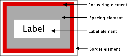
Possible elements of a button.
Why might the style author have divided it up that way? If you have one part of the widget that may be in a different location or a different color than another, it may be a good candidate for an element. Note that this is just one example of how a button could be constructed from elements. Different styles and themes could (and do) accomplish this in different ways.
Here is an example of a vertical scrollbar. It consists of a "trough" element, which contains other elements. These include the up and down arrow elements at either end and a "thumb" element in the middle (it might have additional elements, like borders).

Possible elements of a scrollbar.
Layout
Besides specifying which elements make up a widget, a style also defines how those elements are arranged within the widget. This is called their layout. Our button had a label element inside a spacing element, inside a focus ring element, inside a border element. Its logical layout is this:
border {
focus {
spacing {
label
}
}
}We can ask Tk for the layout of the TButton style:
>>> s.layout('TButton')
[("Button.border", {"children": [("Button.focus", {"children": [("Button.spacing",
{"children": [("Button.label", {"sticky": "nswe"})], "sticky": "nswe"})],
"sticky": "nswe"})], "sticky": "nswe", "border": "1"})]% ttk::style layout TButton
Button.border -sticky nswe -border 1 -children {Button.focus -sticky nswe
-children {Button.spacing -sticky nswe -children {Button.label -sticky nswe}}}>> Tk::Tile::Style.layout('TButton')
=> [["Button.border", {"children"=>[["Button.focus", {"children"=>[["Button.spacing",
{"children"=>[["Button.label", {"sticky"=>"nswe"}]], "sticky"=>"nswe"}]],
"sticky"=>"nswe"}]], "sticky"=>"nswe", "border"=>"1"}]]Perl> Tkx::ttk__style_layout('TButton')
Button.button -sticky nswe -border 1 -children {Button.padding -sticky nswe
-children {Button.spacing -sticky nswe -children {Button.label -sticky nswe}}}If we clean this up and format it a bit, we get something with this structure:
Button.border -sticky nswe -border 1 -children {
Button.focus -sticky nswe -children {
Button.spacing -sticky nswe -children {
Button.label -sticky nswe
}
}
}This starts to make sense; we have four elements: Button.border, Button.focus,
Button.spacing, and Button.label. Each has different element options, such
as children, sticky, and border that specify layout or sizes. Without
getting into too much detail at this point, we can clearly see the nested layout based
on the children and sticky attributes.
Styles uses a simplified version of Tk's pack geometry manager to specify element layout.
This is detailed in the style reference manual page.
Element options
Each of these elements has several different options. For example, a label element has a font and a foreground color. An element representing the thumb of a scrollbar may have one option to set its background color and another to provide the width of a border. These can be customized to adjust how the elements within the overall widget look.
You can determine what options are available for each element? Here's an example of checking what options
are available for the label inside the button (which we know from the layout method
is identified as Button.label):
>>> s.element_options('Button.label')
('compound', 'space', 'text', 'font', 'foreground', 'underline', 'width', 'anchor', 'justify',
'wraplength', 'embossed', 'image', 'stipple', 'background')% ttk::style element options Button.label
-compound -space -text -font -foreground -underline -width -anchor -justify
-wraplength -embossed -image -stipple -background>> Tk::Tile::Style.element_options("Button.label")
=> ["-compound", "-space", "-text", "-font", "-foreground", "-underline", "-width", "-anchor",
"-justify", "-wraplength", "-embossed", "-image", "-stipple", "-background"Perl> Tkx::ttk__style_element_options("Button.label")
-compound -space -text -font -foreground -underline -width -anchor -justify
-wraplength -embossed -image -stipple -backgroundIn the following sections, we'll look at the not-entirely-straightforward way to work with element options.
Manipulating styles
In this section, we'll see how to change the style's appearance by modifying style options. You can do this either by modifying an existing style, or more typically, by creating a new style. We saw how to create a simple style that was derived from another one earlier:
s.configure('Emergency.TButton', font='helvetica 24', foreground='red', padding=10)ttk::style configure Emergency.TButton -font "helvetica 24" -foreground red -padding 10Tk::Tile::Style.configure('Emergency.TButton', {"font" => "helvetica 24", "foreground" => "red", "padding" => 10})Tkx::ttk__style_configure("Emergency.TButton", -font => "helvetica 24", -foreground => "red", -padding => 10);Modifying a style option
Modifying an option for an existing style is done similarly to modifying any other configuration option, by specifying the style, name of the option, and new value:
s.configure('TButton', font='helvetica 24')ttk::style configure TButton -font "helvetica 24"Tk::Tile::Style.configure('TButton', {"font" => "helvetica 24"})Tkx::ttk__style_configure("TButton", -font => "helvetica 24");You'll learn more about what the valid options are shortly.
If you modify an existing style, like we've done here with TButton, that modification will apply to all widgets using
that style (by default, all buttons). That may well be what you want to do.
To retrieve the current value of an option, use the lookup method:
>>> s.lookup('TButton', 'font')
'helvetica 24'% ttk::style lookup TButton -font
helvetica 24>> Tk::Tile::Style.lookup('TButton', 'font')
=> "helvetica 24"Perl> Tkx::ttk__style_lookup("TButton", "-font")
helvetica 24State-specific style options
Besides the normal configuration options for the style, the widget author may have specified different options to use when the widget is in a particular widget state. For example, when a button is disabled, it may change the button's label to grey.
Remember that the state is composed of one or more state flags (or their negation), as set by the widget's state method
or queried via the instate method.
You can specify state-specific variations for one or more of a style's configuration options with a map. For each configuration option, you can specify a list of widget states, along with the value that option should be assigned when the widget is in that state.
The following example provides for the following variations from a button's normal appearance:
- when the widget is in the disabled state, the background color should be set to
#d9d9d9 - when the widget is in the active state (mouse over it), the background color should be set to
#ececec - when the widget is in the disabled state, the foreground color should be set to
#a3a3a3(this is in addition to the background color change we already noted) - when the widget is in the state where the button is pressed, and the widget is not disabled, the relief should be set to
sunken
s.map('TButton',
background=[('disabled','#d9d9d9'), ('active','#ececec')],
foreground=[('disabled','#a3a3a3')],
relief=[('pressed', '!disabled', 'sunken')])ttk::style map TButton \
-background [list disabled #d9d9d9 active #ececec] \
-foreground [list disabled #a3a3a3] \
-relief [list {pressed !disabled} sunken]Tk::Tile::Style.map ("TButton",
"background" => ["disabled"=>"#d9d9d9","active=>"#ececec"],
"foreground" => ["disabled"=>"#a3a3a3"],
"relief => ["pressed !disabled"=>"sunken"]);Tkx::ttk__style_map("TButton",
-background => Tkx::list("disabled", "#d9d9d9", "active", "#ececec"),
-foreground => Tkx::list("disabled", "#a3a3a3"),
-relief => Tkx::list("pressed !disabled", "sunken"));Because widget states can contain multiple flags, more than one state may match an option
(e.g., pressed and pressed !disabled will both match if the widget's pressed state flag is set). The list
of states is evaluated in the order you provide in the map command. The first state in the list that matches is used.
Sound difficult to you?
You now know that styles consist of elements, each with various options, composed together in a layout. You can change options on styles to make all widgets using the style appear differently. Any widgets using that style take on the appearance that the style defines. Themes collect sets of related styles, making it easy to change the appearance of your entire user interface.
What makes styles and themes difficult in practice? Three things. First:
You can only modify options for a style, not element options (except sometimes).
We talked earlier about identifying the elements used in the style by examining its layout and identifying what options were available for each element. But when we went to make changes to a style, we seemed to be configuring an option for the style without specifying an individual element. What's going on?
Again, using our button example, we had an element Button.label, which, included a font
configuration option. What happens is that when that Button.label element is drawn, it looks at the
font configuration option set on the style to determine what font to draw itself in.
To understand why, you need to know that when a style includes an element as a piece of it, that element does not maintain any (element-specific) storage. In particular, it does not store any configuration options itself. When it needs to retrieve options, it does so via the containing style, which is passed to the element. Individual elements, therefore, are "flyweight" objects in GoF pattern parlance.
Similarly, any other elements will look up their configuration options from options set on the style. What if two elements use the same configuration option (like a background color)? Because there is only one background configuration option (stored in the style), both elements will use the same background color. You can't have one element use one background color and the other use a different background color.
Except when you can. There are a few nasty, widget-specific things called sublayouts in the current
implementation, which let you sometimes modify just a single element, via configuring an option
like TButton.Label (rather than just TButton, the name of the style).
Some styles also provide additional configuration options that let you specify what element the option affects.
For example, the TCheckbutton style provides a background option for the main
part of the widget and an indicatorbackground option for the box that shows whether it
is checked.
Are the cases where you can do this documented? Is there some way to introspect to determine when you can do this?
The answer to both questions is "sometimes" (believe it or not, this is an improvement; the answer to both used to be a clear "no").
You can sometimes find some of the style's options by calling the style's configure method without
providing any new configuration options. The reference manual pages for each themed widget now generally include
a styling options section that lists options that may be available to change.
This is one area of the themed widget API that continues to evolve over time.
The second difficulty is also related to modifying style options:
Available options don't necessarily have an effect, and it's not an error to modify a bogus option.
You'll sometimes try to change an option that is supposed to exist according to element options, but it
will have no effect. For example, you can't modify the background color of a button in the aqua theme
used by macOS. While there are valid reasons for these cases, it's not easy to discover
them, which can make experimenting frustrating at times.
Perhaps more frustrating when you're experimenting is that specifying an incorrect style name or option
name does not generate an error. When doing a configure or lookup you can provide an entirely arbitrary name for a style or an option. So if you're bored with the background
and font options, feel free to configure a dowhatimean option. It may not do anything, but it's not
an error. Again, it may make it hard to know what you should be modifying and what you shouldn't.
This is one of the downsides of having a very lightweight and dynamic system. You can create new styles by providing their name when configuring style options without explicitly creating a style object. At the same time, this does open itself to errors. It's also not possible to find out what styles currently exist or are used. And remember that style options are really just a front end for element options, and the elements in a style can change at any time. It's not obvious that options should be restricted to those referred to by current elements alone, which may themselves not all be introspectable.
Finally, here is the last thing that makes styles and themes so difficult:
The elements available, the names of those elements, which options are available or affect each of those elements, and which are used for a particular widget can be different in every theme.
So? Remember, the default theme for each platform (Windows, macOS, and Linux) is different (which is a good thing). Some implications of this:
- If you want to define a new type of widget (or a variation of an existing widget) for your application, you'll need to do it separately and differently for each theme your application uses (i.e., at least three for a cross-platform application).
- As the elements and options available may differ for each theme/platform, you may need a very different customization approach for each.
- The elements, names, and element options available with each theme are not typically documented but are generally identified via theme introspection.
Because all themes aren't available on all platforms (e.g.,
aquais only available on macOS), you'll need access to every platform you need to run on.
Consider trying to customize a button. You know it uses the TButton style. But that style is implemented using a different
theme on each platform. If you examine the layout of that style in each theme, you'll discover each uses different elements arranged
differently. If you try to find the advertised options available for each element, you see those are different too.
And of course, even if an option is nominally available, it may not have an effect).
Classic Tk required you to modify a large set of attributes on individual widgets. That let you create on one platform and it would sorta-kinda work (but probably need tweaking) on others. In themed Tk, the easy option just isn't there. You're pretty much forced to do it the right way if you want your application to work with multiple themes/platforms. It's more work upfront.
Advanced: more on elements
While that's about as far as we're going to go on styles and themes in this tutorial, for curious users and those who want to delve further into creating new themes, we can provide a few more interesting tidbits about elements.
Because elements are the building blocks of styles and themes, it begs the question of "where do elements come from?" Practically speaking, we can say that elements are normally created in C code and conform to a particular API that the theming engine understands.
At the very lowest level, elements come from something called an element factory. At present, there is a
default one, which most themes use, and uses Tk drawing routines to create elements. A second allows you to create
elements from images and is accessible at the script level using the ttk::style element create
method (from Tcl). Any image format supported by Tk is available, including scalable image formats like SVG, if you have
the right extension. Finally, there is a third, Windows-specific engine using the underlying "Visual Styles" platform API.
If a theme uses elements created via a platform's native widgets, the calls to use those native widgets will normally appear within that theme's element specification code. Of course, themes whose elements depend on native widgets or API calls can only run on the platforms that support them.
Themes will then take a set of elements and use those to assemble the styles that are actually used by the widgets. And given the whole idea of themes is that several styles can share the same appearance, it's not surprising that different styles share the same elements.
So while the TButton style
includes a Button.padding element, and the TEntry style includes an Entry.padding element, underneath, these
padding elements are more than likely one and the same. They may appear differently, but that's because of different
configuration options, which, as we recall, are stored in the style that uses the element.
It's also probably not surprising to find out that a theme can provide a set of common options that are used as defaults
for each style if the style doesn't specify them otherwise. This means that if pretty much everything in an entire theme has
a green background, the theme doesn't need to explicitly say this for each style. This uses a root style named ".".
If Fun.TButton can inherit from TButton, why can't TButton inherit from "."?
Finally, it's worth having a look at how existing themes are defined, both at the C code level in Tk's
C library and via the Tk scripts found in Tk's "library/ttk" directory or in third-party themes.
Search for Ttk_RegisterElementSpec in Tk's C library to see how elements are specified.
Case Study: IDLE Modernization
This chapter presents a case study of modernizing the appearance of a substantial Tk-based application.
Some of the changes here have found their way into the Python source tree, but most are not there yet.
IDLE (Integrated DeveLopment Environment) is the standard Python development environment that is bundled with every Python release. It consists of an interactive Python shell, editors with syntax highlighting, a debugger, etc. Its user interface is written in Tkinter.

Overview of IDLE user interface (on Linux).
IDLE was never intended to be a replacement for more full-featured development environments. Yet, because it is relatively simple and bundled with Python, it is popular for those learning (and teaching) the language.
Originally created by Python BDFL Guido van Rossum in 1998, IDLE has been incrementally added to over the years by multiple other developers. But with limited development effort spent on it, it was showing its age, especially on platforms (e.g., macOS) infrequently used by those improving IDLE.
A Python Central comparison of IDE's described IDLE this way:
All those features are, in fact, present, but they do not really make an IDE. In fact, while IDLE offers some of the features you expect from an IDE, it does so without even being a satisfactory text editor. The interface is buggy and fails to take into account how Python works, especially in the interactive shell, the auto-completion is useless outside the standard library, and the editing functionality is so limited that no serious Python programmer — heck, no serious typist — could use it full-time.
If you use an IDE, it should not be IDLE.
With its buggy and dated user interface, IDLE was at risk of being removed from the Python distribution altogether. Yet, because it is simple and bundled, many people, particularly those teaching Python, were eager to see IDLE leap forward.
IDLE was obviously a great candidate to be modernized, using newer Tk features like the themed widgets to help spur some redesign. But it was about more than just swapping widgets. Many improvements could be made just by changing how the "classic" widgets were being used to better reflect a more modern design aesthetic.
IDLE, which is an application, is part of Python's standard library (i.e., 99% designed to be used by other code). That meant following many policies and procedures (not really appropriate for an application) that made changes difficult. Removing some of those roadblocks (see PEP 434) was a significant step required for the types of changes being discussed here.
Project goals
As you can imagine, modernizing a large application like this, based on "classic" Tkinter, was not entirely straightforward. In this chapter, I'll walk through some of the user interface changes made and why.
Everyone involved wanted to see IDLE look a lot better than it did, though nobody was under the illusion that it would turn into a stunning example of cutting-edge design. But something that fit in more so that people could learn about Python without getting distracted by the clumsiness of their tools seemed doable.
The goal also wasn't to compete with Python IDE's more commonly used by professional programmers, such as PyCharm, WingIDE, PyDev, Komodo, etc. Though some more experienced Python developers use IDLE, sporadically or otherwise, it primarily needed to appeal to newcomers to the language and often those new to programming altogether.
There was no shortage of previous attempts to radically advance IDLE, resulting in several forks boasting all kinds of improvements. Many of them used other GUI toolkits or modules that weren't part of the standard library. Staying with Tkinter and the standard library was important to ensure every improvement could, over time, make it into the official version that ships with Python, rather than becoming just another fork.
As well, the hope was to make IDLE easier to contribute to. This suggested pruning down a substantial volume of code, removing some redundancies and inconsistencies, cleaning up some of the more complex pieces, simplifying interactions between system components, etc. There was also a substantial list of reported bugs that we hoped to make a dent in.
While no less critical, I'll largely defer discussion of the substantial issues surrounding software architecture, backward compatibility (including systems running Tk 8.4, pre-ttk, which received only a few selective improvements), etc.
Throughout this chapter, you'll find links to individual issues in Python's issue tracking system, which often provide additional insight into various peoples' thought processes around changes.
As you'll see, this chapter highlights many of the shortcomings of IDLE's user interface. This is done mainly for emphasis because many of the problems shown here are common to many applications and user interfaces. I have only the highest respect for the people who donated their limited time and resources to this open source project and had to consciously make tradeoffs between time, features, and user interface, all within the context of a decidedly non-trivial codebase.
As the material in this chapter relates to a specific Python application, all the examples will be given solely in Python and using Tkinter. So if you're wondering why you're seeing Python code here where you didn't everywhere else, that's why.
Menus
The very first change that was made was to remove the archaic tearoff menus. The macOS version of Tk doesn't even support them, but they were still there on Windows and X11. See [Issue#13884].

Tearoff menus on Windows and Linux.
The change here was to add a "tearoff=0" option to the few places in the code where these menus were created.
At least that was easy.
There were also several bugs where items in the menu were not properly disabled when the feature was unavailable. This led to either menu items that did nothing (confusing for learners) or error dialogs that said little more than "you can't do that."
Main window
One good thing about IDLE is that because it revolves around an editor and a shell, most of it really is a Tk text widget, and there was very little about its user interface that had to change. But even in the main window, which is mostly just a text widget, there were improvements to be had.
The following images show the original version of IDLE's shell window, pre-modernization, just as someone would see when they first launched the program.
Looking at them, what improvements would you make?

Main IDLE window on macOS.

Main IDLE window on Windows.

Main IDLE window on Linux.
Default font
The first change that was made had to do with the default font. IDLE hardcoded 10 point Courier and used that on all platforms. This didn't actually look too bad in Windows, was ok on Linux, but looked terrible on macOS; see [Issue#24745]. Sure, this could be changed through a preferences dialog, but the defaults certainly didn't leave a good first impression.
While one option would simply be to write the code to pick a good font
depending on which platform we're running on, the default was instead
changed to use Tk's built-in TkFixedFont, which provides a better
default on each platform.
You can see the differences in the screenshots below. Notice how the new fonts seem to match better with system terminal windows that are shown.
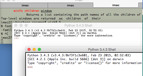
IDLE main window using TkFixedFont (macOS).

IDLE main window using TkFixedFont (Windows).
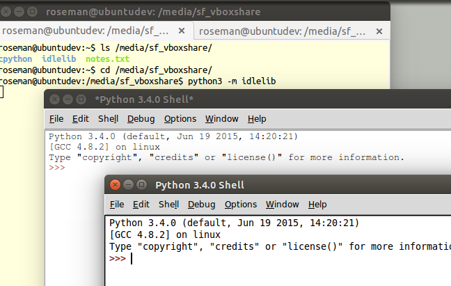
IDLE main window using TkFixedFont (Linux).
Speaking of preferences dialogs, if you want to change the font it often
helps to know what the font actually is (using Font.actual).
Here's the new code from IDLE's preferences dialog that figures that out:
if (family == 'TkFixedFont'):
f = Font(name = 'TkFixedFont', exists = True, root = root)
actualFont = Font.actual(f)
family = actualFont['family']
size = actualFont['size']
if size < 0:
size = 10 # if font in pixels, ignore actual size
bold = 1 if actualFont['weight']=='bold' else 0Around the text widget
There were a few other cosmetic things that just weren't right around the edge of the main window; see [Issue#24750]. Look back at the earlier screenshots of the IDLE main window.
Notice there's a border around the text widget. It's most noticeable on macOS, where it's a dark black, somewhat less so on Linux, and barely perceptible on Windows. This is the result of Tk's "highlightthickness" attribute, which is present when the text widget has the focus.
If the text widget doesn't have the focus, such as when the window becomes inactive, the highlight goes away:

Status bar on inactive window.
Notice how on the macOS screenshot, without the highlight, the status bar at the bottom of the window blends into the text widget. Not good.
As you'll see from looking at other applications, the border around the text widget is no longer a common convention. So let's start by removing that, which is as easy as adding "highlightthickness=0" when creating the text widget.
That still leaves us with the problem of the status bar blending into
the editor. We changed the status bar to be a ttk.Frame widget,
which has a background shading on all platforms. We also placed a
ttk.Separator widget just above the status bar to give us that
clean separation.
Each of the line and column indicators were labels, previously created with:
label = Label(self, bd=1, relief=SUNKEN, anchor=W)This was replaced with a ttk.Label to ensure it matched
the frame. We also did away with the 1990's sunken "3d" look.
label = ttk.Label(self)Last but not least, we can replace the original Tk scrollbar with the
newer ttk.Scrollbar widget.
The resulting changes to the main window are shown below. Despite these being fairly minor, often subtle changes, they go a long way towards IDLE's main window looking a lot cleaner, more modern, and "just fitting in" on all platforms.

IDLE's main window, with improvements (macOS).
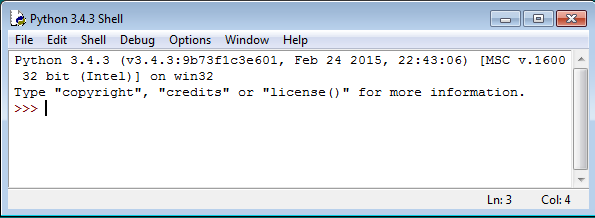
IDLE's main window, with improvements (Windows).

IDLE's main window, with improvements (Linux).
Preferences dialog
One visible piece that greatly needed improvement was the Preferences dialog. Again, here are screenshots on the three platforms:

IDLE's Preferences window (macOS).
IDLE's Preferences window (Windows).
IDLE's Preferences window (Linux).
The other tabs allow you to modify individual colors for syntax highlighting, keystrokes assigned to particular operations, and a few other miscellaneous things.
While there was some debate as to the need for this level of configuration on what was primarily a learning environment, it seemed reasonable to at least make what was there look and work better before considering any more radical surgery; see [Issue#24810].
Among other things, the Preferences dialog was changed from modal (which, amusingly enough, didn't quite work on macOS, allowing multiple copies to be created) to modeless, though I won't go further into that at this point; see [Issue#24760].
Tabs
The first issue to address was the tabs used to switch between the four different preference panes. The original used a custom "megawidget", as classic Tk doesn't have its own notebook widget. While the Windows and Linux ones don't look too bad, on recent versions of macOS, there is a built-in tab widget that looks quite different.
It's actually more common in macOS applications now to use something similar to a toolbar (row of icons with labels along the top or side) to switch between preference panes, though some programs do still use tabs. Tabs are very common on Windows and Linux.
The code was modified to use the ttk.Notebook widget,
which not only looks better on each platform but allows us to scrap
a lot of code for managing tabs ourselves.
Updating widgets
The next obvious step was upgrading the "classic" widgets to their themed counterparts. On this screen, that included the buttons, labels, frames, checkbox, scrollbar, etc. There were a few others on some of the other panes. Generally, this was a straightforward process, often involving removing widget options that were no longer needed or supported by the themed widgets.
Sometimes choosing a different widget made more sense. In this screen, the option menu used for font size was better replaced by a combobox. Similarly, the scale widget is not commonly seen in today's user interfaces and was replaced with the more familiar (and compact) spinbox widget.
There were also various non-standard ways of using certain widgets or specifying certain types of data. These were generally modified to use more familiar paradigms. There were several general issues discussed relating to the design of these dialogs, see, e.g., [Issue#24776], and [Issue#24782].
Layout
While this dialog is a bad example (just given the space imbalance between the left and right halves), a lot of time was spent looking at widget spacing and alignment in dialog boxes.
The general approach was to find similar examples in other applications and use those as a guide. Where are the buttons located? How are multiple fields of a dialog organized? Where are labels relative to the widget they're labeling? Are they left- or right-aligned, capitalized, or do they have a trailing colon? These are the sorts of questions to think about.
A great starting point is converting from using the old pack
geometry manager to grid. Because of the way it works, pack-based
layouts tend to have weird and inconsistent alignment and spacing,
especially if they've been modified over time. Using grid will increase
maintainability because it uses a more familiar mental model and
isn't dependent on the order in which widgets are inserted.
It's likely impossible to come up with one layout that looks fantastic on all platforms, but often you can come up with one (possibly with a couple platform-specific tweaks in the code) that looks decent.
A revised version of the dialog, incorporating many of the techniques here, is shown below.
IDLE Preferences, revised version (macOS).
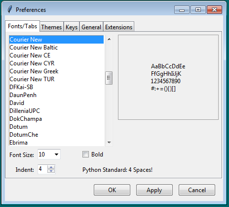
IDLE Preferences, revised version (Windows).
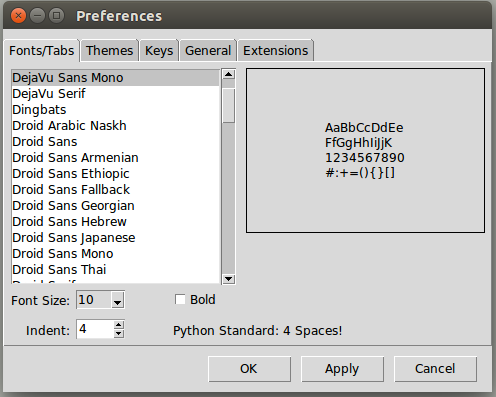
IDLE Preferences, revised version (Linux).
Another example
The screenshot below shows a before and after of the IDLE Preferences pane, which controls syntax coloring; see [Issue#24781].

IDLE Themes pane, before (Windows).
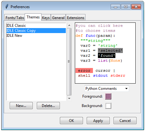
IDLE Themes pane, after (Windows).
Again, substituting widgets and using more familiar conventions is one piece of this. I think the bigger changes have to do with thinking about things from the users' perspective. Particularly as a beginner tool, if you're in here at all, it's probably to switch themes, not tweak colors, which is more prominent in the new version. It also does away with an arbitrary distinction between "built-in" and "custom" themes.
I think the new version is a big improvement, though I have yet to convince some people of this to date. This being open source, we'll see what happens!
Other dialogs
There are multiple other dialog boxes in IDLE; we'll consider a couple more examples here.
Find dialog
Planning on doing some more changes on these, likely combining Find and Replace into a single dialog.
One of the find/search dialogs is shown below, again with before and after on the three platforms; see [Issue#23218].
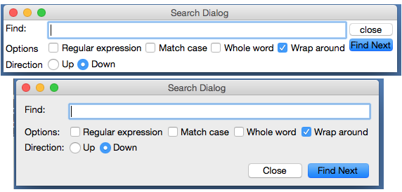
IDLE Find dialog, before and after (macOS).

IDLE Find dialog, before and after (Windows).

IDLE Find dialog, before and after (Linux).
The first step was upgrading the widgets to use the equivalent themed widgets. The effect of this is most obvious with the buttons (being consistent with the capitalization doesn't hurt either).
Speaking of buttons, notice they moved to the bottom on macOS and Linux, though they remained on the right on Windows. On examining multiple different applications, our target users would likely have encountered on each platform, we found these locations were common. With only a few lines of extra code needed to special-case for this layout difference, it made sense to handle things this way.
Other aspects of the layout were also improved. Looking at the original
dialogs (especially how the buttons don't align with other widgets),
I originally thought it was created with pack, and expected to convert it
to grid. Interestingly, it was already using grid. Why then were the
widgets unaligned, a hallmark of pack-based layouts?
This turned out to be a result of using many nested frames. For example, the buttons were placed into their own frame and then placed into the rest of the window. Because of that, the individual buttons couldn't be aligned with widgets in the rest of the user interface.
Nested frames were required when using pack, but often with grid it is
better to avoid them except in exceptional circumstances. That allows you
to align different parts of the user interface (at the expense of
much columnspan/rowspan tweaking).
A more substantial reorganization would have likely removed the nested frames, but particularly with adjusting the buttons, this relatively simple layout could be made to work with just a few tweaks.
You'll notice many older Tkinter user interfaces have the problem
here of their contents running to the edge of the windows, which often
doesn't look right. I've gotten into the habit of placing a ttk.Frame
directly inside each toplevel, with some additional padding, and then
placing the rest of the user interface inside that.
Like Preferences, the Find dialogs were also modal, which meant you had to dismiss them before doing any editing of your file, though at least they did remember the previous settings when you reopened them. These were eventually changed to be regular modeless windows.
About dialog
Speaking of modal dialogs, the About box was also originally modal. Not only that, getting more information (e.g., the IDLE README file) resulted in launching another modal dialog, which needed to be dismissed to go back to the first modal dialog, which needed... etc.
IDLE's doubly-modal About dialog (macOS).
Making the dialog non-modal was the first priority. Second, the nested dialogs were eliminated using a progressive disclosure technique. The initial dialog is fairly sparse but contains a 'More...' "link." When clicked, it expands the window to show one of the documentation files, with an option to switch to any of the others.
The 'More...' "link" effectively plays the role of a button, but takes advantage of everyone's familiarity with web browsers to provide a visually simpler alternative. As far as implementation, we use a (classic, non-themed) label widget, colored blue, and attach a mouse click binding to it.
You can help convey that the link is clickable by changing the cursor when the mouse is over it (via the "cursor" option found on many widgets). On macOS, choose the platform-specific "pointinghand" cursor, on Windows and Linux choose the "hand2" cursor, which actually gets mapped to something more appropriate on those platforms.
Revised About dialog (macOS).
Online help
IDLE also had a (needless to say, modal) help dialog which displayed information on using the program. This displayed a plain text help file that looked similar to the 'About - Readme' window above.
At the same time, like the rest of Python, there was reference documentation, created as "restructured text" which can then be formatted using a tool called Sphinx into HTML, text, etc.
The documentation in IDLE's help dialog was based on a separate but similar plain text file. Keeping the two in sync was a problem. They were separate because Sphinx's plain text rendering didn't look all that good, and all the extra navigation, etc. in the HTML rendering wouldn't be needed for online help, and then there's the hassle of opening a web browser, etc.; see [Issue#16893].
Tk's text widget is smart enough to handle the very basic formatting used in IDLE's documentation, and Python includes an HTML parser in its standard library. Putting the two together made displaying a simplified version of the HTML reference documentation easy.
Online help using text widget (macOS).
It's easy to get carried away here. Back in the mid-1990s, a tiny HTML parser in Tcl spawned a slew of "web browser in a text widget" adventures, first in Tcl and then in other languages, e.g., Python's Grail. Trying to keep up with everything that large teams of developers are putting into real web browsers is a fool's errand. Yet, for very limited and constrained subsets of HTML (as might be found in online help), it's an entirely reasonable approach.
Query dialogs
Still with the modal dialog theme, IDLE used the "simpledialog" package, distributed as part of Tkinter, to request certain small pieces of information from users via modal dialogs. An example is the "Goto line..." command. This, along with an example of the alert that is presented if you type in something invalid is shown below.

Goto line dialog and error handling (macOS).
The alert-on-dialog isn't quite as bad as the dialog-on-dialog pattern we saw before. But these dialogs could certainly stand to be cosmetically updated and a few other tweaks made. For example, while they correctly interpreted hitting the Return or Escape keys as synonymous with pressing OK or Cancel, they didn't also allow for the alternate macOS conventions (Enter key on the numeric keypad and Command-period); see [Issue#24812]. Some other customizations would have been nice to have (e.g., changing the name of the OK button) that simpledialog didn't support.
Regarding the error handling, things were, in some cases, handled worse. For example, there is a command to open an editor window containing the source of a module from Python's stdlib. See what happens if you make a typo.
Open module dialog with error (macOS).
Because the dialog doesn't know if the module name is correct, validation isn't done until after the dialog is dismissed. So the error alert gets attached to another window. To try again, you have to dismiss that, use the menu to reopen the dialog, and try again (from scratch).
There were a couple of places in the code where more validation in the dialog was really necessary. Because the "simpledialog" code was part of Tkinter and wasn't readily extensible in the ways needed, developers had to resort to "inheritance by text editor" (i.e., copy the entire simpledialog code and modify the copy). Twice, separately.
Since the appearance needed to be updated anyway, we generalized things and ignored Tkinter's simpledialog module altogether. Instead, a single general-purpose replacement was created that could be used throughout IDLE (and still resulted in less code).
New query dialog (macOS).
Besides the updated widgets and alignment, notice how error messages from invalid input are now shown in the dialog itself (a technique seen frequently in web applications) rather than a separate alert. For macOS, we also made sure to add key bindings for the numeric keypad Enter key and Command-period, and also made sure the window looked like a modal dialog is supposed to via this little gem:
self.tk.call('::tk::unsupported::MacWindowStyle', 'style', self._w,
'moveableModal', '')As far as validation, the query dialog was structured to accept a validation callback, which could then handle arbitrary criteria. For example, here is the validation code used when people enter the name of a new theme. It makes sure it fits certain syntactical requirements and also hasn't been already used.
def newtheme(self):
def validate_theme(s):
if not s:
raise ValueError('Cannot be blank')
if len(s) > 30:
raise ValueError('Cannot be longer than 30 characters')
if s in self.all_theme_names():
raise ValueError('Name already used')
new_theme = querydialog.askstring(parent=self, prompt='...',
title='Create New Theme', validatecmd=validate_theme)
if new_theme is not None:
...A generic 'integer' validation callback, with an optional minimum and maximum, was added to the query dialog module for dialogs like the 'Goto line...' dialog.
Dialog placement
Several dialogs, including alerts, file save, etc., appeared in the middle of the screen, rather than close to the window that they were associated with; see [Issue#25173].
Choosing the right window as the parent of the dialog is
important to ensure the dialog window appears near that window.
On macOS, these dialogs are often attached to the title bar of the
parent window (see the error alerts in the previous section).
The front ends to these dialogs in Tkinter support both a master
and a parent. While most of the time, "master" and "parent" are used
interchangeably in Tkinter, that's not the case here. If you provide only the
master, the dialog won't be attached to that window (but the dialog still
needs an existing window to create the dialog, which is why the master
parameter is there). If the dialog is associated with another window, be
sure to use the parent parameter.
Window integration
Multiple people had hoped to make it possible to have everything displayed in a single window, to avoid the window management hassles that can sometimes trip up people, see, e.g., [Issue#9262], [Issue#24826], and [Issue#24818].
Below is an early, partially-functional mockup of some of the things we wanted to accomplish.
Early mockup of window integration (macOS).
At this point, almost everything here has been implemented (though not incorporated into IDLE's codebase), and it ended up looking almost identical to the original mockup. See, once in a while, it happens!
Tabbed editor
Even beginner programmers have to juggle multiple different source files. If each gets its own window, as was the case originally in IDLE, things can get messy and/or lost pretty quickly. Using tabs to organize multiple files in a single window is a familiar, effective solution.
When architecting your application, don't build large components as subclasses of Toplevel, or assume they'll be the only thing in the window in the future. Getting around that assumption in the code took a large amount of work. If components are instead built as frames, they can be easily inserted into a toplevel, a paned window, a tabbed notebook, another frame, etc.
Luckily, we can rely on the ttk.Notebook widget to provide the tabbed user inteface, just like we did in Preferences.
Or maybe not.
Unfortunately, the ttk.Notebook widget (and the underlying platform widgets it uses) only really support displaying and switching between a small, fixed number of tabs. There's nothing built-in to support adding or closing tabs from the user interface, which we definitely need here. And as every programmer knows, it is more than possible to need a large number of tabs.
As you've seen in different editors and word processors, everyone does things slightly differently. We did our own custom tab widget (sigh...) for IDLE. The design borrowed heavily from the TextMate editor on macOS. It allows creating new tabs, closing old ones, dragging to rearrange the order, tooltips on each tab, indicating if the contained file needed saving, etc. When the number of tabs grows too large to comfortably display, the remainder are accessible via a popup menu on the last visible tab.
The tabbed widget implementation relies on a single Tkinter canvas to display the row of tabs and handle all interaction. Switching the window content is separate from the widget, with a simple callback mechanism used to coordinate everything.
Debugger
The design of the original debugger (which had its own set of flaws, see [Issue#17942]) was too tall to be integrated as we wanted.

Original IDLE debugger (macOS).
The user interface was substantially revised, with a layout that would work both in a standalone window and when integrated. The new version uses a paned window to separate the controls and stack on the left from the variable display on the right. Both the stack and variable display are implemented using tree view widgets. This also provides a great deal of control of how much space each element will use.

New IDLE debugger (macOS).
Integrated shell and debugger
Another paned window was used to integrate the shell and the debugger with the tabbed editor. Additional controls will be added to show/hide the panes as the implementation progresses.
The embedded shell is interesting too. Recall that IDLE normally has a single Python shell window running another Python process; when modules in an editor are "run," they do so via that shell. It's nice to have that big shell available, and we don't necessarily want to start up a separate shell in the editor.
New in Tk 8.5, the Text widget actually supports "peers," which are separate widgets that share the same text backend. That means when something changes in one, it changes in the other. It's a seamless way to solve our problem here.
Workarounds, hacks, and more
This being a chapter on actual experiences modernizing a real application, it would be a lie to say that the underlying user interface toolkit (Tk and the Tkinter wrapper) always worked exactly as it should. Like IDLE, Tkinter and Tcl/Tk are the results of incredible volunteer efforts. That being said...
Tk and Tkinter have some bugs and rough edges. I know you're shocked.
In this section, I'll try to catalog just a few of the particular "gotchas" that we ran into, as well as provide some little tips that don't necessarily fit elsewhere but help provide a bit more polish to the user interface.
Tool tips
- tool tips broken on macOS; see [Issue#24570]
MacWindowStylehelp for tooltips, vs.wm overrideredirectelsewhere
Context menus
- bogus text widget bindings interfere with popup clicks;see [Issue#24801]
- two different popup click bindings needed on macOS; [Issue#24801]
Peer text widgets
- broken peer text widget API in Tkinter;see [Issue#17945]
Modal windows
- macOS not doing fully modal, plus window style;see [Issue#24760]