Text
Text widgets.
A text widget manages a multi-line text area.
Text widgets are part of the classic Tk widgets, not the themed Tk widgets.
While we briefly introduced text widgets in an earlier chapter, we'll go into more detail here. You'll get a better sense of the level of sophistication they allow. Still, if you plan to do any significant work with the text widget, the reference manual is a well-organized, helpful, and highly-recommended read.
Text widgets are created using the Text class:
text = Text(parent, width=40, height=10)Text widgets are created using the tk::text command:
tk::text .text -width 40 -height 10Text widgets are created using the TkText class:
text = TkText.new(parent) {width 40; height 10}new_tk__text method, a.k.a. Tkx::tk__text:
$text = $parent->new_tk__text(-width => 40, -height => 10);You'll often provide a width (in characters) and height (in lines). As always, you can ask the geometry manager to expand it to fill the available space in the window.
The basics
If you simply need a multi-line text field for a form, there are only a few things to worry about: create and size the widget (check), provide an initial value, and retrieve the text after a user has submitted the form.
Providing initial content
Text widgets start with nothing in them, so we'll need to add any initial content ourselves.
Because text widgets can hold a lot more than plain text, a simple mechanism (like the entry widget's
textvariable configuration option) isn't sufficient.
Instead, we'll use the widget's insert method:
text.insert('1.0', 'here is my\ntext to insert').text insert 1.0 "here is my\ntext to insert"text.insert(1.0, "here is my\ntext to insert")$text->insert("1.0", "here is my\ntext to insert");The "1.0" here is the position where to insert the text, and can be read as "line 1, character 0". This refers to the first character of the first line. Historically, especially on Unix, programmers tend to think about line numbers as 1-based and character positions as 0-based.
The text to insert is just a string. Because the widget can hold multi-line text, the string we
supply can be multi-line as well. To do this, simply embed \n (newline) characters in the
string at the appropriate locations.
Retrieving the text
After users have made any changes and submitted the form (for example), your program can
retrieve the contents of the widget via the get method:
thetext = text.get('1.0', 'end')set thetext [.text get 1.0 end]thetext = t.get("1.0", 'end')$thetext = $text->get("1.0", "end");The two parameters are the start and end position; end has the obvious meaning.
You can provide different start and end positions if you want to obtain only part of the text.
You'll see more on positions shortly.
Customizing appearance
We previously saw the width and height configuration options for text widgets.
Several other options control its appearance. The most useful are:
foreground:- color to draw the text in
background:- background color of the widget
padx, pady:- extra padding along the inside border of the widget
borderwidth:- width of the border around widget
relief:- border style:
flat,raised,sunken,solid,ridge,groove
Wrapping and scrolling
What if some lines of text in the widget are very long, longer than the width of the widget? By default,
the text wraps around to the next line. This behavior can be changed with the
wrap configuration option. It defaults to char, meaning wrap lines at any character.
Other options are word to wrap lines only at
word breaks (e.g., spaces), and none meaning to not wrap lines at all. In the latter case,
some text of longer lines won't be visible unless we attach a horizontal scrollbar to the widget.
(Users can also scroll through the text using arrow keys, even if scrollbars aren't present).
Both horizontal and vertical scrollbars can be attached to the text widget in the same way as with other widgets, e.g., canvas, listbox.
t = Text(root, width = 40, height = 5, wrap = "none")
ys = ttk.Scrollbar(root, orient = 'vertical', command = t.yview)
xs = ttk.Scrollbar(root, orient = 'horizontal', command = t.xview)
t['yscrollcommand'] = ys.set
t['xscrollcommand'] = xs.set
t.insert('end', "Lorem ipsum...\n...\n...")
t.grid(column = 0, row = 0, sticky = 'nwes')
xs.grid(column = 0, row = 1, sticky = 'we')
ys.grid(column = 1, row = 0, sticky = 'ns')
root.grid_columnconfigure(0, weight = 1)
root.grid_rowconfigure(0, weight = 1)
tk::text .t -width 40 -height 5 -wrap none -yscrollcommand ".ys set" -xscrollcommand ".xs set"
ttk::scrollbar .ys -orient vertical -command ".t yview"
ttk::scrollbar .xs -orient horizontal -command ".t xview"
.t insert end "Lorem ipsum...\n...\n... "
grid .t -column 0 -row 0 -sticky nwes
grid .xs -column 0 -row 1 -sticky we
grid .ys -column 1 -row 0 -sticky ns
grid columnconfigure . 0 -weight 1
grid rowconfigure . 0 -weight 1t = TkText.new(root) {width 40; height 5; wrap "none"}
ys = Tk::Tile::Scrollbar.new(root) {orient 'vertical'; command proc{|*args| t.yview(*args);}}
xs = Tk::Tile::Scrollbar.new(root) {orient 'horizontal'; command proc{|*args| t.xview(*args);}}
t['yscrollcommand'] = proc{|*args| ys.set(*args);}
t['xscrollcommand'] = proc{|*args| xs.set(*args);}
t.insert('end', "Lorem ipsum...\n...\n... ")
t.grid( :column => 0, :row => 0, :sticky => 'nwes')
xs.grid( :column => 0, :row => 1, :sticky => 'we')
ys.grid( :column => 1, :row => 0, :sticky => 'ns')
TkGrid.columnconfigure(root, 0, :weight => 1)
TkGrid.rowconfigure(root, 0, :weight => 1)$t = $mw->new_tk__text(-width => 40, -height => 5, -wrap => 'none');
$ys = $mw->new_ttk__scrollbar(-orient => 'vertical', -command => [$t, "yview"]);
$xs = $mw->new_ttk__scrollbar(-orient => 'horizontal', -command => [$t, "xview"]);
$t->configure(-yscrollcommand => [$ys, 'set']);
$t->configure(-xscrollcommand => [$xs, 'set']);
$t->insert('end', "Lorem ipsum...\n...\n... ");
$t->g_grid(-column => 0, -row => 0, -sticky => 'nwes');
$xs->g_grid(-column => 0, -row => 1, -sticky => 'we');
$ys->g_grid(-column => 1, -row => 0, -sticky => 'ns');
$mw->g_grid_columnconfigure(0, -weight => 1);
$mw->g_grid_rowconfigure(0, -weight => 1);We can also ask the widget to ensure that a certain part of the text is visible. For example, let's say
we've added more text to the widget than will fit onscreen (so it will scroll). However, we want to ensure
that the top of the text rather than the bottom is visible. We can use the see method.
text.see('1.0').text see 1.0text.see('1.0')$text->see("1.0");Disabling the widget
Some forms will temporarily disable editing in particular widgets unless certain conditions are met
(e.g., some other options are set to a certain value). To prevent users from changing
a text widget, set the state configuration option to disabled. Re-enable editing
by setting this option back to normal.
text['state'] = 'disabled'.text configure -state disabledtext['state'] = 'disabled'$text->configure(-state => "disabled");As text widgets are part of the classic widgets, the usual state and instate
methods are not available.
Modifying the text in code
While users can modify the text in the text widget interactively, your program can also make
changes. Adding text is done with the insert method, which we used above to provide an
initial value for the text widget.
Text positions and indices
When we specified a position of 1.0 (first line, first character), this was an example of an index.
It tells the insert method where to put the new text (just before the first line, first character, i.e., at the
very start of the widget). Indices can be specified in a variety of ways. We used another one with the get method:
end means just past the end of the text. (Why "just past?" Text is inserted right
before the given index, so inserting at end will add text to the end of the widget).
Note that Tk will always add a newline at the very end of the text widget.
Here are a few additional examples of indices and how to interpret them:
3.end:- The newline at the end of line 3.
1.0 + 3 chars:- Three characters past the start of line 1.
2.end -1 chars:- The last character before the new line in line 2.
end -1 chars:- The newline that Tk always adds at the end of the text.
end -2 chars:- The actual last character of the text.
end -1 lines:- The start of the last actual line of text.
2.2 + 2 lines:- The third character (index 2) of the fourth line of text.
2.5 linestart:- The first character of line 2.
2.5 lineend:- The position of the newline at the end of line 2.
2.5 wordstart:- First char. of the word with the char. at index 2.5.
2.5 wordend:- First char. after the word with the char. at index 2.5.
Some additional things to keep in mind:
- The term
charscan be abbreviated asc, andlinesasl. - Spaces between terms can be omitted, e.g.,
1.0+3c. - An index past the end of the text (e.g.,
end + 100c) is interpreted asend. - Indices wrap to subsequent lines as needed; e.g.,
1.0 + 10 charson a line with only five characters will refer to a position on the second line. - Line numbers in indices are interpreted as logical lines, i.e., each line ends only at the "\n." With long lines and wrapping enabled, one logical line may represent multiple display lines. If you'd like to move up or down a single line on the display, you can specify this as, e.g., "1.0 + 2 display lines".
- When indices contain multiple words, make sure they are quoted appropriately so that Tk sees the entire index as one argument.
To determine the canonical position of an index, use the index method. Pass it any
index expression, and it returns the corresponding index in the form line.char. For example,
to find the position of the last character (ignoring the automatic newline at the end), use:
text.index('end').text index endtext.index('end')$text->index("end") You can compare two indices using the compare method, which lets you check for equality,
whether one index is later in the text than the other, etc.
if text.compare(idx1, "==", idx2"): # same positionif {[.text compare idx1 "==" idx2]} { # same position }if text.compare(idx1, "==", idx2) then # same positionif ($text->compare(idx1, "==", idx2)) { # same position }Valid operators are ==, !=, <, <=, >, and >=.
Deleting text
While the insert method adds new text anywhere in the widget, the delete method removes it.
We can delete either a single character (specified by index) or a range of characters (specified by
start and end indices). In the latter case, characters from (and including) the start index until just before
the end index are deleted (the character at the end index is not deleted). So if we assume for each of these
we start off with "abcd\nefgh" in the text widget:
text.delete('1.2') ⇒ "abd\nefgh"
text.delete('1.1', '1.2') ⇒ "acd\nefgh"
text.delete('1.0', '2.0') ⇒ "efgh"
text.delete('1.2', '2.1') ⇒ "abfgh"
.text delete 1.2 ⇒ "abd\nefgh"
.text delete 1.1 1.2 ⇒ "acd\nefgh"
.text delete 1.0 2.0 ⇒ "efgh"
.text delete 1.2 2.1 ⇒ "abfgh"text.delete(1.2) ⇒ "abd\nefgh"
text.delete(1.1, 1.2) ⇒ "acd\nefgh"
text.delete(1.0, 2.0) ⇒ "efgh"
text.delete(1.2, 2.1) ⇒ "abfgh"$text->delete("1.2"); ⇒ "abd\nefgh"
$text->delete("1.1", "1.2"); ⇒ "acd\nefgh"
$text->delete("1.0", "2.0"); ⇒ "efgh"
$text->delete("1.2", "2.1"); ⇒ "abfgh"There is also a replace method that performs a delete followed by an insert
at the same location.
Example: logging window
Here's a short example using a text widget as an 80x24 logging window for an application. Users don't edit the text widget at all. Instead, the program writes log messages to it. We'd like to display more than 24 lines (so no scrolling). If the log is full, old messages are removed from the top before new ones are added at the end.
from tkinter import *
from tkinter import ttk

root = Tk()
log = Text(root, state='disabled', width=80, height=24, wrap='none')
log.grid()

def writeToLog(msg):
    numlines = int(log.index('end - 1 line').split('.')[0])
    log['state'] = 'normal'
    if numlines==24:
        log.delete(1.0, 2.0)
    if log.index('end-1c')!='1.0':
        log.insert('end', '\n')
    log.insert('end', msg)
    log['state'] = 'disabled'
package require Tk
grid [text .log -state disabled -width 80 -height 24 -wrap none]
proc writeToLog {msg} {
set numlines [lindex [split [.log index "end - 1 line"] "."] 0]
.log configure -state normal
if {$numlines==24} {.log delete 1.0 2.0}
if {[.log index "end-1c"]!="1.0"} {.log insert end "\n"}
.log insert end "$msg"
.log configure -state disabled
}require 'tk'
root = TkRoot.new
@log = TkText.new(root) {state 'disabled';width 80;height 24;wrap 'none'}.grid
def writeToLog(msg)
numlines = @log.index("end - 1 line").split('.')[0].to_i
@log['state'] = :normal
@log.delete(1.0, 2.0) if numlines==24
@log.insert('end', "\n") unless @log.index('end-1c')=='1.0'
@log.insert('end', msg)
@log['state'] = :disabled
enduse Tkx;
$mw = Tkx::widget->new(".");
$log = $mw->new_tk__text(-state => "disabled", -width => 80, -height => 24, -wrap => "none");
$log->g_grid;
sub writeToLog {
my ($msg) = @_;
$numlines = $log->index("end - 1 line");
print $numlines . "\n";
$log->configure(-state => "normal");
if ($numlines==24) {$log->delete("1.0", "2.0");}
if ($log->index("end-1c")!="1.0") {$log->insert_end("\n");}
$log->insert_end($msg);
$log->configure(-state => "disabled");
}Note that because the program placed the widget in a disabled state, we had to re-enable it to make any changes, even from our program.
Formatting with tags
So far, we've used text widgets when all the text is in a single font. Now it's time to add formatting like bold, italic, strikethrough, background colors, font sizes, and much more. Tk's text widget implements these using a feature called tags.
Tags are objects associated with the text widget. Each tag is referred to via a name chosen by the programmer. Each tag has several configuration options. These are things like fonts and colors that control formatting. Though tags are objects having state, they don't need to be explicitly created but are automatically created the first time the tag name is used.
Adding tags to text
Tags can be associated with one or more ranges of text in the widget. As before, ranges are specified via indices.
A single index represents a single character, and a pair of indices represent a range from the start
character to just before the end character. Tags are added to a range of text using the
tag_add method.
text.tag_add('highlightline', '5.0', '6.0').text tag add highlightline 5.0 6.0text.tag_add('highlightline', 5.0, 6.0)$text->tag_add("highlightline", "5.0", "6.0");Tags can also be provided when first inserting text. The insert method supports an optional parameter
containing a list of one or more tags to add to the text being inserted.
text.insert('end', 'new material to insert', ('highlightline', 'recent', 'warning')).text insert end "new material to insert" "highlightline recent warning"text.insert('end', 'new material to insert', 'highlightline recent warning')$text->insert_end("new material to insert", "highlightline recent warning");As the widget's contents are modified (whether by a user or your program), the tags will adjust automatically. For example, if we tagged the text "the quick brown fox" with the tag "nounphrase", and then replaced the word "quick" with "speedy," the tag still applies to the entire phrase.
Applying formatting to tags
Formatting is applied to tags via configuration options; these work similarly to configuration options for the entire widget. As an example:
text.tag_configure('highlightline', background='yellow', font='TkFixedFont', relief='raised').text tag configure highlightline -background yellow -font "TkFixedFont" -relief raisedtext.tag_configure('highlightline', :background=>'yellow', :font=>'TkFixedFont', :relief=>'raised')$text->tag_configure("highlightline", -background => "yellow", -font => "TkFixedFont", -relief => "raised");Tags support the following configuration options: background, bgstipple, borderwidth,
elide, fgstipple, font, foreground, justify, lmargin1, lmargin2,
offset, overstrike, relief, rmargin, spacing1, spacing2,
spacing3, tabs, tabstyle, underline, and wrap.
Check the reference manual for detailed descriptions of these. The tag_cget method allows us to query the configuration options of a tag.
Because multiple tags can apply to the same range of text, there is the possibility of conflict (e.g., two tags
specifying different fonts). A priority order is used to resolve these; the most recently created tags have
the highest priority, but priorities can be rearranged using the tag_raise and tag_lower
methods.
More tag manipulations
To delete one or more tags altogether, we can use the tag_delete method. This also, of course,
removes any references to the tag in the text. We can also remove a tag from a range of text using the
tag_remove method, specifying the tag to remove, and the start and (optional) end index of the range.
Even if that leaves no ranges of text with that tag, the tag object itself still exists.
The tag_ranges method will return a list of ranges in the text that a given tag has been applied to. There
are also tag_nextrange and tag_prevrange methods that allow you to
search forward or backward for a tag starting from a given position.
The tag_names method, called with no additional parameters, will return a list of all tags currently
defined in the text widget (including those that may not be presently used). If we pass the method an index,
it will return the list of tags applied to just the character at the index.
Finally, we can use the first and last characters in the text having a given tag as indices, the same way we
can use "end" or "2.5". To do so, just specify tagname.first or tagname.last.
Differences between tags in canvas and text widgets
Both canvas and text widgets support "tags" that can be applied to several objects, style them, etc. However, canvas and text tags are not the same and there are substantial differences to take note of.
In canvas widgets, only individual canvas items have configuration options that control their appearance. When we refer to a tag in a canvas, the meaning of that is identical to "all canvas items presently having that tag." The tag itself does not exist as a separate object. So in the following snippet, the last rectangle added will not be colored red.
canvas.itemconfigure('important', fill='red')
canvas.create_rectangle(10, 10, 40, 40, tags=('important'))
.canvas itemconfigure important -fill red
.canvas create rectangle 10 10 40 40 -tags importantcanvas.itemconfigure('important', :fill => 'red')
TkcRectangle.new(canvas, 10, 10, 40, 40, :tags => 'important')$canvas->itemconfigure("important", -fill => "red");
$canvas->create_rectangle(10, 10, 40, 40, -tags => "important");In contrast, with text widgets, it's not the individual characters that retain the state information about appearance, but tags, which are objects in their own right. So in this snippet, the newly added text will be colored red.
text.insert('end', 'first text', ('important'))
text.tag_configure('important', foreground='red')
text.insert('end', 'second text', ('important'))
.text insert end "first text" important
.text tag configure important -foreground red
.text insert end "second text" importanttext.insert('end', 'first text', 'important')
text.tag_configure('important', :foreground => 'red')
text.insert('end', 'second text', 'important')$text->insert_end("first text", "important");
$text->tag_configure("important", -foreground => "red");
$text->insert_end("second text", "important");Events and bindings
One very cool thing we can do is define event bindings on tags. That allows us to easily do things like
recognize mouse clicks on particular ranges of text and popup a menu or dialog in response. Different
tags can have different bindings. This saves the hassle of sorting out questions like "what does a click
at this location mean?". Bindings on tags are implemented using the tag_bind method:
text.tag_bind('important', '<1>', popupImportantMenu).text tag bind important <1> "popupImportantMenu"text.tag_bind('important', '1', proc{popupImportantMenu})$text->tag_bind("important", "<1>", sub{popupImportantMenu});Widget-wide event bindings continue to work as they do for every other widget, e.g., to capture a mouse click
anywhere in the text. Besides the normal low-level events, the text widget generates a
<<Modified>> virtual event whenever a change is made to the
content of the widget, and a <<Selection>> virtual event
whenever there is a change made to which text is selected.
Selecting text
We can identify the range of text selected by a user, if any.
For example, an editor may have a toolbar button to bold the selected text. While you can tell when
the selection has changed (e.g., to update whether or not the bold button is active) via the <<Selection>>
virtual event, that doesn't tell you what has been selected.
The text widget automatically maintains a tag named sel, which refers to the selected text. Whenever the
selection changes, the sel tag will be updated. So we can find the range of text selected using the
tag_ranges method, passing it sel as the tag to report on.
Similarly, we can change the selection by using tag_add to set a new selection, or tag_remove
to remove the selection. The sel tag cannot be deleted, however.
Though the default widget bindings prevent this from happening, sel is like any other tag in that it can support
multiple ranges, i.e., disjoint selections. To prevent this from happening, when changing the selection from your
code, make sure to remove any old selection before adding a new one.
The text widget manages the concept of the insertion cursor (where newly typed text will appear) separate from the selection. It does so using a new concept called a mark.
Marks
Marks indicate a particular place in the text. In that respect, they are like indices. However, as the text is modified, the mark will adjust to be in the same relative location. In that way, they resemble tags but refer to a single position rather than a range of text. Marks actually don't refer to a position occupied by a character in the text but specify a position between two characters.
Tk automatically maintains two different marks. The first, named insert, is the present location of the
insertion cursor. As the cursor is moved (via mouse or keyboard), the mark moves with it. The second mark,
named current, tracks the position of the character underneath the current mouse position.
To create your own marks, use the widget's mark_set method, passing it the name of the mark and an index
(the mark is positioned just before the character at the given index). This is also used to move an existing mark to
a different position. Marks can be removed using the mark_unset method, passing it the name of the mark.
If you delete a range of text containing a mark, that also removes the mark.
The name of a mark can also be used as an index (in the same way 1.0 or end-1c are indices).
You can find the next mark (or previous one) from a given index in the text using the mark_next or
mark_previous methods. The mark_names method will return a list of the names of all marks.
Marks also have a gravity, which can be modified with the mark_gravity method, passing it the
name of the mark and the new gravity (left or right, the default). Gravity affects what happens when text is inserted at the mark.
Suppose we have the text "ac" with a mark in between that
we'll symbolize with a pipe, i.e., "a|c." If the gravity of that mark is right, the mark
attaches itself to the "c." If the new text "b" is inserted at the mark, the mark will remain stuck to the "c,"
and so the new text will be inserted before the mark, i.e., "ab|c." If the gravity is instead left, the mark
attaches itself to the "a," and so new text will be inserted after the mark, i.e., "a|bc."
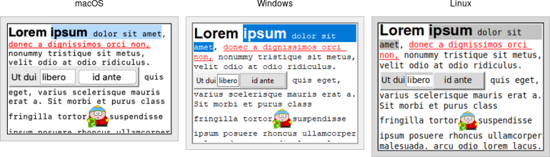
Images and widgets
Like canvas widgets, text widgets can contain images and any other Tk widgets (including frames containing many other widgets). In a sense, this allows the text widget to work as a geometry manager in its own right. The ability to add images and widgets within the text opens up a world of possibilities for your program.
Images are added to a text widget at a particular index, with the image specified as an existing Tk image. Other options that allow you to fine-tune padding, etc.
flowers = PhotoImage(file='flowers.png')
text.image_create('sel.first', image=flowers)
image create photo flowers -file flowers.png
.text image create sel.first -image flowersflowers = TkPhotoImage.new(:file => 'flowers.png')
TkTextImage.new(text, 'sel.first', :image => flowers)Tkx::image_create_photo( "flowers", -file => "flowers.png");
$text->image_create("sel.first", -image => "flowers");Other widgets are added to a text widget in much the same way as images. The widget being added must be a descendant of the text widget in the widget hierarchy.
b = ttk.Button(text, text='Push Me')
text.window_create('1.0', window=b)
ttk::button .text.b -text "Push Me"
.text window create 1.0 -window .text.bb = Tk::Tile::Button.new(text) {text 'Push Me'}
TkTextWindow.new(text, 1.0, :window => b)$b = $text->new_ttk__button(-text => "Push Me");
$text->window_create("1.0", -window => $b);Even more
Text widgets can do many more things. Here, we'll briefly mention just a few more of them. For details on any of these, see the reference manual.
Search
The text widget includes a powerful search method to locate a piece of text within the
widget. This is useful for a "Find" dialog, as one obvious example. You can search backward or forward from a
particular position or within a given range, specify the search term using exact text, case insensitive, or via
regular expressions, find one or all occurrences of the search term, etc.
Modifications, undo and redo
The text widget keeps track of whether changes have been made (useful to know whether it needs to be
saved to a file, for example). We can query (or change) using the edit_modified method. There is also
a complete multi-level undo/redo mechanism, managed automatically by the widget when we set its undo
configuration option to true. Calling edit_undo or edit_redo modifies the current
text using information stored on the undo/redo stack.
Eliding text
Text widgets can include text that is not displayed. This is known as "elided" text, and is made
available using the elide configuration option for tags. It can be used to implement
an outliner, a "folding" code editor, or even to bury extra meta-data intermixed with displayed text.
When specifying positions within elided text, you have to be a bit more careful. Methods that work with
positions have extra options to either include or ignore the elided text.
Introspection
Like most Tk widgets, the text widget goes out of its way to expose information about its internal state. We've
seen this in terms of the get method, widget configuration options, names and
cget for both tags and marks, etc. There is even more information available that can be useful
for a wide variety of tasks. Check out the debug, dlineinfo, bbox,
count, and dump methods in the reference manual.
Peering
The Tk text widget allows the same underlying text data structure (containing all the text, marks, tags, images, etc.) to be
shared between two or more different text widgets. This is known as peering and is controlled via the
peer method.